Visual Design Projects in Calgary
Visual Design Projects in Calgary
Sign Up
Post a job
Sign Up
Log In
Filters
2
Projects
People
Message
1
Ryan Fairweather
Tuponian Park Character Design for Telus Spark
1
15
Message
1
Vlad Savruk
Mazie - Marketing Automation Identity
1
87
Message
0
Oleg Lalov
pro
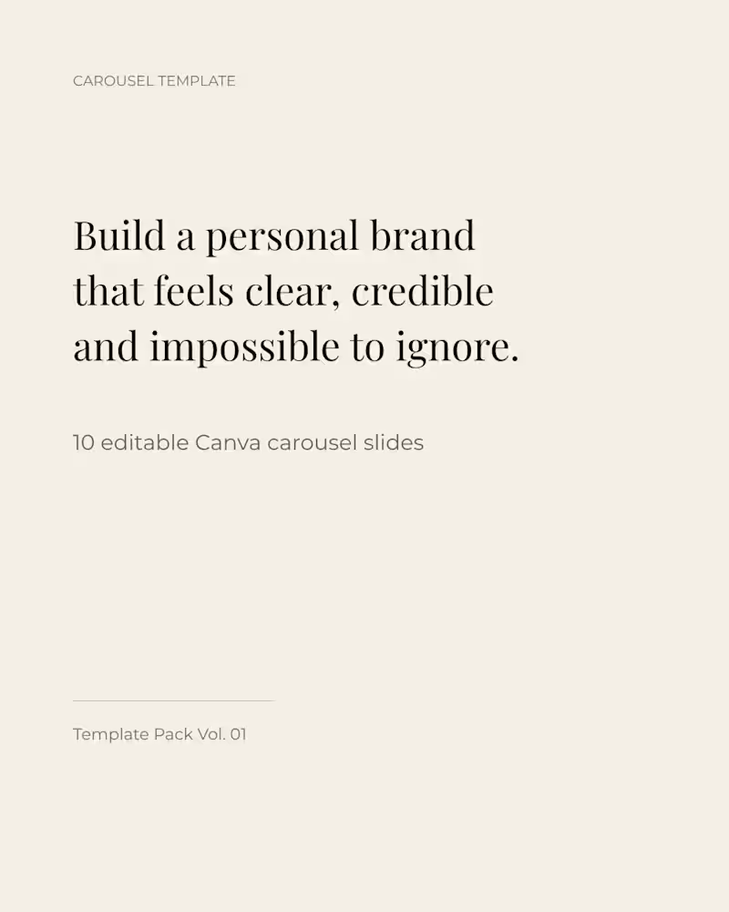
Canva carousel template pack for personal brand content. Designed to help turn ideas into clear, structured, and memorable social media posts. The layout system is minimal, elegant, and easy to adapt for educational content, frameworks, insights, and CTA slides.
0
71
Message
0
Connor McKenzie
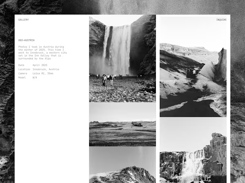
Analog Photography Gallery
0
113
Message
0
Nefe Onohwosa
Nights of Fire | Graphic Design :: Behance
0
3
Message
1
Vlad Savruk
Castle, Brand Identity + Logo
1
7
Message
0
Oleg Lalov
pro
High agency women
0
101
Message
0
Nefe Onohwosa
Fruitco | Branding & Brand Identity :: Behance
0
3
Message
1
Vlad Savruk
Comp AI, Visual Identity + Logo System
1
7
Message
1
Oleg Lalov
pro
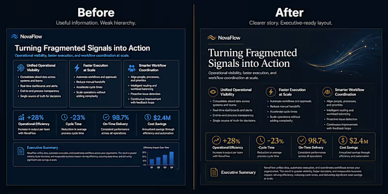
A strong slide redesign is not just about making a slide look better. It’s about making the message easier to understand. In this concept, I took a business slide with solid information, but weak hierarchy and crowded structure — and redesigned it into a cleaner, more executive-ready layout. Before: The content is there, but too many elements compete for attention. After: The same idea becomes clearer through stronger hierarchy, better spacing, cleaner grouping, and more controlled visual rhythm. That’s where presentation design creates real value: not by decorating the slide, but by helping the audience see what matters first. What changed: — clearer headline hierarchy — better spacing — stronger content grouping — fewer competing elements — a more premium overall feel Small layout decisions can completely change how a business story is perceived.
2
1
161
Message
0
Nefe Onohwosa
Audio Addict | Brand design & UI/UX Design
0
2
Message
0
Oleg Lalov
pro
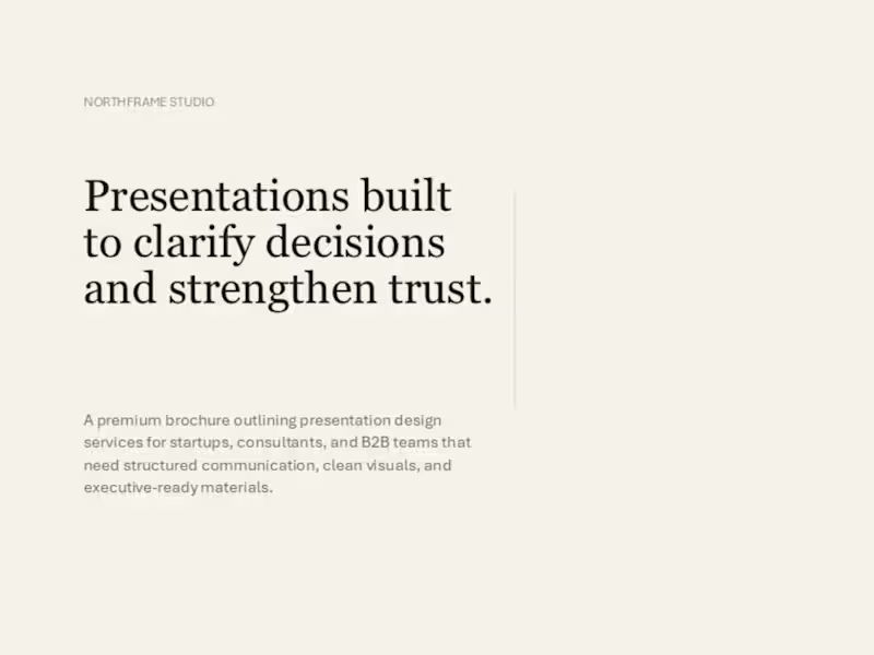
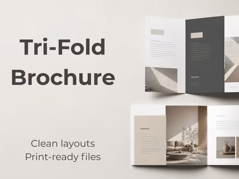
Northframe Brochure Design | Clean Business Presentation Created a clean, editorial-style business brochure for Northframe, focused on clarity, structure, and professional visual presentation. My role included shaping the layout system, refining typography and spacing, and building a consistent page rhythm across the document. The result was a polished brochure that communicates information clearly while maintaining a modern, premium feel.
0
114
Message
0
Oleg Lalov
pro
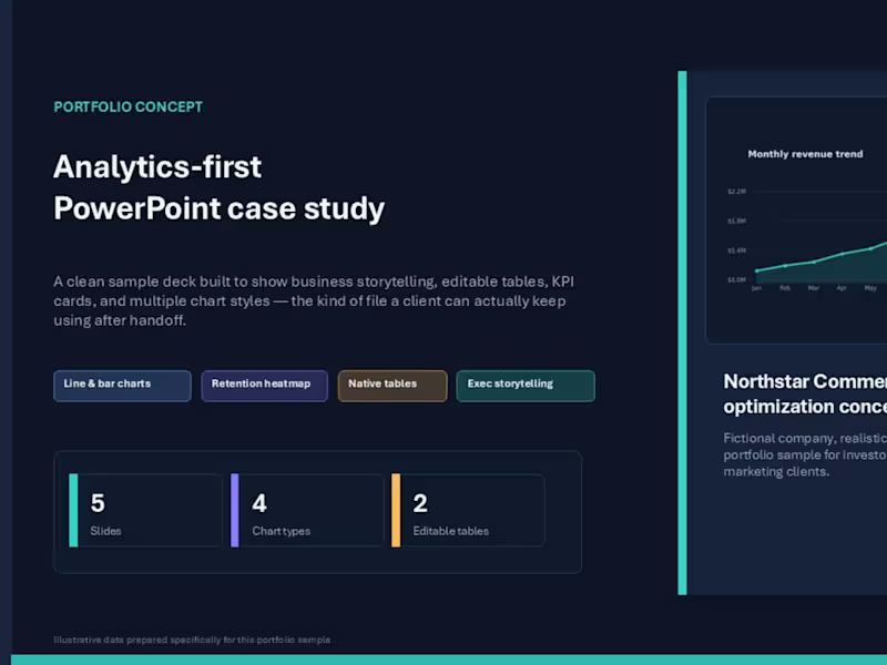
Northstar Commerce — PowerPoint Strategy Presentation. Concept PowerPoint deck created for a commerce-focused brand, built around a clean, analytic-first visual system. The project focused on transforming business content into a structured, executive-ready presentation with strong hierarchy, refined layout discipline, and clear storytelling. The goal was to create a deck that feels modern, credible, and presentation-ready rather than template-driven.
0
128
Message
0
Oleg Lalov
pro
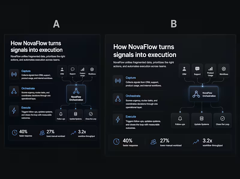
:What makes a slide feel premium? Usually not more effects. Not more decoration. And definitely not more elements. A strong slide often feels expensive because it does less — but with more control. For me, the difference usually comes down to: • clearer hierarchy • calmer spacing • stronger alignment • fewer competing elements • more intentional contrast Small decisions change the whole impression. Which version feels more premium to you — A or B?
0
162
Message
1
Oleg Lalov
pro
NovaFlow — AI SaaS Pitch Deck
1
160
Message
1
Oleg Lalov
pro
Business Brochure Design in PowerPoint
1
164
Explore projects