Brand & Web Designer | Landing Pages, Sites & Art Direction
- 5.0
- Rating
- 40
- Followers
Brand & Web Designer | Landing Pages, Sites & Art Direction
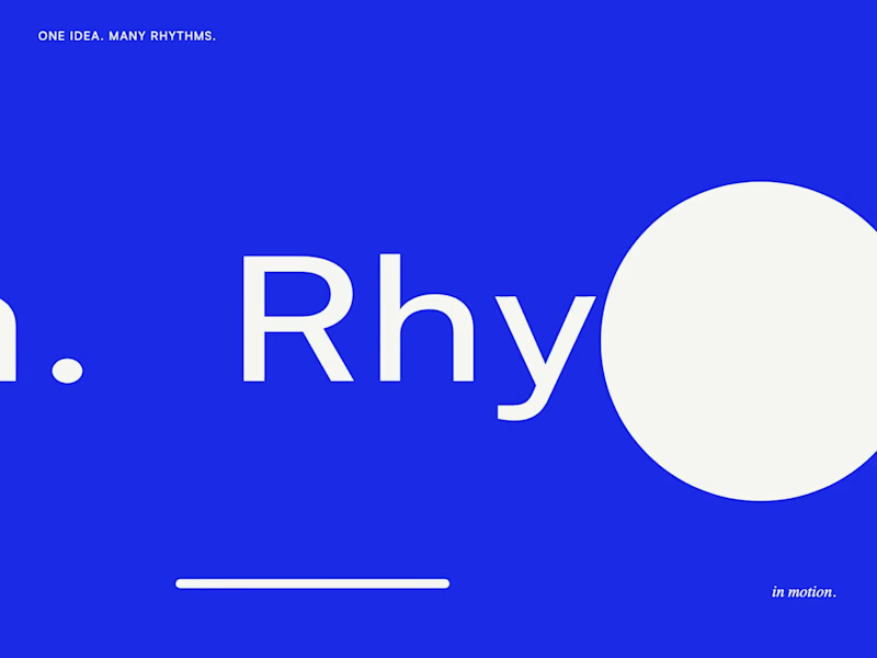
Motion Design & Art Direction
I design motion from the first composition to the final frame, combining typography, graphic design and animation.
This self-initiated series shows how I work with timing, weight and visual hierarchy. Letters stretch and rebound, geometric forms trigger chain reactions, and transitions carry one composition into the next. Each movement follows the same graphic language while giving each film a distinct pace.
My focus is on how a design behaves over time: where the eye goes, how an element arrives, and when a transition needs to hold or accelerate.
8
24
405
Corpus started with a real operational problem.
A shared healthcare practice in Brasília has one consultation room used by different professionals and specialties. What looked like a simple scheduling problem quickly became a coordination problem: checking availability, accounting for transitions between specialties, managing patients, reminders, cancellations and billing.
I built Corpus to absorb that complexity. It turns a fragmented, message-based workflow into one clear scheduling experience, with a time-aware interface, automatic room-transition rules, patient context, cancellation logic and Ask Corpus, a natural-language layer for getting things done without navigating the booking system.
One principle guided the project: AI interprets. The system decides. Natural language makes the experience faster, while availability, conflicts, permissions and billing remain deterministic.
Building this with Lovable was also a genuinely enjoyable experiment in how far a product can be taken within one environment. Beyond the application itself, I used Lovable to build an interactive case study and even a fully code-driven product film, using the same visual language to design not only the product, but also how its story is told.
Explore the interactive case:
https://bookingcorpus.lovable.app/case
From “Can I use the room?” to “You’re booked.”
#lovablechallenge
0
240
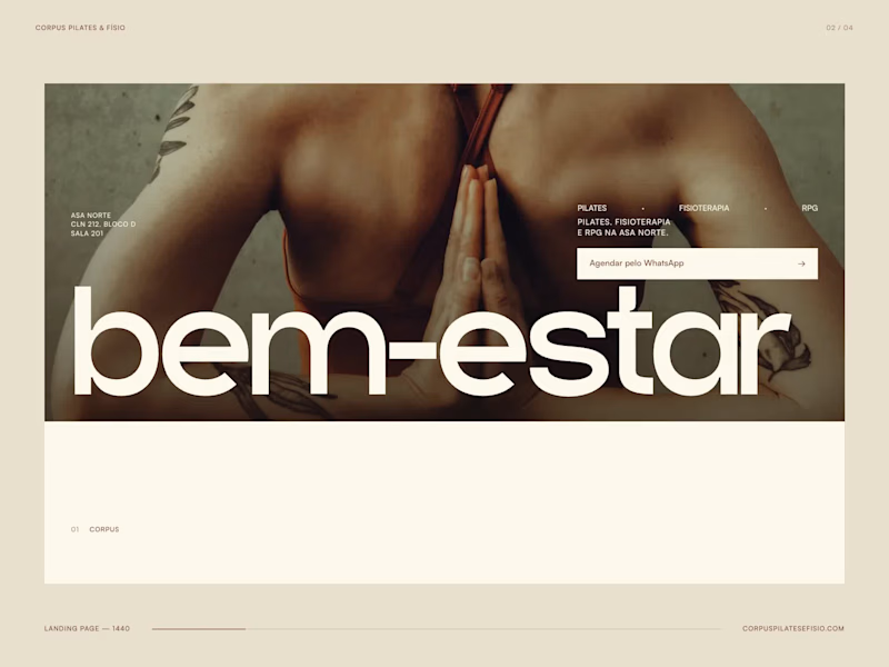
A conversion-focused digital experience for a Pilates and physiotherapy studio in Brasília, Brazil.
Corpus needed a landing page designed to turn paid-media traffic into real conversations, while staying true to the brand’s warm, editorial identity.
I translated the existing visual language into a responsive web experience built around movement, photography and typography. Instead of relying on conventional healthcare layouts or generic UI patterns, the interface uses scale, rhythm and interaction to make the brand feel physical and human.
The experience adapts its entry point to different campaigns, including Pilates, physiotherapy and RPG, creating a direct connection between the ad and the landing page. Services, contextual imagery and WhatsApp CTAs are integrated throughout the journey without disrupting the visual experience.
The project covers art direction, web design, responsive design, interaction and AI-assisted front-end development, from concept to a functional digital experience.
3
1
162

Senior Brand Designer & Art Director | Branding & Editorial
New to Contra
Senior Brand Designer & Art Director | Branding & Editorial
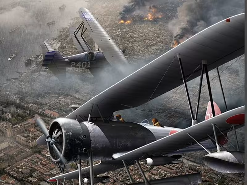
Historical aviation illustration depicting an aerial combat over Shanghai in the 1930s.
The aircraft were illustrated and composited manually using Illustrator and Photoshop, while atmospheric elements and environmental background were developed through AI-assisted generation and refined through advanced photo editing techniques.
This project combines historical research, visual storytelling, digital illustration, and modern AI workflows to recreate a cinematic interpretation of a real aviation conflict, balancing historical accuracy with narrative impact.
0
31
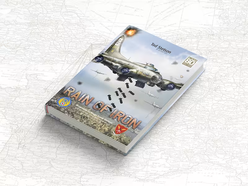
Some projects challenge your technical skills. Others challenge something much deeper. Rain of Iron was one of those experiences. This project was born from a deep personal story: the real experiences lived by the father of the author, a B-17 bombardier who fought during World War II.
But beyond the historical context, the heart of this work was never simply war itself. It was about telling the story of an ordinary person whose life was permanently changed after being called to face one of humanity’s darkest moments — and how returning home after war never truly means returning to who you once were.
From a design perspective, the challenge was immense. Hundreds of pages, large volumes of text, historical research, image restoration, technical illustrations, custom-built mission maps, typography decisions, editorial consistency, and the constant search for balance between density of information and fluid visual reading.
But what made this project truly meaningful to me was something beyond design. I had the opportunity to help someone fulfil a deeply personal mission: honouring his father and preserving the testimony of someone who witnessed history firsthand.
Not through the words of historians. But through the eyes of someone who was there. Sometimes we work for deadlines.
Sometimes we work for clients. And sometimes we work because certain stories simply deserve to exist. Because there are moments when money becomes secondary. And helping build something meaningful becomes the greatest reward itself.
1
37
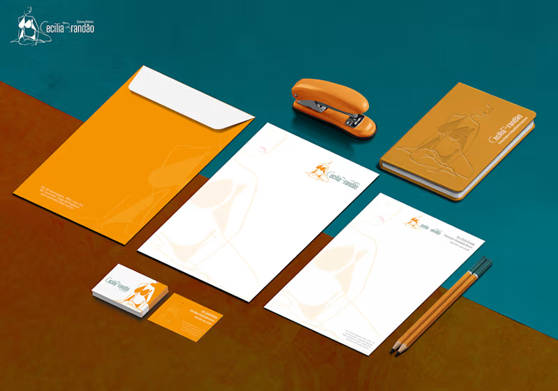
A Visual ID is one of the most important things for your own business
or for a corporate business.
Without it, there will be nothing to be presented for the audience and no matter if it is composed just by letters, letters and symbols or just symbols.
The work shown here was done for a gynaecologist and sex therapeutic
with focus on female public.
To develop the logo two main points were considered.
The idea of constructing a new structure, being this construction composed by multiple lines as happens in our lives, and woman sensuality represented by curved lines.
0
43

I build visual identity for startups and tech companies.
I build visual identity for startups and tech companies.

Viver é a essência do aprender
Viver é a essência do aprender

View more →

Senior AI && Fullstack Developer


AI-powered Graphic Design
AI-powered Graphic Design
View more →

Transform Your Business with Cutting-Edge Design
Transform Your Business with Cutting-Edge Design



Creativity first
Creativity first