Freelance Responsive Designs in Brașov
Freelance Responsive Designs in Brașov
Sign Up
Post a job
Sign Up
Log In
Filters
2
Projects
People
Dmytro Zelinskyi
pro
Brașov, Romania
UX/UI Designer for SaaS, Web Apps & Mobile | 7+ Years
$1k+
Earned
1x
Hired
5.0
Rating
29
Followers
Follow
Message
UX/UI Designer for SaaS, Web Apps & Mobile | 7+ Years
6
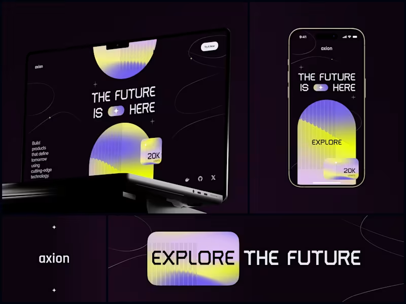
Axion - Tech Startup Website & Mobile Design The brief was basically "we want to look like the future." Which, honestly, can go wrong in a hundred ways. But Axion had the product to back it up, so the job was to match the visual energy to what they were actually building. Went with a dark base and hit it hard with neon yellow and purple gradients. Bold typography. The kind of design that stops your scroll. Desktop version leads with a full-bleed hero and that "20K users" number placed right where your eye naturally lands after reading the headline. Mobile version isn't just a responsive resize - I rethought the hierarchy so it works as its own experience when you're swiping on a phone. Built the final version in Webflow so the client could update content themselves without needing a developer every time they wanted to change a number. #WebDesign #UIDesign #StartupDesign #CreativeDirection #Webflow #DigitalExperience #Branding #TechDesign
6
552
5
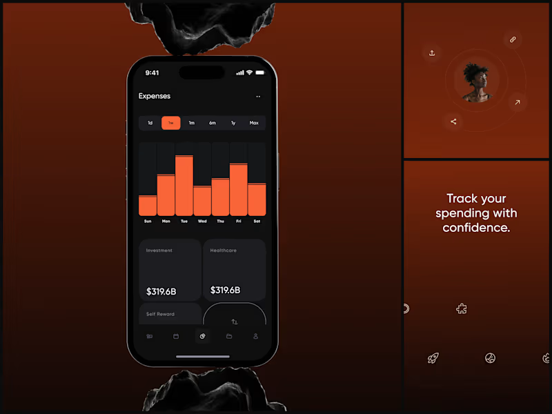
Expense Tracker The dark UI isn't aesthetic. It's functional. When you're reviewing weekly spending at 11pm, your eyes need low-strain contrast that still makes the data pop. The category cards sit below the chart for a reason. The chart answers "how much did I spend this week?" The cards answer "where did it go?" Finance apps either look sterile or playful. This needed to feel like neither - it needed to feel powerful. Like your money is being managed by something that takes it seriously. "Track your spending with confidence." Confidence. That word choice shaped every design decision. #MobileDesign #UIDesign #Fintech #AppDesign #DarkUI #DataVisualization #ProductDesign #iOSDesign #ExpenseTracker #FigmaDesign
2
5
563
4
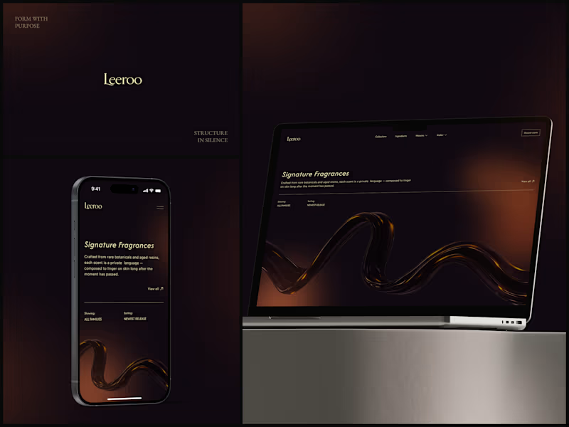
Leeroo - Luxury Fragrance House How do you design the visual equivalent of a scent? You can't show smell. So the 3D amber resin ribbon does the work - liquid, warm, moving slowly like something expensive evaporating. That one element replaces every product photo a fragrance brand thinks it needs. "Crafted from rare botanicals and aged resins, each scent is a private language." The copy already sounds like it smells good. The design just had to stay out of its way. Dark. Gold. Italic serif. Nothing else. What's the first luxury brand site that made you feel something? #WebDesign #UIDesign #LuxuryBrand #DarkUI #3DDesign #Typography #FragranceDesign #Ecommerce #ArtDirection #FigmaDesign
4
531
4
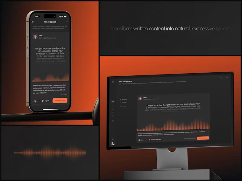
AI Voice Platform You're designing sound. On a screen. Without sound. The waveform is the entire UX. It's proof the AI is working, it's visual feedback, and it's the emotional bridge between typed words and a human voice saying them. Remove the waveform and this is a text box with a button. Keep it and it's an instrument. "Mike. Warm and professional voice." Personality selection. The interface makes choosing a voice feel as natural as choosing a font. Orange accent. Dark canvas. Voice deserves a stage. #UIDesign #DarkUI #AI #VoiceTech #ProductDesign #SaaS #MobileDesign #WebApp #TextToSpeech #FigmaDesign
4
504
Responsive Design
(1)
Follow
Message
Explore people