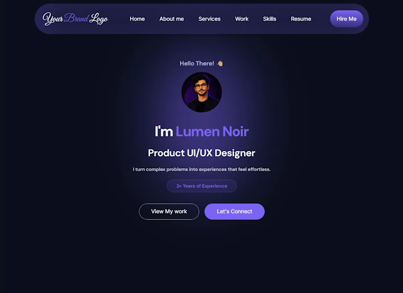
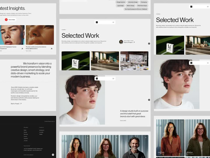
Projects in BhopalProjects in BhopalA premium dark-mode Framer portfolio template featuring a complete UX case study system, redesign case study layouts, responsive pages, reusable components, and modern interactions. Built specifically for UI/UX designers, product designers, freelancers, and design students.
What's Included
✓ Portfolio Homepage ✓ UX Case Study Template ✓ Redesign Case Study Template
✓ Responsive Desktop, Tablet & Mobile Layouts ✓ Reusable Components ✓ Custom 404 Page
✓ Organized Design System ✓ Smooth Animations & Interactions ✓ Easy Framer Customization
Perfect For
• UI/UX Designers
• Product Designers
• Freelance Designers
• Design Students
• Creative Professionals
• Framer Creators
Why First Impression?
Most portfolio templates help you showcase your projects.
First Impression helps you showcase your thinking.
Designed specifically for modern UI/UX portfolios, it includes dedicated case study templates that allow you to present research, design decisions, outcomes, redesigns, and project impact in a structured and professional way.
Whether you're applying for jobs, attracting freelance clients, or building your personal brand, First Impression gives you everything you need to create a memorable online presence.
Key Features
• Premium dark-mode aesthetic
• Conversion-focused portfolio structure
• UX case study framework
• Redesign case study framework
• Mobile responsive layouts
• Framer-native components
• Fast loading and optimized structure
• No coding required
• Easy customization
License
For personal and commercial use.
Support
If you need help customizing the template, support documentation and guidance are included. ⚡ ZYNTH — Brand Identity Design
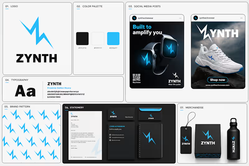
Some brands sell products. ZYNTH was designed to sell a feeling — energy in motion.
The idea behind this identity was to create a brand that feels fast, powerful, and future-ready. Since ZYNTH sits between sports and smart technology, I wanted the visual system to communicate both performance and innovation at the same time.
My thought process:
Instead of creating a generic sports logo, I explored movement, electricity, and pulse-like energy. The lightning-inspired "Z" became the core symbol — representing speed, power, and constant momentum.
The visual direction uses bold typography, high-contrast colors, and a dynamic system that can live across products, social media, mobile experiences, and brand applications.
The goal wasn't just to design a logo.
It was to build a brand that feels like movement before you even read the name.
Built to Amplify You. ⚡
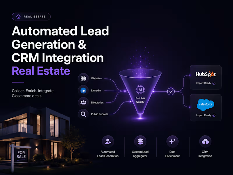
#BrandIdentity #LogoDesign #SportsBranding #VisualIdentity #DesignProcess A real estate business needed an efficient system to collect, enrich, and manage high-quality sales leads from public sources — reducing manual work and enabling seamless CRM integration. We built a targeted lead collection and enrichment system, extracting publicly available data, enhancing each lead with company name, role, and industry details, and preparing everything for direct import into HubSpot and Salesforce.
✅ Industry-specific lead collection using keywords and demographics
✅ Lead enrichment with company name, role, and industry data
✅ HubSpot & Salesforce ready CSV export
✅ Scalable, repeatable lead pipeline
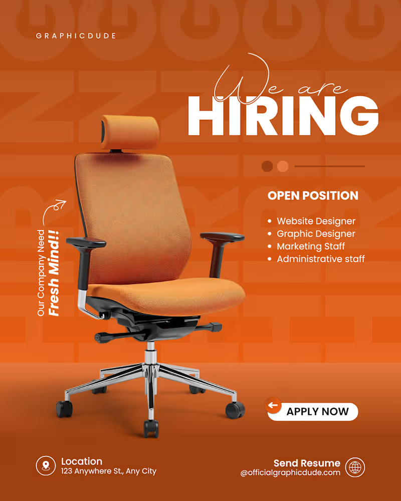
Result: Client significantly improved productivity, cut manual lead tasks, and scaled outreach with organized, enriched data ready for immediate use. A bold, vibrant, and highly engaging corporate recruitment flyer designed for a modern agency or startup. The design leverages high-contrast color theory, strong product/object positioning, and clear typographic hierarchy to attract top talent and drive job applications.
Key Highlights:
High-Impact Monochrome Palette: Utilizes a striking, energetic orange gradient background paired with a bold, oversized "HIRING" text watermark in the background to create deep layers and visual interest.
3D Product Centric Focus: Features a crisp, high-resolution premium office chair with realistic shadows as the central hero element, instantly communicating the corporate/workspace theme.
Smart Typography Pairing: Combines an elegant, flowing script font for "We are" with a heavy, clean sans-serif for "HIRING," creating an eye-catching header focal point.
Conversion-Optimized Layout: Uses a clean bulleted list for open positions ("Website Designer", "Graphic Designer", etc.) paired with a high-contrast, rounded "APPLY NOW" CTA button for seamless navigation.