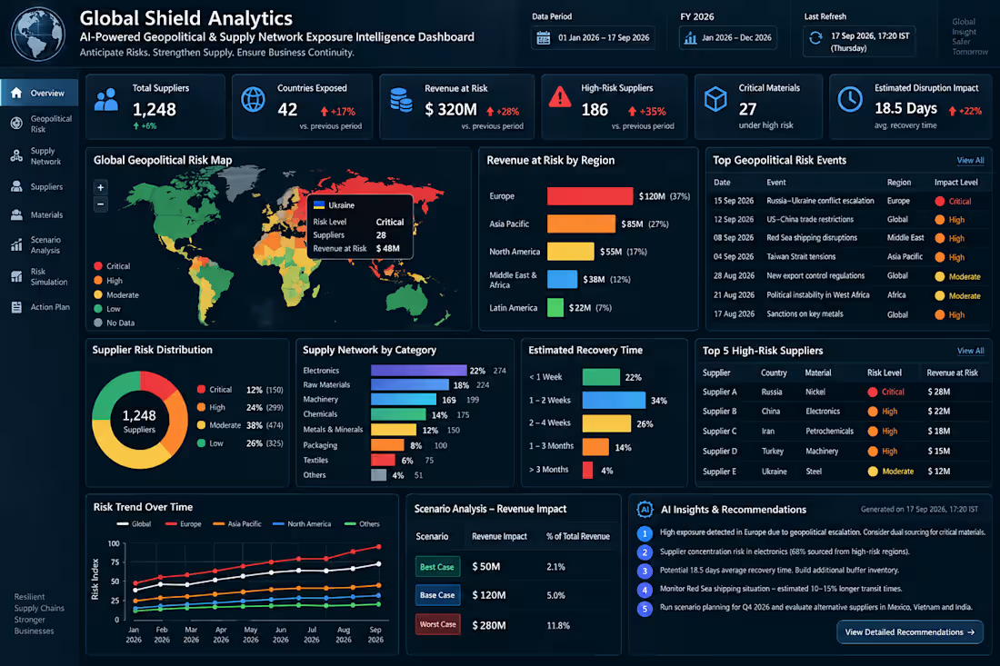
Projects using Microsoft Power BI in BheemunipatnamProjects using Microsoft Power BI in BheemunipatnamAI-Powered Geopolitical & Supply Network Exposure Intelligence Dashboard
Global supply chains are complex. Understanding where your business is exposed shouldn’t be.
I designed Global Shield Analytics as an executive-level Power BI solution that connects geopolitical risk, supplier dependency, critical materials, operational disruption, recovery time, and financial exposure in one intelligent reporting environment.
Instead of simply showing what happened, the solution is designed to help leadership understand:
Where are we exposed? → What could be affected? → What could it cost? → How long could recovery take? → What should we investigate next?
What I Can Build for Your Business
Every organization has different data, KPIs, reporting processes, and decision-making requirements. I build the Power BI solution around your actual business needs, rather than forcing your data into a generic template.
Requirement Discovery
I understand your reporting challenges, business objectives, KPIs, stakeholders, existing reports, and required outcomes.
Data Preparation
I connect, clean, transform, and structure data from sources such as Excel, SQL, ERP, CRM, and other business systems using Power Query.
Data Modelling
I develop a scalable semantic model with relationships, dimensions, measures, and business logic designed around your reporting requirements.
DAX & KPI Development
I create the calculations required for your business — financial metrics, operational KPIs, supplier performance, risk indicators, trends, targets, and other decision metrics.
Power BI Dashboard Development
I transform the prepared data into a professional, interactive dashboard with executive KPIs, drill-down analysis, filters, trends, comparisons, risk views, and actionable insights.
Business Validation
I validate the calculations and outputs against the agreed requirements and source data so the final reporting solution is consistent and business-ready.
Performance Optimisation
I structure and optimise the model and report for better performance, usability, navigation, and scalability.
Final Delivery
I provide the completed Power BI solution with the agreed reporting structure, visuals, calculations, and handover documentation.
🔗 From Business Requirement to Final Intelligence
Requirement → Data → Power Query → Data Model → DAX → KPIs → Dashboard → Validation → Final Delivery
Whether your organization needs to replace manual Excel reporting, consolidate fragmented data, improve an existing Power BI environment, or build a new executive BI solution, the dashboard can be designed around the specific problem you need to solve.
The Business Value
The goal is not to create more charts.
The goal is to create a single, clear decision-support layer that helps teams understand complex business exposure faster and focus attention where it matters.
Power BI | Microsoft Fabric | SQL | Power Query | DAX | Data Modelling | Executive BI
📅 Dashboard Date: 17 September 2026
📊 Reporting Period: 01 January 2026 – 17 September 2026
🔄 Last Refresh: 17 September 2026, 17:20 IST
Have a Power BI or Business Intelligence requirement?
Share the business problem, reporting challenge, or data requirement. I can design and build the Power BI solution around it — from initial requirements through final delivery. 💎 Enterprise Value Realization Dashboard
Track Investments. Realize Benefits. Drive Business Impact.
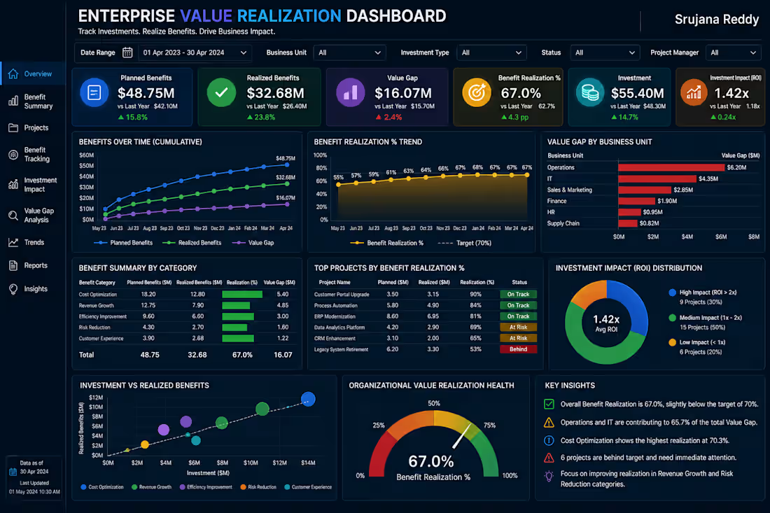
The Enterprise Value Realization Dashboard is a professional Business Intelligence solution designed to measure whether business projects and investments are delivering their promised benefits. It provides a centralized view of planned benefits, realized benefits, value gaps, benefit realization rates, and investment impact, enabling leadership to understand where investments are creating value and where corrective action is required.
With interactive analytics, this dashboard helps organizations monitor project outcomes, identify benefit gaps, prioritize underperforming investments, and improve overall return on strategic initiatives.
📊 Key Metrics
Planned Benefits
Realized Benefits
Value Gap
Benefit Realization %
Investment Impact (ROI)
Overall Value Realization Score
📈 Dashboard Features
Executive Value Realization KPI Overview
Planned vs Realized Benefits Analysis
Benefit Realization Trend
Business Unit Value Gap Analysis
Project Benefit Performance
Investment Impact & ROI Analysis
Investment vs Realized Benefits
Executive Insights & Recommendations
💼 Business Value
This dashboard helps organizations:
Measure actual benefits against planned outcomes
Identify projects with significant value gaps
Track investment performance and ROI
Prioritize initiatives requiring corrective action
Improve benefit realization across business units
Support data-driven investment decisions
Designed by:
Srujana Reddy | Business Analyst
Transforming investment and project data into actionable insights that measure realized value, identify performance gaps, and improve strategic business outcomes.
💼 Client Note
Thank you for exploring my portfolio.
The Enterprise Value Realization Dashboard is a professional Power BI solution designed to help organizations measure whether strategic projects and investments are delivering their expected business benefits. It provides clear visibility into planned versus realized benefits, value gaps, benefit realization rates, and investment impact, enabling leadership to identify underperforming initiatives and focus resources where they can create the greatest value.
I specialize in developing modern, interactive Power BI dashboards that transform project, investment, and financial data into actionable insights for strategic decision-making.
Services I Offer
Enterprise Value Realization Dashboards
Investment & ROI Analytics
Project Portfolio Analytics
Strategic KPI Dashboards
Benefit Tracking & Performance Reporting
Interactive Power BI Reports
Advanced DAX & Data Modeling
Custom Business Intelligence Solutions
What You Can Expect
Executive-Level Dashboard Design
Interactive & User-Friendly Reports
Advanced DAX & Data Modeling
Real-Time Benefit & Investment KPI Monitoring
Business-Focused Visualizations
Customized Solutions Tailored to Your Business Needs
Every dashboard I develop is designed to measure realized business value, identify benefit gaps, evaluate investment performance, and provide leadership with clear insights for better resource allocation and strategic execution.
If you're looking for a custom Power BI Enterprise Value Realization Dashboard to measure project outcomes, track investment impact, and improve benefit realization, I'd be happy to collaborate on your next project.
Let's transform your investment data into actionable insights that maximize realized value, improve ROI, and drive measurable business outcomes. 🧠 Organizational Network Intelligence Dashboard
Understand Connections. Strengthen Collaboration. Reduce Organizational Risk.
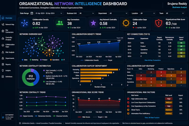
The Organizational Network Intelligence Dashboard is a professional Business Intelligence solution designed to analyze how information, collaboration, and relationships flow across an organization. It provides a centralized view of collaboration density, key connectors, network centrality, collaboration gaps, and organizational risk, helping leadership understand communication patterns and identify areas that need stronger cross-functional collaboration.
With interactive network analytics, this dashboard helps organizations identify influential connectors, detect collaboration gaps, improve information flow, and reduce organizational dependency and communication risks.
📊 Key Metrics
Collaboration Density
Key Connectors
Network Centrality
Collaboration Gaps
Organizational Risk Score
Collaboration Health Score
📈 Dashboard Features
Executive Network KPI Overview
Interactive Organizational Network Map
Key Connector Analysis
Network Centrality Trends
Department Collaboration Gap Analysis
Collaboration Gap Heatmap
Organizational Risk Monitoring
Executive Insights & Recommendations
💼 Business Value
This dashboard helps organizations:
Understand collaboration patterns across teams
Identify key employees who connect different groups
Detect cross-department collaboration gaps
Improve information flow and knowledge sharing
Identify organizational network risks
Support data-driven organizational planning
Designed by:
Srujana Reddy | Business Analyst
Transforming organizational network data into actionable insights that strengthen collaboration, improve information flow, and build a more connected and resilient organization.
💼 Client Note
Thank you for exploring my portfolio.
The Organizational Network Intelligence Dashboard is a professional Power BI solution designed to help organizations understand collaboration patterns, information flow, and cross-functional relationships. It provides visibility into collaboration density, key connectors, network centrality, collaboration gaps, and organizational risk, helping leadership identify communication bottlenecks and strengthen collaboration across teams.
I specialize in developing modern, interactive Power BI dashboards that transform complex organizational data into actionable insights for better workforce planning, collaboration, and business decision-making.
Services I Offer
Organizational Network Intelligence Dashboards
Collaboration & Workforce Analytics
Executive KPI Dashboards
Cross-Department Performance Analytics
Organizational Risk Reporting
Interactive Power BI Reports
Advanced DAX & Data Modeling
Custom Business Intelligence Solutions
What You Can Expect
Executive-Level Dashboard Design
Interactive & User-Friendly Reports
Advanced DAX & Data Modeling
Collaboration & Network KPI Monitoring
Business-Focused Visualizations
Customized Solutions Tailored to Your Business Needs
Every dashboard I develop is designed to identify collaboration gaps, understand organizational connections, improve information flow, and provide leadership with actionable insights for stronger organizational performance.
If you're looking for a custom Power BI Organizational Network Intelligence Dashboard to analyze collaboration, identify network risks, and improve cross-functional connectivity, I'd be happy to collaborate on your next project.
Let's transform your organizational data into actionable insights that strengthen collaboration, reduce communication gaps, and drive better business outcomes. 🚀 🔗 Strategic Dependency Intelligence Dashboard
Understand Dependencies. Manage Risk. Protect Strategic Outcomes.
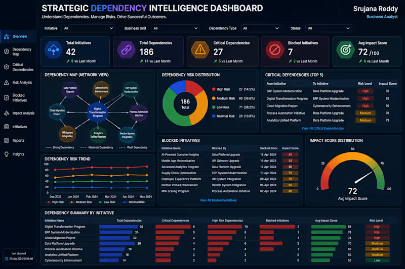
The Strategic Dependency Intelligence Dashboard is a professional Business Intelligence solution designed to help organizations identify how strategic initiatives depend on other teams, systems, projects, and business capabilities. It provides a centralized view of dependency relationships, critical dependencies, dependency risks, blocked initiatives, and overall impact scores.
With interactive analytics, this dashboard helps leadership identify high-risk dependencies early, reduce project delays, prioritize critical actions, and improve coordination across strategic initiatives.
📊 Key Metrics
Dependency Map
Critical Dependencies
Dependency Risk
Blocked Initiatives
Impact Score
Overall Dependency Health
📈 Dashboard Features
Executive Dependency KPI Overview
Interactive Dependency Network Map
Critical Dependency Analysis
Dependency Risk Trend Monitoring
Blocked Initiative Tracking
Impact Score Analysis
Initiative & Business Unit Comparison
Executive Insights & Recommendations
💼 Business Value
This dashboard helps organizations:
Identify critical dependencies early
Reduce initiative delays and blockers
Prioritize high-impact risks
Improve cross-team coordination
Understand dependency-driven business impact
Support data-driven strategic planning
Designed by:
Srujana Reddy | Business Analyst
Transforming dependency data into actionable insights that reduce strategic risk, remove blockers, and improve successful execution of enterprise initiatives.
💼 Client Note
Thank you for exploring my portfolio.
The Strategic Dependency Intelligence Dashboard is a professional Power BI solution designed to help organizations understand and manage dependencies across strategic initiatives, teams, systems, and projects. It provides clear visibility into critical dependencies, dependency risks, blocked initiatives, and impact scores, enabling leadership to identify potential delays and prioritize high-impact actions.
I specialize in building modern, interactive Power BI dashboards that transform complex business relationships and operational data into actionable insights for strategic decision-making.
Services I Offer
Strategic Dependency Dashboards
Project & Initiative Analytics
Risk & Impact Analysis
Executive KPI Dashboards
Portfolio Performance Reporting
Interactive Power BI Reports
Advanced DAX & Data Modeling
Custom Business Intelligence Solutions
What You Can Expect
Executive-Level Dashboard Design
Interactive & User-Friendly Reports
Advanced DAX & Data Modeling
Dependency & Risk KPI Monitoring
Business-Focused Visualizations
Customized Solutions Tailored to Your Business Needs
Every dashboard I develop is designed to identify critical dependencies, reduce blockers, improve cross-functional coordination, and provide leadership with clear insights for faster strategic execution.
If you're looking for a custom Power BI Strategic Dependency Dashboard to identify project dependencies, manage risks, and improve initiative execution, I'd be happy to collaborate on your next project.
Let's transform your dependency data into actionable insights that reduce strategic risk, remove bottlenecks, and drive successful business outcomes. 🚀 💰 Pricing & Revenue Management Intelligence Dashboard
Optimize Pricing. Protect Margins. Maximize Revenue.
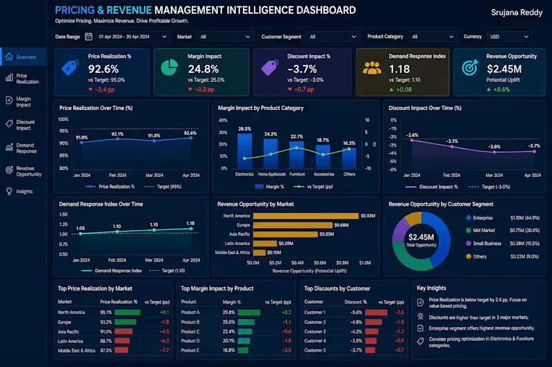
The Pricing & Revenue Management Intelligence Dashboard is a professional Business Intelligence solution designed to help organizations evaluate pricing performance across markets, customer segments, and product categories. It provides a centralized view of price realization, margin impact, discount impact, demand response, and revenue opportunities, enabling commercial teams to identify pricing gaps and improve profitability.
With interactive analytics and clear KPI tracking, this dashboard helps businesses understand customer response to pricing changes, optimize discounts, identify high-value markets, and make data-driven pricing decisions.
📊 Key Metrics
Price Realization
Margin Impact
Discount Impact
Demand Response
Revenue Opportunity
Pricing Performance Score
📈 Dashboard Features
Executive Pricing KPI Overview
Price Realization Trend Analysis
Product-wise Margin Analysis
Discount Impact Monitoring
Demand Response Analysis
Market-wise Revenue Opportunity
Customer Segment Analysis
Pricing Insights & Recommendations
💼 Business Value
This dashboard helps organizations:
Identify pricing gaps against targets
Protect profit margins
Optimize discount strategies
Understand demand response
Discover revenue growth opportunities
Improve pricing decisions across markets and customers
Designed by:
Srujana Reddy | Business Analyst
Transforming pricing data into actionable insights that improve margins, unlock revenue opportunities, and drive profitable business growth.
💼 Client Note
Thank you for exploring my portfolio.
The Pricing & Revenue Management Intelligence Dashboard is a professional Power BI solution designed to help organizations optimize pricing strategies, protect profit margins, and identify revenue growth opportunities. It provides clear visibility into price realization, margin impact, discount performance, demand response, and potential revenue opportunities across markets, products, and customer segments.
I specialize in developing modern, interactive Power BI dashboards that transform commercial and financial data into actionable insights, helping businesses improve pricing decisions and maximize profitable growth.
Services I Offer
Pricing & Revenue Management Dashboards
Revenue & Margin Analytics
Pricing Performance Reporting
Customer & Market Analytics
Executive KPI Dashboards
Interactive Power BI Reports
Advanced DAX & Data Modeling
Custom Business Intelligence Solutions
What You Can Expect
Executive-Level Dashboard Design
Interactive & User-Friendly Reports
Advanced DAX & Data Modeling
Pricing & Revenue KPI Monitoring
Business-Focused Visualizations
Customized Solutions Tailored to Your Business Needs
Every dashboard I develop is designed to identify pricing gaps, optimize discounts, protect margins, uncover revenue opportunities, and support smarter commercial decisions.
If you're looking for a custom Power BI Pricing & Revenue Management Dashboard to optimize pricing, improve profitability, and identify growth opportunities, I'd be happy to collaborate on your next project.
Let's transform your pricing data into actionable insights that strengthen margins, maximize revenue, and drive profitable business growth. 🚀 🧠 Enterprise Decision Rights Dashboard
Clarify Ownership. Accelerate Approvals. Improve Decision Effectiveness.
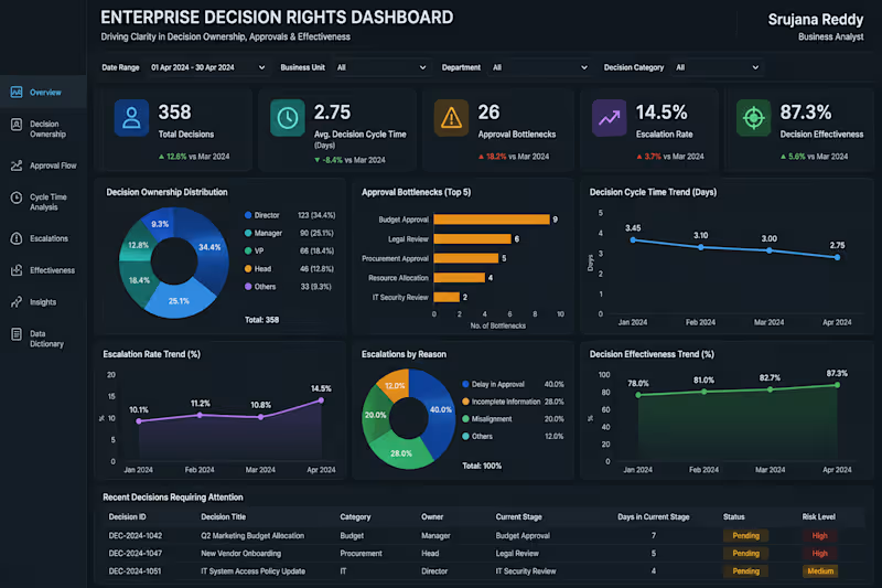
The Enterprise Decision Rights Dashboard is a professional Business Intelligence solution designed to help organizations understand who owns key decisions, where approval processes are getting delayed, and how effectively decisions are being executed. It provides a centralized view of decision ownership, approval bottlenecks, decision cycle time, escalation rates, and overall decision effectiveness.
With interactive analytics, this dashboard helps leadership identify approval delays, improve accountability, reduce unnecessary escalations, and create faster, more effective decision-making processes.
📊 Key Metrics
Decision Ownership
Approval Bottlenecks
Decision Cycle Time
Escalation Rate
Decision Effectiveness
Overall Decision Health
📈 Dashboard Features
Executive Decision KPI Overview
Decision Ownership Analysis
Approval Bottleneck Tracking
Decision Cycle Time Trends
Escalation Analysis
Decision Effectiveness Monitoring
Department & Decision Category Analysis
Executive Insights & Recommendations
💼 Business Value
This dashboard helps organizations:
Clarify decision ownership and accountability
Identify approval bottlenecks
Reduce decision-making delays
Monitor escalation patterns
Improve cross-functional decision efficiency
Support faster, data-driven leadership decisions
Designed by:
Srujana Reddy | Business Analyst
Transforming decision data into actionable insights that improve accountability, accelerate approvals, and enable smarter enterprise decision-making.
💼 Client Note
Thank you for exploring my portfolio.
The Enterprise Decision Rights Dashboard is a professional Power BI solution designed to help organizations improve decision ownership, approval workflows, and leadership effectiveness. It provides visibility into decision ownership, approval bottlenecks, decision cycle time, escalation rates, and decision effectiveness, helping organizations identify delays and strengthen accountability.
I specialize in building modern, interactive Power BI dashboards that transform complex business data into actionable insights for leadership and enterprise decision-making.
Services I Offer
Decision Intelligence Dashboards
Executive KPI Dashboards
Approval & Workflow Analytics
Governance & Performance Reporting
Business Process Analytics
Interactive Power BI Reports
Advanced DAX & Data Modeling
Custom Business Intelligence Solutions
What You Can Expect
Executive-Level Dashboard Design
Interactive & User-Friendly Reports
Advanced DAX & Data Modeling
Decision & Performance KPI Monitoring
Business-Focused Visualizations
Customized Solutions Tailored to Your Business Needs
Every dashboard I develop is designed to identify decision bottlenecks, improve accountability, reduce approval delays, and provide leadership with clear insights for faster and more effective decision-making.
If you're looking for a custom Power BI Decision Rights Dashboard to improve governance, streamline approvals, and strengthen organizational decision-making, I'd be happy to collaborate on your next project.
Let's transform your decision data into actionable insights that accelerate execution, improve accountability, and drive better business outcomes. 📡 IT Service Management (ITSM) Dashboard
Optimize IT Services. Improve Response. Deliver Operational Excellence.
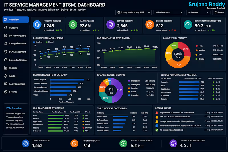
The IT Service Management (ITSM) Dashboard is a professional Business Intelligence solution designed to help organizations monitor and optimize IT support operations, service requests, incident management, and service performance. It provides a centralized view of incident resolution, SLA compliance, service requests, change requests, and overall service performance, enabling IT teams to improve service quality and maintain business continuity.
With real-time insights and interactive analytics, this dashboard helps organizations reduce incident resolution time, improve SLA performance, enhance service delivery, and support efficient IT operations.
📊 Key Metrics
Incident Resolution
SLA Compliance
Service Requests
Change Requests
Service Performance
IT Service Health Score
📈 Dashboard Features
Executive ITSM KPI Overview
Incident Resolution Analysis
SLA Compliance Monitoring
Service Request Tracking
Change Request Management
Service Performance Trends
Department & Service Performance Analysis
Executive Insights & Smart Recommendations
💼 Business Value
This dashboard helps organizations:
Improve IT service efficiency
Monitor SLA compliance in real time
Reduce incident resolution time
Track service and change requests
Identify recurring service issues
Support data-driven IT service management
Designed by:
Srujana Reddy | Business Analyst
Transforming IT service data into actionable insights that improve operational efficiency, enhance service quality, and ensure reliable business support.
💼 Client Note
Thank you for exploring my portfolio.
The IT Service Management (ITSM) Dashboard is a professional Power BI solution designed to help organizations monitor, manage, and optimize IT service operations. It provides complete visibility into incident resolution, SLA compliance, service requests, change requests, and overall service performance, enabling IT teams and business leaders to improve service quality, reduce operational disruptions, and deliver reliable IT support.
I specialize in developing modern, interactive Power BI dashboards that transform IT service data into actionable insights, helping organizations enhance operational efficiency, streamline service management processes, and make data-driven decisions.
Services I Offer
IT Service Management (ITSM) Dashboards
IT Operations & Service Desk Analytics
Executive KPI Dashboards
Incident & SLA Performance Reporting
Change & Service Request Analytics
Interactive Power BI Reports
Advanced DAX & Data Modeling
Custom Business Intelligence Solutions
What You Can Expect
Executive-Level Dashboard Design
Interactive & User-Friendly Reports
Advanced DAX & Data Modeling
Real-Time IT Service KPI Monitoring
Business-Focused Visualizations
Customized Solutions Tailored to Your Business Needs
Every dashboard I develop is designed to improve incident management, strengthen SLA compliance, optimize IT service delivery, monitor operational performance, and provide data-driven insights that support reliable and efficient IT operations.
If you're looking for a custom Power BI IT Service Management (ITSM) Dashboard to monitor IT services, improve service desk performance, and optimize operational efficiency, I'd be happy to collaborate on your next project.
Let's transform your IT service data into actionable insights that improve service quality, enhance operational resilience, and drive continuous business success. 🌐 API Performance & Integration Dashboard
Monitor APIs. Ensure Seamless Integrations. Maximize System Reliability.
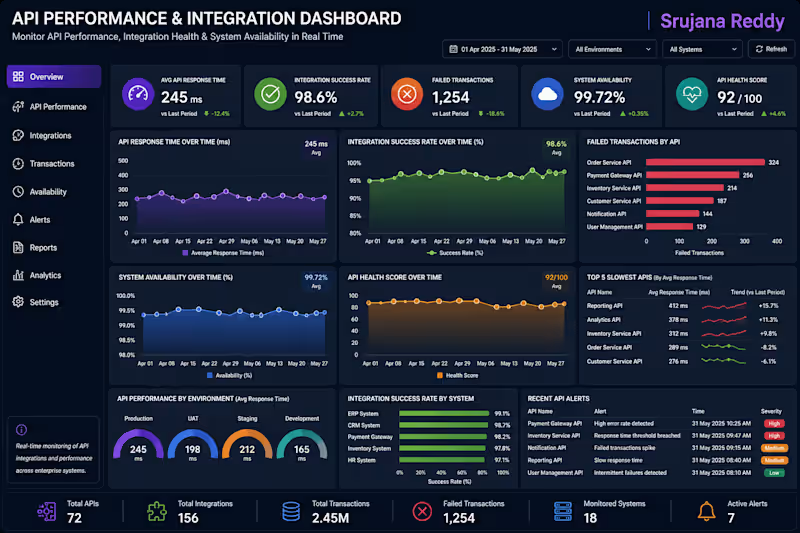
The API Performance & Integration Dashboard is a professional Business Intelligence solution designed to help organizations monitor the performance, availability, and reliability of enterprise APIs and system integrations. It provides a centralized view of API response time, integration success rate, failed transactions, system availability, and API health score, enabling IT teams to identify performance bottlenecks, reduce failures, and maintain seamless communication across enterprise applications.
With real-time insights and interactive analytics, this dashboard helps organizations improve integration efficiency, enhance system stability, and support uninterrupted business operations.
📊 Key Metrics
API Response Time
Integration Success Rate
Failed Transactions
System Availability
API Health Score
Overall Integration Performance
📈 Dashboard Features
Executive API Performance KPI Overview
API Response Time Analysis
Integration Success Monitoring
Failed Transaction Tracking
System Availability Dashboard
API Health Score Analysis
Environment & System Performance Comparison
Executive Insights & Smart Recommendations
💼 Business Value
This dashboard helps organizations:
Monitor API performance in real time
Improve enterprise system integrations
Detect and reduce failed transactions
Increase system availability and reliability
Identify performance bottlenecks quickly
Support faster, data-driven IT operations
Designed by:
Srujana Reddy | Business Analyst
Transforming API and integration data into actionable insights that improve system performance, strengthen enterprise connectivity, and ensure reliable business operations.
💼 Client Note
Thank you for exploring my portfolio.
The API Performance & Integration Dashboard is a professional Power BI solution designed to help organizations monitor the health, performance, and reliability of enterprise APIs and system integrations. It provides complete visibility into API response times, integration success rates, failed transactions, system availability, and API health scores, enabling IT teams to proactively identify issues, optimize integrations, and ensure seamless communication between business applications.
I specialize in developing modern, interactive Power BI dashboards that transform complex technical and operational data into actionable insights, helping organizations improve system performance, enhance operational efficiency, and support data-driven IT management.
Services I Offer
API Performance & Integration Dashboards
IT Operations & Infrastructure Analytics
Executive KPI Dashboards
System Performance Monitoring
API Health & Availability Reporting
Interactive Power BI Reports
Advanced DAX & Data Modeling
Custom Business Intelligence Solutions
What You Can Expect
Executive-Level Dashboard Design
Interactive & User-Friendly Reports
Advanced DAX & Data Modeling
Real-Time API & Integration KPI Monitoring
Business-Focused Visualizations
Customized Solutions Tailored to Your Business Needs
Every dashboard I develop is designed to improve API performance, monitor enterprise integrations, reduce transaction failures, increase system availability, and provide data-driven insights that strengthen IT operations and digital transformation initiatives.
If you're looking for a custom Power BI API Performance & Integration Dashboard to monitor enterprise systems, optimize API performance, and improve integration reliability, I'd be happy to collaborate on your next project.
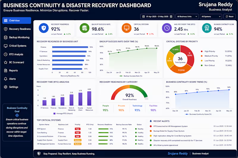
Let's transform your API and integration data into actionable insights that enhance system reliability, improve operational efficiency, and drive business success. 🛡️ Business Continuity & Disaster Recovery Dashboard
Ensure Business Resilience. Minimize Downtime. Recover with Confidence.
The Business Continuity & Disaster Recovery Dashboard is a professional Business Intelligence solution designed to help organizations monitor business resilience and ensure critical operations continue during unexpected disruptions. It provides a centralized view of recovery readiness, backup success rates, critical systems, recovery time objectives (RTO), and overall business continuity performance, enabling IT leaders and executives to respond quickly and reduce operational risks.
With real-time insights and interactive analytics, this dashboard helps organizations strengthen disaster recovery strategies, improve system availability, minimize downtime, and maintain uninterrupted business operations.
📊 Key Metrics
Recovery Readiness
Backup Success Rate
Critical Systems
Recovery Time (RTO)
Business Continuity Score
Overall Resilience Index
📈 Dashboard Features
Executive Business Continuity KPI Overview
Recovery Readiness Monitoring
Backup Success Rate Analysis
Critical System Health Tracking
Recovery Time (RTO) Performance
Business Continuity Trend Analysis
Risk & Incident Monitoring
Executive Insights & Smart Recommendations
💼 Business Value
This dashboard helps organizations:
Monitor disaster recovery readiness
Improve backup reliability and system resilience
Reduce downtime during business disruptions
Track recovery performance against RTO targets
Identify critical operational risks
Support data-driven business continuity planning
Designed by:
Srujana Reddy | Business Analyst
Transforming business continuity data into actionable insights that strengthen operational resilience, accelerate recovery, and ensure uninterrupted business performance.
💼 Client Note
Thank you for exploring my portfolio.
The Business Continuity & Disaster Recovery Dashboard is a professional Power BI solution designed to help organizations strengthen operational resilience and ensure business continuity during unexpected disruptions. It provides complete visibility into recovery readiness, backup success rates, critical systems, recovery time objectives (RTO), and overall business continuity performance, enabling IT leaders and executives to proactively manage risks and maintain uninterrupted operations.
I specialize in building modern, interactive Power BI dashboards that transform operational and IT data into actionable insights, helping organizations improve disaster recovery planning, enhance system reliability, and make faster, data-driven decisions.
Services I Offer
Business Continuity & Disaster Recovery Dashboards
IT Operations & Infrastructure Analytics
Executive KPI Dashboards
Risk & Resilience Reporting
Disaster Recovery Performance Analytics
Interactive Power BI Reports
Advanced DAX & Data Modeling
Custom Business Intelligence Solutions
What You Can Expect
Executive-Level Dashboard Design
Interactive & User-Friendly Reports
Advanced DAX & Data Modeling
Real-Time Business Continuity KPI Monitoring
Business-Focused Visualizations
Customized Solutions Tailored to Your Business Needs
Every dashboard I develop is designed to improve business resilience, monitor recovery readiness, track critical systems, optimize disaster recovery performance, and provide data-driven insights that support continuous business operations.
If you're looking for a custom Power BI Business Continuity & Disaster Recovery Dashboard to monitor operational resilience, strengthen recovery strategies, and reduce business risks, I'd be happy to collaborate on your next project.
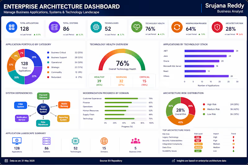
Let's transform your business continuity data into actionable insights that improve resilience, minimize downtime, and ensure reliable business operations. 🧩 Enterprise Architecture Dashboard
Simplify Enterprise Architecture. Optimize Technology. Drive Digital Transformation.
The Enterprise Architecture Dashboard is a professional Business Intelligence solution designed to help organizations gain complete visibility into their business applications, technology landscape, and system architecture. It provides a centralized view of application portfolios, technology health, system dependencies, modernization progress, and architecture risks, enabling enterprise architects and IT leaders to make informed strategic decisions.
With real-time insights and interactive analytics, this dashboard helps organizations optimize IT investments, identify outdated technologies, reduce architectural complexity, and accelerate digital transformation initiatives.
📊 Key Metrics
Application Portfolio
Technology Health
System Dependencies
Modernization Progress
Architecture Risk
Enterprise Architecture Score
📈 Dashboard Features
Executive Enterprise Architecture KPI Overview
Application Portfolio Analysis
Technology Health Monitoring
System Dependency Mapping
Modernization Progress Tracking
Architecture Risk Assessment
Business Unit & Technology Stack Analysis
Executive Insights & Smart Recommendations
💼 Business Value
This dashboard helps organizations:
Monitor enterprise applications and technology assets
Identify system dependencies and architecture risks
Track modernization initiatives and digital transformation progress
Improve technology governance and operational efficiency
Optimize IT investments and application portfolios
Support strategic, data-driven enterprise architecture decisions
Designed by:
Srujana Reddy | Business Analyst
Transforming enterprise architecture data into actionable insights that improve technology governance, accelerate modernization, and support sustainable business growth.
💼 Client Note
Thank you for exploring my portfolio.
The Enterprise Architecture Dashboard is a professional Power BI solution designed to help organizations manage and optimize their enterprise technology landscape. It provides complete visibility into application portfolios, technology health, system dependencies, modernization progress, and architecture risks, enabling enterprise architects, IT leaders, and executives to make informed strategic decisions and support long-term digital transformation.
I specialize in building modern, interactive Power BI dashboards that transform complex enterprise architecture data into meaningful insights, helping organizations improve technology governance, optimize IT investments, and streamline business operations.
Services I Offer
Enterprise Architecture Dashboards
IT Portfolio & Technology Analytics
Executive KPI Dashboards
Digital Transformation Reporting
Technology Health & Risk Analytics
Interactive Power BI Reports
Advanced DAX & Data Modeling
Custom Business Intelligence Solutions
What You Can Expect
Executive-Level Dashboard Design
Interactive & User-Friendly Reports
Advanced DAX & Data Modeling
Real-Time Architecture KPI Monitoring
Business-Focused Visualizations
Customized Solutions Tailored to Your Business Needs
Every dashboard I develop is designed to improve enterprise visibility, monitor technology performance, identify architecture risks, support modernization initiatives, and provide data-driven insights that strengthen IT governance and business strategy.
If you're looking for a custom Power BI Enterprise Architecture Dashboard to monitor applications, manage technology landscapes, and support digital transformation initiatives, I'd be happy to collaborate on your next project.
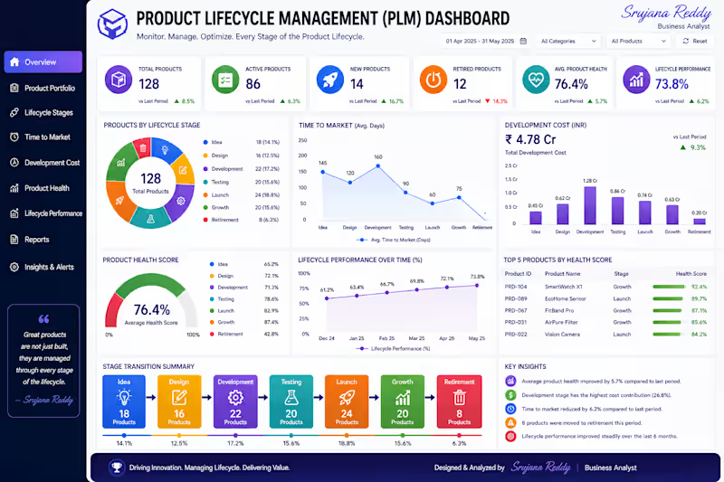
Let's transform your enterprise architecture data into actionable insights that optimize technology investments, reduce complexity, and drive sustainable business success. 🏷️ Product Lifecycle Management (PLM) Dashboard
Manage Every Stage. Accelerate Innovation. Maximize Product Success.
The Product Lifecycle Management (PLM) Dashboard is a professional Business Intelligence solution designed to help organizations monitor and optimize every stage of a product's lifecycle—from product ideation and development to launch, growth, maturity, and retirement. It provides a centralized view of product stage, time-to-market, development costs, product health, and lifecycle performance, enabling product managers and executives to make informed, data-driven decisions.
With real-time insights and interactive analytics, this dashboard helps organizations improve product development efficiency, reduce time-to-market, optimize investment decisions, and maximize overall product performance.
📊 Key Metrics
Product Stage
Time-to-Market
Development Cost
Product Health
Lifecycle Performance
Product Portfolio Score
📈 Dashboard Features
Executive PLM KPI Overview
Product Lifecycle Stage Analysis
Time-to-Market Tracking
Development Cost Monitoring
Product Health Assessment
Lifecycle Performance Trends
Product Portfolio Performance Analysis
Executive Insights & Smart Recommendations
💼 Business Value
This dashboard helps organizations:
Monitor product performance across every lifecycle stage
Reduce product development time
Optimize development costs
Improve product portfolio management
Identify high-performing and underperforming products
Support strategic product and investment decisions
🛠 Tools Used
Microsoft Power BI
Power Query
DAX
Data Modeling
Product Analytics
Interactive Data Visualization
Designed by:
Srujana Reddy | Business Analyst
Transforming product lifecycle data into actionable insights that accelerate innovation, improve product performance, and drive sustainable business growth.
💼 Client Note
Thank you for exploring my portfolio.
The Product Lifecycle Management (PLM) Dashboard is a professional Power BI solution designed to help organizations manage and monitor the complete product lifecycle—from product ideation and development to launch, growth, maturity, and retirement. This dashboard provides complete visibility into product stages, time-to-market, development costs, product health, and lifecycle performance, enabling product teams and business leaders to make informed decisions throughout the product journey.
I specialize in developing modern, interactive Power BI dashboards that transform product and business data into actionable insights, helping organizations accelerate innovation, optimize product investments, and improve overall portfolio performance.
Services I Offer
Product Lifecycle Management (PLM) Dashboards
Product Portfolio Analytics
Executive KPI Dashboards
Product Performance Reporting
Time-to-Market & Development Cost Analytics
Interactive Power BI Reports
Advanced DAX & Data Modeling
Custom Business Intelligence Solutions
What You Can Expect
Executive-Level Dashboard Design
Interactive & User-Friendly Reports
Advanced DAX & Data Modeling
Real-Time Product KPI Monitoring
Business-Focused Visualizations
Customized Solutions Tailored to Your Business Needs
Every dashboard I develop is designed to improve product visibility, optimize development processes, monitor product performance, reduce time-to-market, and provide data-driven insights that support successful product lifecycle management.
If you're looking for a custom Power BI Product Lifecycle Management (PLM) Dashboard to optimize product development, monitor lifecycle performance, and improve strategic decision-making, I'd be happy to collaborate on your next project.
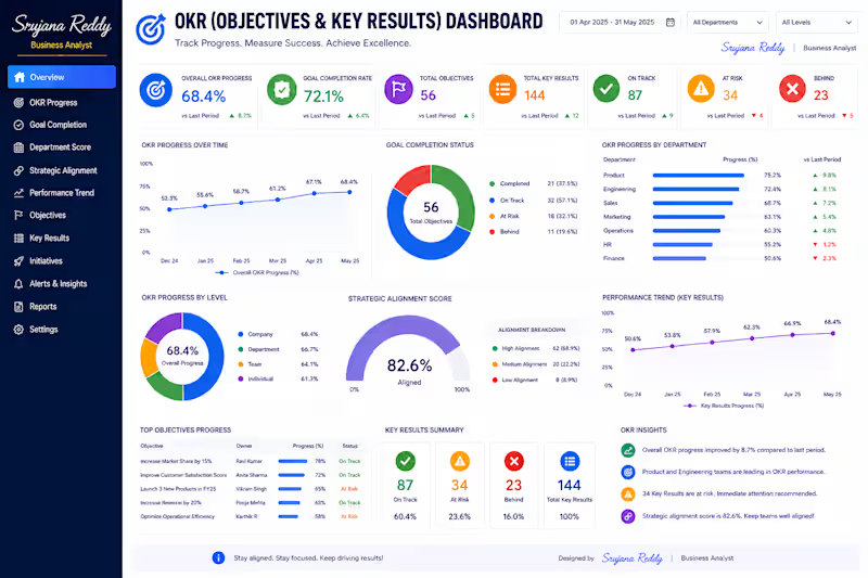
Let's transform your product lifecycle data into actionable insights that accelerate innovation, maximize product success, and drive sustainable business growth. 🎯 OKR (Objectives & Key Results) Dashboard
Align Goals. Measure Progress. Achieve Business Success.
The OKR (Objectives & Key Results) Dashboard is a professional Business Intelligence solution designed to help organizations monitor strategic goals, track key results, and measure overall business performance. It provides a centralized view of OKR progress, goal completion, department performance, strategic alignment, and performance trends, enabling leaders to evaluate organizational success and ensure teams remain aligned with business objectives.
With real-time insights and interactive analytics, this dashboard helps executives identify performance gaps, improve accountability, and drive continuous business growth.
📊 Key Metrics
OKR Progress
Goal Completion
Department Score
Strategic Alignment
Performance Trend
Overall OKR Achievement Score
📈 Dashboard Features
Executive OKR KPI Overview
Goal Progress Tracking
Department Performance Analysis
Strategic Alignment Monitoring
Performance Trend Analysis
Objective & Key Results Summary
Team & Department Comparison
Executive Insights & Smart Recommendations
💼 Business Value
This dashboard helps organizations:
Track organizational goals in real time
Measure progress against key results
Improve strategic alignment across departments
Identify underperforming objectives
Increase accountability and transparency
Support data-driven strategic decision-making
Designed by:
Srujana Reddy | Business Analyst
Transforming organizational goals into actionable insights that improve strategic alignment, accelerate performance, and drive measurable business success.
💼 Client Note
Thank you for exploring my portfolio.
The OKR (Objectives & Key Results) Dashboard is a professional Power BI solution designed to help organizations align strategic goals, measure business performance, and monitor progress across teams and departments. This dashboard provides complete visibility into OKR progress, goal completion, department performance, strategic alignment, and performance trends, enabling executives to track organizational success and make informed strategic decisions.
I specialize in building modern, interactive Power BI dashboards that transform business data into actionable insights, helping organizations improve performance management, increase accountability, and achieve strategic objectives.
Services I Offer
OKR & Strategic Performance Dashboards
Executive KPI Dashboards
Business Performance Analytics
Goal & Performance Tracking
Department Performance Reporting
Interactive Power BI Reports
Advanced DAX & Data Modeling
Custom Business Intelligence Solutions
What You Can Expect
Executive-Level Dashboard Design
Interactive & User-Friendly Reports
Advanced DAX & Data Modeling
Real-Time KPI & OKR Monitoring
Business-Focused Visualizations
Customized Solutions Tailored to Your Business Needs
Every dashboard I develop is designed to improve strategic visibility, align organizational goals, monitor key results, identify performance gaps, and support data-driven decision-making for sustainable business growth.
If you're looking for a custom Power BI OKR Dashboard to monitor business objectives, track key results, and improve organizational performance, I'd be happy to collaborate on your next project.
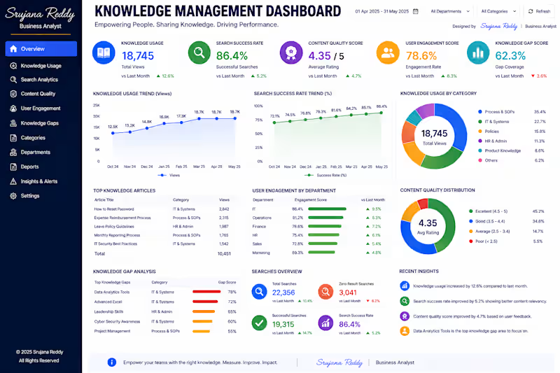
Let's transform your strategic goals into actionable insights that drive accountability, improve execution, and deliver measurable business success. 📚 Knowledge Management Dashboard
Empower Knowledge. Enhance Collaboration. Drive Performance.
The Knowledge Management Dashboard is a professional Business Intelligence solution designed to help organizations measure how effectively employees access, share, and utilize knowledge resources. It provides a centralized view of knowledge usage, search success rates, content quality, user engagement, and knowledge gaps, enabling organizations to improve collaboration, enhance productivity, and support informed decision-making.
With real-time insights and interactive analytics, this dashboard helps organizations identify valuable knowledge assets, optimize content quality, and ensure employees have quick access to the right information.
📊 Key Metrics
Knowledge Usage
Search Success Rate
Content Quality
User Engagement
Knowledge Gap Analysis
Knowledge Effectiveness Score
📈 Dashboard Features
Executive Knowledge KPI Overview
Knowledge Usage Trend Analysis
Search Performance Monitoring
Content Quality Assessment
User Engagement Analytics
Knowledge Gap Identification
Department & Category Performance Analysis
Executive Insights & Smart Recommendations
💼 Business Value
This dashboard helps organizations:
Improve knowledge sharing across teams
Increase employee productivity
Monitor content quality and relevance
Identify critical knowledge gaps
Enhance search efficiency and user engagement
Support data-driven knowledge management strategies
Designed by:
Srujana Reddy | Business Analyst
Transforming organizational knowledge into actionable insights that improve collaboration, accelerate learning, and drive smarter business decisions.
💼 Client Note
Thank you for exploring my portfolio.
The Knowledge Management Dashboard is a professional Power BI solution designed to help organizations measure, manage, and optimize the use of knowledge resources across the enterprise. It provides complete visibility into knowledge usage, search success rates, content quality, user engagement, and knowledge gaps, enabling organizations to improve collaboration, enhance employee productivity, and support continuous learning.
I specialize in developing modern, interactive Power BI dashboards that transform organizational data into actionable insights, helping businesses improve knowledge sharing, strengthen decision-making, and maximize operational efficiency.
Services I Offer
Knowledge Management Dashboards
Business Intelligence & Executive KPI Dashboards
Employee Engagement Analytics
Data Governance & Performance Reporting
Interactive Power BI Reports
Advanced DAX & Data Modeling
Business Process Analytics
Custom Power BI Dashboard Development
What You Can Expect
Executive-Level Dashboard Design
Interactive & User-Friendly Reports
Advanced DAX & Data Modeling
Real-Time KPI Monitoring
Business-Focused Visualizations
Customized Solutions Tailored to Your Business Needs
Every dashboard I create is designed to improve knowledge accessibility, enhance collaboration, identify knowledge gaps, optimize content quality, and provide data-driven insights that support better business performance.
If you're looking for a custom Power BI Knowledge Management Dashboard to improve knowledge sharing, monitor employee engagement, and strengthen organizational performance, I'd be happy to collaborate on your next project.
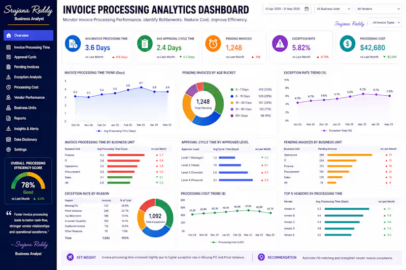
Let's transform your organizational knowledge into meaningful insights that empower employees, improve collaboration, and drive long-term business success. 🧾 Invoice Processing Analytics Dashboard
Accelerate Invoice Processing. Improve Financial Efficiency.
The Invoice Processing Analytics Dashboard is a professional Business Intelligence solution designed to help organizations monitor and optimize their invoice processing workflow. It provides a centralized view of invoice processing time, approval cycles, pending invoices, exception rates, and processing costs, enabling finance teams to identify operational bottlenecks and improve process efficiency.
With real-time analytics and interactive visualizations, this dashboard helps organizations streamline invoice approvals, reduce processing delays, minimize operational costs, and strengthen financial performance.
📊 Key Metrics
Invoice Processing Time
Approval Cycle
Pending Invoices
Exception Rate
Processing Cost
Invoice Processing Efficiency
📈 Dashboard Features
Executive Invoice Processing KPI Overview
Invoice Processing Time Analysis
Approval Cycle Monitoring
Pending Invoice Tracking
Exception Rate Analysis
Processing Cost Monitoring
Vendor & Department Performance Analysis
Executive Insights & Smart Recommendations
💼 Business Value
This dashboard helps organizations:
Reduce invoice processing time
Improve approval workflow efficiency
Monitor pending invoices in real time
Identify processing exceptions and bottlenecks
Optimize invoice processing costs
Support faster, data-driven financial decisions
Designed by:
Srujana Reddy | Business Analyst
Transforming invoice processing data into actionable insights that improve operational efficiency, accelerate financial workflows, and support smarter business decisions.
💼 Client Note
Thank you for exploring my portfolio.
The Invoice Processing Analytics Dashboard is a professional Power BI solution designed to help organizations streamline invoice processing, improve approval efficiency, and reduce operational delays. This dashboard provides complete visibility into invoice processing time, approval cycles, pending invoices, exception rates, and processing costs, enabling finance teams to identify bottlenecks and optimize the entire accounts payable workflow.
I specialize in building modern, interactive Power BI dashboards that transform financial and operational data into actionable insights, helping organizations improve productivity, reduce costs, and make data-driven decisions.
Services I Offer
Invoice Processing Analytics Dashboards
Accounts Payable & Finance Dashboards
Workflow & Process Performance Analytics
Executive KPI Dashboards
Financial Operations Reporting
Interactive Power BI Reports
Advanced DAX & Data Modeling
Custom Business Intelligence Solutions
What You Can Expect
Executive-Level Dashboard Design
Interactive & User-Friendly Reports
Advanced DAX & Data Modeling
Real-Time KPI Monitoring
Business-Focused Visualizations
Customized Solutions Tailored to Your Business Needs
Every dashboard I develop is designed to improve invoice processing efficiency, accelerate approval workflows, reduce processing costs, identify operational bottlenecks, and support faster financial decision-making.
If you're looking for a custom Power BI Invoice Processing Analytics Dashboard to optimize financial operations, monitor invoice workflows, and improve process efficiency, I'd be happy to collaborate on your next project.
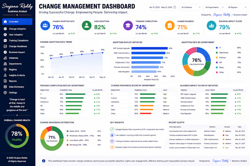
Let's transform your invoice processing data into actionable insights that accelerate workflows, reduce costs, and drive operational excellence. 🔄 Change Management Dashboard
Drive Change. Increase Adoption. Maximize Business Impact.
The Change Management Dashboard is a professional Business Intelligence solution designed to help organizations monitor the success of digital transformation initiatives and organizational change programs. It provides a centralized view of change adoption, user engagement, training completion, readiness levels, and overall business impact, enabling leaders to measure how effectively employees adapt to new processes, technologies, and systems.
With real-time insights and interactive analytics, this dashboard helps organizations improve change adoption, minimize resistance, and ensure successful business transformation.
📊 Key Metrics
Change Adoption Rate
User Adoption
Training Completion
Change Readiness
Business Impact
Overall Change Success Score
📈 Dashboard Features
Executive Change Management KPI Overview
Change Adoption Trend Analysis
User Adoption Monitoring
Training Completion Tracking
Change Readiness Assessment
Business Impact Measurement
Department & Initiative Performance Analysis
Executive Insights & Smart Recommendations
💼 Business Value
This dashboard helps organizations:
Measure the success of change initiatives
Improve employee adoption of new systems
Track training effectiveness
Identify areas with low change readiness
Reduce transformation risks
Support data-driven change management decisions
Designed by:
Srujana Reddy | Business Analyst
Transforming change management data into actionable insights that improve adoption, accelerate transformation, and drive sustainable business success.
💼 Client Note
Thank you for exploring my portfolio.
The Change Management Dashboard is a professional Power BI solution designed to help organizations successfully manage digital transformation initiatives and organizational change. It provides complete visibility into change adoption, user engagement, training completion, change readiness, and business impact, enabling leaders to measure adoption progress and drive successful transformation outcomes.
I specialize in building modern, interactive Power BI dashboards that convert complex organizational data into actionable insights, helping businesses improve employee adoption, optimize change initiatives, and make informed strategic decisions.
Services I Offer
Change Management Dashboards
Digital Transformation Analytics
Executive KPI Dashboards
User Adoption & Training Analytics
Business Impact Reporting
Interactive Power BI Reports
Advanced DAX & Data Modeling
Custom Business Intelligence Solutions
What You Can Expect
Executive-Level Dashboard Design
Interactive & User-Friendly Reports
Advanced DAX & Data Modeling
Real-Time KPI Monitoring
Business-Focused Visualizations
Customized Solutions Tailored to Your Business Needs
Every dashboard I develop is designed to improve change visibility, increase user adoption, monitor transformation progress, and provide data-driven insights that support successful organizational change.
If you're looking for a custom Power BI Change Management Dashboard to monitor digital transformation, improve user adoption, and measure business impact, I'd be happy to collaborate on your next project.
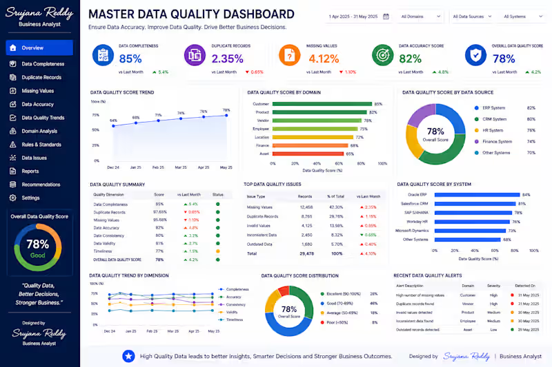
Let's transform your change management data into actionable insights that accelerate adoption, strengthen organizational performance, and deliver successful business transformation. 📋 Master Data Quality Dashboard
Ensure Data Accuracy. Build Business Trust.
The Master Data Quality Dashboard is a professional Business Intelligence solution designed to help organizations monitor, measure, and improve the quality of their business data. It provides a centralized view of data completeness, duplicate records, missing values, accuracy scores, and quality trends, enabling organizations to identify data issues before they impact business operations.
This dashboard empowers data governance teams and business leaders with real-time insights to maintain reliable, consistent, and high-quality master data across the organization.
📊 Key Metrics
Data Completeness
Duplicate Records
Missing Values
Data Accuracy Score
Data Quality Trends
Overall Data Quality Index
📈 Dashboard Features
Executive Data Quality KPI Overview
Data Completeness Analysis
Duplicate Record Monitoring
Missing Value Detection
Data Accuracy & Consistency Tracking
Data Quality Trend Analysis
Department & System-wise Quality Analysis
Executive Insights & Smart Recommendations
💼 Business Value
This dashboard helps organizations:
Improve master data accuracy and consistency
Detect duplicate and incomplete records
Reduce data quality issues across systems
Support reliable reporting and analytics
Strengthen data governance and compliance
Enable confident, data-driven business decisions
Designed by:
Srujana Reddy | Business Analyst
Transforming business data into trusted, high-quality information that supports accurate reporting, operational excellence, and smarter business decisions.
💼 Client Note
Thank you for exploring my portfolio.
The Master Data Quality Dashboard is a professional Power BI solution designed to help organizations monitor and improve the quality of their critical business data. It provides complete visibility into data completeness, duplicate records, missing values, data accuracy, and quality trends, enabling businesses to maintain reliable, consistent, and trusted data across multiple systems.
I specialize in building modern, interactive Power BI dashboards that transform raw business data into meaningful insights, helping organizations improve data governance, reporting accuracy, and operational efficiency.
Services I Offer
Master Data Quality Dashboards
Data Governance & Quality Analytics
Executive KPI Dashboards
Business Intelligence Reporting
Data Validation & Monitoring
Interactive Power BI Reports
Advanced DAX & Data Modeling
Custom Power BI Dashboard Development
What You Can Expect
Executive-Level Dashboard Design
Interactive & User-Friendly Reports
Advanced DAX & Data Modeling
Data Quality KPI Monitoring
Business-Focused Visualizations
Customized Solutions Based on Your Business Requirements
Every dashboard I develop is designed to improve data accuracy, eliminate duplicate and incomplete records, strengthen data governance, and provide reliable information for smarter business decisions.
If you're looking for a custom Power BI dashboard to monitor data quality, improve data governance, and build trusted business reporting, I'd be happy to collaborate on your next project.
Let's transform your business data into trusted, high-quality insights that drive operational excellence and confident decision-making.