Projects using Figma Make in Bengaluru
Projects using Figma Make in Bengaluru
Sign Up
Post a job
Sign Up
Log In
Filters
2
Projects
People
Message
1
Divan Raj
pro
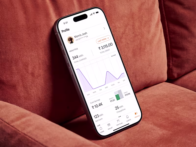
Design of ChargeIndia EV Charging Application Platform
1
6
Message
1
Vaibhav Yadav
pro
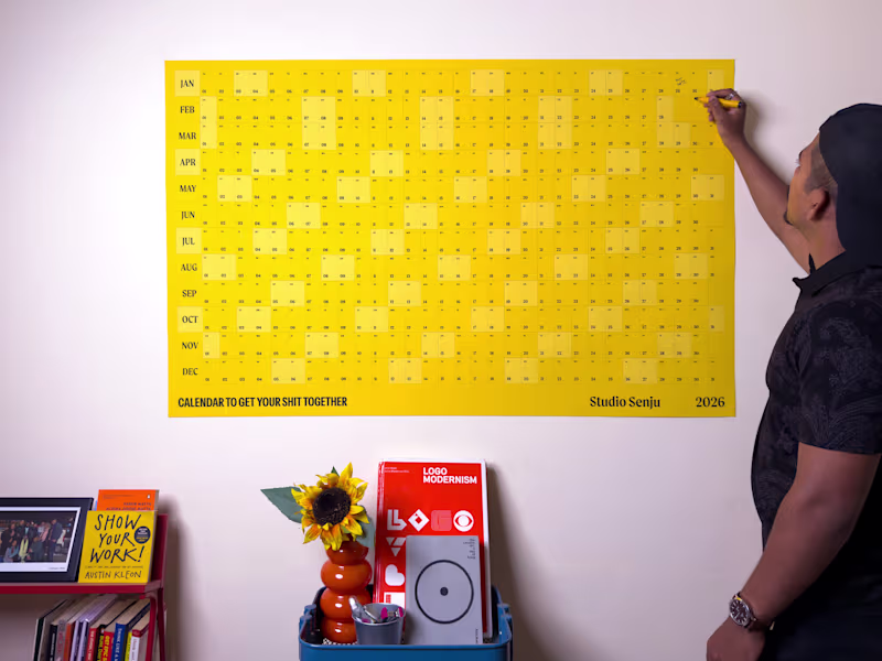
Designed a calendar few weeks back. 12 Months at once. Huge size. Idea was: GET YOUR SH*T TOGETHER. More here: https://www.senju.studio/calendar-2026
1
167
Message
1
Pooja Pawar
pro
Sharing another conecept design. A quiet digital space designed to reflect how architects think, plan, and build. 👉 Goal Translate architectural values clarity, structure, balance, and restraint into a digital experience that feels timeless and confident. 👉 Approach Focused on strong grid systems, generous whitespace, and clear visual hierarchy. The layout treats content like space: allowing it to breathe, guiding attention slowly, and avoiding unnecessary visual noise. Typography and composition do most of the talking. 👉 Tools Figma · Grid systems · Typography exploration · Visual hierarchy principles
1
191
Message
0
Reyhan Tamang
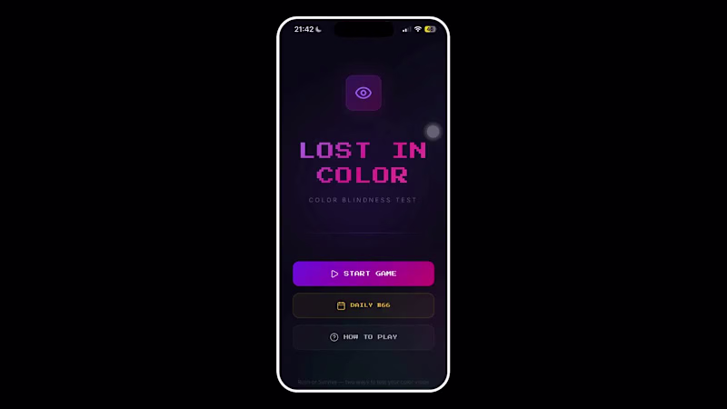
Last year, I made a color blindness game for the Figma Makeathon. I just rebuilt it as a PWA(Progressive Web App) with Claude Code, and I'm honestly pretty proud of how it turned out. Lost in Color - simulate 3 types of color blindness and see how well your vision holds up. https://lostincolor.fun/
0
102
Message
1
Rajani - Email Marketing Specialist
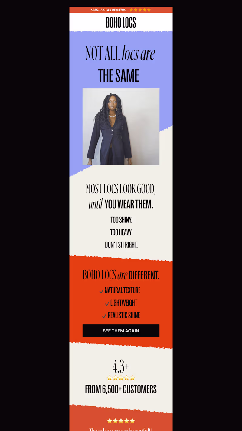
Recently completes Email design flow for a locs brand, love these bold colors
1
127
Message
1
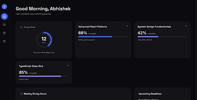
Abhishek RG
EduFlow — Premium Student Learning Dashboard😍
1
108
Message
7
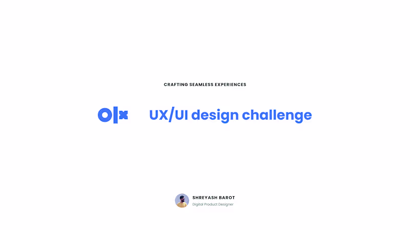
Shreyash Barot
OLX Product Design Solution – A Smarter Way to Buy & Sell!
7
10
Message
0
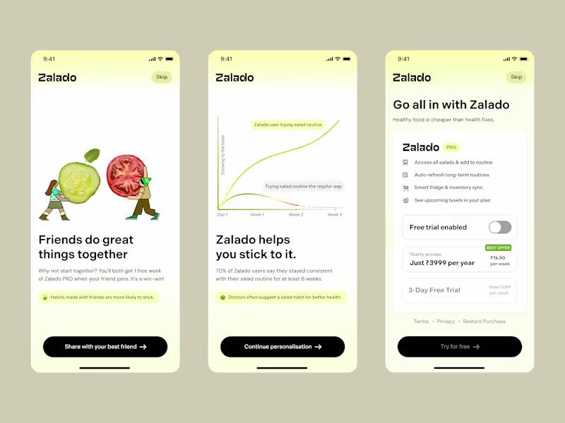
Sanal C K
pro
Zalado® — Upgrade & Referral Flow Last week, I’ve been working on growth design for Zalado®, by crafting the Upgrade & Referral flow to make healthy habits more social, rewarding, and shareable. The goal was simple: drive conversions through subtle psychology, clean visuals, and frictionless moments that feel good to act on. I think they’re already seeing traction with their private waitlist of users. You can also get early access (http://zalado.app/) A few smart tweaks in your onboarding or upgrade flow could easily add a few thousand dollars in MRR to your app. So why hesitate to experiment with growth design? Get in touch by clicking this “Hire (https://cal.com/hypermodedesign/30min)” button — I’d love to help you grow your mobile app into your primary revenue stream.
0
48
Message
72
Arjun Haridas
Presenting - Silver Line 🌥️ https://silverlinespace.figma.site My Config Makeathon Submission! A helpline for hearts that can't quite see the bright side today. 🌥️ The Problem We all carry small struggles around with us. A rejection email, a plan that fell through, a rough day at work, a friend who didn't text back. None of them are the end of the world, but they pile up. And on the wrong day, even the little things feel heavy. Most of us weather them alone and in silence, scrolling past everyone else's highlight reel while quietly having a hard time. There are apps for big crises and apps for vanity metrics, but very little for the everyday, low-grade cloud that just needs a kind word from a stranger. ☀️ The Solution Silver Line is a communal sky where strangers help strangers spot their silver lining. Share your cloud. Sign in, step into the sky, and post the little problem weighing you down. Set how heavy it feels, then send it up. Be someone's silver line. Open any cloud and leave a message of encouragement, a kind word, or a bit of perspective. Loved someone's comment? Send a ray of sun to show you appreciate it. Watch clouds turn happy. When you can finally see the bright side, tap "I see the silver lining" and watch your cloud become a happy cloud. The goal is simple: make every cloud in the sky a happy one! Because no one should face their problems alone. Safety rails (community flagging + admin moderation) keep the sky a kind place. 🛠️ The Process & Figma Tools Used The whole thing was built predominantly in Figma, powered by Figma Make. Planning: Mapped the idea and concept with an AI agent before touching design. Figma MCP: Built the entire design system and variables directly in Figma, fast and clean. Figma Design Agent: Spun up the major screens in minutes. Figma Weave + Figma Draw: Generated the cloud assets and visuals; Draw was a joy for the finishing touches. Figma Make: The heart of it. Prompted my vision and watched it come to life, iterating across versions. Used Figma Make's Select Edits for precise manual tweaks (images, text, padding) to save AI credits. Supabase:Connected for persistence, so clouds, messages, and rays of sun are saved between visits. A real end-to-end Figma workflow, from design system to a live, interactive product. 🔗 Link - Try it out yourself! 🚀 Live Working Prototype: https://silverlinespace.figma.site *** Cannot provide figma community link as this project is connected to Supabase! *** 👤 Built by Arjun Haridas, Product Designer, Bangalore, India. Originally designed and built during the Config Makeathon period. Huge thanks to Figma for the makeathon and to Contra for hosting. And to everyone who's ever been the silver line to someone else's cloud you're the reason this exists. 😊🌤️ #FigmaMakeathon #ConfigMakeathon
48
72
3.6K
Message
2
Vanshika Kataria
Reimagining Sports with AI — Introducing Fitzz For the Figma Makeathon, I designed Fitzz, an AI-powered application for sports enthusiasts that brings sports discovery, community, performance tracking, athlete ratings, and personalized coaching into one unified experience. Using Figma Make, I transformed an idea into a fully interactive product by breaking the design process into multiple phases—from ideation and user flows to AI-driven experiences and final visual refinement. The goal was simple: help people discover sports, stay consistent, improve performance, and grow through AI-powered guidance. Check it out on Figma Community, It's Live Guys!! https://www.figma.com/community/file/1649133905560941364/fitzz-mobile-app-design #FigmaMakeathon #FigmaMake #ProductDesign #UIDesign #UXDesign #AI #SportsTech #DesignChallenge
2
2
116
Message
1
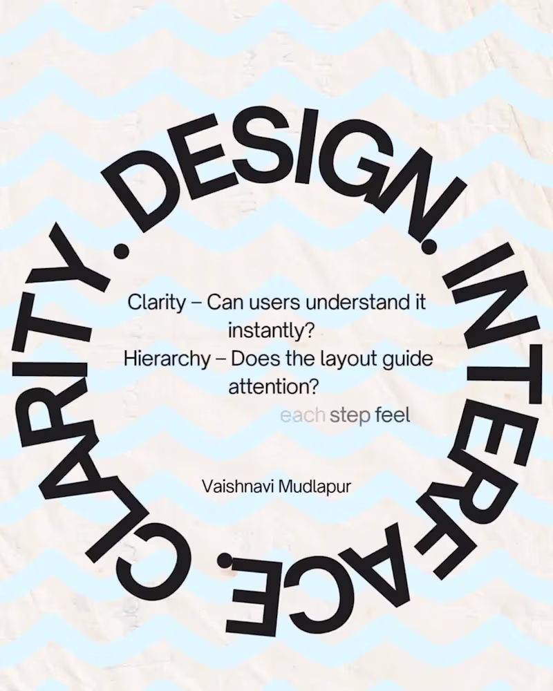
Vaishnavi Mudlapur
What I look for when designing a new interface design: Whenever I start designing a product, I focus on three things: • Clarity – Can users understand it instantly? ⁉️ • Hierarchy – Does the layout guide attention?👑 • Flow – Does each step feel natural?🫗 Design decisions should make the product easier to use, not just nicer to look at. Something I .earned while Designing Interfaces: One thing I’ve realized while designing products: Users rarely struggle because of COMPLEX features, they struggle because of UNCLEAR interfaces. Clarity is often the most powerful design tool. Keep it complex, but always be CLEAR. Drop in your insights as well! 🚀🧠
1
90
Message
1
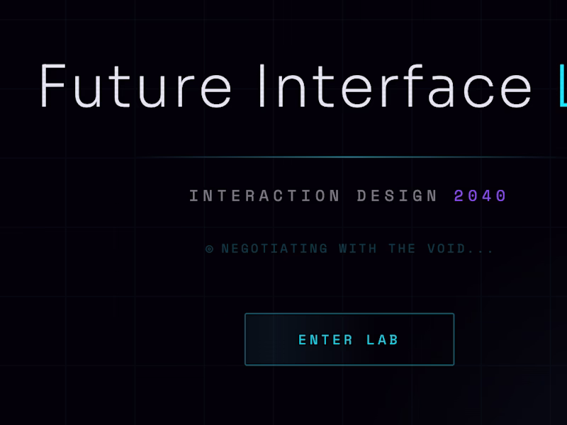
Prakash Anand Kolkundi
Here is my Third Submission Future Interface Lab: Interaction Design 2040: Concept: A cinematic, immersive web experience showcasing 7 next-generation interaction paradigms through a spatial hub — no conventional navigation, menus, or page routes. The 7 Paradigms: Attention-Aware — UI that responds to where you're looking/focusing Anticipation Interface — predictive UI that acts before you ask Time-Fluid — interfaces that bend and stretch with temporal context Emotion-Responsive — adapts to your emotional state Collective Interface — shared, multi-user interaction design Self-Explaining — UI that teaches itself to you contextually Zero Navigation. Figma Published link: https://drop-blur-60344225.figma.site Figma Community published link: https://www.figma.com/community/file/1609958598777521514
1
115
Message
1
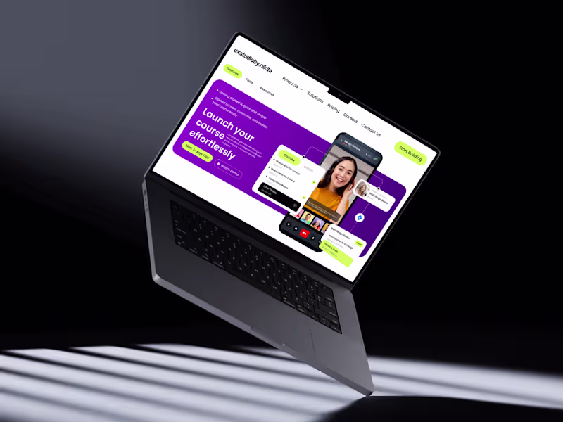
Nikita K Kakade
Designed a modern, high-converting SaaS hero section in Figma focused on strong visual hierarchy, clean aesthetics, and usability. Built using a structured grid system with precise spacing and alignment for a balanced and professional layout. The design highlights a bold gradient hero background, clear typography hierarchy, and impactful call-to-action buttons to boost engagement. Key components like the navbar, buttons, and cards are created using Auto Layout, ensuring scalability and responsiveness. Interactive elements such as course cards and video overlays are enhanced with subtle shadows, soft corner radius, and layered composition to add depth and a premium feel. Consistent use of color, spacing, and typography ensures a cohesive design system throughout. Perfect for SaaS platforms, course websites, and startups aiming for a modern, user-friendly, and conversion-driven interface. #UIUXDesign #FigmaDesign #SaaSDesign #WebDesign #ProductDesign #UIDesign #UXDesign #DesignSystem #LandingPageDesign #StartupDesign #CreativeDesign #InteractionDesign
1
39
Message
0
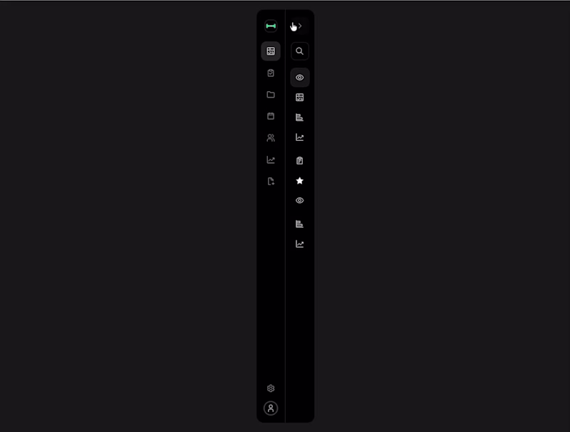
Byldex studio
Dialing into the details of a fitness dashboard prototype exploring metrics, testing flows, and making every navigation feel effortless. #UIDesign #UXDesign #ProductDesign #Prototype #InteractionDesign #FitnessApp #FigmaDesign
0
12
Message
0
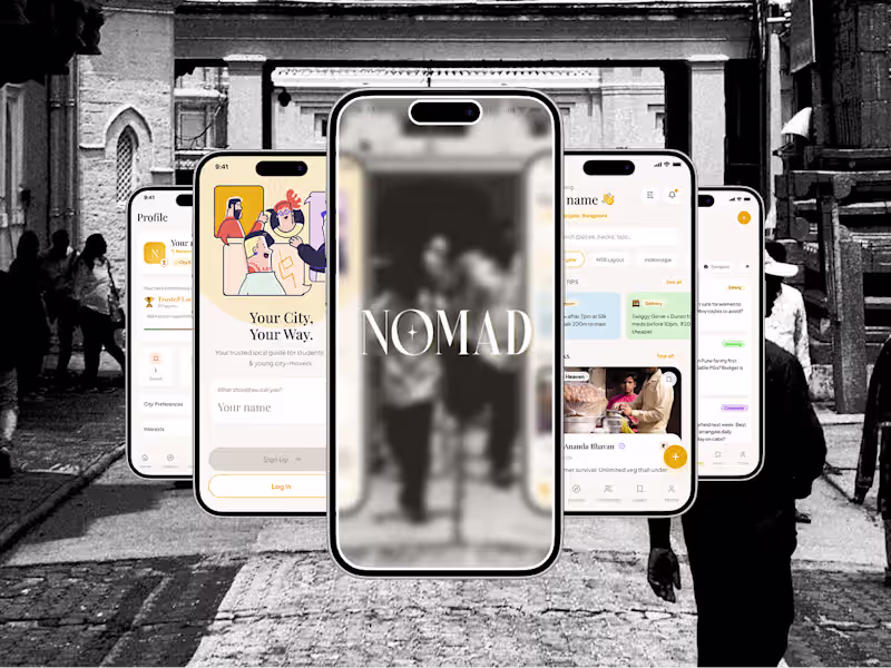
Neel Gaurav
Nomad | Product Design Case Study
0
0
Message
0
Amey More
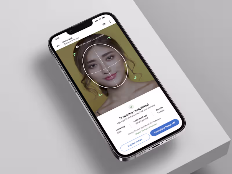
Smart Delivery App - Age Verification System About: Walmart's alcohol pickup flow was a compliance liability hiding inside a UX problem. Associates were making high-stakes age verification calls under peak-hour pressure with decision-critical signals scattered across multiple screens no clear path for edge cases, no confidence in exceptions. What I did: I redesigned the entire verification system from scratch: a guided, adaptive, multi-modal flow that handled ID-less scenarios, intelligent exception routing, and real-time validation all within a 3-sprint delivery alongside a 13-person cross-functional team. Post-launch: 93% compliance rate. 90% task satisfaction. Hand-off time dropped to under 3 minutes. Verification errors and peak-hour abandonment both declined measurably. What started as a workflow fix became a shift in decision architecture proving that compliance and speed aren't opposing forces when the interaction model is built around context.
0
44
Explore projects