

Quality Web & Product Design 🚀


Quality Web & Product Design 🚀





Digital Products | Websites & Apps

Digital Products | Websites & Apps


Helping brands grow with strategic marketing visuals

Helping brands grow with strategic marketing visuals
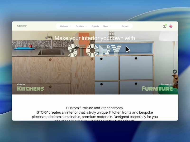
The best part of this website might be the page nobody is supposed to see.
About 4 months ago, we launched the new website for STORY Design Amsterdam.
STORY is all about giving homes personality, so we wanted the website to have some too.
Including their 404 page.
Naturally, I put the owner's dog on it.
If you end up on the wrong page, you might as well enjoy it.
But the fun details only work if the website itself does too.
Before the launch, most of their website traffic came through Instagram.
Today, around 60% comes from Google.
And now we've taken the next step by adding a little shop, so people can buy their kitchen handles directly from the site.
Next up: a great about us page; photoshoots are already planned.
I don't design websites that often.
But when I do, I don't want to create something that could belong to any business.
It should feel like their business. Do you think I achieved that?
26
83
4.3K


Official Framer Expert. Sharp design, real results.
Official Framer Expert. Sharp design, real results.

NOXE Pro, a premium headphones landing page built entirely in Framer. No client, no brief. Just a self-initiated project to explore how a high-end audio brand could present a single product with the visual weight it deserves.
The page covers everything a product launch needs: feature highlights, specs, color variants, social proof, and a clear call to action. Every section was designed to feel as premium as the product itself, with clean typography, intentional spacing, and smooth interactions throughout.
Built in Framer from scratch. Fully responsive.
1
4
812


Product designer making enterprise software actually usable.
Product designer making enterprise software actually usable.

PAYE — a B2B payroll & HR SaaS template, designed and built in Framer.
A clean, conversion-focused marketing site for a modern payroll product. Clear hierarchy, structured sections, and a layout that makes a complex B2B offering feel simple and trustworthy — from pricing to features to social proof.
Built with real product-thinking behind it: how to communicate value, guide the visitor, and turn interest into sign-ups. Fully responsive, CMS-ready, and crafted with the clarity enterprise software deserves.
Designed and developed end to end.
2
1
474


Obsid — a portfolio template for product designers, designed and built in Framer.
A clean, confident portfolio for product designers who want their work to lead. Structured case study layouts, refined typography, and a flow that takes visitors from first impression to "let's talk" — projects, about, and contact, all in their place.
Built with product-thinking at its core: present your process, showcase outcomes, and make your craft easy to read. Fully responsive, CMS-ready, and crafted with clarity over clutter.
Designed and developed end to end.
1
0
526

CoachOne — a one-page coaching website template, designed and built in Framer.
A premium, high-converting single-page site for coaches, mentors, and solo practitioners. Every section earns its place — hero, services, testimonials, about, and contact — flowing seamlessly to guide visitors from first impression to booking.
Built for conversion: clear value, social proof, and a frictionless path to taking the next step. Fully responsive and crafted with clarity over clutter.
Designed and developed end to end.
1
0
462

Senior Product Design Partner


Framer & Web Designer. Clean & scalable web experiences
Framer & Web Designer. Clean & scalable web experiences
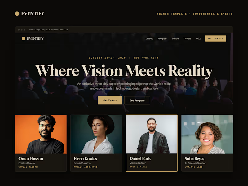
Framer template designed for conferences, summits, and multi-day events. It includes a modular system to manage speakers, schedule, and ticket sales, with content connected from the CMS and a dark, elegant, and editorial visual identity.
Eventify is a Framer template for conferences, summits and multi-day events, built from a clear, modular structure ready to adapt to different agenda formats, speakers and ticket sales.
The project has been developed from the start as a reusable, scalable and easy-to-customise digital product. Beyond the visual proposal, the system resolves all the necessary architecture to manage dynamic content, speaker profiles, sessions, calendar and ticketing from the CMS.
Its creation has leveraged one of the new features of Framer 3.0, the incorporation of AI agents within the workflow. The result is a complete, coherent and ready-to-publish template that balances visual direction, flexibility and a technical foundation designed to grow.
1
24
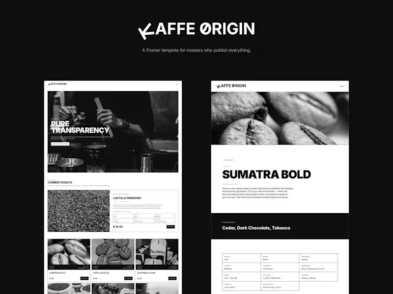
Kaffe Origin is a Framer template for specialty roasters, built on one idea: if what you're selling is the origin, the interface must publish it. Each coffee contains its batch, altitude, producer and process. The entire interface is monochrome so that photography is the only thing that gets to have colour.
The problem
Most store templates give you a photo and a price. It works when the photo is the selling point. With speciality coffee it doesn't, because two identical bags are separated by altitude, variety, process, and who grew it. The interesting part of the product is precisely the one that these templates throw away.
The decision that conditions everything
Strict black and white. One typeface, one-pixel dividers, no accent colour anywhere.
This restraint is not an aesthetic preference, it is a mechanism. Since nothing else has colour, the photography can do something a flat template cannot: each image rests in grey and opens up to colour when you touch it. Discipline buys the reward.
Letting the effect survive on mobile
There is no hover on phones, and that is where most people look. An effect that only works on desktop is a demo, not a feature. On mobile, the reveal is triggered by scrolling: each photo lights up as it enters the screen, and going down the catalogue becomes a sequence of images illuminating one after the other.
Grow with content, not with design
Two collections that reference each other. You tag a coffee with a method and it appears on that method's page all by itself. You add a fifth method and the index row, the menu column, and a whole detail page build themselves. A previous version made with tabs I discarded for this very reason: tabs do not grow.
What I left out
There is no cart. Each product links to the checkout URL that the owner already has. A roastery that sells nine coffees does not need an e-commerce engine, and adding it would have made the template heavier, slower, and dependent on an external service.
0
35

TRIPTYCH
One Framer template. Three completedesign directions. Priced for the work it saves.
Build once. Present your client with three complete design directions. Triptych turns one Framer template into a faster way to explore, compare and approve a visual direction.
Have you found another Framer template offering anything quite like it? I haven’t.
https://triptych-template.framer.website/
Most templates make you commit to one visual direction before you know if it is the right one.
Triptych gives you three complete identities inside the same website: Minimal, Bold and Editorial.
Every section genuinely changes its layout, typography and composition. You can switch styles live, mix them across the page and share any combination with a unique URL.
No duplicated pages. No rebuilding the same website three times. No endless back and forth trying to choose a direction.
Explore all three versions live and find the one that fits your project
Last days at the $49 launch price. Then it goes up to $69.
https://contra.com/products/OlUwxCj9-triptych
2
2
260


Crafting compelling Digital Experiences.
Crafting compelling Digital Experiences.


