UX-led product design & dev agency for b2b saas and AI
UX-led product design & dev agency for b2b saas and AI
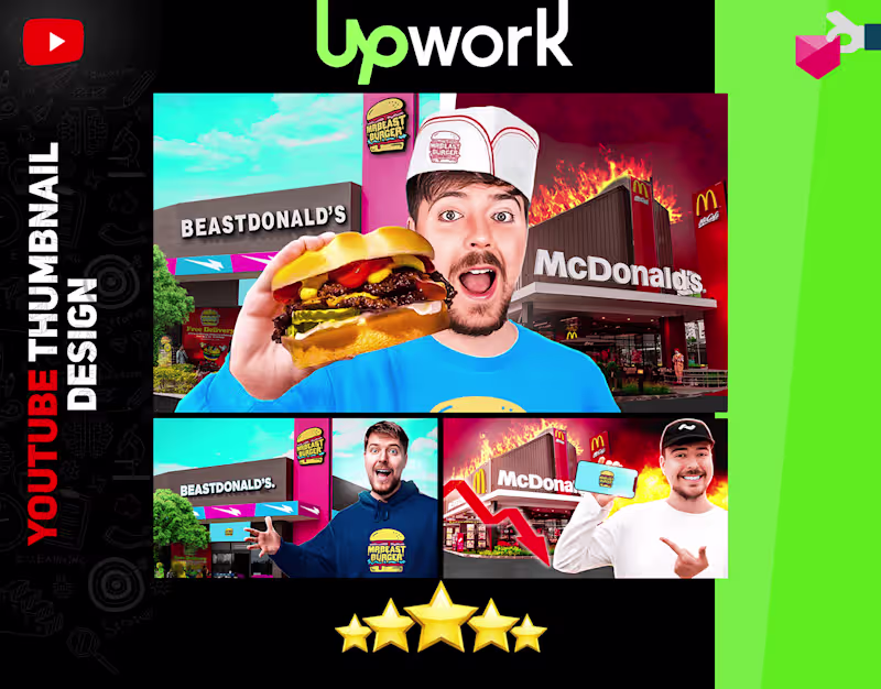
Full-Time YouTube Thumbnail Designer & Strategist
- $10k+
- Earned
- 9x
- Hired
- 5.0
- Rating
- 37
- Followers
Full-Time YouTube Thumbnail Designer & Strategist

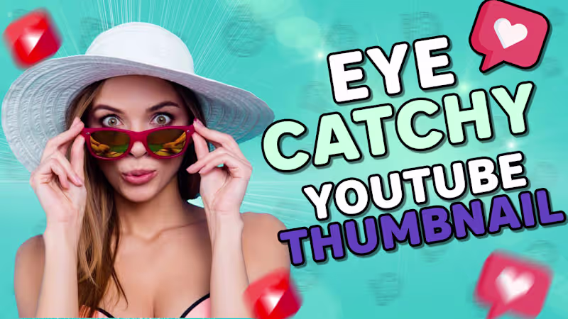
YouTube Thumbnail Expert for Hire
- $50k+
- Earned
- 85x
- Hired
- 4.9
- Rating
- 125
- Followers
YouTube Thumbnail Expert for Hire
View more →
Clients Satisfaction is My First Parity
Clients Satisfaction is My First Parity

View more →
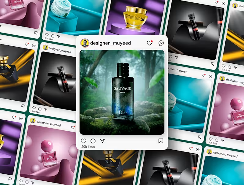
Passionate Graphic Designer for Impactful Branding
Passionate Graphic Designer for Impactful Branding

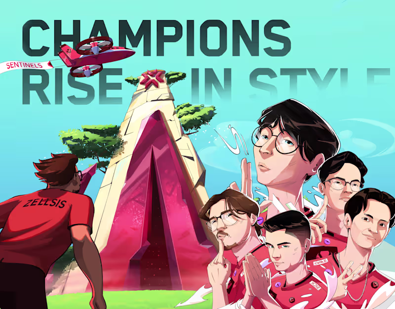
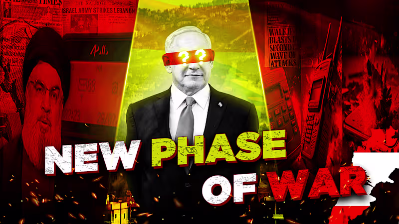
YouTube Content Creators 🎬
YouTube Content Creators 🎬

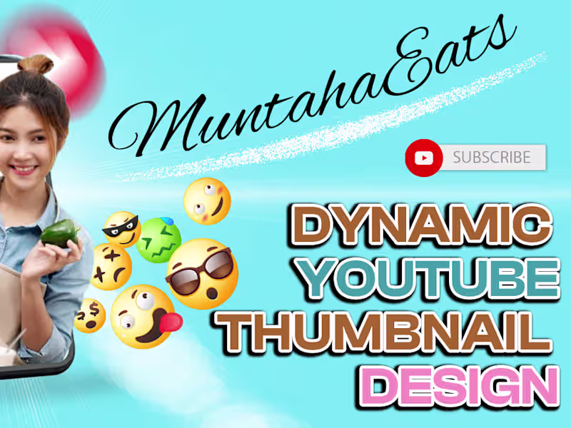
YouTube Thumbnail, Video Editing Service
YouTube Thumbnail, Video Editing Service

View more →
Unique designs for your brand
Unique designs for your brand


View more →