
Book Cover, Print & Banner Design for Brands
- 5.0
- Rating
- 2
- Followers
Book Cover, Print & Banner Design for Brands
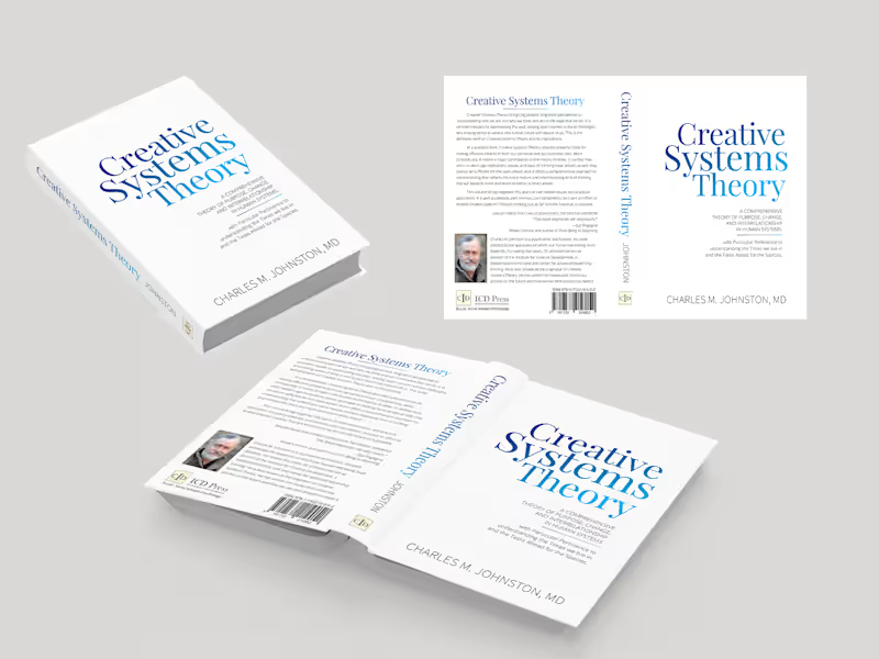
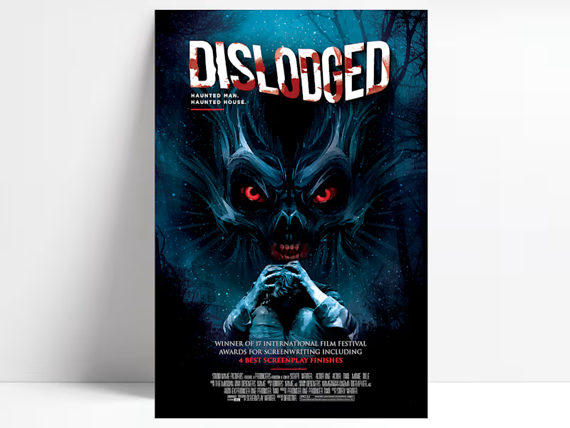
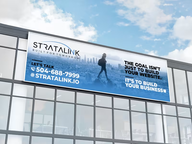
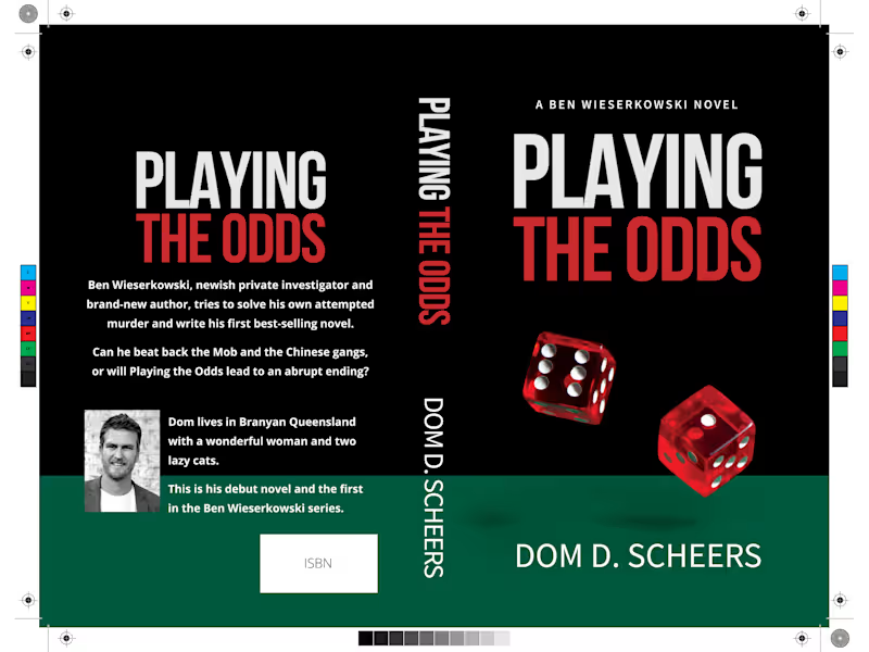

I am a professional Brand Designer, I do all kind of Design
- 24
- Followers
I am a professional Brand Designer, I do all kind of Design
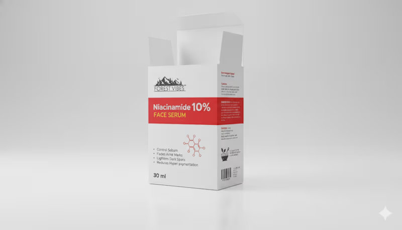
Indian Client Work Niacinamide 10% Face Serum Multiple Style Package Design. Here, I have designed several packages of Niacinamide 10% Face Serum for my Indian client. From here, the client has finalized a design and is selling their product by printing that package. From here, you can get your design ideas if you want, and those who want to package such products can contact me. I am here for you. You can design labels for your products, and if you want, you can get your company's full branding done by me. If you want to get ideas about my designs, you can check out my entire portfolio, so if you need this service, be sure to contact me.
2
2
201
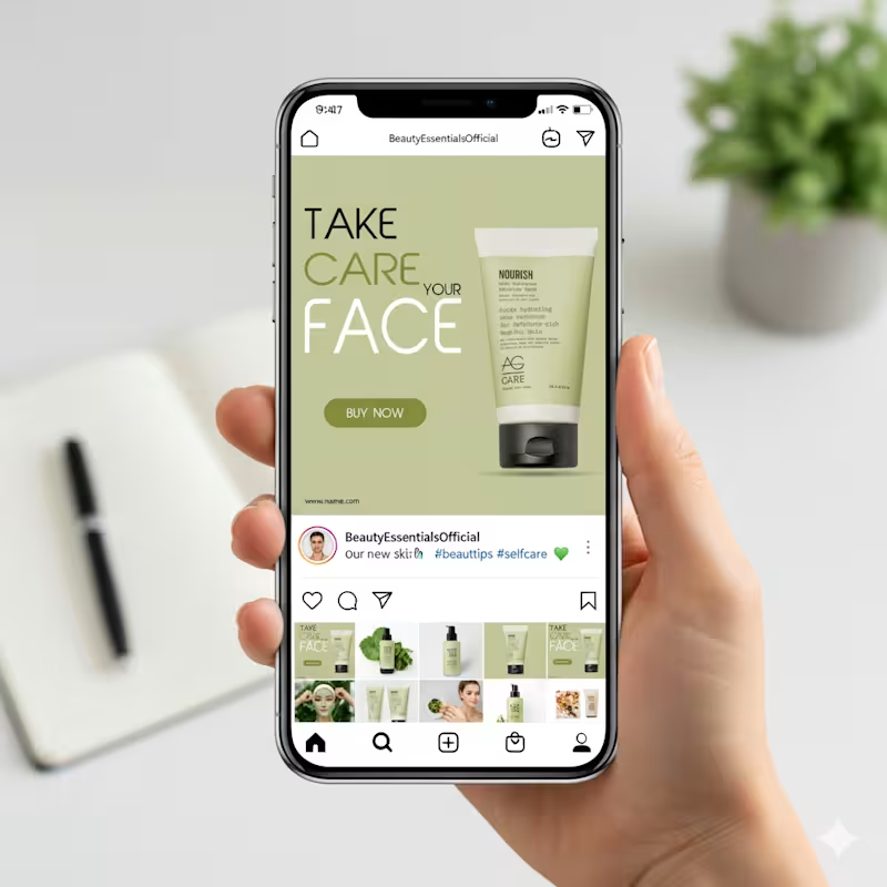
This design focuses on calm, care, and clarity, which fits perfectly with a skincare product.
The soft green background immediately communicates freshness, nature, and hydration. It creates a soothing mood and helps the product feel gentle and trustworthy. Nothing feels loud or aggressive, which is important for beauty and self-care brands.
The typography hierarchy is very intentional.
“FACE” is large and bold to grab attention while scrolling.
“TAKE CARE YOUR” stays lighter so it supports the message without overpowering it. This balance keeps the layout readable and visually clean.
The product is placed on the right with plenty of breathing space. That negative space makes the packaging feel premium and keeps the focus exactly where it should be. The subtle shadow adds depth without making it look heavy or artificial.
3
116
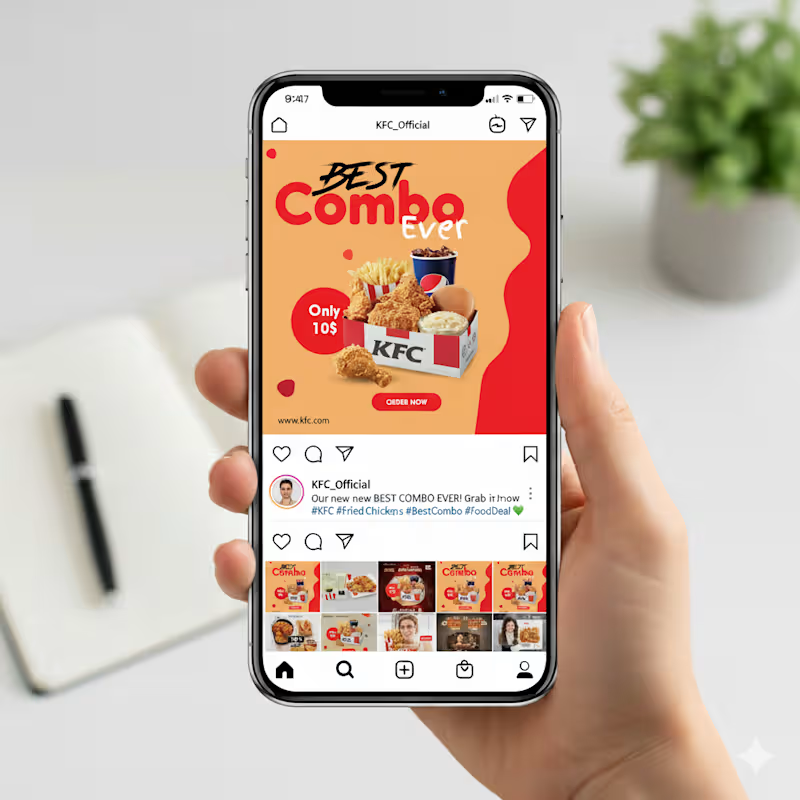
This Instagram post is built to grab attention fast. The layout uses a bold headline that highlights the offer right away, with “Best Combo Ever” placed prominently so viewers instantly understand the message. I used warm tones in the background to make the food look even more appetizing, and the red accents help guide the eye toward key details like the price and the call-to-action.
The combo box sits at the center as the main focus, supported by clean shadows to give it depth. The “Only 10$” badge stands out clearly for quick scanning, and the “Order Now” button at the bottom creates a natural flow that nudges the viewer to take action. Overall, the design is simple, bright, and easy to understand within a second of scrolling.
2
2
90

Brand & UI/UX Designer — Design + Web Development
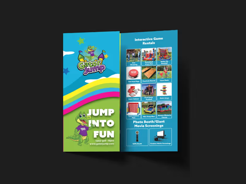
I designed a strategic, high-impact tri-fold brochure for Gator Jump, an event rental company transitioning its focus toward large-scale corporate clients, churches, and schools. The primary challenge was balancing a wide product catalog—Inflatables (Bounce Houses, Slides, Obstacle Courses), Games, Photo Booths, and Giant Movie Screens—while distinctly guiding the viewer’s attention toward the premium, high-ticket items ideal for corporate events.
To solve this, I applied a strict visual hierarchy on the A4 tri-fold canvas. Obstacle Courses, Slides, and Games were given prominent placement with large, dynamic visuals on the most visible panels (front cover and center-fold), while secondary services like Bounce Houses and Photo Booths were positioned strategically on the back and side panels to ensure visibility without competing for the spotlight.
Visually, the client adored a specific rainbow gradient color palette, so I used it as the structural backbone of the design—allowing the colors to flow seamlessly across the front and back panels. This creates a cohesive, energetic brand experience and transforms the brochure from a simple price list into a professional statement. I paired this with bold, modern typography inspired by the Azo Sans family (avoiding their old website fonts as requested) to ensure high readability against the colorful backdrop.
All required functional elements were integrated seamlessly: the logo and contact details on the front, categorized product grids inside, and a QR code, email, phone number, and the specific brand messaging on the back. The result is a print-ready, visually striking tri-fold brochure that captures the excitement of large events while maintaining the premium credibility needed to attract corporate clients.
0
197
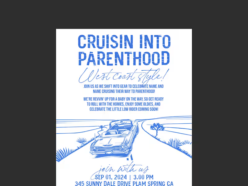
This project was a custom hand-drawn invitation design for a West Coast, lowrider-themed baby shower. The core challenge was beautifully balancing two seemingly opposing worlds—the gritty, nostalgic aesthetic of 90s car club culture (lowriders, oldies, hydraulics, and cruising) with the soft, joyful innocence of a baby celebration.
I leaned heavily into a hand-drawn illustration style to capture the authentic vintage feel of classic lowrider artwork. The composition centers on a lovingly detailed lowrider, but instead of standard rims, I infused baby elements—like a tiny rattle dangling from the rearview mirror and a crib-shaped 'bed' in the back—to bridge the two themes perfectly. I used a warm, sun-soaked West Coast color palette of pastel pinks, blues, and creams, contrasted with deep blacks and chrome greys to keep the 'car club' edge intact.
Typography was crucial; I paired a bold, graffiti-inspired script for the title ('Cruisin' into Parenthood') to capture the urban vibe, with a clean, readable sans-serif for the event details to maintain clarity. I carefully laid out all the supplied verbiage ('Rims, rides, and rattles') using a classic cruise-night poster layout, ensuring the flow felt like a vintage event flyer. The result is a nostalgic, humorous, and deeply personal invitation that makes the parents-to-be feel seen as a couple, while celebrating the exciting journey ahead into parenthood—proving that even a baby shower can have serious street cred.
1
217
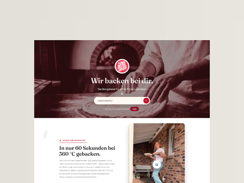
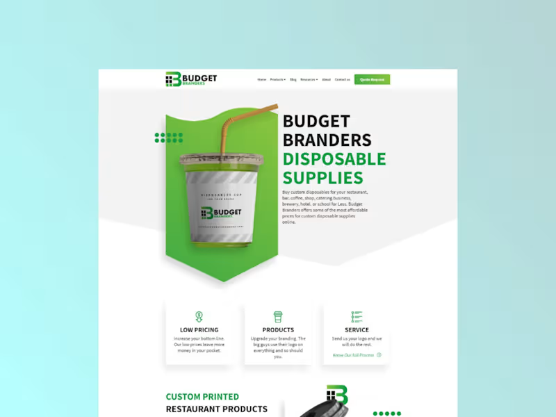
This landing page was designed for Budget Branders, a manufacturer of custom disposable cups and bags for the food & beverage industry. The primary goal was to overhaul their plain, corporate website into a visually bold and fluid experience that drives lead generation. To capture the energy of the F&B sector, I incorporated dynamic elements like floating coffee beans and liquid splashes, moving away from static white sections. I maintained their brand identity using the signature lime green, grey, and white palette, while introducing bold typography and a clear conversion path—updating the primary call-to-action to 'Request Free Quote' to maximize client inquiries.
0
361

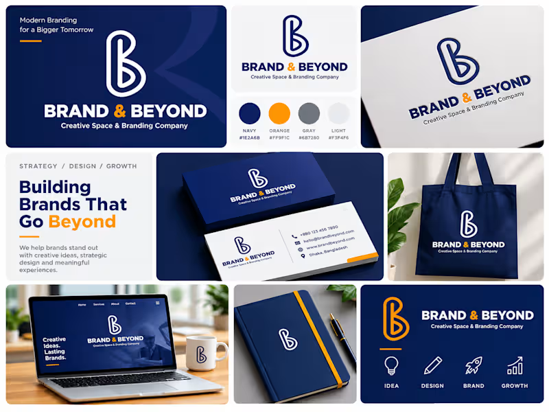
Logo and Branding design
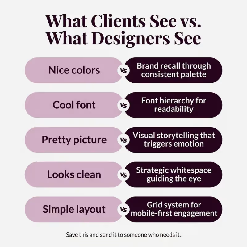
Stop calling it just a nice design.
Every design choice your designer makes has a reason.
You just never asked why.
Here is what is really going on.
You see nice colors. Your designer sees brand
recall built into every post.
You see a cool font. Your designer sees a hierarchy system
that controls where eyes land first.
You see a pretty picture. Your designer sees storytelling that
triggers emotion in under 2 seconds.
You see a clean look. Your designer sees whitespace
engineered to guide attention to the CTA.
You see a simple layout. Your designer sees a grid system
optimized for the screen you are reading this on right now.
The difference between a design that gets scrolled past
and one that stops the thumb?
Strategy you cannot see. But your audience feels.
Next time your designer delivers something simple,
look again. There is nothing simple about it.
Save this. Send it to someone who needs to hear it.
2
2
218

Most carousels get scrolled past in 𝟬.𝟯 𝘀𝗲𝗰𝗼𝗻𝗱𝘀.
Not because the design is bad.
Because the value isn't obvious fast enough.
Here's the 𝗲𝘅𝗮𝗰𝘁 𝗳𝗿𝗮𝗺𝗲𝘄𝗼𝗿𝗸 I use to make every 𝗰𝗮𝗿𝗼𝘂𝘀𝗲𝗹 𝘄𝗼𝗿𝘁𝗵 saving:
1. Lead with a 𝗰𝗹𝗲𝗮𝗿 promise
→ Hook = the result they'll get. No vague intros.
2. Give 𝗰𝗹𝗮𝗿𝗶𝘁𝘆, not content
→ One sharp idea per slide. Cut everything else.
3. Build a 𝘀𝗶𝗺𝗽𝗹𝗲 framework
→ Something they can remember AND repeat.
4. End with a 𝗻𝗲𝘅𝘁 step
→ Tell people exactly what to do. Direction = engagement.
5. Make it 𝗿𝗲𝘂𝘀𝗮𝗯𝗹𝗲
→ A checklist, method, or takeaway they'll come back to.
The goal isn't to 𝗶𝗺𝗽𝗿𝗲𝘀𝘀.
It's meant to be useful fast.
𝗦𝗮𝘃𝗲 this. ⌛
Send it to someone who posts 𝗰𝗮𝗿𝗼𝘂𝘀𝗲𝗹𝘀.
DM for your design!!! E-mail: ahmedmahdia1319@gmail.com (mailto:ahmedmahdia1319@gmail.com)
1
294

Roll-Up Banner Design | Print-Ready | Corporate & Business
Designed a series of professional roll-up banner layouts tailored for corporate events, exhibitions, and trade shows. Each design follows a structured visual hierarchy—starting with a bold hero image at the top, followed by a strong headline statement, supporting service/feature sections, and a clean contact/call-to-action footer.
Key design features:
High-impact typography with contrasting headline weights to draw attention instantly
Strategic use of brand color accents to guide the viewer's eye through the content
Icon-supported feature sections for quick, scannable communication
Minimal, whitespace-driven layout for a premium, professional feel
Optimized for standard roll-up banner dimensions (85cm × 200cm / 33" × 79")
Print-ready with bleed, safe zone, and CMYK color considerations
Ideal for: corporate agencies, real estate firms, construction companies, travel brands, and service-based businesses looking to make a strong impression at events and exhibitions.
Tools: Adobe Illustrator / Photoshop | Print Design | Brand Identity
DM for your work. and dont forget to comment.
3
285

Connect With People Before You Speak
If you’re a founder, business owner, or startup ready to stand out, your brand needs more than just visibility — it needs results. A strong social media presence helps you capture attention, build trust, and turn interest into action. With the right strategy and design, your brand can look sharper, feel stronger, and convert more people into loyal customers.
Let your brand speak clearly, confidently, and professionally—and make every impression count.
Let’s Make Your Brand Work Harder. Feel free to contact me. E-mail: ahmedmahdia1319@gmail.com (mailto:ahmedmahdia1319@gmail.com)
3
250

Graphic Designer | Image Editing & Print Expert

A4 Travel & Tourism Brochure Design
Designed a modern A4 brochure for a travel and tourism campaign, featuring a clean editorial layout, engaging destination photography, and well-structured content. The design was created to showcase travel experiences while maintaining strong visual hierarchy and brand consistency. The final artwork was delivered as a fully print-ready file with proper bleed, margins, and high-resolution output for professional printing.
Services: Brochure Design, Editorial Design, Print Design, Layout Design, Print-Ready Production
Tools: Adobe InDesign, Adobe Photoshop, Adobe Illustrator
0
23

A4 Travel & Tourism Brochure Design
Designed a modern A4 brochure for a travel and tourism campaign, featuring a clean editorial layout, engaging destination photography, and well-structured content. The design was created to showcase travel experiences while maintaining strong visual hierarchy and brand consistency. The final artwork was delivered as a fully print-ready file with proper bleed, margins, and high-resolution output for professional printing.
Services: Brochure Design, Editorial Design, Print Design, Layout Design, Print-Ready Production
Tools: Adobe InDesign, Adobe Photoshop, Adobe Illustrator
0
13

Square Tri-Fold Brochure Design
Designed a modern square tri-fold brochure for a nonprofit organization to communicate its mission, programs, and community impact. The design features a clean editorial layout, compelling imagery, and a well-structured information hierarchy to engage readers and build trust. The brochure was prepared as a fully print-ready file with professional bleed, margins, and high-resolution output for commercial printing.
Services: Tri-Fold Brochure Design, Editorial Design, Print Design, Marketing Collateral, Print-Ready Production
Tools: Adobe InDesign, Adobe Photoshop, Adobe Illustrator
0
17

8-Page Fitness & Gym Brochure Design
Designed a modern and impactful 8-page A4 brochure for a fitness club to promote membership plans, training programs, and wellness services. The project focused on creating a clean editorial layout with bold typography, engaging visuals, and a consistent brand identity across all pages. The brochure was delivered as a fully print-ready file with proper bleed, margins, and high-resolution output for professional printing.
Services: Brochure Design, Editorial Design, Print Design, Layout Design, Print-Ready Production
Tools: Adobe InDesign, Adobe Photoshop, Adobe Illustrator
0
13

Corporate Document & Editorial Designer | InDesign Expert
New to Contra
Corporate Document & Editorial Designer | InDesign Expert
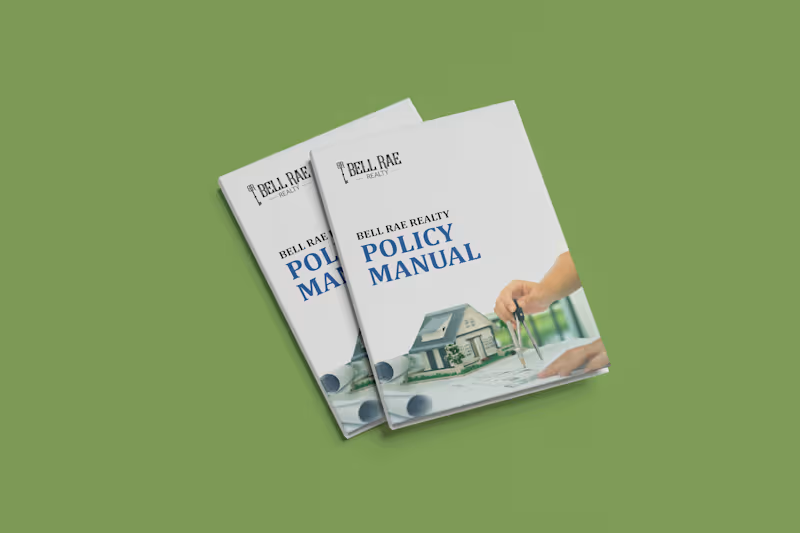
Bell Rae Realty – Corporate Policy Manual & Real Estate Employee Handbook Design
Project Overview
Developed a comprehensive, corporate policy manual and internal operational handbook for Bell Rae Realty. Designed to serve as an authoritative standard operating procedure (SOP) and onboarding document, the publication translates corporate governance, company values, and operational guidelines into a polished, structured, and easily navigable editorial format.
Key Deliverables & Features
Executive Cover & Brand Presentation: Created a clean, trustworthy cover featuring the company’s logo, prominent typography hierarchy, and context-driven real estate imagery to establish an authoritative corporate tone.
Structured Table of Contents / Appendix: Designed a dual-column index layout with dot leaders, clean page numbering, and an introductory banner image for seamless section navigation.
Mission & Core Values Layout: Arranged brand philosophy and core organizational pillars using a balanced two-page spread, incorporating branded blue icon containers, clear paragraph styling, and supportive workplace photography.
Clean Real Estate Visual Language: Implemented a corporate blue and white color system, subtle divider lines, and architectural/team imagery to reinforce professional credibility and brand consistency.
Grid Architecture & Production Setup: Built using a modular multi-column grid system, parent/master pages, baseline grid alignment, and accurate margins/bleeds for dual-purpose print production and interactive PDF distribution.
Role & Scope
Editorial & Publication Layout Design
Corporate Typography & Hierarchy Structuring
Table of Contents & Document Architecture Setup
Photo Masking, Color Balance & Asset Integration
Print & Digital Pre-Press Preparation
Tools Used
Adobe InDesign
Adobe Illustrator
Adobe Photoshop
1
165
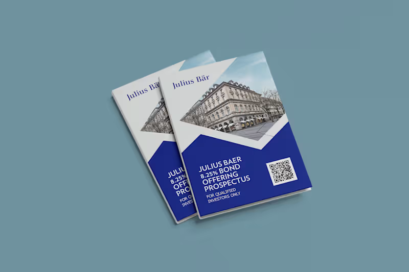
Julius Bär – Bond Offering Prospectus & Corporate Investment Brochure Design
Project Overview
Designed a comprehensive, high-end corporate investment prospectus and informational brochure for the Julius Bär 8.25% Bond Offering. Built specifically for qualified investors, this publication translates dense financial parameters, executive messaging, and regulatory disclosures into an elegant, highly structured, and reader-friendly format aligned with Swiss private wealth branding.
Key Deliverables & Features
Executive Cover Composition: Crafted an authoritative cover featuring crisp architectural imagery, sharp geometric brand accents, clear typography hierarchy, and a dedicated QR code for seamless digital access.
Financial Data & Feature Architecture: Organized complex bond specifications, investment terms, and regulatory compliance points into modular cards, structured comparison grids, and clean iconography for fast visual parsing.
Editorial Layout & Typography: Paired refined serif headlines with a modern sans-serif body type to ensure comfortable readability across narrative sections, including the executive letter from the CEO.
Corporate Visual Identity: Applied a disciplined color palette of deep navy blue, pure white, and high-resolution urban photography to maintain consistency with global financial market standards.
Grid System & Print Pre-Flight: Built with a precise multi-column grid system, parent/master pages, custom paragraph/character styles, and accurate margins/bleeds for flawless print-ready production.
Role & Scope
Publication & Editorial Layout Design
Information Architecture & Data Visualization
Image Curation, Masking & Composition
Print Production & Pre-Press Formatting
Tools Used
Adobe InDesign
Adobe Illustrator
Adobe Photoshop
1
196
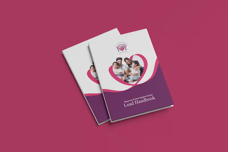
Knotts Family Agency – Resource Parent Support Group Handbook & Brochure Design
Project Overview:
Eti Knotts Family Agency-r Resource Parent Support Group-er jonno toiri kora ekটি professional handbook ebong informational booklet design। Ei booklet-er mul uddesho holo foster/resource parent-der proyojoniyo guidelines, agency-r history, guidelines ebong contact details shundor o structured bhabe tule dhora।
Key Deliverables & Features:
Cover Page Design: Heart ebong layered wave shape use kore family-centric ekটি warm, professional look toiri kora hoyeche।
Inner Page Layouts: Information hierarchy thik rekhe typography, clean bullet points, ebong iconography use kora hoyeche jate handbook ti read kora shohoj hoy।
Custom Imagery Integration: Family imagery gulo house/arch-shaped frames-e shundor bhabe placement kora hoyeche।
Brand Identity Consistency: Brand color palette (deep purple ebong vibrant magenta/pink) preserve kore consistency maintain kora hoyeche।
Print-Ready Quality: CMYK color profile, proper margins, bleeds ebong balanced grid system follow kore print-ready format-e toiri kora।
Role / Responsibilities:
Print & Editorial Design
Layout & Typography Styling
Photo Editing & Frame Treatment
Brand Color Harmonization
Tools Used:
Adobe InDesign
Adobe Illustrator
Adobe Photoshop
1
170
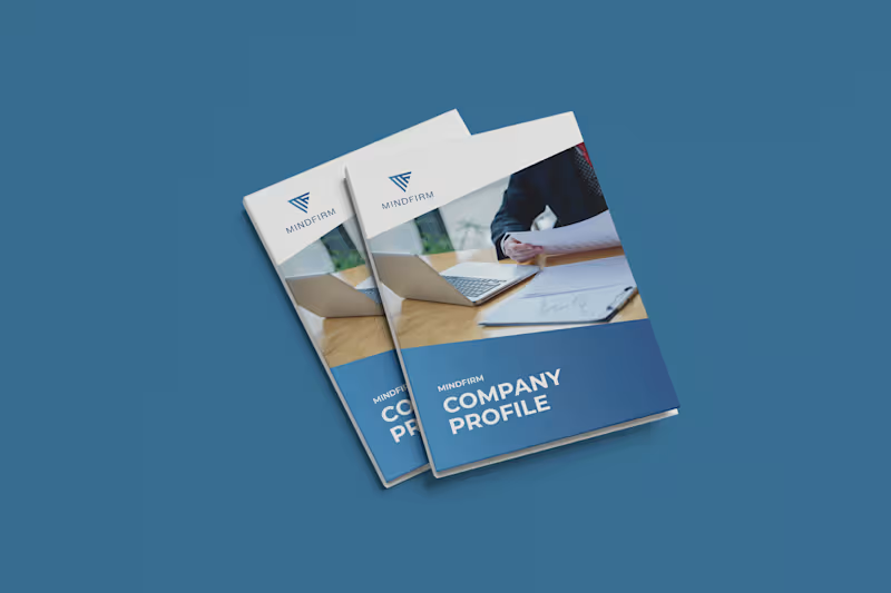
MindFirm — Corporate Company Profile & Capability Brochure Design
Subtitle / One-Line Summary
A modern, multi-page corporate company profile and capability brochure designed for MindFirm, establishing an authoritative corporate identity through clean editorial typography and structured data visualization.
Project Overview
MindFirm is a corporate consulting and advisory firm based in Saudi Arabia. The objective was to design a comprehensive company profile and capability deck to present to enterprise clients, prospective partners, and stakeholders.
The design challenge was to translate corporate messaging—including company values, service frameworks, and value propositions—into an executive-level publication that balances regional business standards with contemporary international layout aesthetics.
Role & Scope of Work
Role: Lead Publication & Layout Designer
Services:
Multi-page Editorial Layout Design
Information Architecture & Section Hierarchy
Custom Infographics & Process Diagramming
Imagery Curation & Framing Systems
Print-Ready Prepress & Interactive Digital Delivery
Design Approach & Execution
Geometric Brand Integration: Derived dynamic angular framing from the MindFirm logo icon, using sharp diagonal divisions across covers and inner spreads to create visual energy and brand cohesion.
Corporate Hierarchy & Spacing: Built on a systematic grid system with clear typographic hierarchy, ample whitespace, and bold corporate blue tones balanced against neutral gray and white backgrounds.
Service Architecture & Infographics: Designed scannable service matrices with dedicated iconography and created a customized concentric "MindFirm Values" circular diagram to make organizational principles visually digestable.
High-Impact Corporate Imagery: Paired modern corporate photography with regional business imagery, reinforcing regional authenticity while maintaining an executive tone.
Technical Production: Developed complete Parent Pages, Paragraph/Character Styles, and color profiles in Adobe InDesign, ensuring smooth print preflight (CMYK with bleeds) and web-optimized interactive distribution.
Deliverables
Print-Ready Multi-Page PDF (CMYK, 300 DPI, Bleeds & Crop Marks)
Interactive Screen PDF (Clickable Navigation & Hyperlinks)
Master InDesign (.INDD) Source Template & Style Assets
Tools Used
Adobe InDesign (Grid Systems, Style Sheets & Multi-Page Layout)
Adobe Illustrator (Vector Diagramming, Values Wheel & Iconography)
Adobe Photoshop (Image Retouching & Composition)
1
225

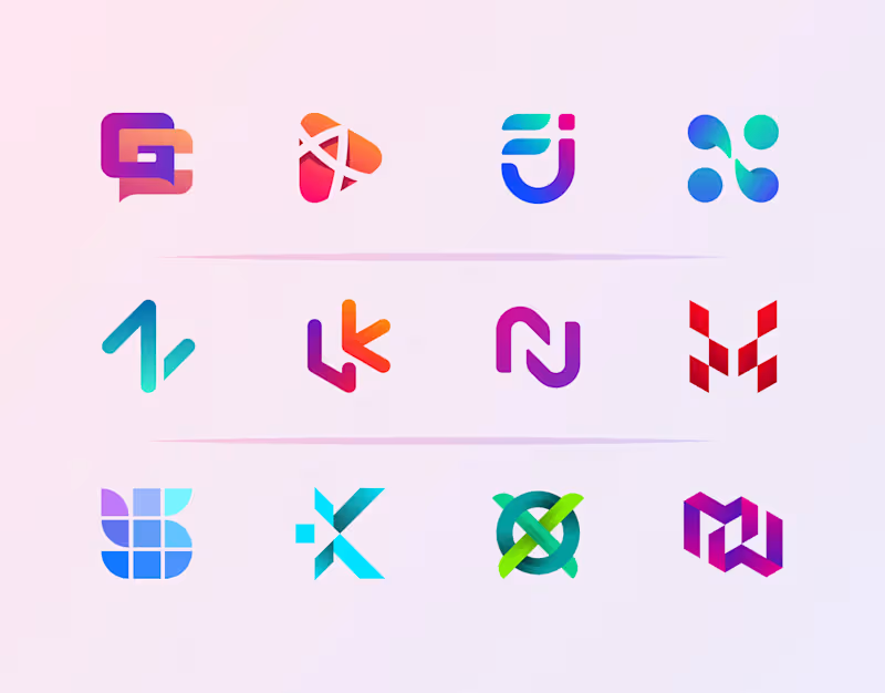
Crafting Unique Logos & Brand Identities


Textile Pattern and Tech Pack Design Expert
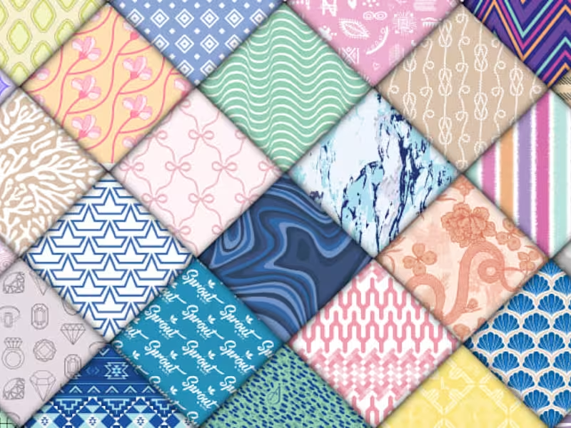
Bring your products to life with custom, high-quality seamless patterns! Whether you need vibrant textiles, modern packaging, chic branding assets, or digital backgrounds, I create versatile surface pattern designs tailored to your unique brand identity.
As showcased in jpg, my design capabilities span a wide variety of aesthetics—ranging from minimalist geometric structures and delicate florals to abstract marble textures, playful illustrations, and intricate bohemian motifs.
Let’s collaborate to create something beautiful. Hit the inquiry button, share your vision, and let's get started!
1
366

I completed these pattern design for few clients few month ago. I am a professional textile designer specializing in creating high-quality, continuous repeat patterns tailored to your exact brand aesthetic. Whether you need bold cultural statement prints, soft romantic florals, or clean modern geometrics, I deliver print-ready files optimized for industry-standard manufacturing.
Let's bring your creative vision to life! Contact me today to discuss your project, or place your order now to get started!
0
358
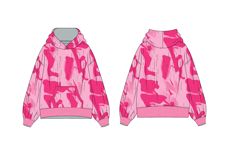
"I’m pleased to share a recent pattern+Tech Pack design concept for a streetwear hoodie, where I explored the tension between rigid structure and organic chaos.
The design utilizes a fragmented, almost 'digital artifact' motif—reimagining classic organic forms into sharp, pixelated, and gestural strokes. These aggressive, horizontal elements are layered over large, soft, abstract pink color blocks to create depth.
This technique, which I call 'structured decay,' was designed to give a classic streetwear silhouette a complex, textured, and forward-thinking aesthetic. The final result is a pattern with incredible rhythm and unexpected transitions.
#PatternDesign (https://www.linkedin.com/search/results/all/?keywords=%23patterndesign&origin=HASH_TAG_FROM_FEED) #TextileDesign (https://www.linkedin.com/search/results/all/?keywords=%23textiledesign&origin=HASH_TAG_FROM_FEED) #SurfacePattern (https://www.linkedin.com/search/results/all/?keywords=%23surfacepattern&origin=HASH_TAG_FROM_FEED) #FashionDesign (https://www.linkedin.com/search/results/all/?keywords=%23fashiondesign&origin=HASH_TAG_FROM_FEED) #StreetwearAesthetic (https://www.linkedin.com/search/results/all/?keywords=%23streetwearaesthetic&origin=HASH_TAG_FROM_FEED)
2
4
310

These pattern are made by me. I created these pattern few month ago for clients over the world.I am a professional textile designer specializing in creating high-quality, continuous repeat patterns tailored to your exact brand aesthetic. Whether you need bold cultural statement prints, soft romantic florals, or clean modern geometrics, I deliver print-ready files optimized for industry-standard manufacturing.
0
360