Freelance Event Planners in Bangladesh
Sign Up
Post a job
Sign Up
Log In
Filters
2
Projects
People
Orbix Studio
max
Dhaka, Bangladesh
UX-led product design & dev agency for b2b saas and AI
$25k+
Earned
193
Followers
expert
Follow
Message
UX-led product design & dev agency for b2b saas and AI
1
Finding events nearby has always been easy. Finding them beautiful has never been. This event discovery app was designed for people who live for the next experience: concerts, sports finals, cinema, and social gatherings all surfaced by location, category, and date without a single moment of friction. Scattered event listings with no visual hierarchy. Ticket details buried behind multiple taps. No sense of what's happening today versus this week. Calendar views that feel like spreadsheets instead of schedules. Nearest events filtered by week with full venue photography. Category tabs that switch context instantly. Event detail pages with host profiles, door times, and a single "Buy Ticket" CTA. A December calendar view where every upcoming event anchors to its exact time slot. Popular events ranked with pricing visible before you click. A mobile experience that makes discovering and booking events feel as exciting as attending them. Dark. Focused. Always live. Designing an events platform, ticketing app, or social discovery product that needs to feel this considered? Let's build it together. #MobileDesign #EventApp #DarkUI #AppDesign #UIDesign #ContraFreelance #TicketingApp #UIUXDesign Tools: Figma ยท Jitter
1
365
1
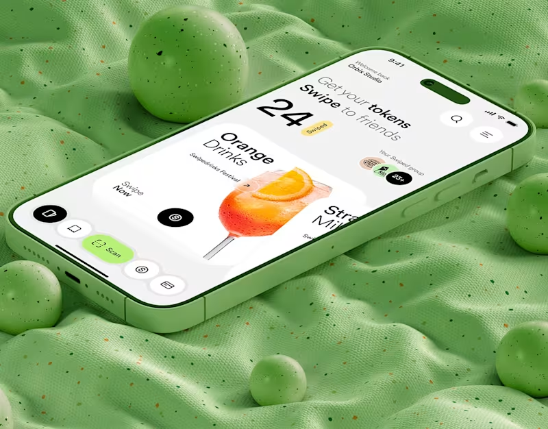
Swipe Drinks | Mobile App
1
12
24
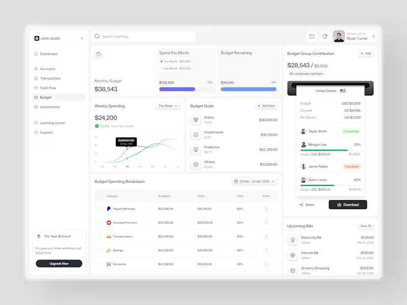
Most people set a budget once and forget it exists until it's too late. This dashboard was designed to fix that. Weekly spending at $24,200, up 12.5% from last month. Monthly budget at $38,543 with 75% already allocated. Budget goals tracked by category salary, investments, freelance, and others each with a completion percentage and a dollar target that makes progress visible before the month ends. The group contribution panel takes it further. Four members. One shared budget of $5,000. Taylor completed. Morgan at 70%. Quinn at 45%. Jamie cancelled. A collaborative finance tool that makes shared budgeting feel as clean as personal budgeting should. Upcoming bills electricity, internet, grocery listed before they hit. A spending breakdown table that shows exactly what was budgeted, what was spent, and how much is left in every category. This is what budget management looks like when the design treats users like they actually want to be in control of their money. Does this feel like a dashboard that would change how a team manages their finances together? ๐ Designed by Orbix Studio Tools: Figma #DashboardDesign #FintechUI #BudgetApp #UIDesign #WebDesign #ContraFreelance #ProductDesign #SaaSUI
11
24
2.2K
25
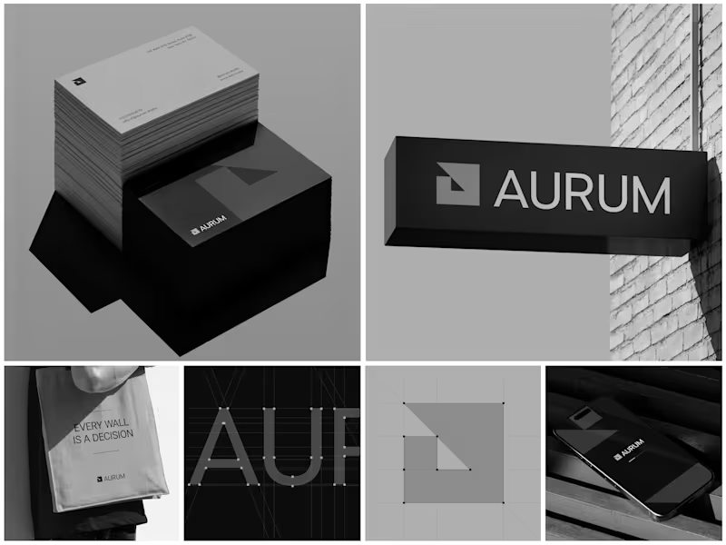
Aurum - Brand Identity System When Aurum came to me, they had a name and a vision a studio that wanted to feel deliberate, architectural, and unapologetically bold in every space it touched. No logo, no system, just a line that stuck with me from our first conversation: "every wall is a decision." That phrase became the seed for the entire identity. I started with the simplest possible geometry a square split by a triangle and built the mark from a strict construction grid so it would hold its proportions at any size, from a business card to a building-mounted sign. Once the mark was locked, I stripped the palette down to black, white, and grey. No color to hide behind just contrast, shadow, and negative space doing the work. From there, the system grew outward: letterpress-style stationery with generous shadow and texture, exterior signage designed to read cleanly against brick and daylight, a minimal mobile app screen, and a tote bag that turned the brand's own tagline into a quiet piece of merchandise. Every touchpoint had to pass the same test does it still feel like Aurum at this scale, in this material, from this distance? The result is an identity that's confident without shouting restrained enough for a business card, strong enough for a wall. Curious how I'd approach building out a system like this for your own brand want to talk through it?
9
25
1.4K
Event Planner
(2)
Follow
Message
Abdul Awal
pro
Dhaka, Bangladesh
Webflow, Framer, Astro, WordPress & Shopify Agency | UI/UX
New to Contra
Follow
Message
Webflow, Framer, Astro, WordPress & Shopify Agency | UI/UX
0
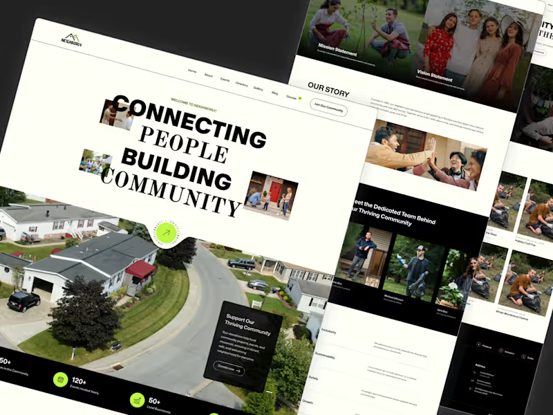
Neighborly - Community & Nonprofit Website Template
0
2
0
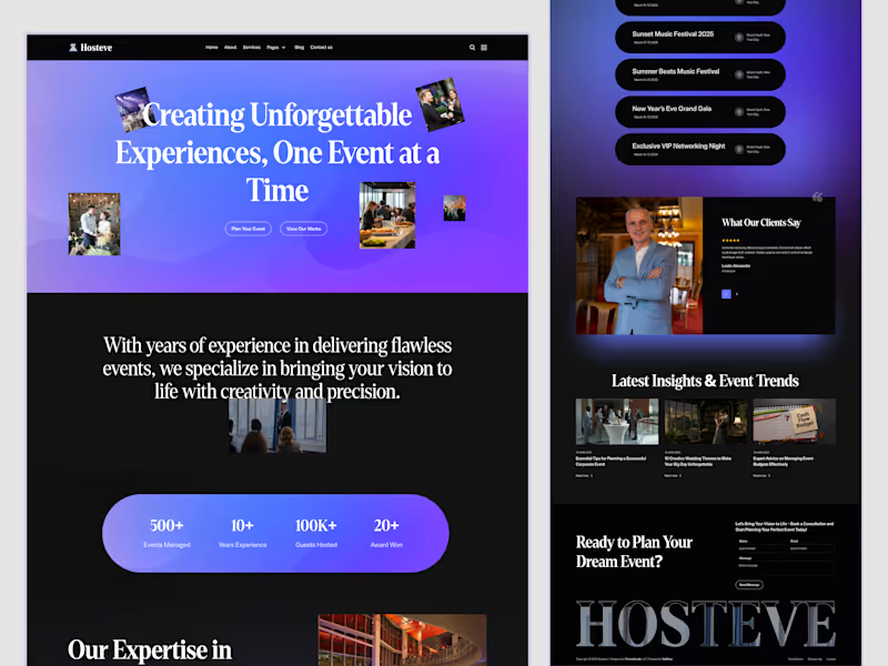
Event & Conference Website Design - Hosteve
0
2
1
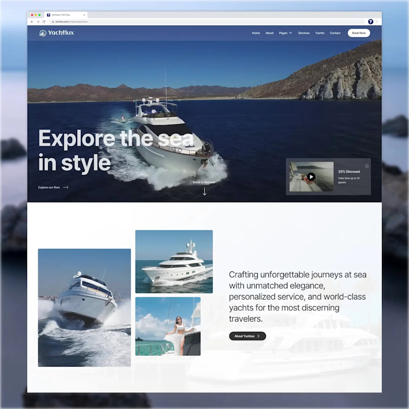
Luxury Yacht Rental Business Website template created as Figma, Webflow, Astro, Framer versions.
1
195
1
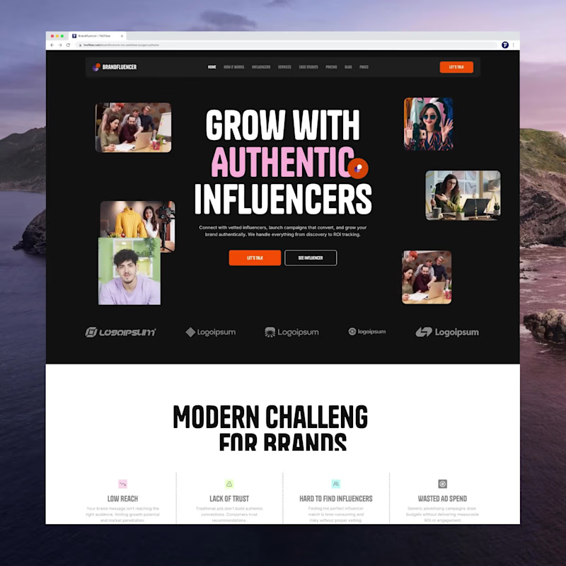
Multipurpose Influencer Marketing Website Template created as Webflow, Framer. Astro, Figma, HTML Versions.
1
192
Event Planner
(2)
Follow
Message
Enamul Haque
Pabna, Bangladesh
Creative Product developer on Webflow and Framer
Follow
Message
Creative Product developer on Webflow and Framer
0
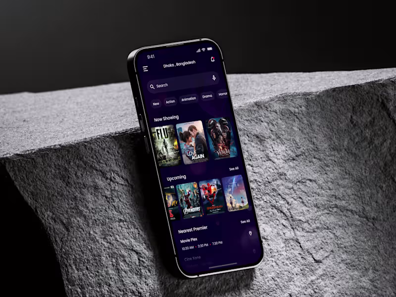
Movie Ticket Booking App: Cinemol
0
1
0
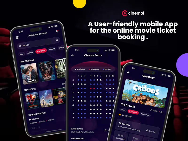
Cinemol-Movie Ticket Booking App
0
1
0
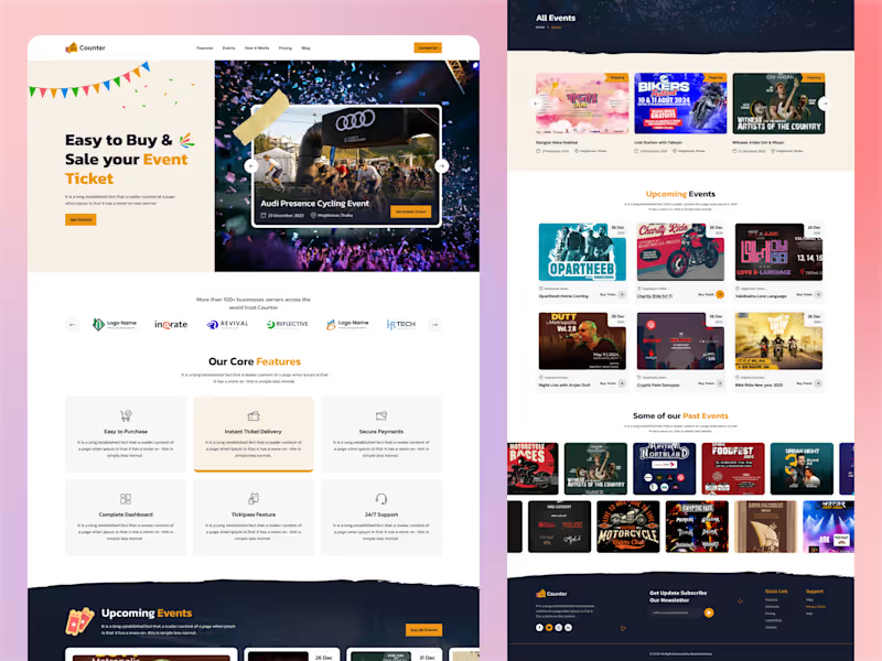
Event Ticket Selling Website UI/UX Design for Counter
0
1
0
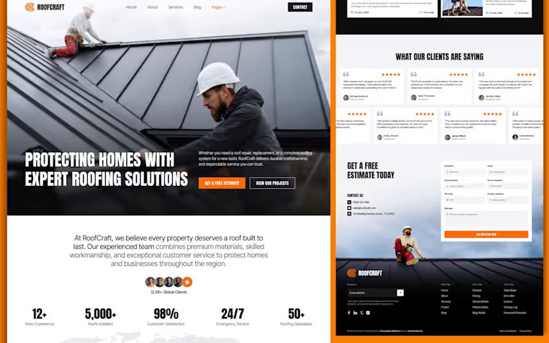
High-Converting Landing Page for Modern Roofing Contractors
0
2
Event Planner
(3)
Follow
Message
Md. Abdur Rahman
Pabna, Bangladesh
The designer that you can trust.
6
Followers
Follow
Message
The designer that you can trust.
4
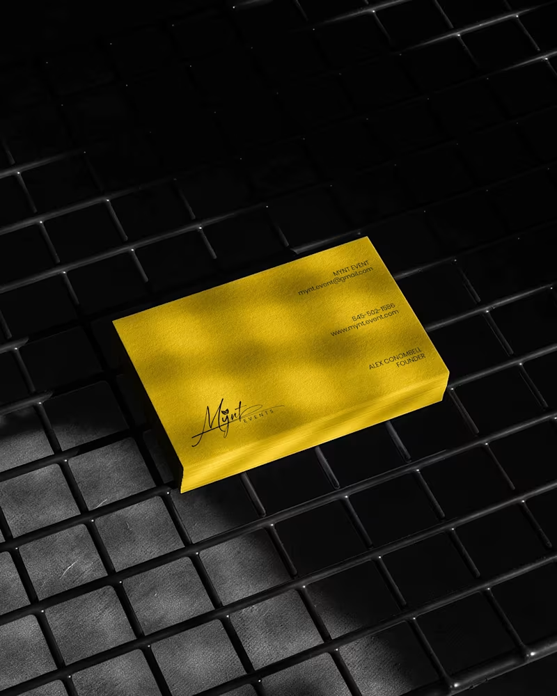
Luxury Brand Identity System for a Premium Event Planning Business PROJECT DESCRIPTION: Mynt Events is a premium event planning business built around moments that matter โ proposals, curated celebrations, and experiences where every detail is considered and nothing is left to chance. The founder came to me with a business that had already outgrown its brand. The work was operating at a premium level. The identity wasn't communicating that yet. The brief was clear: build a complete brand identity system that positions Mynt Events as the obvious choice for clients who already know what they want and are deciding who to trust with it. The Strategic Starting Point Every decision in this project started with a single question: what does a client need to feel the moment they encounter this brand for the first time? For Mynt Events, that feeling needed to be confidence. Trust. The quiet certainty that this is a business that handles things properly โ that the moment they're planning will be in the right hands. That emotional target shaped every mark, every color choice, and every surface application that followed. The Logo The primary mark is a signature script logo with a leaf detail structurally embedded within the letterforms. The script was chosen deliberately โ in the events industry, clients are trusting you with moments that cannot be redone. A signature communicates personal commitment. It feels authored, not assembled. The leaf element does secondary brand work quietly. It signals organic intention, care, and attention to detail without requiring explanation or a separate icon. The underline sweep grounds the composition and gives it the horizontal confidence it needs to hold across wide-format surfaces โ packaging lids, signage panels, and environmental applications where a floating mark would lose presence. A monogram M was developed as a secondary mark for applications where the full signature loses legibility at small scale โ product labels, cap patches, and interior packaging details. The Palette Gold and black. Not chosen for trend. Chosen for emotional function. Gold carries warmth, occasion, and perceived value โ the feeling of something worth celebrating. Black carries authority, precision, and restraint โ the feeling of a business that delivers without drama. Together they position Mynt Events exactly where it needs to sit: celebratory but controlled, personal but professional. The palette was tested across matte, gloss, foil, backlit, and fabric applications to confirm it held integrity across every surface in the system without compensation or adjustment. The Full Identity System Every deliverable was designed as part of a single coherent brand expression โ not a collection of individual design tasks, but a system where every piece reinforces every other piece: โ Primary signature logo and monogram secondary mark โ Full brand palette and typography hierarchy โ Premium gold foil business card โ Luxury magnetic gift box with full interior branding โ Ring box and product packaging application โ Branded tote bag โ Apparel โ t-shirt and structured cap with patch application โ Backlit environmental signage panel โ Digital UI and mobile wallpaper application The Result A brand identity system that closes the gap between what Mynt Events delivers and what a client sees before they ever make contact. The brand now works at a proposal ring box and a storefront signage panel simultaneously โ with the same presence, the same authority, and the same unmistakable identity at every scale. That's not styling. That's positioning. And positioning is what turns a great business into the obvious choice. SERVICES INCLUDED IN THIS PROJECT: Brand Strategy, Logo Design, Visual Identity System, Monogram Design, Business Card Design, Luxury Packaging Design, Gift Box Design, Apparel Design, Environmental Signage Design, Digital UI Application, Brand Collateral Design, Full Brand System KEYWORDS: Luxury Event Brand Identity, Signature Logo Design, Event Planner Branding, Gold Brand Identity, Script Logo Design, Visual Identity System, Custom Logo Design, Brand Identity Designer, Luxury Logo Design, Event Brand Design, Handcrafted Logo Design, Premium Brand Identity, Calligraphy Logo Design, Brand Mockup Design, Logo Design Concept, Black And Gold Branding, Event Planner Logo, Signature Brand Identity, Full Brand System, Brand Strategy Design
2
4
146
2
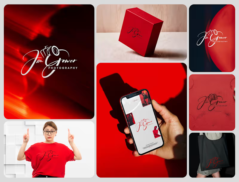
Signature Brand Identity System for a Photography Business PROJECT DESCRIPTION: Jim Gower is a professional photographer who needed more than a logo. He needed a complete brand identity that could represent his work at every level โ from a business card handed to a client after a shoot to a lightbox sign above a studio entrance. The brief was clear: build something that feels personal, premium, and immediately recognizable as belonging to one person and one vision. The Approach Every decision in this project started with strategy before it touched aesthetics. Who is Jim Gower to his ideal client? What feeling should someone walk away with after their first encounter with his brand? What does premium mean in the photography space right now โ and how do you stand apart from it without alienating it? The answers shaped everything that followed. The Work The primary logo is a signature script with the camera body structurally integrated into the letterforms โ the "G" in Gower becomes the lens housing, making the mark read as both a name and a profession without requiring a separate icon. The script carries energy and movement, referencing the intuitive, fast-moving nature of working photographers. The crimson brand palette was selected for emotional weight โ confident, warm, and saturated enough to hold presence across both physical and digital surfaces without compromise. The full system was then applied and stress-tested across every client touchpoint: โ Primary and secondary logo variations โ Brand color palette and typography system โ Business card design โ Premium gift box packaging โ Tote bag and apparel โ Digital UI mockup for web and mobile โ Environmental signage and lightbox application The Result A brand identity system that positions Jim Gower not as a photographer with a logo, but as a brand with a presence โ one that commands attention, communicates quality instantly, and scales from a phone screen to a storefront without losing a single point of its power. SERVICES INCLUDED IN THIS PROJECT: Brand Strategy, Logo Design, Visual Identity System, Brand Collateral Design, Packaging Design, Apparel Mockup, Digital UI Application, Environmental Signage Mockup Photography Logo Design, Signature Logo Design, Brand Identity System, Photographer Branding, Script Logo Design, Visual Identity Design, Custom Logo Design, Brand Identity Designer, Logo Design Process, Creative Brand Design, Handcrafted Logo Design, Photography Brand Kit, Premium Brand Identity, Calligraphy Logo Design, Brand Mockup Design, Logo Design Concept, Red Brand Identity, Photographer Visual Identity, Brand Strategy Design, Full Brand System
2
101
1
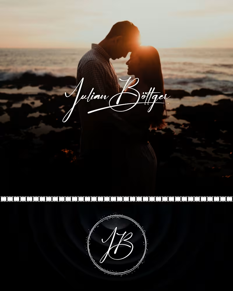
Julian Bรถttger โ Full Brand Identity for a Wedding & Portrait Photographer A photographer's work lives and dies by first impressions. Julian's images were exceptional. His brand wasn't keeping up. We built a complete visual identity from the ground up โ designed to feel personal, timeless, and scalable across every surface it would ever touch. What was delivered: โ Custom hand-lettered signature logotype (primary mark) โ Monogram seal (JB) for watermarks, merch, and secondary use โ Business card system โ black and white versions โ Studio signage mockup โ Apparel (t-shirt + tote bag) โ Stationery and print collateral โ Film-strip and overlay assets for video content The brief was clear: no templates, no stock fonts, nothing generic. Every element was drawn or crafted specifically for this brand. The identity now works at every scale โ from a coffee mug to a 6-foot sign โ and across every context, from dark editorial photography to bright lifestyle imagery. Available for similar projects. Inquire to discuss scope and timeline. Brand Identity, Logo Design, Visual Identity, Graphic Design, Photography, Creative Services, Wedding Industry, Brand Guidelines, Print Design, Merch Design
1
53
5
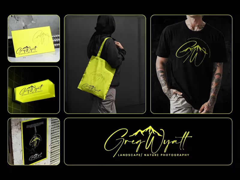
Greg Wyatt โ Landscape & Nature Photography | Full Brand Identity System Project Summary: A complete brand identity built for a landscape and nature photographer who needed more than a logo โ he needed a visual world that matched the scale of what he shoots. The Brief: Greg Wyatt captures landscapes the way most people only dream of seeing them. The work is cinematic, emotional, and deeply personal. But his brand wasn't reflecting any of that. The goal was to build a cohesive identity system from the ground up โ one that could hold its own across every surface it touched. The Approach: Every decision in this project started with one question: does this feel like standing at the edge of something vast? The signature wordmark was hand-lettered in style to feel personal and authorial โ because the best landscape photography is never accidental. It carries the photographer's fingerprint. The mountain mark was integrated directly into the initials rather than placed beside them, making the connection between artist and subject inseparable. Color was the most strategic call in this project. Neon yellow on deep black creates the kind of contrast that stops a scroll, but it wasn't chosen for that reason alone. It references the exact quality of light that makes a great outdoor photograph โ that electric moment just before or after darkness. The brand lives in that moment. The system was then pressure-tested across real-world applications: a neon illuminated storefront sign, business cards, tote bags, apparel, and a brand pattern โ because a logo that only works on a white background isn't a brand system. It's a starting point. What Was Delivered: โ Primary signature wordmark โ Mountain monogram mark โ Circular badge logo โ Submark and watermark variations โ Brand color and typography system โ Business card design โ Tote bag design โ T-shirt / apparel design โ Illuminated signage mockup โ Brand pattern / texture โ Full brand presentation The Result: A brand identity that works as hard as the photographer behind it. Cohesive across every format. Instantly recognizable. Built to grow with the brand rather than date it. Services Provided: Brand Identity Design ยท Logo Design ยท Visual Identity ยท Brand Strategy ยท Print Design ยท Merch Design ยท Brand Presentation Keywords: Brand Identity, Logo Design, Photography Brand, Signature Logo, Handwritten Logo, Mountain Logo, Nature Photography Branding, Outdoor Brand Identity, Monogram Logo, Visual Identity System, Photographer Branding, Custom Logo Design, Dark Brand Aesthetic, Neon Branding, Apparel Design, Print Collateral, Brand Strategy, Creative Direction, Full Brand System, Freelance Brand Designer
6
5
86
Event Planner
(1)
Follow
Message
Md.Saidur Rahman
Dhaka, Bangladesh
Eye-Catching Trade Show Booth & Signage Design Specialist
Follow
Message
Eye-Catching Trade Show Booth & Signage Design Specialist
0
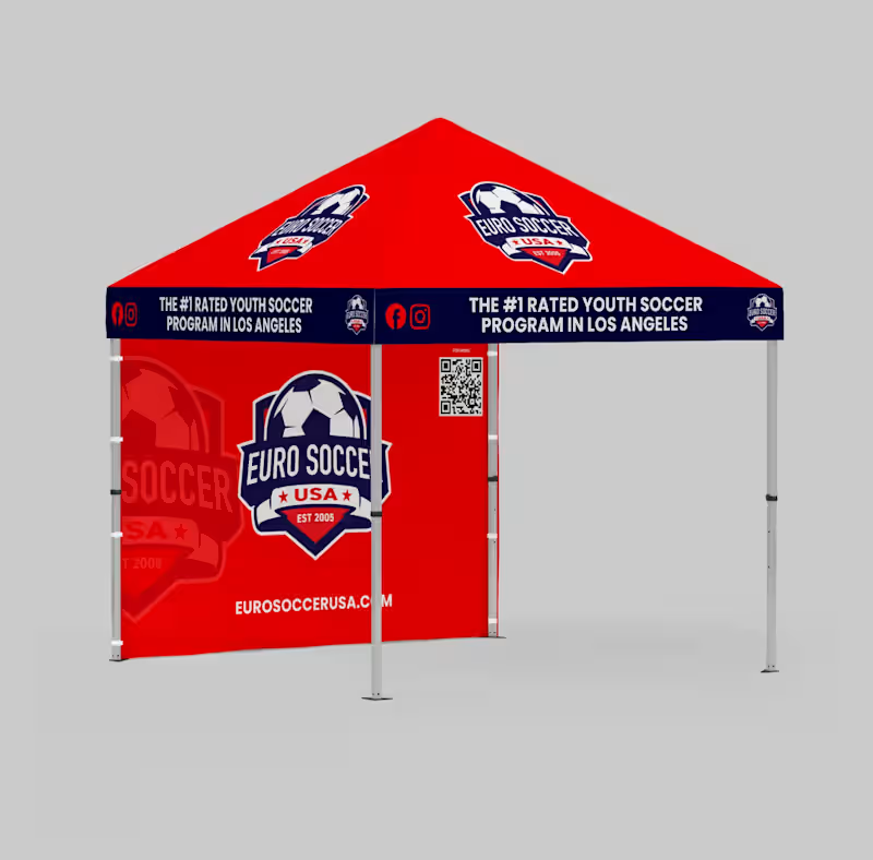
Hereโs a fresh rewritten version (within ~600 characters): Great branding is built in the details. โจ This event setup for Euro Soccer USA combines bold visuals with durable materials for maximum impact. The red canopy, custom teardrop flags, and clean pop-up banner create a strong, unified look that stands out in any crowd. From single pieces to full event systems, I design and deliver branding thatโs made to perform and last. Need high-impact event graphics? Letโs connect. #BrandingSolutions #EventMarketing #CustomTents #SoccerBranding #MadeToLast #DesignAgency #Signage
0
65
0
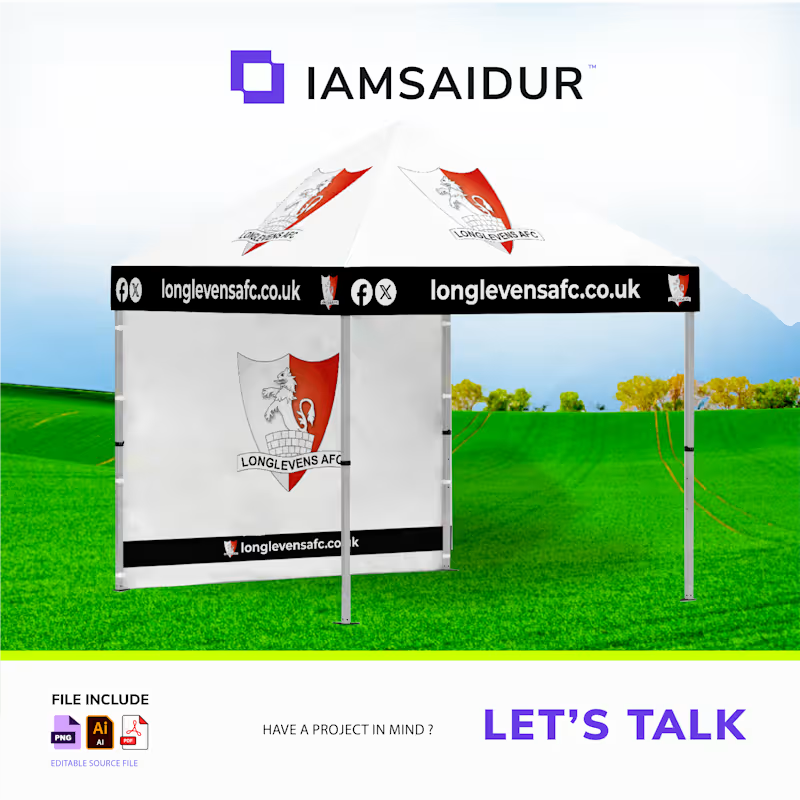
Longlevens AFC Canopy Branding Project For outdoor sporting events, visibility is everything. This custom canopy branding project for Longlevens AFC was designed to deliver maximum brand exposure while maintaining a clean, professional, and highly recognizable presence on the field. Design Highlights Bold High-Contrast Branding A striking black valance combined with a clean white canopy creates exceptional contrast, ensuring the branding remains visible and impactful in all outdoor lighting conditions. Optimized Typography for Distance Viewing Website and social media information were carefully sized, positioned, and spaced to maintain excellent readability from both near and far viewing distances. Dominant Club Identity Large-scale club crests positioned on the canopy peaks reinforce team recognition and establish a strong visual presence across the event space. Production-Ready Design Execution As a graphic designer specializing in exhibition, event, and large-format branding, I create print-ready artwork engineered for real-world production. Every design is built to precise manufacturer specifications, ensuring flawless output while maintaining a strong visual strategy. With more than 1,000 exhibition booths, event displays, and branded environments delivered worldwide, my focus remains on combining creative impact with technical accuracy through CMYK color management, high-resolution artwork, and production-optimized layouts. Let's Work Together Looking for a custom canopy, gazebo, event tent, or outdoor branding solution? Send me a message to discuss your next project and bring your brand to life with high-impact, production-ready design.
0
82
0
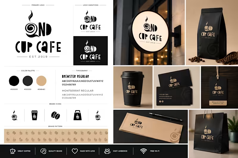
I design bold, minimal, production-ready brand identity systems for cafรฉs, food brands, and lifestyle businesses. This project, 2ND CUP CAFE, is a full identity system built around clean typography, monochrome aesthetics, and scalable real-world applications โ including packaging, signage, and merchandise. Focused on clarity, consistency, and a premium feel โ designed to stand out in real environments, not just screens. Letโs build something memorable. โโจ #CafeBranding #BrandIdentity #LogoDesign #PackagingDesign #MinimalDesign #VisualIdentity #CoffeeBrand #ModernBranding
0
52
1
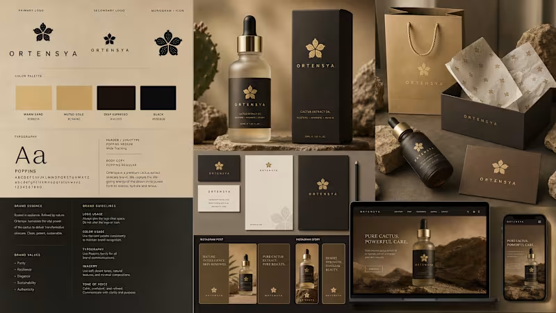
Designing Identity: From Brand Strategy to Packaging Experience โจ Every great brand identity should tell a story before a single word is read. For Ortensya, a premium cactus-extract skincare brand rooted in the resilience of desert nature, the goal was to craft a visual ecosystem that balances earthy authenticity with elevated luxury. Hereโs a closer look into the design system: โฆ The Palette A curated minimalist spectrum featuring Warm Sand (#D8B27A) and Muted Gold (#C9A96E) inspired by desert landscapes โ grounded with Deep Espresso and rich Black to create depth, contrast, and premium visual weight. โฆ Typography Built around Poppins โ Medium with wide tracking for headlines and clean Regular weights for body copy. The geometric sans-serif structure delivers clarity, sophistication, and seamless readability across both print and digital applications. โฆ Packaging & Brand Touchpoints From matte black rigid boxes and frosted glass dropper bottles to debossed stationery and luxury shopping bags, every tactile detail reinforces the brandโs balance between raw nature and refined elegance. โฆ Digital Experience A responsive, image-driven UI/UX system designed for immersive storytelling โ ensuring the brand essence transitions fluidly from desktop to mobile and social platforms. A strong identity system is never just a logo. Itโs a complete emotional and sensory experience across every touchpoint. Whatโs your favorite element of this branding system? ๐ #GraphicDesign #BrandIdentity #PackagingDesign #VisualIdentity #UIUXDesign #Typography #LuxuryBranding #CosmeticBranding #BrandStrategy #MinimalDesign #MockupPresentation #CreativeDirection
1
1
82
Event Planner
(1)
Follow
Message
Rabbani Rasha Alvy
Bangladesh
Top notch Product Design
Follow
Message
Top notch Product Design
0
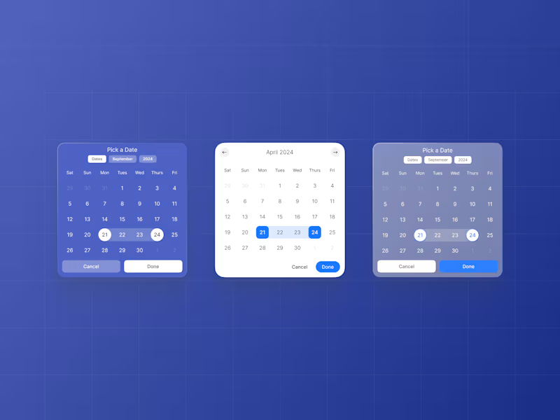
Minimal Calendar Ui Design
0
1
0
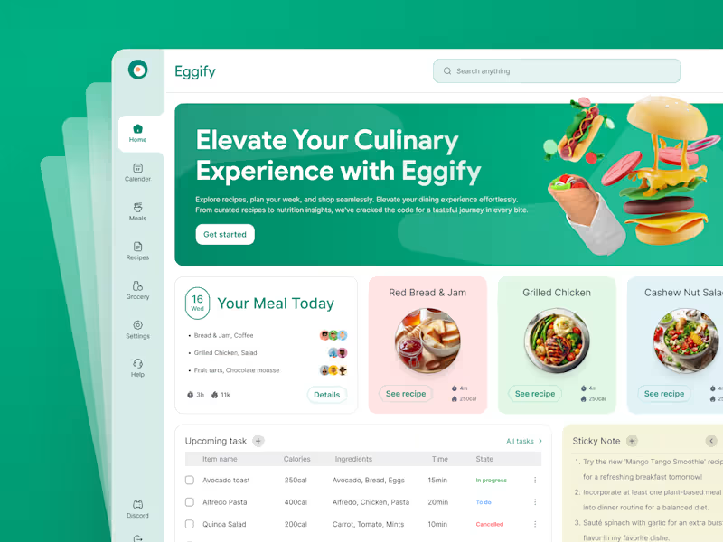
SaaS Food Dashboard - Meal Planner Eggify
0
3
0
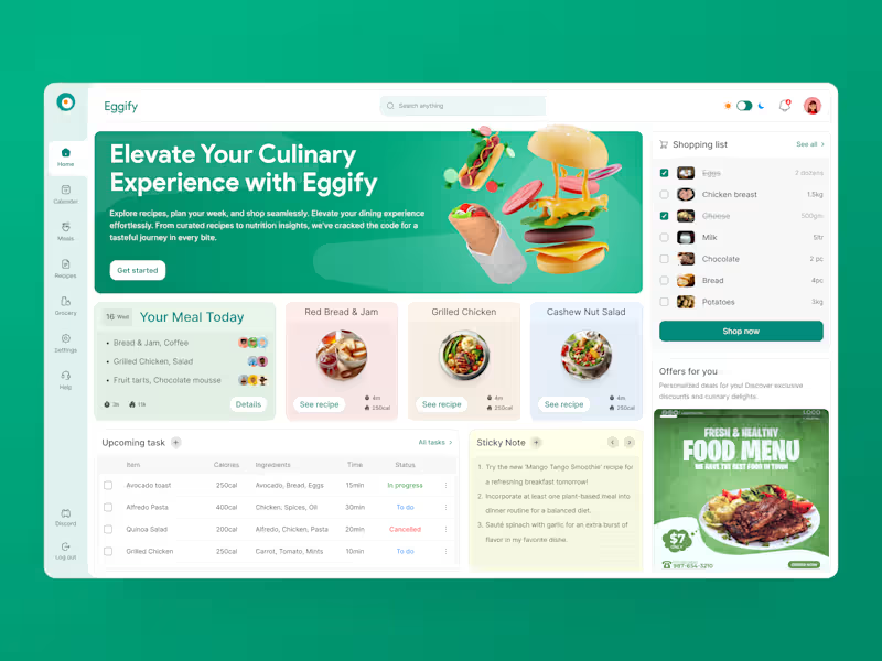
SaaS Food Dashboard - Daily Meal Planner
0
2
0
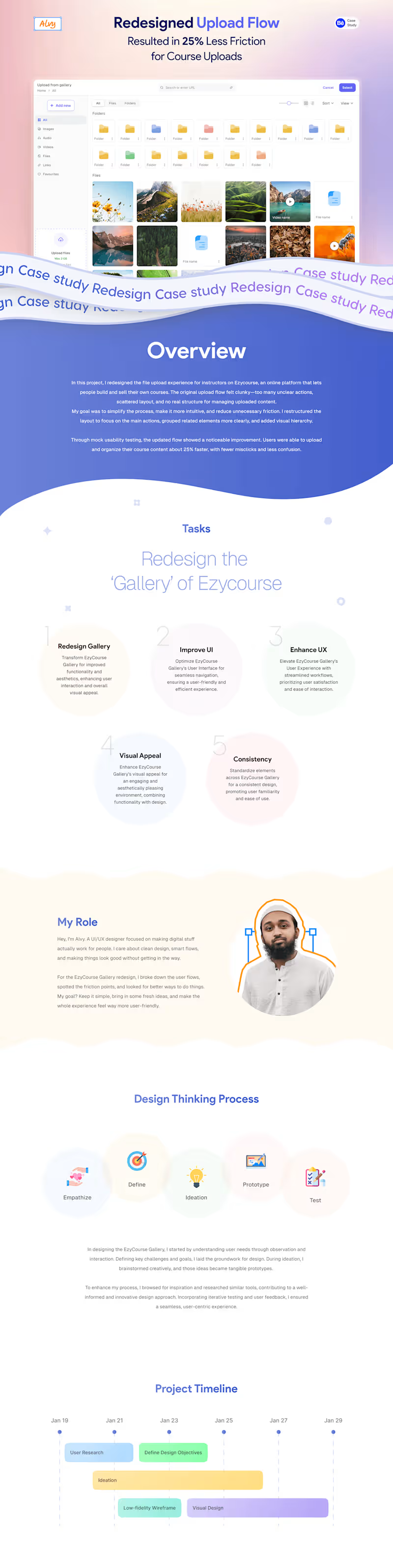
UX Case Study - Course platform upload flow redesign
0
1
Event Planner
(3)
Follow
Message
Dipto Malo
Dhaka, Bangladesh
Motion Graphics Storyboard Artist
New to Contra
Follow
Message
Motion Graphics Storyboard Artist
0
VIDIOSA - Promo Video
0
7
0
Playbook โ File Management for Creatives
0
91
0
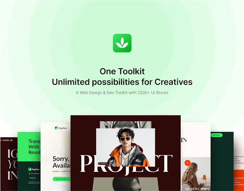
Pagifye - Promo video case study
0
2
0
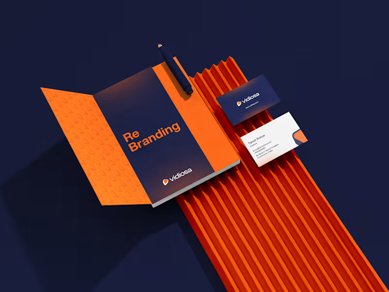
Vidiosa Rebranding Case Study
0
4
Event Planner
(1)
Follow
Message
Sharif Hossain
Savar Union, Bangladesh
Head Of Creative
Follow
Message
Head Of Creative
0
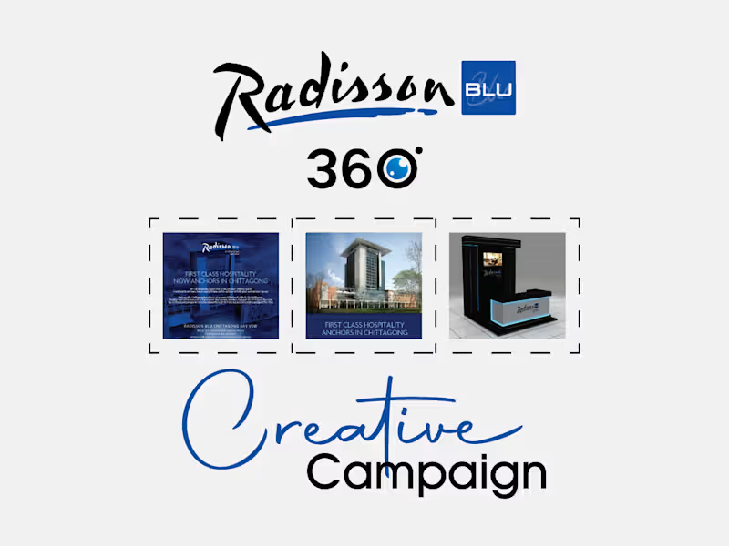
Hotel Radisson Blu Chittagong Bay View Print Ad & more
0
6
0
Few of My Designed Logos
0
4
0
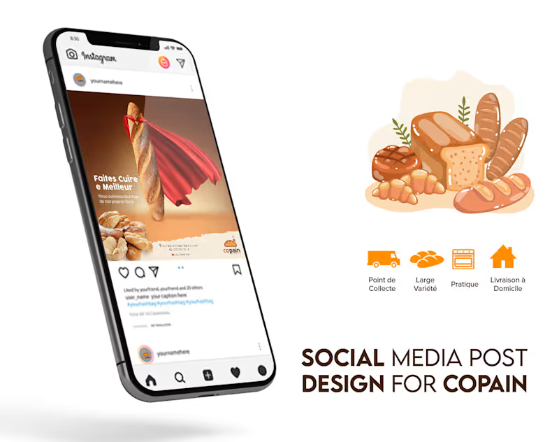
Copain: son pain, chez soi
0
3
View more โ
Event Planner
(1)
Follow
Message
Explore people