Projects using Google AI Studio in BahawalpurProjects using Google AI Studio in BahawalpurSabae Titanium Optics: A Complete E-commerce Website for Premium Eyewear
WHAT IS THIS PROJECT?
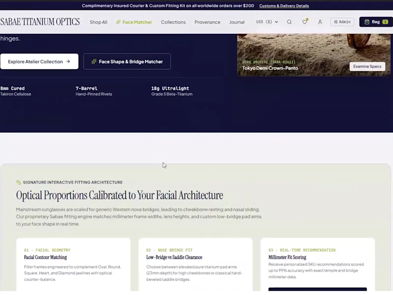
Sabae Titanium Optics is a full online store for a luxury eyewear brand that sells handcrafted titanium and acetate frames. I designed and built it as a complete, ready-to-launch storefront. It covers everything from the first impression to checkout, plus the tools the owner needs to run the business.
WHO IS IT FOR?
• Eyewear and optical brands that want to sell online
• Luxury and premium product brands (watches, jewelry, fashion accessories)
• Store owners who want a professional website that builds trust and converts visitors into buyers
• Startups launching a new e-commerce brand
THE PROBLEM IT SOLVES
Eyewear is one of the hardest products to sell online. Customers worry about three things:
Will these frames suit my face shape?
Will they fit my nose and temples comfortably?
Is this brand trustworthy enough for a premium purchase? When customers are unsure, they leave, or they buy and return the product. Both cost the store money. This website is built to remove that uncertainty.
HOW IT SOLVES IT
Face Matcher (smart recommendation tool)
• Recommends frames by face shape: oval, round, square, heart, and diamond
• Matches nose-bridge fit (low-bridge or saddle style)
• Uses temple and bridge measurements to suggest the best fit
• Acts like a virtual optician, so the customer feels guided
Professional storefront
• Curated "Signature Icons & Hero SKUs" section with badges, ratings, and SKU codes
• Clear product cards with short, useful descriptions
• Wishlist and a live shopping bag with item count
Built for international customers
• Multi-currency selector (USD and more)
• Shipping and customs information, and an insured courier message in the top bar
Brand storytelling (Optical Journal)
• Editorial articles about craftsmanship, materials, and technique
• Each article links to a featured product, so content helps sell
Trust signals
• Insured courier, 30-day trial, lifetime hinge warranty, and hand-finishing details
• Placed where customers make decisions, which reduces hesitation
Admin panel
• The owner can manage products and store content without touching code
Premium design
• Clean, editorial look with elegant typography and generous spacing
• Responsive on mobile, tablet, and desktop
BENEFITS FOR THE BUSINESS OWNER
• More sales: guided recommendations help customers decide faster
• Fewer returns: better fit information means fewer wrong purchases
• Higher trust: a polished design and clear policies make the brand look established
• Global reach: multi-currency and shipping info make it easy to sell abroad
• Better engagement: the journal brings in visitors and keeps them reading
• Easy management: the admin panel saves time and developer costs
BENEFITS FOR THE CUSTOMER
• Finds frames that suit their face without visiting a store
• Understands fit, materials, and warranty before buying
• Enjoys a fast, clean, and easy shopping experience
WHY WORK WITH ME
• I think about the business goal first, not only how the site looks
• I combine design, development, and user experience in one project
• I understand international clients and communicate clearly in English
• I deliver clean, responsive, ready-to-use work
• I can build a similar store, or a fully custom one, for your brand
WHAT YOU CAN GET FROM ME
✅ Complete e-commerce website design and development
✅ Smart product-finder or recommendation features
✅ Admin dashboard and store management
✅ Mobile-responsive, modern UI
✅ Fixes, improvements, and redesigns for an existing store
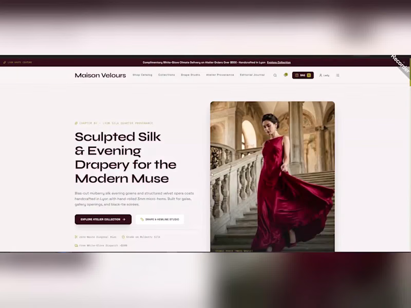
Have a store or product idea? Message me and let's build something your customers will trust. Want a luxury online boutique that sells silk evening wear the way a Lyon atelier would, and that you can manage yourself? MAISON VELOURS is a complete e-commerce website with a customer storefront and a built-in store admin, designed to turn visitors into loyal clients.
THE GOAL
High-end fashion buyers expect elegance, trust, and effortless shopping, while the brand owner needs full control without touching code. This project delivers both in one system.
CUSTOMER STORE
Editorial hero: "Sculpted Silk & Evening Drapery for the Modern Muse" with clear calls to action
Shop Catalog and Collections: clean product grids with prices, collector editions, wishlist hearts, and quick add to bag
Shop-the-Look viewer: tap a hotspot on a runway photo to see the gown and add it to the bag
Drape & Hemline Studio: customers choose grain, silk colorway and shape, and see the live configured price
Atelier Provenance: brand story, Lyon silk heritage and zero-waste pattern making
Editorial Journal and Buying Guides: content that builds trust
Client account: loyalty points, VIP tiers, saved addresses, payment tokens and order history
Search, shopping bag and a responsive layout
STORE ADMIN AND CUSTOMIZATION ENGINE
Dashboard: revenue, average order value, orders and low-stock alerts
Catalog management, order fulfilment and alterations tracking
Zero-code theme settings and international treasury overview
Low-stock radar with one-click restock
DESIGN APPROACH
Elegant typography, a deep burgundy and cream palette, generous white space and large editorial photography create a premium feeling on mobile, tablet and desktop.
RESULTS FOR THE BRAND
A premium first impression
Custom orders handled inside the store
Loyal clients through VIP tiers
Full control from one admin panel
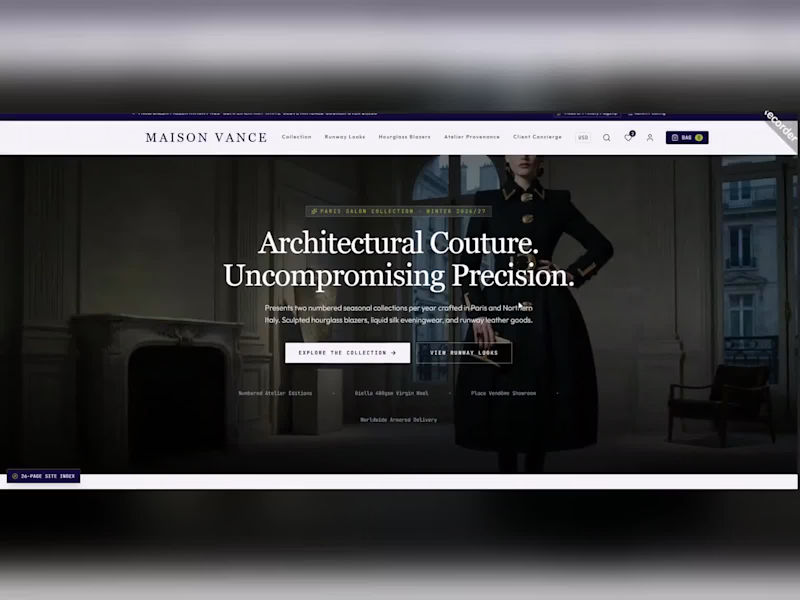
Watch the full-screen recording to see everything in action. I can build a store like this for your fashion, jewellery, or lifestyle brand. Message me to start. Want a luxury fashion store that feels like a Paris atelier and sells like a pro? MAISON VANCE is a complete high-end e-commerce website concept for a couture brand, designed to turn browsers into confident buyers.
THE GOAL
Luxury shoppers expect elegance, trust, and effortless shopping. This website delivers a refined brand story together with a fast, easy store experience on every device.
WHAT I BUILT (26-page site)
Cinematic hero: "Architectural Couture. Uncompromising Precision." with clear calls to action
Collection pages: clean product grids with prices, editions, and quick wishlist hearts
Paris Runway Lookbook and Folio: an editorial gallery of seasonal looks
Shop-the-Runway Look Viewer: switch between looks and add every piece of an ensemble to the bag
Curated collections: hourglass blazers, new season, best-sellers, limited editions and essentials
Atelier Provenance: brand story, craftsmanship, materials, and "Three Tenets of Vance Longevity"
Client Concierge: a dedicated client service section
Saved Wishlist and Gift Registry: share a registry link or move everything to the bag
Shopping bag, search, account, currency selector, and a top announcement bar with offers
Luxury footer with collections, client services and policies
DESIGN APPROACH
Elegant serif headlines, deep navy accents, generous white space and large editorial photography create a premium, trustworthy feeling. Every section is fully responsive for mobile, tablet and desktop.
RESULTS FOR THE BRAND
A premium first impression from the first second
Easy browsing and faster decisions
Higher perceived value for every product
A clear path from lookbook to checkout
Watch the full screen recording to see the complete experience. I can build a store like this for your fashion, jewellery, beauty, or lifestyle brand. Message me to start. Looking to hire an AI automation expert for your business? Here is a recent project I delivered for the AI automation industry.
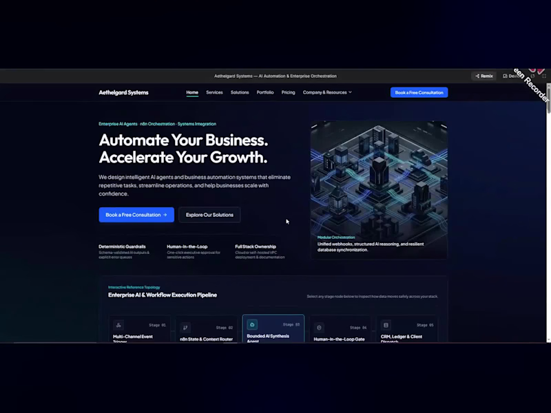
I designed and built Aethelgard Systems, a professional website for an AI automation and enterprise workflow agency. The goal was simple: present complex technical services in a clear, trustworthy way and turn visitors into paying clients.
What the website includes:
A conversion-focused homepage with a strong headline and a clear "Book a Free Consultation" call to action
An interactive AI and workflow execution pipeline that shows businesses exactly how an automation runs, from the first trigger to the final CRM or ledger update
Core services: AI agent development, n8n workflow automation, business process automation, AI chatbots and virtual assistants, CRM automation, and lead generation and qualification
Real operational problems matched with reliable, engineered solutions, such as manual data entry, slow lead routing, and unreliable no-code scripts
Tailored automation solutions for 15 industries, including E-commerce, Real Estate, Healthcare, Education, Finance, Marketing Agencies, SaaS, and Professional Services
A structured four-phase implementation process: operational audit, systems and agent architecture, testing and validation, and production launch with team enablement
Client testimonials, featured automation architectures, and an FAQ section that answers common buyer questions
Why this matters for your business:
A strong website builds trust before the first conversation. This project shows how a technical service can be explained simply, how a clear process reduces buyer doubt, and how a well-structured page guides visitors toward booking a consultation.
About me:
I have 10+ years of experience in AI automation and have worked with 200+ clients and 110+ companies across different countries. Besides AI automation, I also offer:
Web development, including business websites and online stores
Mobile app development
Graphic design
Video editing
I can help with n8n workflows, AI agents, chatbots, email automation, lead generation, CRM and Google Sheets automation, Slack, WhatsApp and Telegram integrations, and fixing errors in existing automations.
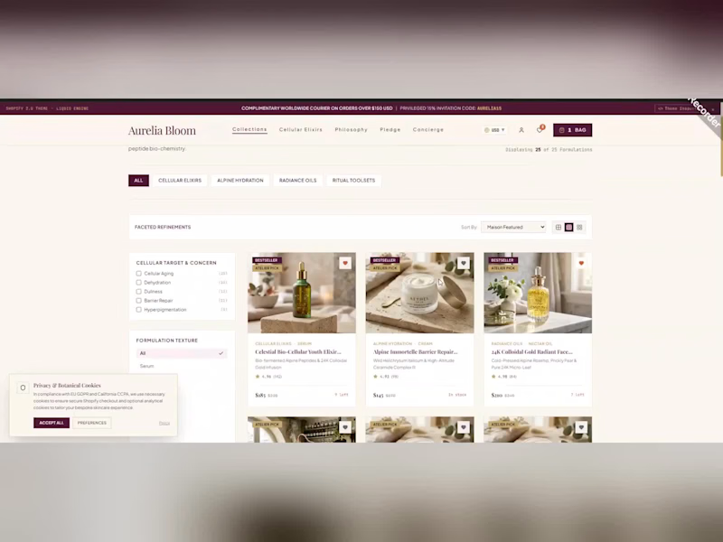
I am open to freelance projects, long-term collaborations, and remote roles with clients from any country. If you want to save time, reduce manual work, and grow your business with automation, send me a message and tell me about your project. I will reply with a clear plan. Aurelia Bloom is a concept luxury skincare e-commerce website designed and built as a complete, end-to-end shopping experience for a premium botanical beauty brand. The project shows how elegant visual design, clear product discovery, and a thoughtful customer journey can come together to create an online store that feels as refined as the products it sells.
The experience opens with a warm ivory and deep plum palette, refined serif typography, and generous white space, giving the brand a calm, high-end editorial look. A slim announcement bar highlights complimentary worldwide delivery, while the clean navigation (Collections, Cellular Elixirs, Philosophy, Pledge and Concierge) keeps every key section one click away. A currency selector, account access, wishlist, and shopping bag complete the header for a true international storefront.
The heart of the project is "The Complete Botanical Master Catalog", a fully filterable product collection page. Customers can browse by category tabs (All, Cellular Elixirs, Alpine Hydration, Balance Oils and Ritual Toolsets), refine results by Cellular Target & Concern and Formulation Texture, adjust a price range slider, sort by "Most Popular" and switch between grid and list views. Each product card includes high-quality imagery, a Bestseller badge, concern and texture labels, star ratings, pricing, and a wishlist heart so that shoppers can compare products quickly and confidently.
Beyond the catalog, the site tells the brand story through dedicated content pages. The Philosophy page explains the science-led approach, including high-altitude extremophile adaptation and a colloidal 24K gold suspension, supported by an elegant pull-quote layout. "The Circular Sustainability Pledge" presents the brand's eco commitments, such as a violet glass and refill pod system and ethical alpine foraging quotas, in clean, easy-to-scan cards that build trust with conscious buyers.
A personal account dashboard completes the journey. It features a member profile, loyalty points balance, order history with status labels (Fulfilled and Delivered), carrier tracking details, saved items, saved sequences, and VIP privileges, all designed to encourage repeat purchases and long-term customer loyalty. A privacy and botanical cookies consent banner shows attention to compliance and user trust.
Key highlights:
Luxury, editorial-style visual identity with a cohesive colour and type system
Advanced product filtering, sorting and category navigation
Responsive product grid with grid and list view options
Brand storytelling pages for Philosophy and Sustainability
Customer account area with orders, loyalty points and wishlist
Smooth micro-interactions and a polished, conversion-focused layout
This project demonstrates my skills in modern web design, UI and UX design, and e-commerce website development for beauty, skincare, and luxury lifestyle brands. If you need a premium online store, a product catalog website, or a conversion-focused brand site that builds trust and drives sales, I would love to help bring your vision to life. GreenScape Landscaping Co: Premium Landscaping Business Website
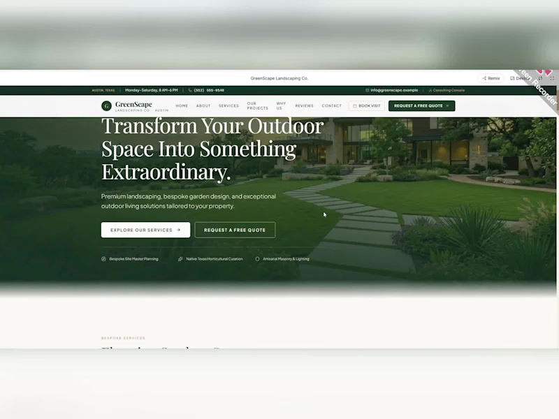
I designed and built GreenScape, a modern, high-end website for a luxury landscaping company based in Austin, Texas. The goal was to give the business a strong first impression and turn website visitors into real quote requests.
The Challenge
Landscaping is a visual, trust-based business. Homeowners want to see quality work, understand the services, and feel confident before they call. Many landscaping websites look generic and make it hard to request a quote.
The Solution
I built a clean, premium website that guides the visitor step by step, from first impression to quote request.
Key Features
Cinematic hero section: a full-width landscape image with the headline “Transform Your Outdoor Space Into Something Extraordinary” and two clear calls to action: “Explore Our Services” and “Request a Free Quote”.
Services section: clean cards for Landscape Design & Installation, Lawn Care & Maintenance, Tree & Hedge Trimming, Outdoor Lighting, and Seasonal Yard Cleanup, each with a short description and a “Learn More” link.
Project showcase: a gallery of completed projects with location tags and project details, so visitors can see real results.
“Why Choose Us” section: a disciplined-approach section (Personalized Landscape Design, Attention to Every Detail, Quality-Focused Workmanship) that builds trust.
Free quote form: a simple form that collects name, email, phone, property address, service required, estimated budget, and project details, so the business gets qualified leads.
Professional navigation: a sticky header with business hours, phone, email, a “Book Visit” button, and a quote button always within reach.
Responsive design: a smooth experience on desktop, tablet, and mobile.
Design Approach
Deep green tones, elegant serif headings, generous white space and high-quality imagery give the site a calm, premium feel that matches the luxury market the business serves.
Result
A professional, fast, and conversion-focused website that makes the brand look credible and makes it easy for customers to book a visit or request a quote.
Looking for a website like this for your business? I build custom, responsive websites that look great and bring in leads. Message me and let’s discuss your project. L'AURA: Fine Dining Restaurant Website Design | Tasting Room and Atelier, San Francisco
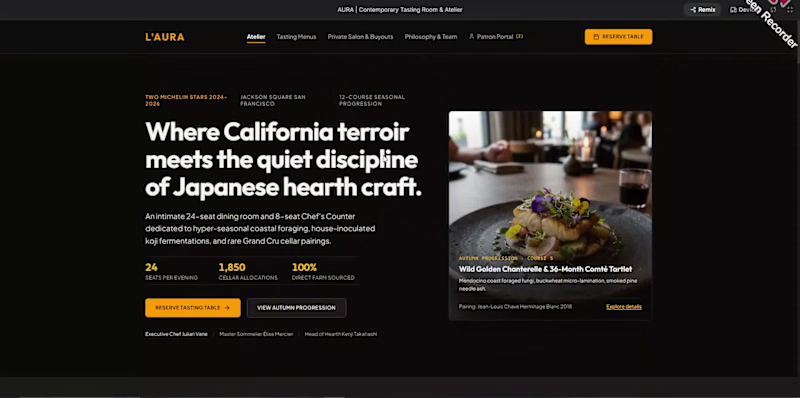
L'AURA is a premium website concept for a contemporary tasting room and atelier in San Francisco's Jackson Square. It brings the feeling of an intimate, high-end dining experience online, so guests can discover the menus, understand the philosophy, and reserve a table in a few clicks.
The Challenge
Fine dining restaurants sell an experience, not just a meal. Their websites must feel as refined as the dining room, while also helping guests do practical things quickly: compare tasting menus, ask about dietary needs, plan a private event, and book a table. Many restaurant sites are slow, cluttered, or hard to use on a phone. L'AURA needed a website that is elegant, clear, and built to turn visitors into reservations.
The Approach
I designed a dark, cinematic interface with warm amber accents, large food photography, and refined typography. Every section is built to be easy to scan, with generous spacing, clear headings, and a "Reserve Table" button always within reach.
Key Features
A strong hero section that introduces the chef's seasonal, farm-to-table philosophy with key numbers at a glance
Tasting menu pages with clear pricing, course progressions and dietary adaptations
A sample course preview that shows guests exactly what to expect
Private Salon and Buyouts section for corporate dinners, celebrations and exclusive events
An interactive private dining estimator that gives an itemised budget based on guests, beverage pairings and extras
Philosophy and team pages covering foraging, fermentation, the cellar and the counter experience
A Patron Portal entry for returning guests
A concierge inquiry form with an inquiry-purpose selector
A clear FAQ covering reservations, cancellations, dietary needs, dress code and corkage
Location, valet and seating schedule details for easy planning
Design Focus
Luxury restaurant branding, user-friendly navigation, a conversion-focused booking journey, a responsive layout and a polished, premium look that builds trust before the guest arrives.
The Result
A refined, modern and easy-to-use restaurant website that reflects the quality of the cuisine and makes booking simple. It shows how thoughtful web design can raise the perceived value of a restaurant and bring in more reservations and private event enquiries.
Looking for a website for your restaurant, cafe, hotel, or luxury hospitality brand? I'd love to help. Message me on Contra to discuss your project. BurgerRush: Fast Food and Takeaway Mobile App | UI/UX Design and Development
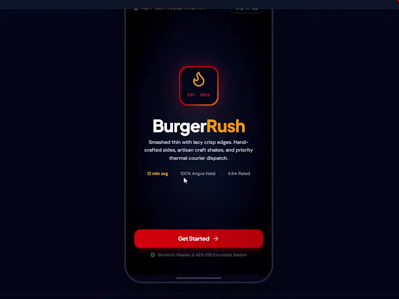
BurgerRush is a modern mobile app concept for a fast food and takeaway brand, built to make ordering a burger feel as quick and exciting as eating one. The app covers the full journey, from the first launch screen to menu browsing, burger customisation, live delivery tracking, and the kitchen that prepares the order.
The Challenge
Food delivery apps are crowded, and most of them feel the same. Customers want to order in a few taps, see exactly what they are getting, and know when it will arrive. Kitchens and couriers need a clear view of every order. BurgerRush needed one app that works well for three very different people: customers, kitchen and courier staff, and administrators.
The Solution
I designed a dark, bold interface with strong red and amber brand colours, large food photography, and clear, readable cards. The app opens with a simple welcome screen, then lets each person choose their role and sign in with a quick biometric step.
What the App Includes
Customer experience: browse the menu, search and filter burgers, sides and shakes, and save favourites
Smart filters for dietary options, heat level, price and fastest preparation time
Burger customisation: choose patty size, bun, cheese, sauces and extras, with allergen and nutrition details shown clearly
Live delivery tracking with a map, courier details, and estimated arrival time
Kitchen and courier dashboard to manage the order queue and deliveries
Administrator tools to oversee live operations
Clean bottom navigation for home, menu, live tracking, AI assistant, and profile
The Result
A polished, easy-to-use food ordering app with a strong brand feel and a smooth experience for customers, kitchen staff, and administrators. It shows how good UI and UX design can make a fast food brand feel premium, trustworthy, and fast.
Looking for a mobile app design for your restaurant, food delivery, or takeaway business? I'd love to help. Message me on Contra to discuss your project. KINETIC: Autonomous Systems Brand Identity
This project is a sharp, technical brand identity for KINETIC, a company working in autonomous systems and intelligent machines. The identity combines precision, motion, and engineering clarity, so the brand feels advanced, reliable, and ready for the future.
The Challenge
Technology and robotics companies must look innovative while also earning trust. A cluttered or generic look makes complex technology feel unclear. KINETIC needed an identity that communicates intelligence, accuracy, and movement, and that works across product interfaces, presentations, reports, websites, and hardware.
The Approach
I designed the identity around the idea of controlled motion and engineered precision. Each element supports a clean, high-tech look:
A strong, modern logo and mark with a clear, technical character
A focused colour palette with high contrast and clear accent colours
Clean, geometric typography built for clarity and hierarchy
A grid-based layout system inspired by technical drawings and data
A consistent visual language that scales from small icons to large displays
What's Included
Primary logo, mark and logo variations
Colour palette and typography system
Brand guidelines with usage rules
Visual direction for digital, print and presentation use
Brand specimen pages and presentation layouts
The Result
A confident, modern and consistent brand identity that gives KINETIC a clear technology voice and a unified look across product, marketing and investor material.
Looking for a brand identity, logo design, or visual identity for your tech, robotics, AI, or engineering company? I'd love to help. Message me on Contra to talk about your project. Banque Privée 1924: Private Banking Brand Identity
This project is a refined brand identity for Banque Privée 1924, a private bank built on heritage, discretion, and trust. The identity blends classic elegance with a modern, clean finish, so the bank feels established and exclusive while still looking current.
The Challenge
Private banking clients expect security, privacy and prestige. A weak or generic identity can lose that trust immediately. Banque Privée 1924 needed a brand that communicates a long history and quiet confidence, and that stays consistent across letterheads, cards, reports, presentations and digital screens.
The Approach
I built the identity around the idea of timeless authority. Every element supports a calm, premium and trustworthy feel:
A dignified logo and monogram with classic proportions and a strong emblem
A deep, restrained colour palette that signals stability and luxury
Elegant serif typography paired with a clear, modern supporting typeface
A structured layout system for formal documents and client communication
Careful spacing and detail, so every piece feels precise and considered
What's Included
Primary logo, emblem and logo variations
Colour palette and typography system
Brand guidelines with usage rules
Stationery and business collateral
Brand specimen pages and presentation layouts
The Result
A polished, trustworthy and consistent brand identity that gives Banque Privée 1924 a strong heritage presence and a professional look across print and digital.
Looking for a brand identity, logo design, or visual identity for your bank, finance firm, law practice, or other premium business? I'd be happy to help. Message me on Contra to discuss your project. Chroma Kinetic: Avant-Garde Liquid Chrome Brand Identity
This project is a bold, futuristic brand identity for Chroma Kinetic, an avant-garde brand built around liquid chrome, motion and energy. The identity turns flowing metallic forms and high-contrast colour into a visual language that feels alive, modern and impossible to ignore.
The Challenge
Experimental and forward-thinking brands need to grab attention fast, but they also need a system that stays consistent. Chroma Kinetic needed an identity that captures the feeling of movement and reflection, while still working clearly across digital screens, social media, posters, and printed material.
The Approach
I designed the identity around the idea of chrome in motion: smooth, reflective and constantly changing. Each decision supports a striking, high-impact look:
A distinctive logo and mark with fluid, metallic character
A high-contrast colour palette with chrome, deep tones and sharp accents
Bold, modern typography with strong presence and clear hierarchy
Dynamic layouts that suggest speed, flow and energy
A consistent system so the brand stays recognisable in every format
What's Included
Primary logo, mark and logo variations
Colour palette and typography system
Brand guidelines with usage rules
Visual direction for posters, social media and digital use
Brand specimen pages and presentation layouts
The Result
A confident, eye-catching and memorable brand identity that gives Chroma Kinetic a clear futuristic voice and a consistent look across digital and print.
Need a bold brand identity, logo design, or visual identity for your creative, tech, or fashion brand? I'd love to help. Message me on Contra to talk about your project. Maison Botanique: Haute Parfumerie Brand Identity
This project is a luxury brand identity for Maison Botanique, a haute parfumerie house inspired by nature, rare botanicals and the art of perfume making. The identity brings together elegant typography, a refined colour palette and a calm, premium visual language that feels at home on a perfume bottle, a gift box and a boutique window.
The Challenge
The luxury fragrance market is crowded, and customers decide in seconds. A perfume house has to communicate quality, heritage, and emotion before anyone smells the product. Maison Botanique needed an identity that feels artisanal and exclusive, with a clear botanical character that sets it apart from generic luxury brands.
The Approach
I designed the identity around the idea of nature handled with craft and restraint. Each element supports a premium, timeless feel:
An elegant logo and wordmark with refined, high-end proportions
A natural, sophisticated colour palette inspired by botanicals and raw materials
Classic serif typography paired with a clean supporting typeface
A consistent layout system for labels, packaging and printed material
Careful use of space, so every piece feels calm, quiet and expensive
What's Included
Primary logo, wordmark and logo variations
Colour palette and typography system
Brand guidelines with usage rules
Packaging and label design direction
Brand specimen pages and presentation layouts
The Result
A cohesive, elegant and memorable brand identity that gives Maison Botanique a strong luxury presence and a consistent look across packaging, print and digital.
Looking for a luxury brand identity, perfume branding, or packaging design for your fragrance, beauty, or lifestyle brand? I'd be glad to help. Message me on Contra to discuss your project. Spatial Labs: Brand Identity for a Design Studio
This project is a complete brand identity for Spatial Labs, a design studio built around space, structure, and modern thinking. The identity brings together clean geometry, a clear system and a confident visual voice, so the studio looks professional and recognisable in every place it appears.
The Challenge
Creative and design studios often struggle to look distinctive. Their brand has to feel creative but also reliable, and it has to work across many formats, from a website and social media to pitch decks, proposals and printed material. Spatial Labs needed an identity that feels modern and precise, and that can grow with the studio over time.
The Approach
I built the identity as a flexible system rather than a single logo. Each choice supports the idea of space and structure:
A clean, memorable logo and mark with strong geometric form
A balanced colour palette with clear primary and secondary colours
A modern typography system with clear hierarchy for headlines, body text and details
Grid-based layouts that keep every page and screen consistent
Clear spacing, alignment and usage rules for the whole brand
What's Included
Primary logo, mark and logo variations
Colour palette and typography system
Brand guidelines and usage rules
Business collateral and stationery
Brand specimen pages and presentation layouts
The Result
A modern, consistent, and flexible brand identity that helps Spatial Labs present itself with confidence, win client trust, and keep a unified look across print and digital.
Need a brand identity, logo design, or visual identity system for your studio, agency, or startup? I'd love to help. Message me on Contra to talk about your project. Brutalist Brand Identity for an Architectural Practice
This project is a complete brand identity design for an architectural practice, built around the honest, raw, and structural language of Brutalist architecture. The goal was to create an identity that feels as solid, confident, and timeless as the buildings the practice designs.
The Challenge
Architecture firms compete on trust, clarity and a strong point of view. Many look alike, with thin logos, generic fonts and soft colour palettes. This practice needed a visual identity that communicates strength, precision and craft at first glance, and that works equally well on a business card, a website, a drawing set and a construction hoarding.
The Approach
I started by studying Brutalist architecture: exposed concrete, bold geometry, heavy forms, strict grids and the play of light and shadow. These ideas shaped every decision in the identity:
A strong, geometric logo and monogram with a solid, architectural feel
A restrained palette inspired by raw concrete and stone, with sharp contrast
Bold, grid-based typography with clear hierarchy
A flexible layout system that mirrors architectural drawings and floor plans
Consistent spacing, alignment and proportion across all applications
What's Included
Primary logo, monogram and logo variations
Colour palette and typography system
Brand guidelines with usage rules
Stationery and business collateral
Brand specimen pages and presentation layouts
The Result
A confident, modern and highly consistent brand identity that helps the practice stand out, look professional in front of clients, and keep its visual language clear across print and digital.
Looking for a brand identity, logo design, or visual identity system for your architecture, interior design, or construction business? I'd be happy to help. Message me on Contra to discuss your project. AI Ad Creative Studio | Direct-Response Ad Campaign, Script and Storyboard Web App Design
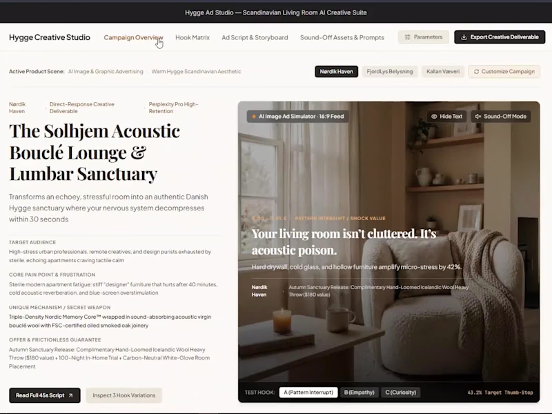
Hygge Ad Studio is an AI-powered ad creative suite that turns one product into a complete direct-response ad campaign: hooks, a 45-second script, a frame-by-frame storyboard, sound-off overlays, captions, and AI image prompts, all in one clean web app. This video is a full walkthrough of the interface for a Scandinavian living room furniture brand.
THE PROBLEM
Marketers and e-commerce brands lose hours moving between documents, chat tools, and design apps to build one ad. Ideas stay scattered, hooks are never tested properly, and the creative team gets a vague brief. The result is slow production, inconsistent ads, and weaker results on Meta, TikTok, Instagram Reels, and YouTube Shorts.
THE SOLUTION
One workspace that takes a product and a brand scene and produces everything a team needs to shoot, edit, and publish the ad.
WHAT THE STUDIO INCLUDES
Campaign Overview
A clear brief in one view: product name, target audience, core pain point, unique mechanism, and the offer with its guarantee. Brand scenes can be switched in one click, so one tool serves several brands or products.
Hook Matrix
Three opening hooks built on different psychology (pattern interrupt, empathy, and curiosity), each with its visual action, pacing, and a target thumb-stop rate, so the team can test the first 1.5 seconds of the ad.
Ad Script and Storyboard
A 45-second direct-response master script split into timed sections, with the voiceover, caption timing, camera movement, lens and motion notes, audio cues, and the emotional shift of each section.
Sound-Off Assets
Bold text overlays and a ready-to-post ad caption written for people who watch with the sound off, plus a search-intent line to help the post get found.
AI Image and Video Prompts
Ready prompts for 16:9 feed ads and 9:16 vertical Reels and TikTok ads, with camera and sensor settings, lighting and colour ratios, a colour palette with HEX values, and negative prompt guardrails to avoid messy, plastic-looking results.
Export
The finished creative deliverable can be exported in one click and handed to the production team.
DESIGN APPROACH
A warm Scandinavian "Hygge" look: soft cream surfaces, strong serif headlines, calm spacing, and dark contrast cards for the key assets. Every section has one job, so a marketer always knows where to look and what to copy next. Built for desktop and easy to scan.
WHY IT MATTERS FOR YOUR BUSINESS
Faster campaign planning: from idea to a full creative brief in minutes
Consistent brand voice and visuals across every ad
Clear briefs for editors, designers, and video creators, so there are fewer revisions
Better testing: three hook variations ready for A/B tests
Ads that work without sound, which suits how most people scroll
WHO IT IS FOR
E-commerce stores, DTC brands, home decor and furniture brands, performance marketing teams, social media managers, agencies and creators who run paid ads.
WHAT I CAN BUILD FOR YOU
AI-powered web apps and internal marketing tools
Dashboard and UI/UX design for your product
Ad creative systems, scripts and storyboards
Brand identity, logos and brand guidelines
Video editing for ads, Reels and YouTube
n8n automation workflows to save time on repeated work
Have a product, a brand, or a tool idea? Message me with a short note about your goal, and I will reply with ideas, a plan, and a clear timeline. Let's build something your customers will remember.
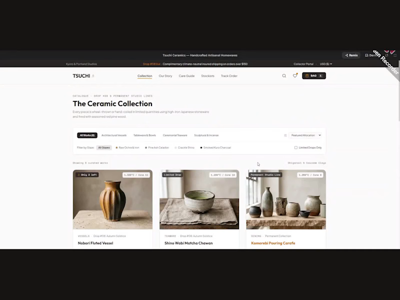
This is a concept project created to show my work. The brand, product, and figures shown are examples. Tsuchi Ceramics is a concept e-commerce website for a handcrafted Japanese-inspired ceramics brand: a clean shop with a filterable ceramic collection, product cards with glaze options and stock counts, a kiln-to-doorstep order tracker, and global stockist showrooms.
The walkthrough shows the full shopping journey: browsing The Ceramic Collection, filtering by category and glaze, reading the maker's story, checking the care guide and tracking an order.
Created as a portfolio concept for artisan brands, homeware stores and craft-led online shops.
THE CONCEPT
Tsuchi (土, "earth") presents wheel-thrown and hand-coiled stoneware, fired in limited quantities. The goal was a calm, minimal website that feels as quiet and tactile as the pottery itself: lots of white space, warm natural photography, clear typography, and a single warm orange accent for actions.
WHAT THE WEBSITE INCLUDES
The Ceramic Collection: a product grid with categories (Architectural Vessels, Tableware & Bowls, Ceremonial Teaware, Sculptural & Incense)
Smart filters: glaze finish (Raw Ochre & Iron, Pine Ash Celadon, Crackle Shino, Smoked Kuro Charcoal), clay type, and a "Limited Drops Only" toggle
Product cards with stock badges ("Only 2 left"), kiln temperature, size, signed-piece details, colour swatches, 360 view and Add to Bag
Our Story: the maker behind the work, shown with workshop photography
Care Guide: includes a Lifetime Kyoto Kintsugi Repair Service request form
Stockists: Global Flagships & Stockist Showrooms with location, hours and contact details
Track Order: an Artisanal Kiln & Delivery Tracker with a clear multi-stage progress timeline
Sticky header with search, wishlist, and shopping bag, plus a detailed dark footer
WHAT THIS PROJECT DELIVERS
Modern e-commerce UI/UX design for a premium handmade brand
A responsive-ready, easy-to-scan product browsing experience
Storytelling pages that build trust (maker profile, care guide, repair service)
A complete layout system ready for development or a Shopify/WooCommerce build
WHO THIS IS FOR
Ceramic and pottery studios, artisan and handmade brands, homeware and lifestyle stores, and small businesses that want a premium online shop with a strong brand feel.
Note: Tsuchi Ceramics is a conceptual project created for portfolio purposes, not a commissioned client project.
Looking for a clean, high-converting e-commerce website for your craft or homeware brand? Send me a message on Contra and let's talk.