




Citizen Eco-Drive — Luxury Watch Campaign & Motion Visuals
Transforming Static Luxury Banners into a Cinematic Advertising Showcase for Citizen Watches
This project focuses on visual campaign direction, digital advertising layouts, and cinematic motion design for Citizen Watches (featuring the Eco-Drive & Quartz series).
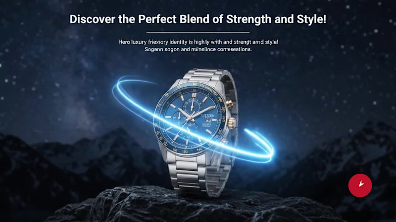
The objective was to create a cohesive luxury brand narrative—bridging the gap between timeless elegance and rugged strength ("Discover the Perfect Blend of Strength and Style").
Visual Identity & Atmosphere: Blended deep navy starry nightscapes and textured rock/mountain environments with clean, high-contrast studio white hero layouts.
Cinematic Product Motion: Brought static print/web banner layouts to life using smooth parallax pans, soft luminous dial sweeps, floating light streaks, and shallow depth-of-field detail reveals.
Design & Typography: Crafted bold editorial typography hierarchies using classic serif layouts for the iconic CITIZEN branding, balanced with clean contemporary sans-serif for product specs and CTAs.
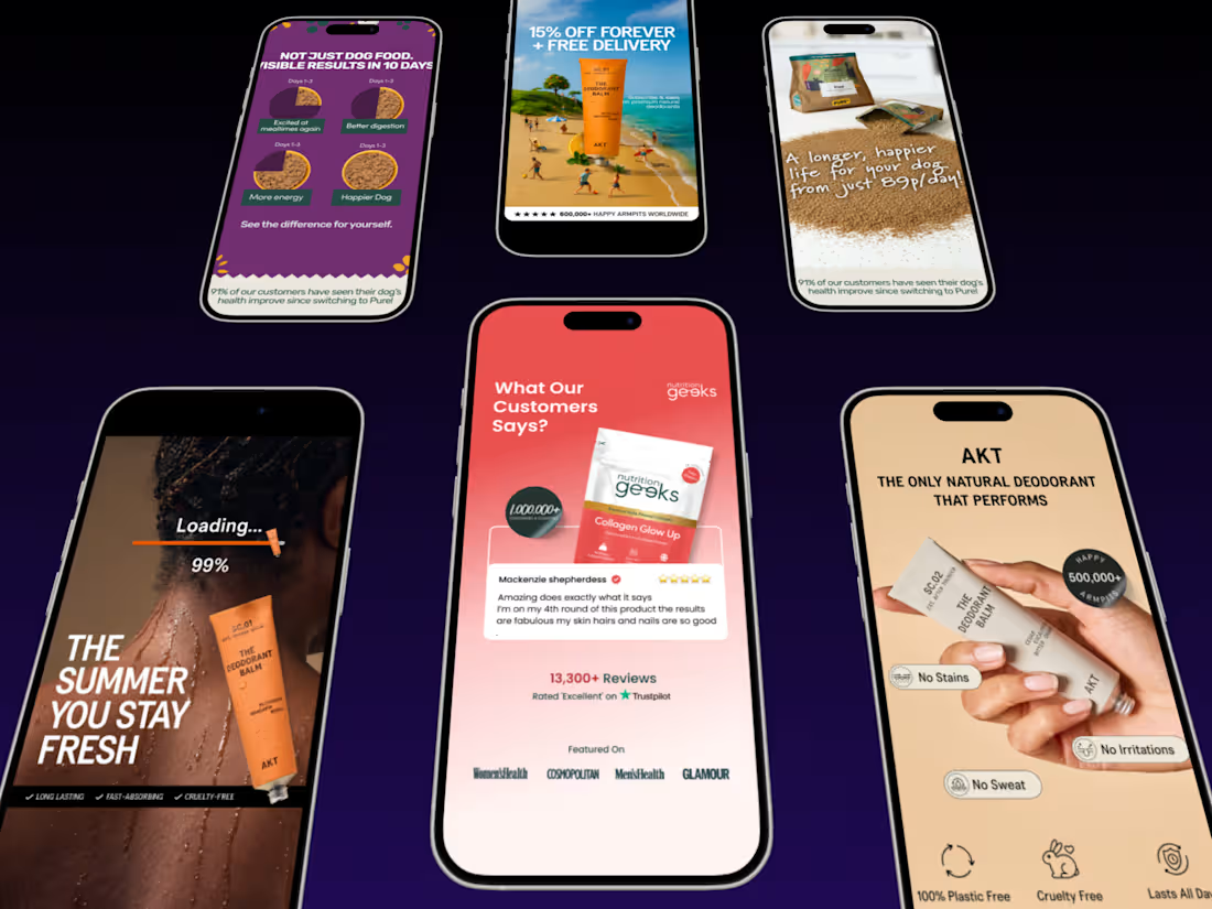
Multi-Format Adaptation: Designed for high-impact social advertising, digital billboard/lightbox displays, and e-commerce hero banners.
My Role in this Project:
Visual Campaign Concept & Art Direction
Advertising Poster & Banner Design
Motion Graphics & Parallax Video Animation
Lighting, Texture Shading & Sound Design Direction
0
216


