AI Video Producer for Brands, Social Media & Filmmakers


AI Video Producer for Brands, Social Media & Filmmakers



Thumbnail Designer, Graphic Designer

Ideate like a Designer think like a Viewer.
Most thumbnail designers forget this part.
They fail to put their thoughts in the shoes of the viewer that's why the views of most video don't really reflect the depth of the video.
What are your thoughts about the design, is it click through rate worthy?
In need of a thumbnail designer in your team.
Hire me Now!
2
3
129

Hello Community
Throw back to a design I made for a documentary channel concerning Charlie Kirk death.
It was a quick one though because of the trend
Loved how the design came out
Click through rate was 20%
1
94

Hello Community
I’ve been working with this creator for about a month now, and in that time I’ve developed a strong understanding of the high-energy, style his documentary thumbnails require. This particular design captures the hidden side of a powerful leader, showing the difference between his public smile and his real, serious face to promise the viewer a "behind-the-scenes" look at how he truly controls the country.
My focus for the design gap is making the viewer curious to see what is being hidden, By emphasizing contrast, sharp details, and expressive poses, I aimed to deliver a thumbnail that not only fits his channel’s documentary tone but also maximizes click potential.
1
130
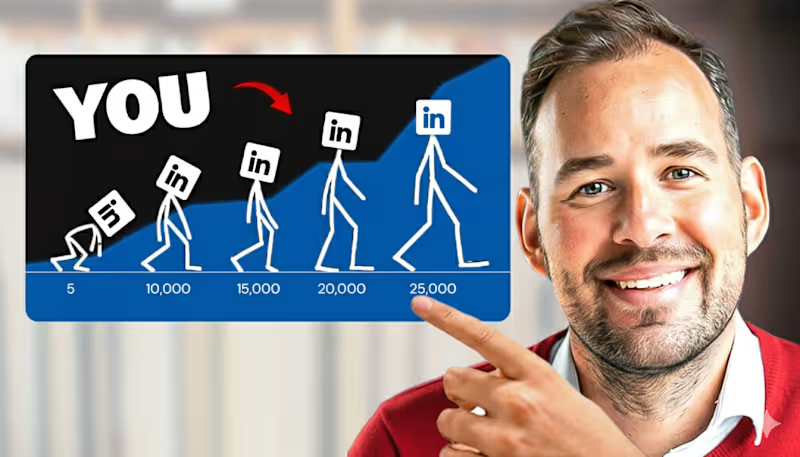
My focus for this thumbnail design.
I leveraged the 'Evolution of Growth' motif to visualize a high-speed career trajectory. By mapping the journey from a 5-follower 'struggle' to a 25,000-follower 'authority,' I created an immediate emotional hook for the viewer. I used high-contrast blue and black to signal professional authority, paired with a sharp, expressive focal point to humanize the data. This isn't just a thumbnail; it's a visual promise of progress that aligns perfectly with the creators Brand
1
118

Brand Archive & Visual Identity Designer | Lagos Culture |
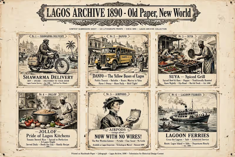
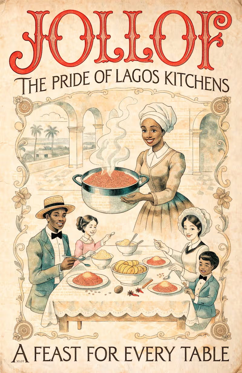
LAGOS ARCHIVE 1890 - Old Paper, New World
I built a Recraft V4 Style that reimagines modern Lagos life as 1890s vintage lithograph posters.
THE IDEA: What if Shawarma delivery bikes, Danfo yellow buses, Suya street grills, Jollof rice kitchens, AirPods, and Lagoon ferries were advertised in 1890? Turning everyday Lagos hustle into archive history.
VISUAL SYSTEM:
Aged handmade paper with cracks, stains, foxing
Engraved cross-hatch illustration like old newspapers
Limited palette: red ochre / teal / cream / black
Ornate 1890s French typography and filigree borders
Authentic lithograph imperfections
COLLECTION: 6 posters + submission sheet
No.1 SHAWARMA DELIVERY
No.2 DANFO - The Yellow Buses of Lagos
No.3 SUYA - Spiced Grill
No.4 JOLLOF - Pride of Lagos Kitchens
No.5 AIRPODS - Now With No Wires! (my twist - 1890 lady discovering wireless tech)
No.6 LAGOON FERRIES
WHY: Lagos is always moving forward but its soul is timeless. This style makes the new feel archival and the old feel alive. Old paper, new world.
#recraftstyleschallenge
0
115





Brand/Product designer with experience in motion graphics.
Brand/Product designer with experience in motion graphics.


Graphic Designer/Canva Expert
Graphic Designer/Canva Expert


View more →


UI/UX Designer and Framer Expert

Apologia Night — Visual Identity & Event Design
A visual design project for Apologia Night, a Christian apologetics event focused on engaging important questions about the Christian faith.
I designed the event flyers and a series of custom illustrations to give the campaign a cohesive visual language while making each topic visually distinct.
The goal was to create a style that felt thoughtful, modern, approachable, and rooted in the subject matter—using illustration and typography to communicate ideas beyond just the event information.
Scope: Art Direction · Graphic Design · Illustration · Event Design · Social Media Design
1
81


Seasoned Designer for B2B & SaaS Solutions
Seasoned Designer for B2B & SaaS Solutions