Projects using Adobe Photoshop in AthensProjects using Adobe Photoshop in AthensThe Story of VELGORA – Rediscovering Timeless Beauty
Before VELGORA, we traveled the world, seeking the lost wisdom of ancient beauty rituals. From Cleopatra's milk and honey baths to Japan's fermented rice water and India's sacred turmeric pastes, we uncovered the secrets that kept generations radiant—long before chemicals existed. But modern skincare forgot this wisdom, replacing nature with synthetics. We knew there had to be a better way.
What We Did Differently
Blending Ancient & Modern – We fused history's most powerful remedies with cutting-edge plant-based actives like bakuchiol, vegan collagen, probiotic ferments, and snail mucin to create skincare that truly works.
Bioadaptive Formulas – Our ingredients adjust to your skin's unique needs in real-time, helping with hydration, repair, and balance.
100% Pure & Ethical – Vegan, cruelty-free, silicone-free, fragrance-free, essential oil-free, alcohol-free. No chemicals, no compromises.
Skincare isn't something new, it's something remembered. VELGORA brings the past and future together for skin that is naturally radiant, healthy, smooth and timeless.
Symbolism of the Tiger:
Power & Confidence – Tigers are strong and fearless, representing skincare that empowers users.
Grace & Elegance – Their sleek movements and striking appearance align with beauty and refinement.
Energy & Vitality – The tiger's dynamic presence can reflect rejuvenation and skin transformation.
Protection & Strength – Just as a tiger dominates its environment, your skincare can provide strong protection.
Uniqueness & Boldness – A red tiger, in particular, stands out, symbolizing passion, fire, and uniqueness.
The name "Velgora"
A fusion of "velvet" (smooth skin) and "tigora" (tiger strength). Brand Strategy · Communication Architecture · Social Media for ΚΕΦΙ | Greek Cancer Patients Association
The challenge
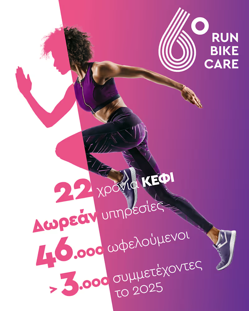
ΚΕΦΙ has been operating for decades. It runs 12 conferences a year, hosts 120 speakers, serves 3,000 attendees, and maintains 12 ongoing patient support groups. The work is real, consistent, and meaningful. The communication was none of those things.
An established NGO with deep roots and a long track record — but no coherent brand identity, no tone of voice, no content strategy to match the scale of what it actually does. And a subject matter that demands both sensitivity and authority: cancer, in all its dimensions: patients, caregivers, doctors, prevention. Getting the communication wrong here doesn't just underperform. It alienates the people it's supposed to reach.
The approach
Strategy first. Before any visual or any post, the work began with a thorough audit: existing communication materials, organizational history, audience mapping and personas and a competitive review of how peer organizations — in Greece and internationally — position themselves in this space.
The benchmark work covered leading cancer advocacy organizations across Europe and the US, identifying what works (credibility through expertise, community through storytelling, clarity in calls to action) and what doesn't (clinical distance, charity-speak, trauma-centered messaging that disempowers rather than supports). From this, a clear direction emerged: warm but credible, expert but human, never clinical, never pitying.
That direction became the foundation for everything that followed — a positioning document, defined content pillars, tone of voice guidelines, and a framework that could survive internal handover.
What was delivered
A complete brand strategy and communication direction document — the reference point every subsequent decision was checked against.
A content architecture: thematic pillars covering medical education, patient support, prevention, events, and advocacy, each with its own messaging logic and format guidelines.
A visual identity system applied consistently across channels — built to work across a fragmented archive of legacy materials and new content alike.
Editorial oversight: reviewing and shaping content before publication, coaching the internal team toward independence.
The information architecture and design direction for a new website (WordPress), structured to serve multiple, distinct audiences simultaneously: patients, caregivers, healthcare professionals, and the general public.