Building things that work, get noticed, and drive results.


Building things that work, get noticed, and drive results.


Hey Pals 😊 I don’t know about you, but I’ve decided to walk into 2026 stronger than ever! That’s why I’m excited to share the redesign of my website, and I hope you’re going to like it.
2025 has been an incredibly exciting year for me. Besides my regular projects, I’m also close to finishing a personal project I started last year, the developers are wrapping up the application soon, and I’ll be sharing that with you as well. So I decided to finish this year by redesigning my website.
Even though the About page isn’t fully finished yet, I feel like we’re among friends here, so I wanted to share it with you a bit earlier.
Hope you’ll like it, and I’m open to any suggestions!
Wishing you a great weekend!😊
2
5
1.1K

Full-stack designer crafting brands & websites


Web and App Designer creating unique work.
Web and App Designer creating unique work.


Not every company believed in me. That’s okay. I believed in myself. I kept pushing, kept creating, and built something I’m proud of. Now I collaborate with clients who see the value I bring...and this is just the beginning.
0
77

Finance Mobile App UI
A clean and intuitive mortgage planning app designed to simplify loan management and scenario forecasting. The interface focuses on usability, clear data visualization, and minimal design elements to help users understand interest rates, repayments, and financial outcomes with confidence. Crafted for clarity, trust, and smooth mobile interaction.
1
101

RHEA Kitchen & Cocktail – Restaurant Website Design
A modern, elegant restaurant website designed to highlight fine dining experiences through refined typography and high-contrast visuals. The layout balances editorial-style sections with immersive food photography, creating a premium and sophisticated brand presence. Built with a focus on clarity, smooth navigation, and seamless reservation flow.
2
96

UI/UX Designer: Designing Websites, Apps & Framer
UI/UX Designer: Designing Websites, Apps & Framer


View more →

designer - one spot left for Q3
designer - one spot left for Q3


Redesign of a stat section. Let me explain how and why I did it:
The previous design was 4 numbers with 4 bodies of copy. An engineer would need to read each and every part of the copy to understand what its about. It was bloated and hard to scan.
So the challenge was to create illustrations that would allow a visitor to scan and instantly understand what the numbers represent ( of course if you are an engineer ) which is who the landing page was designed for.
This is my take on the challenge and what I ended up on.
0
50


AI product studio - I ship AI into live products
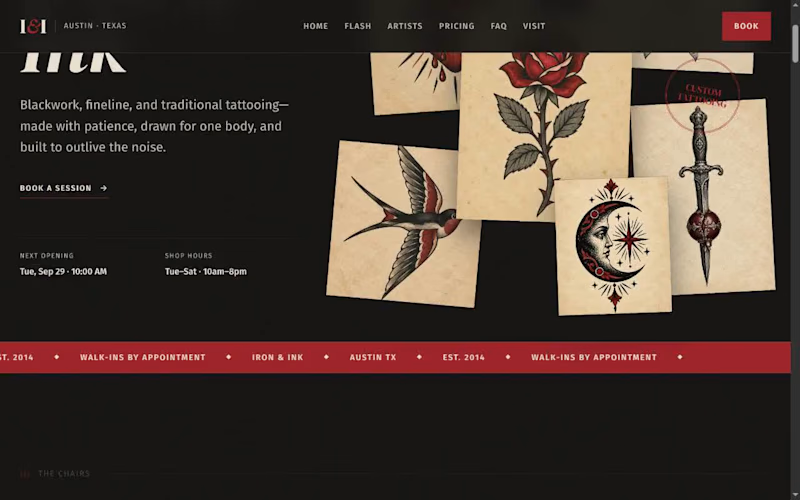
Three tattoo artists in Austin were running their whole business out of an Instagram inbox. Consults arrived as DMs at midnight, a third of bookings never showed up, and nobody ever paid a deposit — there was simply no way to take one.
InkBook gives Iron & Ink a real front door. Clients browse the artists and their actual work, pick the style they want, and book a real slot — with a $50 deposit that makes the appointment stick. If plans change, they reschedule or cancel themselves instead of ghosting. Reminders go out at confirmation, 48 hours before, and on the day.
The owner gets one screen: today's chairs, who might not show and why, and which deposits are in. No more evenings lost to DM triage.
Built end to end in Lovable: public site with flash gallery, pricing and reviews, full booking flow, client bookings, and the owner dashboard. Demo video below walks a complete booking in 30 seconds.
1
109
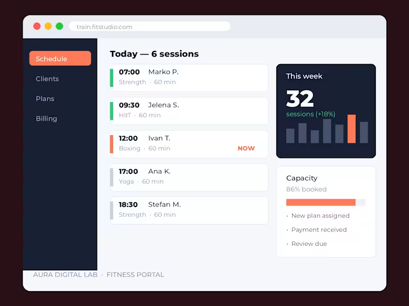
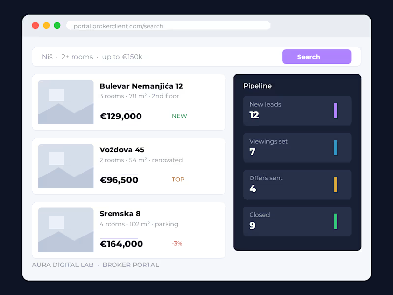
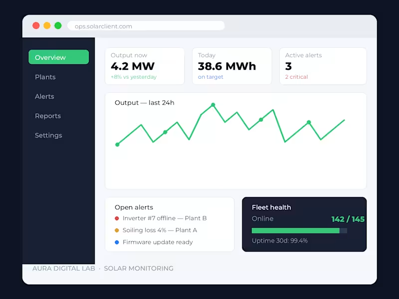

Data-driven UX/UI Design from Concept to Launch


Designer