


Zejtaria
Brand identity for the Albanian National Chamber of Crafts
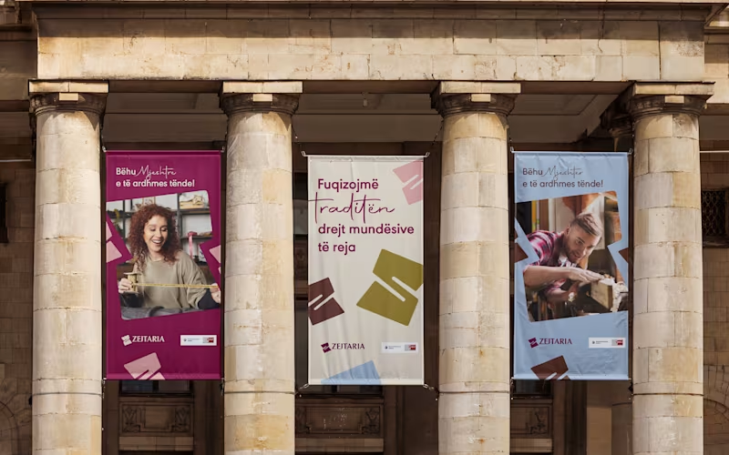
Zejtaria was developed for the National Chamber of Crafts to reposition traditional trades as a serious, viable path — for a generation more inclined to doubt them than choose them.
The visual system centers on a single letterform — Z — folded until it opens into a window, a gesture that reads as both a turn of material and an opening.
Across posters, stationery, packaging, and outdoor applications, the identity holds a deep burgundy as its anchor, extending into terracotta, mustard, powder blue, and blush — with the same restraint carried through every touchpoint: no ornament standing in for meaning.
28
86
1.5K


Brand identity design for Cookie Carousel, a bakery brand. The goal was to create a warm, playful identity that feels inviting and memorable while standing out in a competitive food and beverage market. Deliverables included the primary logo on transparent background, branded mockups, and social media assets ready for use.
1
138


The “Sky Angels” logo carries a deep emotional story, it’s more than design; it’s a tribute. Created in memory of the founder’s late father, the logo features an angel as a symbol of his eternal presence and protection. The golden tones reflect warmth, divinity, and the light he continues to shine over her path. It blends emotion and elegance, a reminder that love never fades, it just takes flight.
4
28
255

Been working on a new app icon concept called Starfish 🌟
Focused on creating something friendly, minimal, and instantly recognizable on any device.
The design blends warm gradients, bold outlines, and playful personality to stand out in dark and light modes.
I’ve also explored how it fits within Apple’s icon grid system and how it looks in context on iOS.
What do you think - would you tap it? 👀
12
173

