

Visual design for authors, coaches & bold creatives

Visual design for authors, coaches & bold creatives
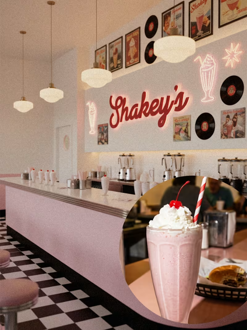
🥤💗 SHAKEY'S
An 80s milkshake bar where the music's too loud, the shakes are stupidly thick, and "extra" isn't optional.
For Brief 147 by @designerbriefs × @kittldesign, I designed the whole brand world for Shakey's—a retro milkshake bar that mixes old-school diner vibes with modern design that actually works.
The vibe:
🍓 Real fruit (not the fake stuff)
🎶 Vinyl records and cassette tape energy
🪩 Bold pinks, cherry reds, creamy neutrals
🥛 Thick shakes with personality
I wanted it to feel playful but not gimmicky. Not costume-y retro. Not trying too hard to be cute. Just the kind of place you walk into for one shake and leave with three photos and zero regrets.
@designerbriefs @kittldesign
2
298
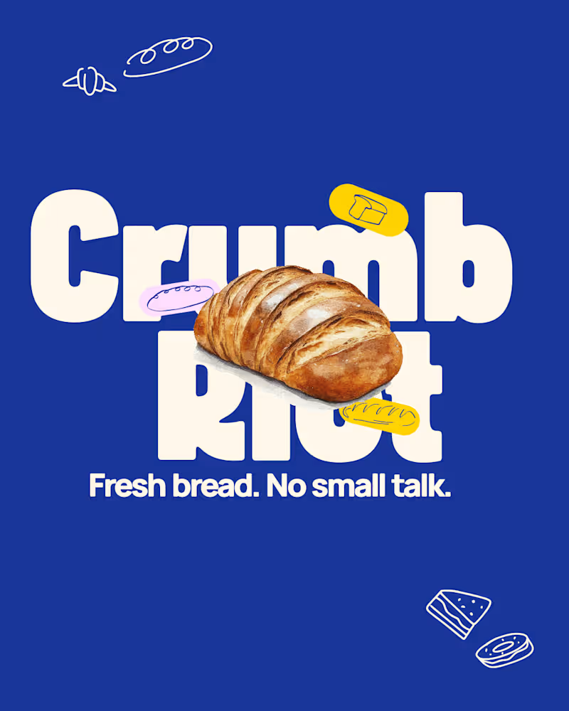
Quick looks from CRUMB RIOT 🥖
A playful bakery brand identity built around bold type, graphic bread illustrations, and a no-fuss visual system that actually scales.
This concept explores how fun, oversized typography and minimal copy can create instant shelf impact without trying too hard.
From logo to packaging to visual mockups, every element is designed to feel fresh, confident, and unmistakably bakery-first.
Save this if you’re into branding that’s simple, memorable, and built to work in the real world.
#bakerybranding #brandidentitydesign #logodesigninspiration #packagingdesign #brandingmockup #visualidentity #branddesigner #graphicdesigninspo #brandingconcept #designportfolio
4
3
376


Brand & Packaging Designer for F&B Brands • Bookings Open!
- 5.0
- Rating
- 18
- Followers
Brand & Packaging Designer for F&B Brands • Bookings Open!
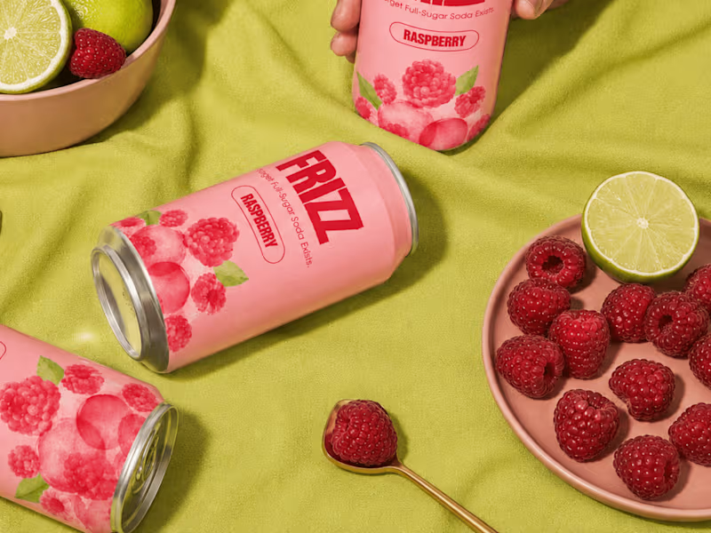
Stop sitting on your brand launch for 2 months. 🍉
I officially launched my 5-Day Visual Identity Sprint on Contra! Get a complete, launch-ready visual system-logos, submarks, colors, fonts, guidelines, and launch assets, delivered in exactly 1 week.
👉How it works:
Lock your start date on Contra
Submit your brief & inspo
Get production-ready brand files in 5 days flat
Fixed scope. Zero stress.
👉Reserve your sprint here: https://contra.com/s/AoEkXbb7-5-day-visual-identity-sprint
1
4


Brand Designer | Identity Systems | Social & Print |
Most coffee brands compete on intensity. Bold colors, aggressive typography, slogans built around hustle and momentum. Even premium specialty brands tend to lean on origin stories, roasting data, and café culture aesthetics.
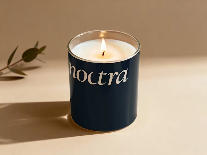
Noctra is a specialty coffee brand built for the quiet hours — the moments between dusk and dawn when the world slows down and you finally have time to just exist. In a market that shouts energy, speed, and productivity, Noctra whispers something different: stillness is not emptiness. Darkness is not absence. And a good cup of coffee deserves more than a rushed morning.
The goal was to build a brand that feels like the last hour before sleep or the first hour before the world wakes — warm, intentional, and deeply present.
6
9
311
Food & Beverage Brand Identity & Marketing Design
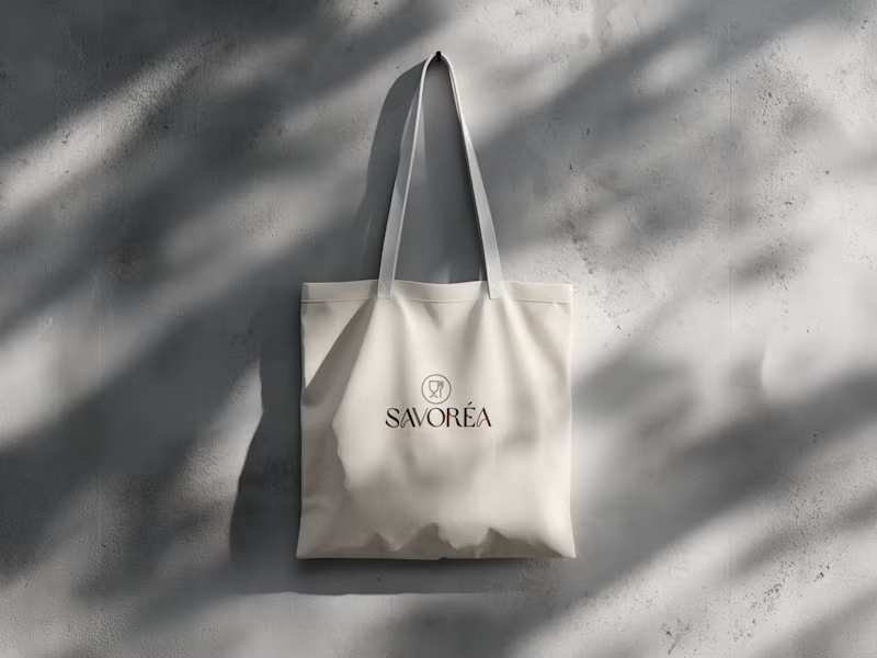
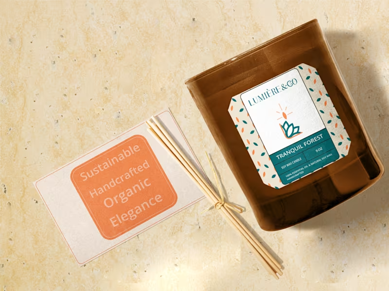
This project focuses on creating a clean and consistent brand identity for a food & beverage brand, applied across both print materials and social media.
The goal was to build a simple visual system that ensures clarity, balance, and brand consistency across all touchpoints. The identity includes logo design, color and typography direction, print applications, and social media layouts, all developed with a minimal and professional approach.
The result is a cohesive branding system that supports clear communication and a strong, reliable brand presence.
6
12
407
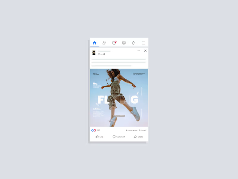
Experimenting with film-inspired grading and clean typographic layout. A simple portrait turned into a mood study.
A Lightroom color experiment: soft highlights, quiet shadows, and a minimal graphic touch.
2
4
260
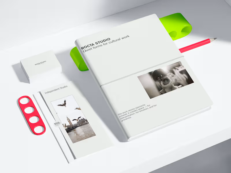
NOCTA STUDIO — Brand Identity & Editorial System
NOCTA STUDIO is a conceptual brand identity project for an independent cultural studio working with artists and filmmakers.
The identity is built around emotional restraint, clarity, and a system-driven approach to typography and layout. The goal was to create a flexible visual language suitable for editorial, print, and digital applications.
This project demonstrates my approach to minimal branding and content systems.
Services
Brand identity design
Editorial design
Visual systems for social & digital
Print & digital mockups
Check my full work
https://www.behance.net/anukumari4567
3
232

Design & data expert driving creative, data-led success.
Design & data expert driving creative, data-led success.


Vanss Aluform – Sustainable Construction Brand Identity
Designed a modern, eco-driven brand identity for Vanss Aluform, a construction and aluminum formwork company focused on sustainable growth. The logo integrates architectural forms with leaf elements to represent structural strength and environmental responsibility.
Developed a green-centric color system supported by neutral tones and natural textures to reinforce the brand’s commitment to innovation and sustainability. Delivered a scalable identity applied across business stationery, safety gear, site signage, and digital platforms.
A clean, future-forward visual system built for the evolving green construction industry.
0
81

Avviare International versity – Academic Brand Identity
Designed a distinguished crest-based logo and brand system for Avviare International versity. The identity blends classical academic heraldry with modern refinement to convey prestige, legacy, and global ambition.
Developed a deep red and gold color palette, monogram mark, and scalable visual system applied across stationery, campus signage, merchandise, and digital platforms.
A cohesive, premium identity built to position the university as authoritative, aspirational, and future-ready.
0
79

Designed a strategic and scalable brand identity for Peepal Network, a full-spectrum consulting company. The logo merges a tree and a networked globe to symbolize interconnected growth, global perspective, and structured problem-solving.
Built a refined monochrome visual system with modern sans-serif typography to convey authority and clarity. Delivered a complete identity direction including logo design, color palette, typography, and corporate mockups for digital and print applications.
A minimal yet powerful brand system designed for long-term scalability and cross-platform consistency.
0
87

Brand designer building identities that mean business.
Brand designer building identities that mean business.

UI/UX designer Available for project, Clients & Remote Work.
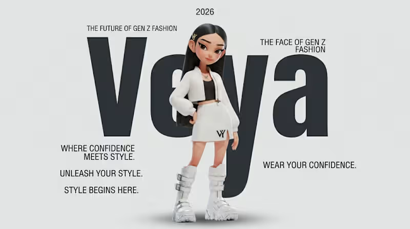
Meet VEYA- the fashion mascot of a fictional Gen Z fashion brand. ✨
VEYA is an original mascot created for a fictional Gen Z fashion brand built around self-expression, creativity, and confidence.
Rather than creating just a character, I designed a complete visual identity system where VEYA comes to life across multiple brand touchpoints- including campaign posters, website landing pages, flagship showrooms, book and magazine covers, stickers, packaging, shopping bags, clothing tags, shoe boxes and more..
Character Brief
Mascot Name: VEYA
Fashion Brand: VEYA
Logo: VY
Role: Style Muse / Fashion Explorer
Personality: Creative, confident, curious, playful, and inspiring.
Here's project link:
https://www.recraft.ai/project/8dc703d3-799c-4474-bbf7-09d87153b188
VEYA believes fashion is not about following trends- it's about discovering your own style and expressing who you are.
This project explores how a single mascot can become the face of an entire fashion world through storytelling, consistency, and a strong visual identity.
#RecraftAI #MascotDesign #CharacterDesign #BrandIdentity #FashionBrand #GenZDesign #3DCharacter #BrandDesign #CreativeAI #DesignChallenge #AIArt
1
2
363
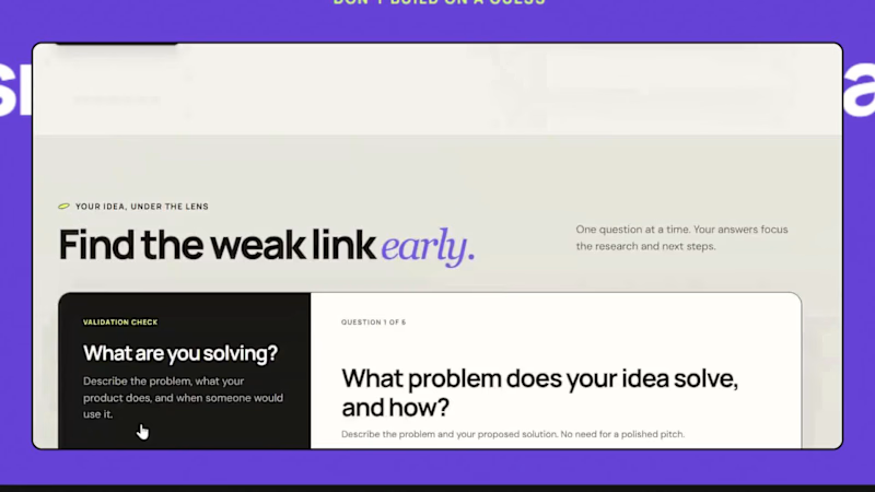
I built Idea Validator.
1. WHAT IS IT?
A validation tool for early-stage founders. Answer 6 simple questions, and it analyzes your competitors, pulls real-time market insights, and rates your idea: strong, medium, or unclear.
2. WHY I BUILT IT
Most early-stage founders start building on gut feeling. They skip research because it is slow and confusing.
3. WHAT PROBLEM DOES IT SOLVE?
Founders waste months on ideas nobody needs. Idea Validator replaces guesswork with real market insights and shows:
-> Problem and demand
-> Reason to choose your idea
-> What could stop it
-> Your next validation steps
-> You can download the full report in one click.
-> Know before you build.
Try it here: https://idea-validator-check.netlify.app/
What would you want this tool to tell you about your idea? Let me know in the comments.
#startups #saas #founders #productdesign #uiux #buildinpublic
3
3
257
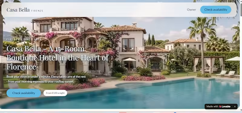
Casa Bella - Effortless Booking for a Solo-Owner Boutique Hotel
1. The Business:
Casa Bella is a 15-room boutique hotel in Florence, run by one owner, Elena - with a small team that keeps the rooms ready and breakfast on the table. No front desk, no call center.
2. The Problem:
Every "is a room available?" inquiry meant hours of back-and-forth for Elena - replying on WhatsApp and email, checking availability by hand, and chasing guests who forgot their bookings. No-shows cost her revenue every week.
3. The Solution:
Casa Bella's booking system turns every inquiry into a confirmed, paid booking -no back-and-forth needed:
-> Guests check dates, pick a room, and pay in under a minute through a conversational assistant
-> Common questions get answered instantly - no waiting on Elena
-> Confirmed bookings auto-send check-in details
-> Cancellations calculate refunds automatically
-> Elena's dashboard shows every booking live, plus replies and hours saved
4. The Result:
What used to take hours of manual back-and-forth now happens on its own. Elena checks her dashboard once a day - everything else is already done.
Built with @Lovable for #lovablechallenge
1
1
350
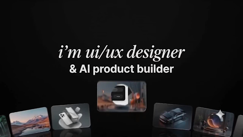
I'm not a professional video editor & this is my first time trying video generation and editing like this.
But I tried my best to make it good.
Spent 7 hours on it, and this is the result. 😍
What do you think? Would love your feedback!
#VideoGeneration #VideoEditing #AIVideo #BeginnerJourney #LearningInPublic #FirstAttempt #CreativeProcess #UIUXDesigner #AIProductBuilder #NoCodeTools #FigmaDesign #ContraFreelancer #WorkInProgress #DesignCommunity #OpenToFeedback
2
3
465

Good design is good business.
Good design is good business.

Logos. Brand. Posters. Systems. Designed with precision.
Logos. Brand. Posters. Systems. Designed with precision.

Spiderman-inspired eyes. Noise-driven gradients. Not just visual polish — this project explores how a single icon and colour gradient can anchor brand presence across formats. Same concept, optimised for album cover, laptop, and mobile screens.
4
434


