Sign Up
Filters
1
Projects
People
6
Gabriela Garrido
Pro
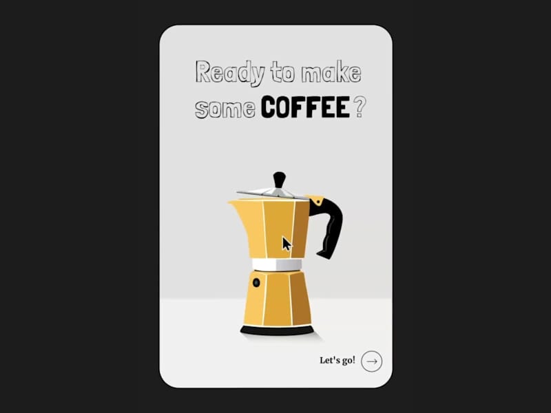
Ad Animation
6
61
1
Mert Ali Hanbay
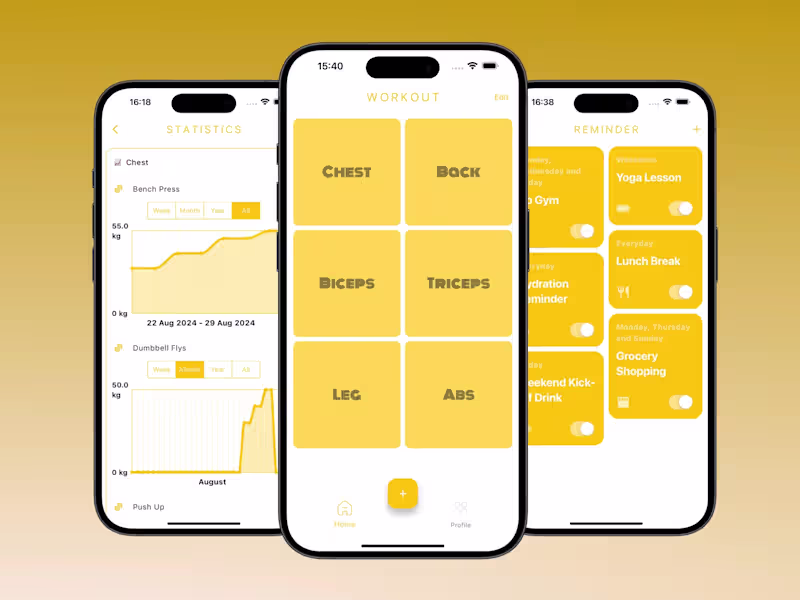
GymLog: Workout Tracker
1
4
0
Anton P.
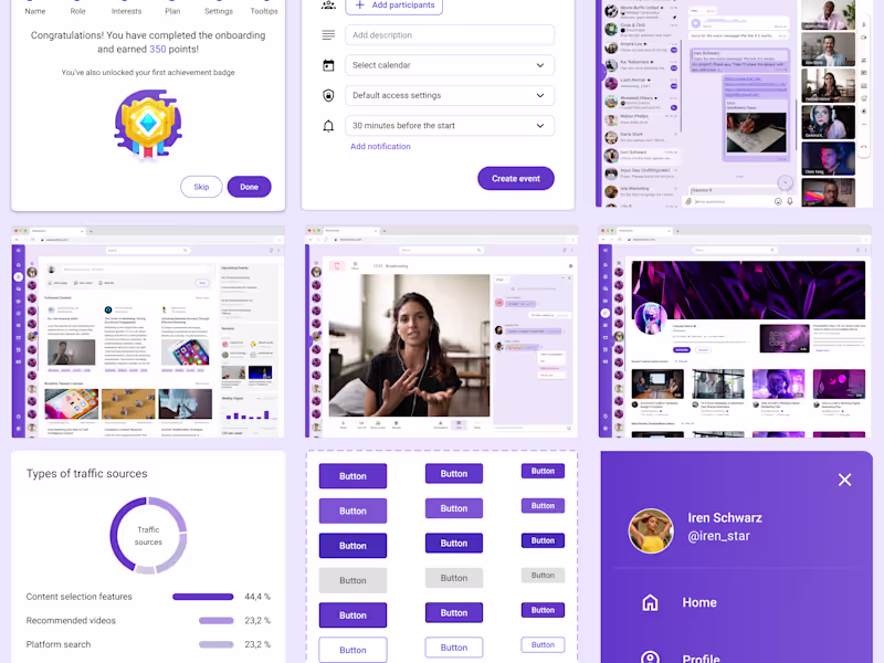
Innovative EdTech Platform
0
1
$920 earned
0
Min Bui
Pro
Brand Strategy & Conversion Rate Optimization Designer | CRO
0
2
0
Max Kinzel
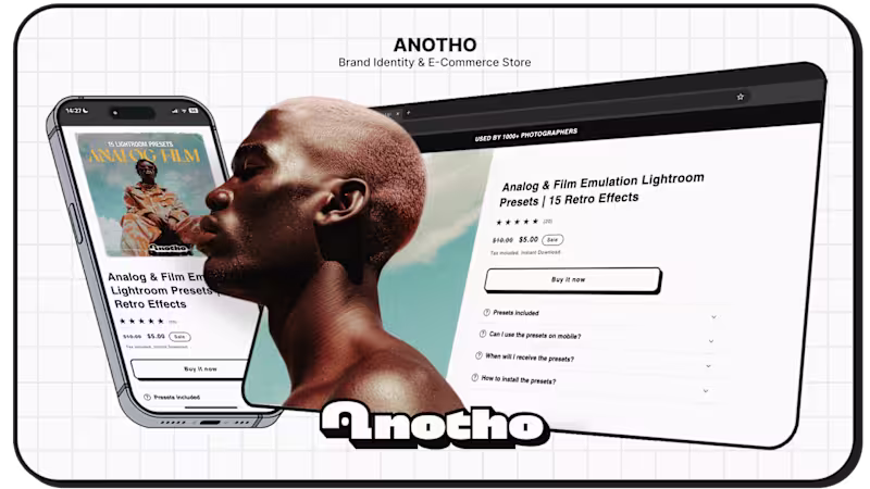
ANOTHO - Branding & E-Commerce
0
12
0
Andreas Böhler
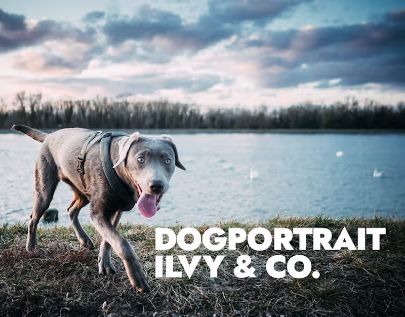
Dogportrait Ilvy & Co
0
2
0
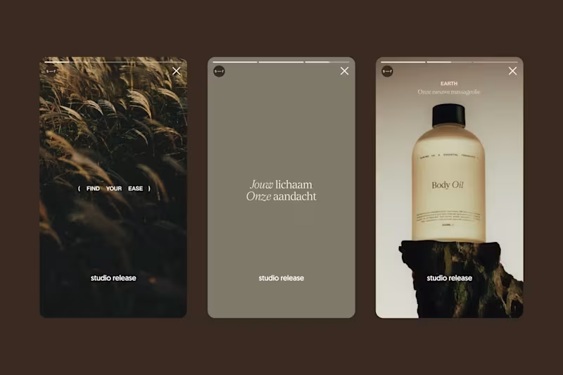
Lisa Lawall
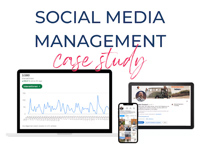
Case Study: Carsten Seubert, Empowering Space
0
8
0
Louiza Boukhecha
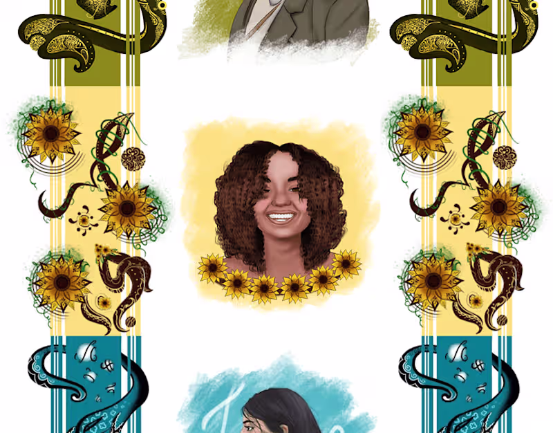
mes illustration :: Behance
0
3
4
Gabriela Garrido
Pro
Interactive Soda Configurator for Crumbl Cookies
1
4
29
0
Mert Ali Hanbay
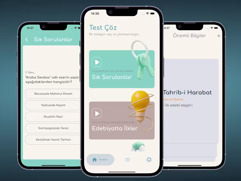
Yazar Eser: YKS, AYT Edebiyat
0
1
1
Anton P.
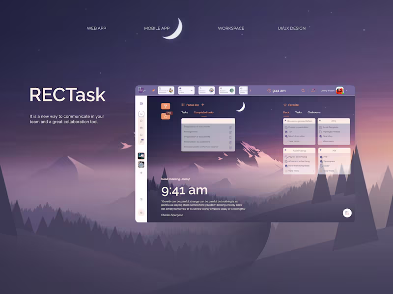
Simplifying Task Management with RecTask
1
3
16
Min Bui
Pro
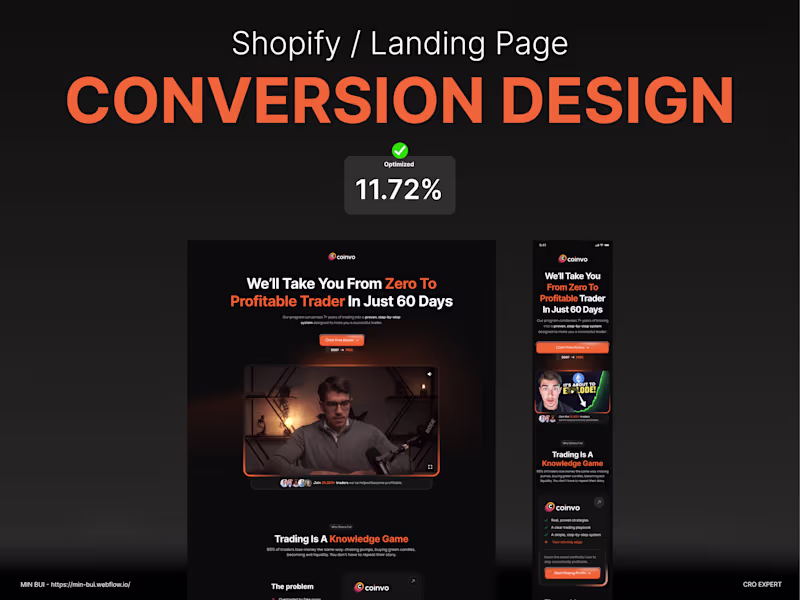
🖼 PDP Gallery: The Silent Salesperson The first 3 images above-the-fold often decide if someone scrolls… or bounces. Here’s how I build high-converting PDP image sequences: 1️⃣ Lifestyle first: show the product in context, solving a problem or making life better 2️⃣ Trust second: show close-ups, quality, packaging, badges, or customer UGC 3️⃣ Details last: size, angles, optional variants, tech specs I try to not dump 8 studio shots and call it a day. Gallery = story. CRO lives here. #CRO #UXDesign #PDP #ProductPageDesign #ShopifyDesign #EcommerceTips #ConversionRateOptimization #DTCDesign #UIUX #EcommerceStrategy
2
16
132
0
Max Kinzel
Max Kinzel Creative Agency - Branding & Web design
0
1
0
Andreas Böhler
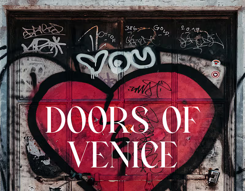
Doors of Venice
0
0
0
Lisa Lawall
Content repurposing/ creation for Rachel Pedersen (TikTok)
0
10
0
Louiza Boukhecha
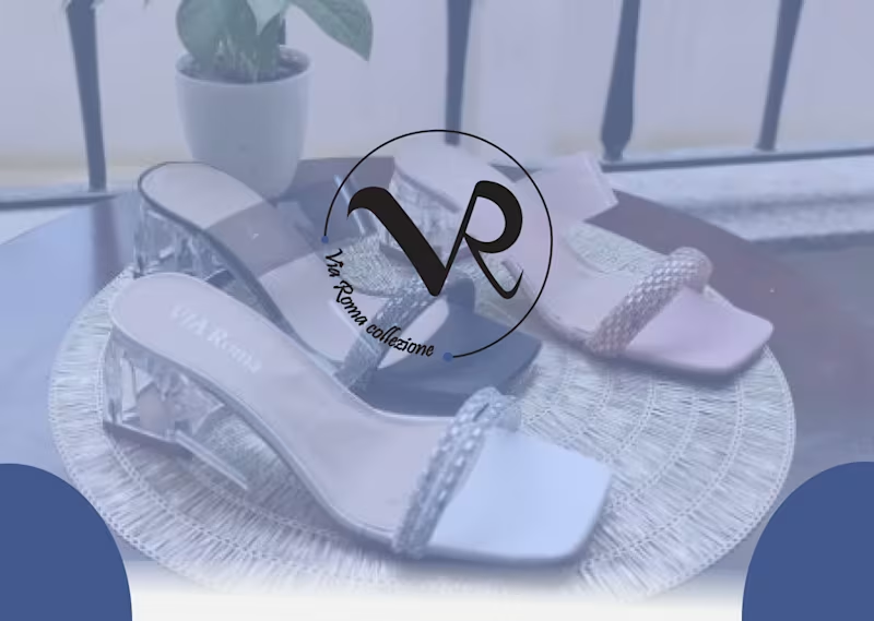
VIA ROMA logo brand identity :: Behance
0
1
4
Gabriela Garrido
Pro
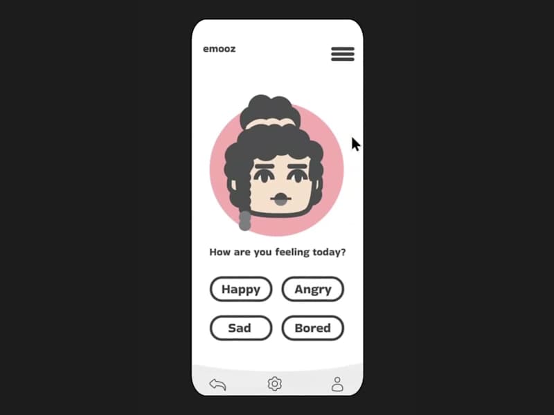
Mood Tracker
1
4
66
0
Mert Ali Hanbay
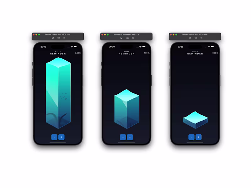
Water Reminder
0
7
29
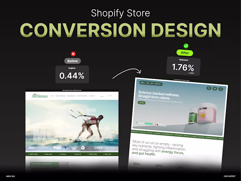
Min Bui
Pro
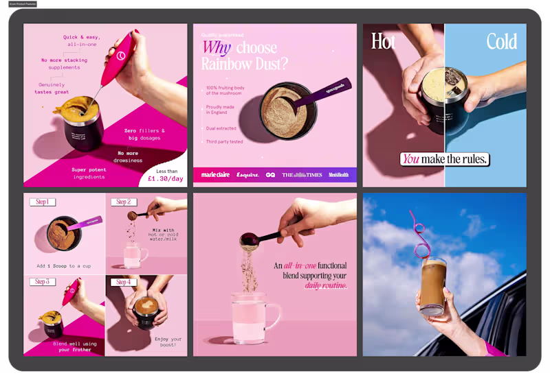
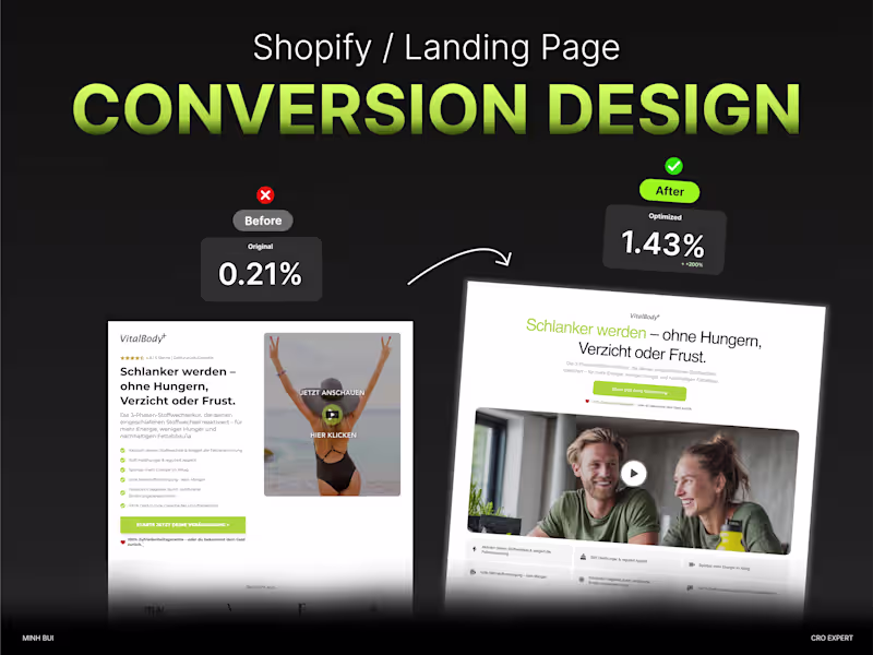
🧪 Supplement brands live or die by trust. 😃 When the product goes in your body, everything on your site needs to signal safety, credibility, and clarity. That’s why I redesigned this supplement store with CRO front and center: ✔️ Clean, clinical visual identity ✔️ Mobile-first, high-trust PDPs ✔️ Scroll behavior = trust indicators, not distractions ✔️ Subtle motion + retention flows When it looks trustworthy, it sells better. #CRO #Shopify #SupplementBrand #DTCEcommerce #TrustByDesign #UIUX #Branding
1
29
203
0
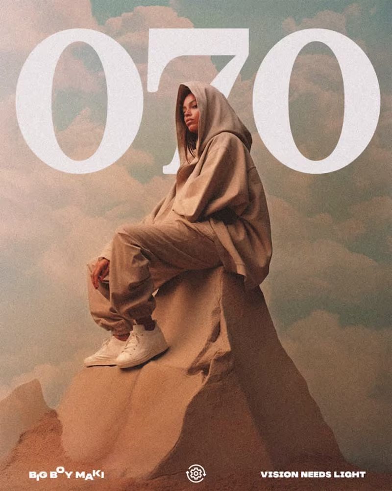
Max Kinzel
VISION NEEDS LIGHT - Graphic Design
0
7
0
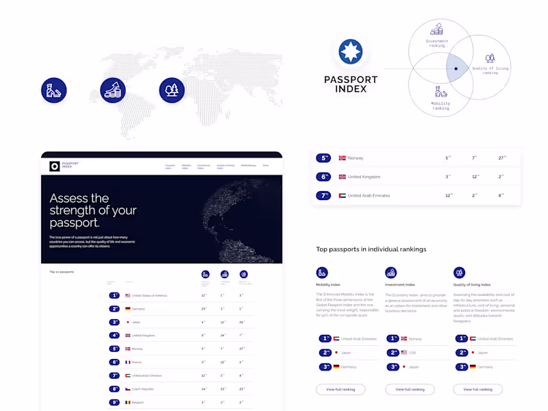
Anton P.
PASSPORT INDEX: Power of a Passport
0
2
0
Andreas Böhler
Fashion Portrait // Alicia
0
0
0
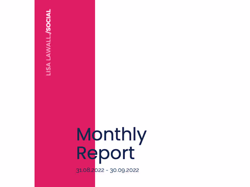
Lisa Lawall
4x reach and awareness within just one month
0
16
0
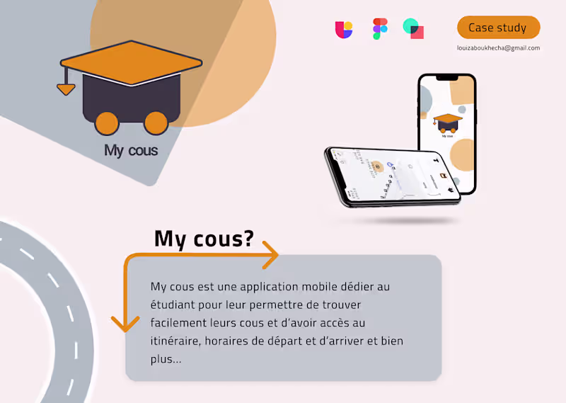
Louiza Boukhecha
my cous - UX case study :: Behance
0
1
4
Gabriela Garrido
Pro
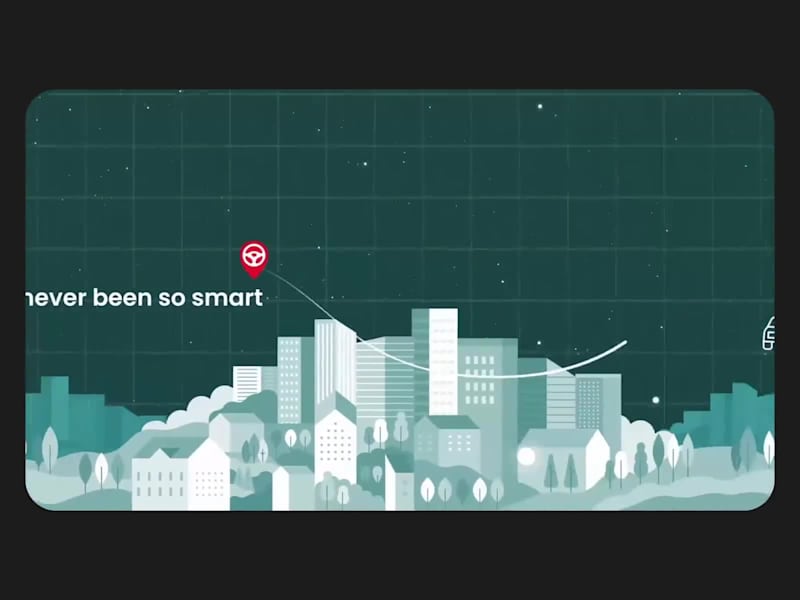
Interactive Explainer Animation
1
4
63
40
Min Bui
Pro
✨ Branding consistency isn’t just aesthetics, it’s conversion power! When fonts, colors, tone, and visuals align across website, ads, packaging, and emails: it builds trust faster! I try to design systems that connect every brand touchpoint, so every swipe, scroll, or click feels undeniably you. 🎯 #BrandConsistency #CRO #UIUX #DTC #EcommerceBranding #ConversionDesign #ShopifyDesign #VisualIdentity Let me know if you want a version for Behance, LinkedIn, or Instagram carousel too.
8
40
256
2
Gabriela Garrido
Pro
Animated spot
2
13
17
Min Bui
Pro
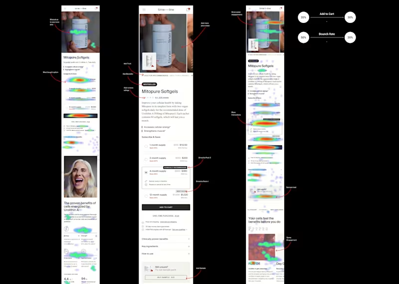
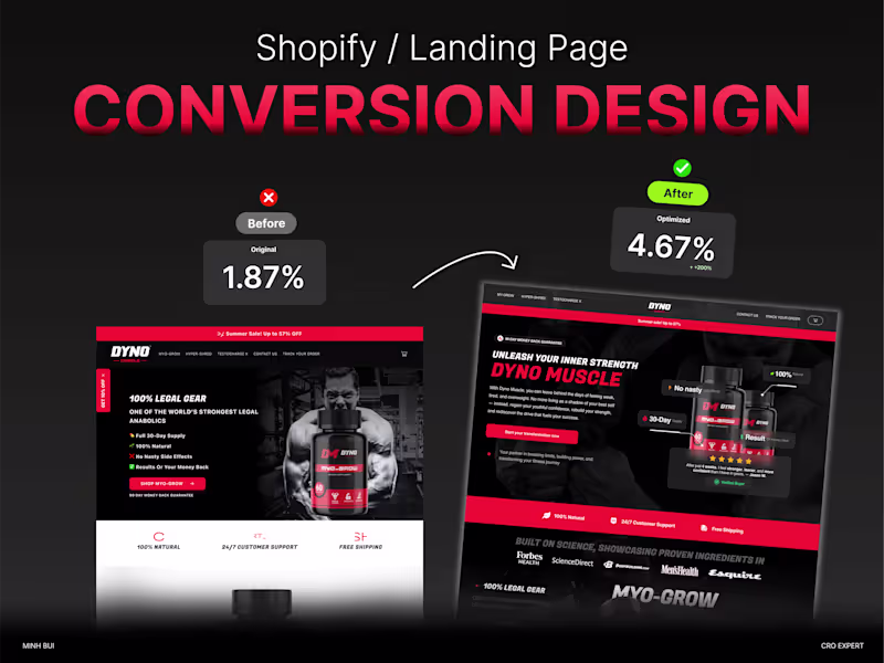
🧬💊 Health supplement websites need more than trust. They need conversion. When I revamped a DTC wellness brand site, I focused on: ✅ Building visual credibility (clean, clinical but not cold) ✅ Mobile-first layout with storytelling hierarchy ✅ Clear supplement benefit highlights ✅ UGC + expert trust combo (before-after, reviews, endorsements) ✅ CRO-led sections: bundles, subscriptions, post-purchase upsells ✅ Revamped PDP: from feature-focused → outcome-driven The result? A brand that feels premium, and sells like it. #HealthSupplements #CRODesign #DTCBranding #ShopifyDesign #ConversionRateOptimization #Framer #Webflow #FigmaUX #LandingPageDesign #WellnessEcommerce #MobileFirstUX #SubscriptionBrand
1
17
140
1
Gabriela Garrido
Pro
Interactive Icon Animations
1
1
11
24
Min Bui
Pro
🧪 CRO Audit Checklist ≠ surface-level review. When I audit a store or landing page, I look at: ✅ Value clarity (above the fold) ✅ Trust signals & hesitation blockers ✅ Scroll & click behavior (Hotjar, Clarity) ✅ Checkout leaks & upsell gaps ✅ Mobile friction & CTA placement ✅ Visual hierarchy and copy relevance ✅ Load speed, broken flows, and analytics tagging I think it is not guesswork. It’s a system. One that finds revenue left on the table. #CRO #ConversionAudit #UXAudit #ShopifyDesign #DTCGrowth #FigmaUX #HeatmapAnalysis #Framer #WebDesign #LandingPageOptimization #ConversionRateOptimization
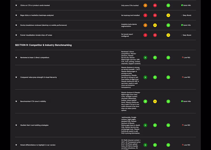
24
156
1
Gabriela Garrido
Pro
Memory Game
1
1
13
21
Min Bui
Pro
📍 Click Maps ≠ Pretty Heatmaps I think it is wise to check click maps to spot friction. 👉 Are they clicking non-clickable elements? 👉 Ignoring key CTA buttons? 👉 Raging at dropdowns that don’t drop? Click maps expose confusion. Tap maps on mobile? Even more brutal. I beleive CRO isn’t just design, it’s debugging user behavior. #CRO #ClickMap #TapMap #HeatmapAnalysis #UXDesign #MobileUX #ConversionRateOptimization #UXAudit #DTC #Shopify #Framer #Figma
21
140
1
Gabriela Garrido
Pro
Logo and Loader Animation
1
1
11
21
Min Bui
Pro
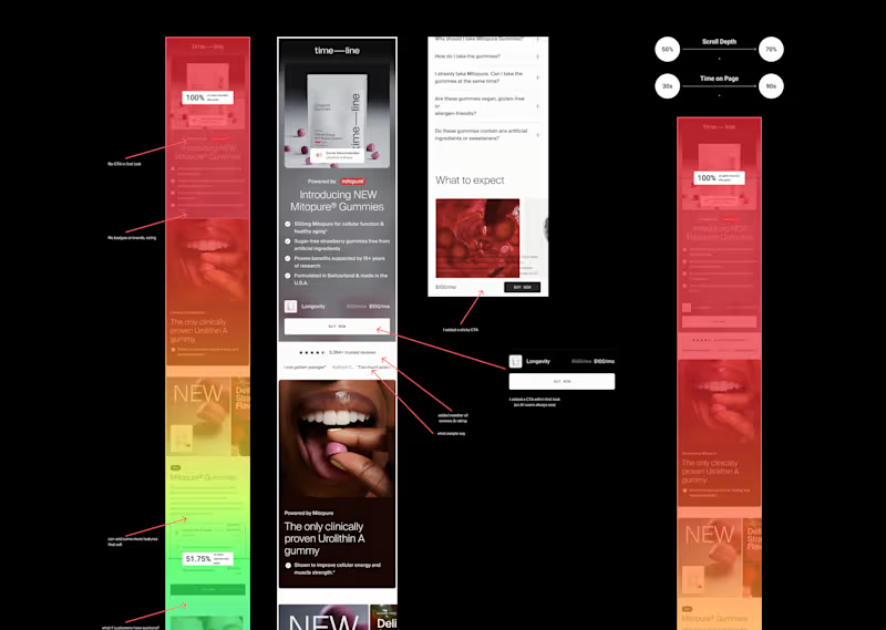
📊 Scroll Maps show attention drop-off... and opportunity. If 75% of users never see my CTA because it’s buried mid-page… Some may see it is a design issue. But for me, it is a revenue leak! I use scroll maps to: ✅ Spot CTA blindness ✅ Reposition trust elements ✅ Compress key storytelling above the fold Scroll depth tells me where users lose interest... and where I need to earn it back. #CRO #ScrollMap #UXDesign #Heatmap #ConversionOptimization #Figma #Framer #Shopify #LandingPageDesign #DTC
2
21
153
2
Gabriela Garrido
Pro
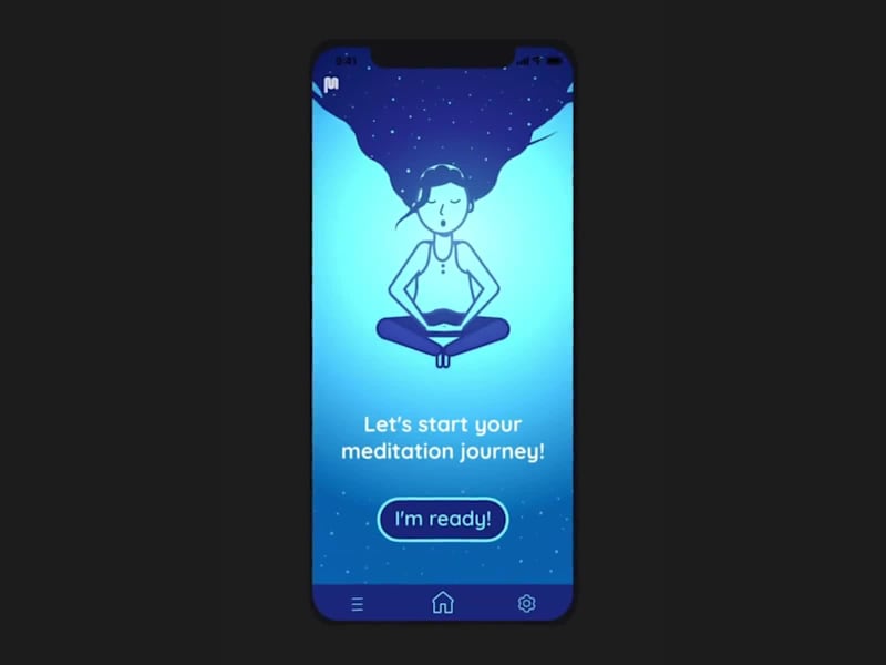
Meditation App
1
2
21
26
Min Bui
Pro
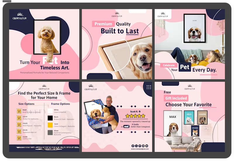
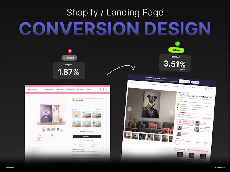
🐾 Above-the-fold visuals = conversion gold. For pet memorial or personalized frame products, I always lead with: 🖼️ A lifestyle hero image (pet + frame in cozy home setting) 🎨 Next: UGC or AI preview mockup with customer's pet name 📦 Then: Close-up of quality, size, and frame details This image sequence boosts trust, emotion, and urgency; before they even scroll. It’s not just pretty. It’s persuasive. #CRO #PDPDesign #PetEcommerce #PersonalizedGifts #ShopifyDesign #DTCBrand #ConversionDesign #AboveTheFold #StorytellingDesign #Framer #Replo #EcommerceUX
1
26
161
11
Min Bui
Pro
If it were me, I’d design a weight loss PDP to feel like a 3-step journey, not just a product page. Clarity on timing, habit support, real voices. No hype. Just a path that feels doable. Trust builds conversions more than urgency ever will.
1
11
108
17
Min Bui
Pro
Most whey product pages talk about: 25g of protein, Low carb, Digestive enzymes. But what actually converts? ✅ Clear product comparison (Isolate vs Concentrate vs Blend) ✅ Flavor descriptions that make me taste it before I buy ✅ Reviews from people like me (not just elite athletes) ✅ Auto-quantity selector based on usage goal (3x/week? Daily?) ✅ “Add to cart” button that’s visible before scroll ends I think people don’t buy protein. They buy progress. So I designed the store like I know what they’re really showing up for.
2
17
172
25
Min Bui
Pro
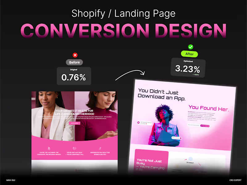
When designing for ambitious moms, i'm not just solving for time. I'm solving for mental load. BossBestie isn’t about productivity hacks, it’s about mental clarity, emotional support, and the permission to focus. So if i'm building the landing page or onboarding flow, I'd tell myself that: Don’t sell features. Show relief. Don’t just say “plan your day.” Show how it reduces overwhelm. Use copy that speaks like a best friend, not a calendar. Moms don’t want another to-do list. They want to feel like they’re not doing it all alone.
25
177
17
Min Bui
Pro
I'm not just selling a swab and a QR code. I'm selling relief, clarity, and the confidence to take control of your health. If my PDP reads like a lab manual, I'm losing people. Here’s what converts: ✅ Clear: What’s inside the kit (without clinical overload) ✅ Reassuring: What happens after they send it back? ✅ Human: Testimonials that sound like real people, not lab reports ✅ Mobile-first: Most buyers are on their phone, feeling uncertain People don’t buy health kits to collect data. They buy to feel better, faster, design the page like I myself understand that.
17
167
17
Min Bui
Pro
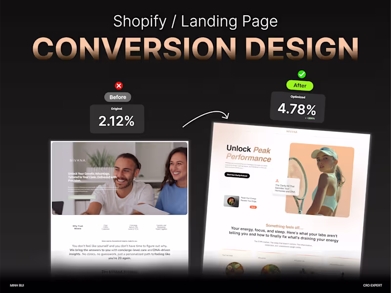
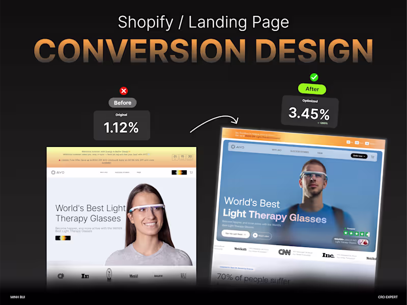
Most light therapy brands stop at “clinical.” White background. Specs. FDA logo. The end. But glass is sensory. It’s about the warmth, the ritual, the result. If I'm designing a product page for light therapy glasses, I'd: Show how it fits into a daily routine (not just on a sterile face) Use motion or glow effects to simulate the light response Bring before/after emotions into testimonials (not just features) People buy what they can visualize themselves in, not just what “makes sense.”
1
17
178
9
Min Bui
Pro
Recently, I tested swapping “Start Your Audit” with “See Your CRO Score Now” on a homepage banner. Result: ~20% higher click rate and more leads entering qualification stage. Micro‑copy matters. Your CTA isn’t just a button , it’s persuasion. If anyone wants help brainstorming CTAs for their design funnel, I’m happy to jump in.
1
9
108
16
Min Bui
Pro
I often get asked: “Should I pick beautiful design or high-converting layout?” My take: You don’t have to choose. Start with CRO-led wireframes Layer your brand aesthetic after Test visually bold elements only if they don’t hurt UX Have you ever A/B tested a “pretty vs plain” version? What happened?
16
137
24
Min Bui
Pro
One design habit I started: always build with focus zones, using contrast, spacing, and directional cues to funnel eyeballs. Since I adopted it: Bounce rates dropped ~10–12% Clicks on primary CTAs went up If you share one design habit that’s helped your work, I’ll compare notes.
24
172
0
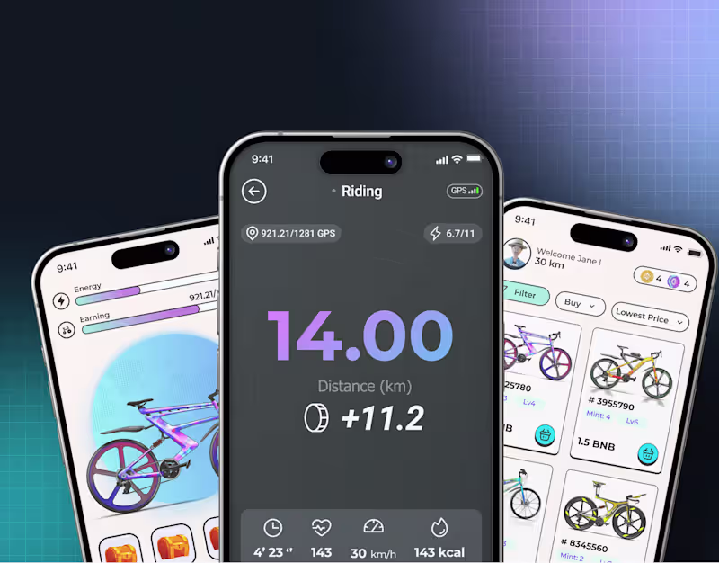
Min Bui
Pro
Gps Earning
0
0
0
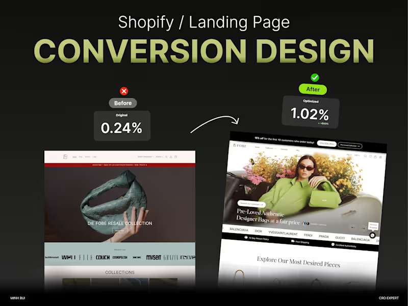
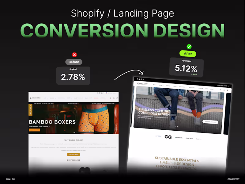
Min Bui
Pro
Swole Panda CRO
0
0
0
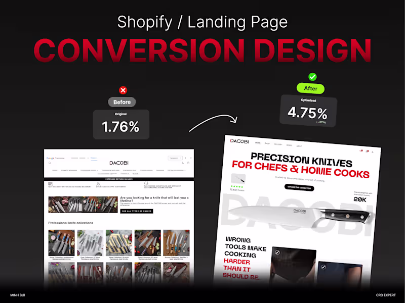
Min Bui
Pro
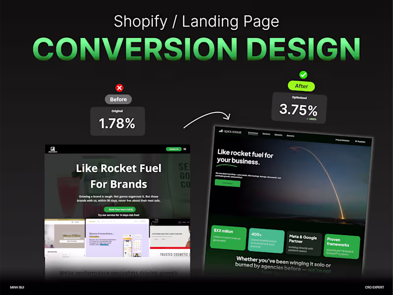
Quick Evolve CRO
0
1
0
Min Bui
Pro
Wellness Meditation
0
2
Explore projects