Social Media & Content Strategist | UGC Content Strategist
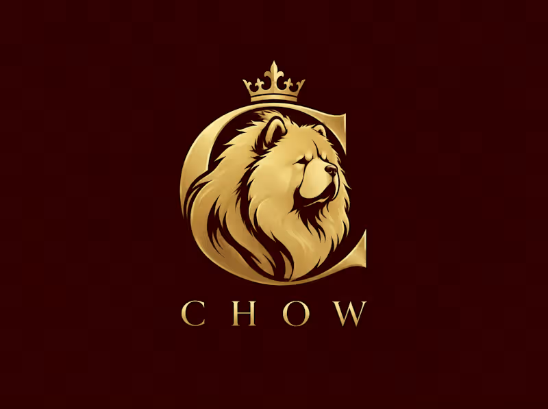
CHOW — Luxury Pet Brand Logo Design
Project Type: Logo Design · Brand Identity · Creative Direction
Project Overview
CHOW is a luxury pet brand logo concept inspired by the elegance, confidence, and distinctive appearance of the Chow Chow breed.
The goal was to create a bold yet refined visual identity that feels premium, memorable, and timeless. I combined a stylized Chow Chow emblem with a regal crown, elegant typography, and a rich burgundy-and-gold color palette to create a sophisticated brand aesthetic.
Creative Direction
The design takes inspiration from luxury fashion houses and heritage emblems, using metallic gold against a deep burgundy background to communicate prestige and exclusivity.
The Chow Chow illustration is the centerpiece of the identity, while the crown adds a regal touch and the clean, widely spaced lettering creates a modern, high-end finish.
Design Highlights
Custom-inspired Chow Chow emblem
Regal crown and crest composition
Burgundy and gold luxury color palette
Elegant, minimalist typography
Premium visual direction for a pet-related brand
Versatile concept suitable for digital branding and packaging exploration
My Approach
My focus was to create a logo that communicates the personality of the breed while giving the brand a distinctive, premium look. Every element—from the emblem to the color palette—was selected to work together as a cohesive visual identity.
This concept explores how thoughtful design can help a pet brand stand out and build a recognizable presence.
Need a logo that reflects your brand's personality?
I can help bring your vision to life through creative logo concepts, visual direction, and cohesive branding.
Let's create something distinctive for your brand.
This logo is for purchase.
0
111
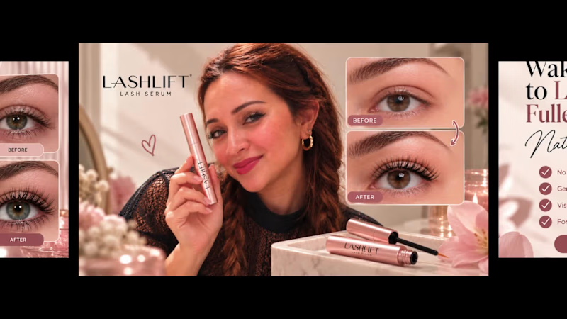
LASHLIFT — Social Media Campaign & Creative Direction
A premium beauty campaign designed to turn product visuals into a cohesive brand experience.
Project Overview
LASHLIFT is a lash serum brand concept I developed to explore how beauty brands can use strategic visual storytelling to create a premium, recognizable, and engaging social media presence.
I created a series of coordinated campaign visuals, combining product photography concepts, UGC-inspired creative, lifestyle imagery, and promotional content. The goal was to build a consistent visual identity while exploring different ways to showcase the product across social media platforms.
Campaign Strategy
My approach was to create content that speaks to different stages of the customer journey, from discovering the brand to learning about the product and considering a purchase.
Brand awareness: Premium product imagery designed to capture attention and establish a recognizable visual identity.
Product storytelling: Lifestyle and vanity-inspired visuals that place the product in an aspirational, everyday beauty routine.
UGC-inspired content: Creator-style imagery designed to feel personal, relatable, and native to social media.
Product education: Clear, visual communication around product use and key messaging.
Conversion-focused creative: Promotional layouts with concise headlines and calls to action designed to encourage product exploration.
Creative Direction
I chose a soft blush, warm beige, cream, and rose-gold palette to communicate femininity, elegance, and a premium beauty aesthetic.
The campaign combines refined typography, close-up beauty imagery, reflective surfaces, and carefully composed product scenes to create visual consistency across different content formats.
Rather than repeating the same layout, I explored multiple creative directions while keeping the brand recognizable throughout the campaign.
Deliverables
Social media campaign visuals
Product-focused promotional graphics
UGC-inspired creative concepts
Lifestyle and product photography concepts
Brand-consistent visual storytelling
Conversion-oriented advertising concepts
My Approach
As a Social Media Manager and Strategist, I believe effective content needs more than an attractive design. It should communicate a clear message, connect with the intended audience, and support a wider marketing objective.
With this LASHLIFT concept, I explored how a beauty brand could balance aspirational visuals with relatable content and product-focused messaging to create a more cohesive social media presence.
Looking for creative social media content for your beauty, skincare, or lifestyle brand?
I can help you develop a consistent visual direction and content concepts tailored to your brand, audience, and marketing goals.
Let's create something that makes your brand stand out.
1
206

Business Services – Promotional Motion Graphics Video
Created a modern, animated promotional video designed to showcase a business's creative services in a visually engaging and professional way.
What I did:
Developed the creative concept and visual direction.
Designed a clean, modern layout using bold colors, typography, and geometric elements.
Created animated service showcases for web design, motion graphics, and video editing.
Incorporated visual imagery to make each service more engaging and recognizable.
Designed smooth transitions and animated elements to maintain visual flow.
Created a clear contact section to encourage potential clients to get in touch.
Tools Used: Figma, Canva, and Adobe Illustrator.
Skills: Motion Graphics, Promotional Video Design, Graphic Design, Visual Storytelling, Typography, Animation, and Creative Direction.
0
76

Squarespace Web Designer for Artists & Creatives
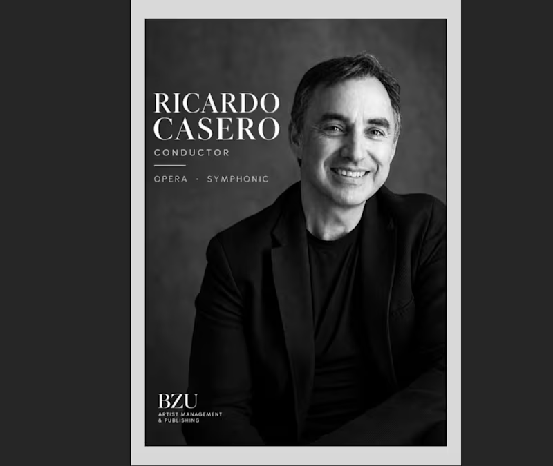
Ricardo Casero | Professional Conductor Press Kit
Professional press kit design and editorial presentation for Ricardo Casero, orchestra conductor.
The project focuses on presenting the artist's professional profile, career highlights and promotional materials in a clear, elegant and visually cohesive format.
Designed for concert promoters, orchestras, festivals and cultural institutions.
Services: Artist Press Kit Design · Editorial Layout · Artist Branding · Visual Communication
0
21
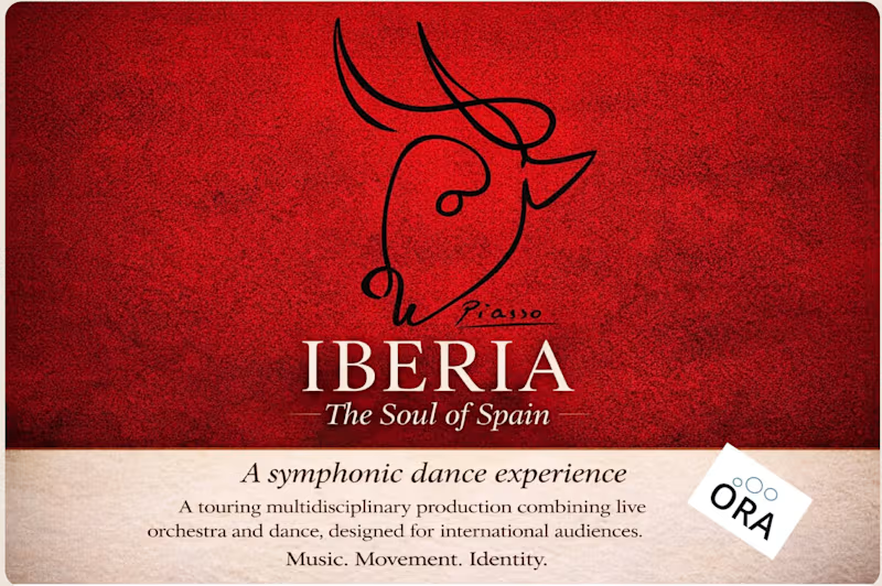
IBERIA – The Soul of Spain | Artistic Press Kit Design
Professional press kit design and artistic presentation for IBERIA – The Soul of Spain, a multidisciplinary production bringing together orchestral music and Spanish dance.
The project features 35 performing artists, supported by a technical production team.
Developed as a professional presentation tool for concert promoters, festivals, cultural institutions, and potential partners.
Services: Press Kit Design · Editorial Layout · Artistic Project Presentation · Visual Communication
https://static1.squarespace.com/static/6913914ab2540232654fd26f/t/6aa93fa86a9dc1078c1aabae/1789476776609/Iberia_+El+alma+de+Espan%CC%83a.PRESSKIT.pdf
0
27

Website Design for Classical Musicians
A recent Squarespace website project for internationally acclaimed conductor and composer Joseph Swensen.
Designed to bring together his artistic identity, career, compositions, recordings and latest projects in a clear, elegant and accessible digital space.
At BZU, I create bespoke websites for musicians and creative professionals, combining artistic understanding with thoughtful web design.
Explore the website: https://www.josephswensen.com/
#Squarespace #WebDesign #ClassicalMusic #Portfolio
1
61
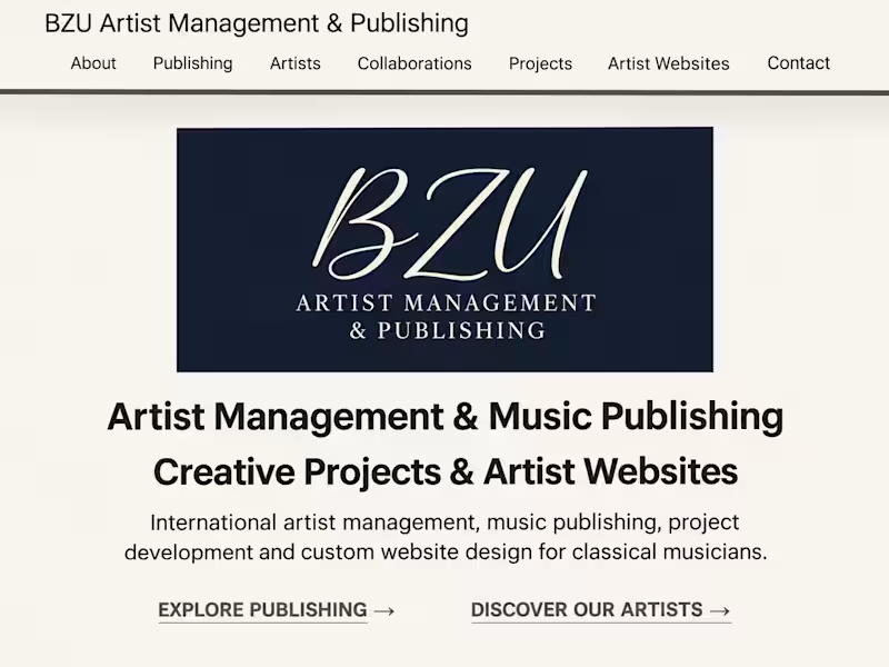
BZU Artist Management & Publishing | Squarespace Website Design
A complete website designed and developed for BZU Artist Management & Publishing, an international company specialising in classical music, artist representation, music publishing and creative projects.
The project brings together artist profiles, music publishing, creative collaborations and professional website design services in a cohesive, elegant digital experience.
My work included:
Website design and development using Squarespace
Visual identity and page layouts
Content organisation and navigation
Mobile-responsive design
Integration of artist portfolios and professional services
Explore the website:
https://www.bzuartistmanagementpublishing.com/
#Squarespace #WebDesign #Portfolio #CreativeDesign #ClassicalMusic
1
2
92

Social Media & Ad Campaign Graphic Designer
Social Media & Ad Campaign Graphic Designer


Exploring to shape the world creatively and empathically
Exploring to shape the world creatively and empathically


Web and Brand Designer
Web and Brand Designer


Creative designer blending strategy, style & AI tools.
- $1k+
- Earned
- 5x
- Hired
- 5.0
- Rating
- 196
- Followers
Creative designer blending strategy, style & AI tools.

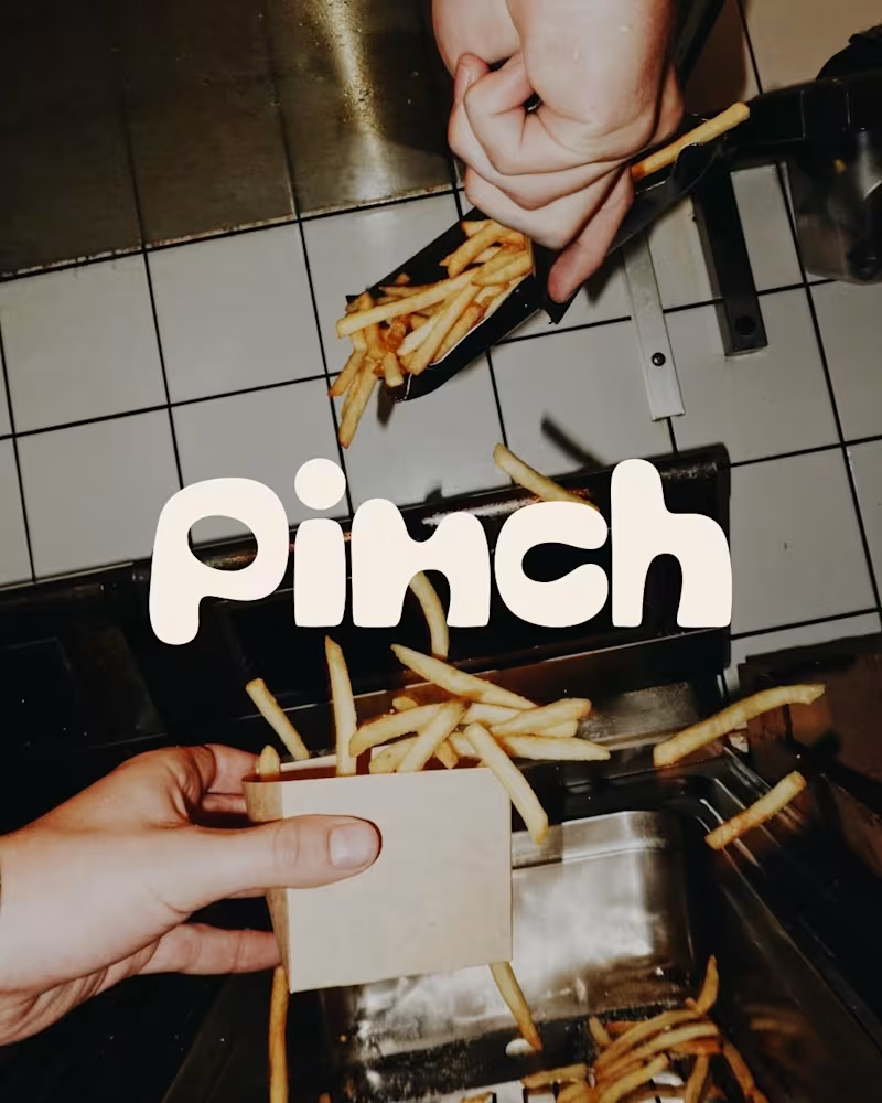
Bland is a choice.
Pinch is a concept brand for a mid-high salt line made to live on the counter, not in the cupboard. Five flavors, five two-color tins, one refillable keepsake people leave next to the bar cart.
I built the full identity: wordmark, lid lockups, hand-stamped pattern system, tone of voice, and art direction.
More from the system coming soon.
78
121
6.1K
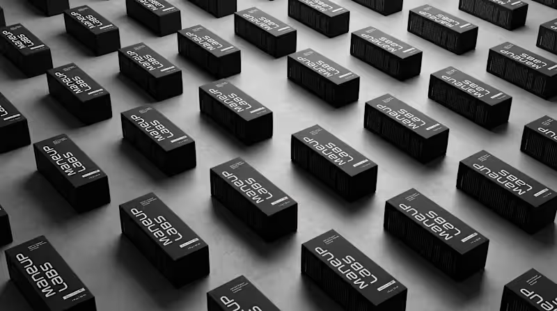
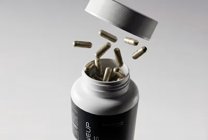
Hot take: hair growth products don't have to look like medicine to work like it.
Most brands in this category go clinical white and blue, it reads safe, but it also reads like something you'd hide in a drawer, not something you'd want visible on your sink. For Maneup Labs, I went almost fully black instead.
That was a real risk. In a category this saturated with sterile, pharmacy-white packaging, going dark could just as easily read cold, or get lost next to competitors leaning into "clean = trustworthy." But it did the opposite: next to every clinical-looking bottle on the shelf, black reads premium, not medicinal, closer to what you'd expect from a grooming or fragrance brand than a hair-loss aisle.
That's the audience shift the whole rebrand was built around, not the guy who wants to feel like he's medicating something, but the guy who wants a product that looks like it belongs on his counter.
Would a bottle like this make it out of your bathroom cabinet and onto your sink?
Check it out (https://contra.com/p/oN7mPNlL-maneup-labs-brand-identity-and-packaging-design)
63
111
6.1K