
Ana Paula Coirini
Graphic designer specializing in visual identity
New to Contra
Ana Paula is ready for their next project!
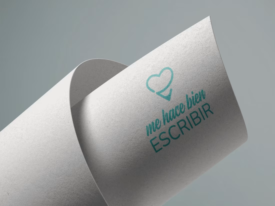
Visual Identity for "Me Hace Bien Escribir": Therapeutic Writing
I developed the brand identity for 'Me Hace Bien Escribir,' a platform dedicated to therapeutic writing and personal growth. What started as a social media collaboration evolved into a deep brand redesign fueled by a strong personal connection with the founder’s mission.
My goal was to capture the raw yet delicate nature of the project. I designed a minimalist 'imagotipo' that reflects the courage of writing from the heart. The visual system balances vulnerability with professionalism, using clean lines to mirror the clarity that writing brings to the soul.
This project showcases my ability to translate complex human emotions into a functional and intentional visual language that resonates with a sensitive audience
0
92
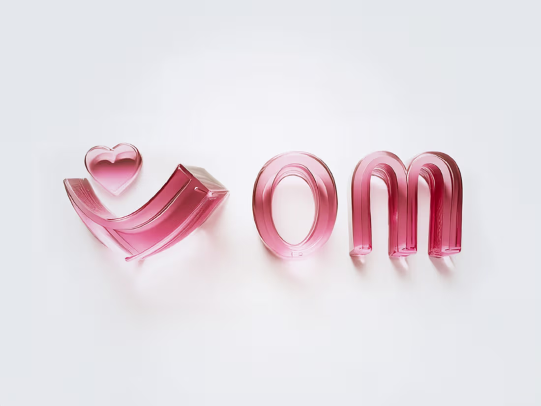
Visual identity for Espacios Om: Reprogramming Spaces and Wellbeing
I developed a minimalist and organic visual identity for Espacios Om, a brand dedicated to the redesign and harmonization of physical and interior spaces. The goal was to reflect a loving, light, and simple essence.
I focused on creating a balanced visual system that conveyed peace and coherence. By eliminating the unnecessary, the brand achieves a powerful yet delicate presence, ensuring that the visual language feels as fluid and breathable as the spaces it manages. The project included a custom logo design and a cohesive brand system, designed for longevity and clarity.
0
86
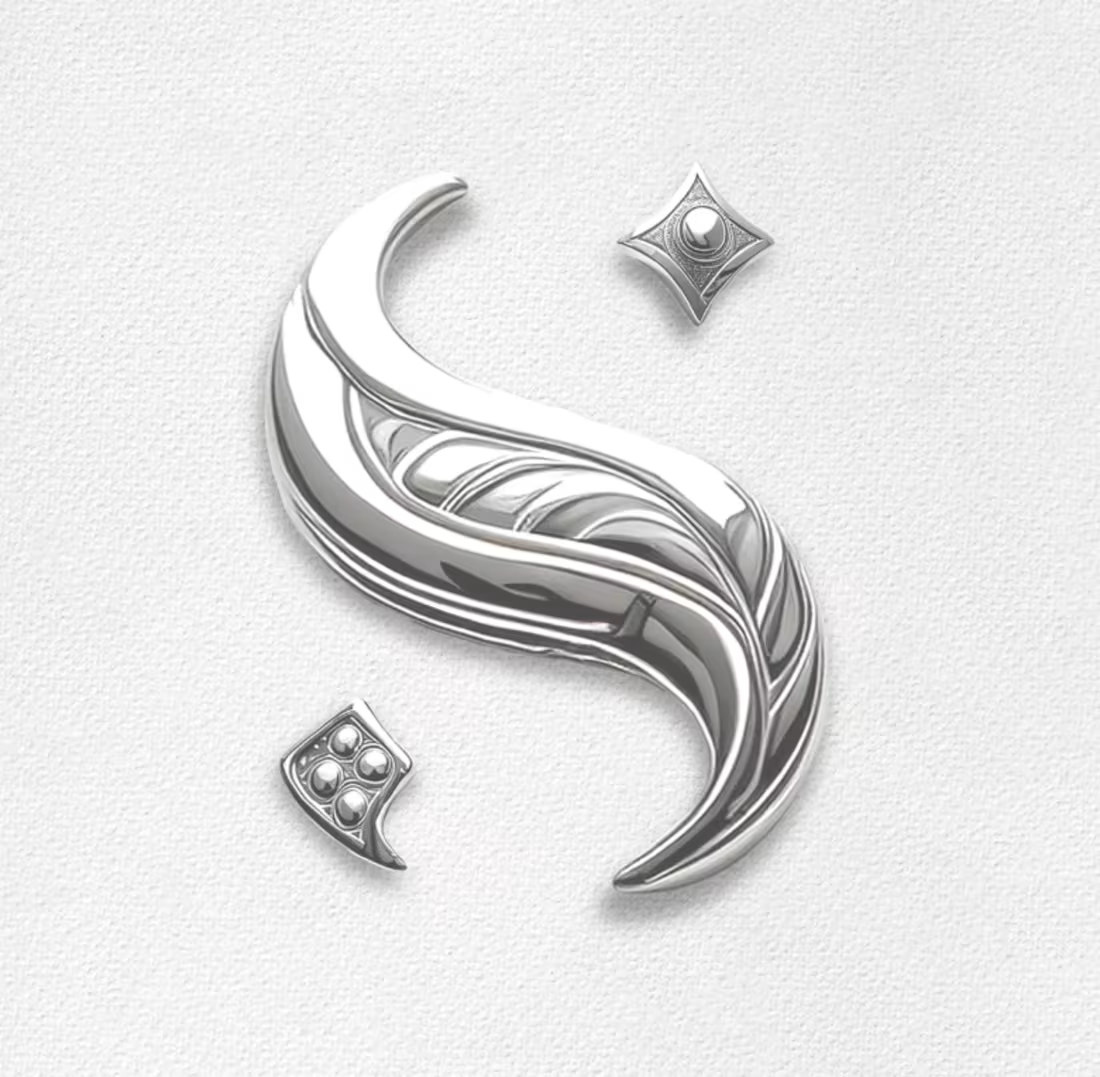
Visual Identity Design for Luxury Jewelry Brand
I developed the visual identity for Sauda Joyas based on a clear core concept: if the brand were a person, she would be sophisticated, resilient, and empowered. The challenge was to translate that personality into a graphic identity that inspires both trust and approachability.
The result is a brand with a seamless and minimalist aesthetic, designed to communicate balance across every touchpoint. I focused on creating a versatile visual system that complements the quality of the jewelry, achieving an identity that is not only elegant but also authentic and reliable
0
104
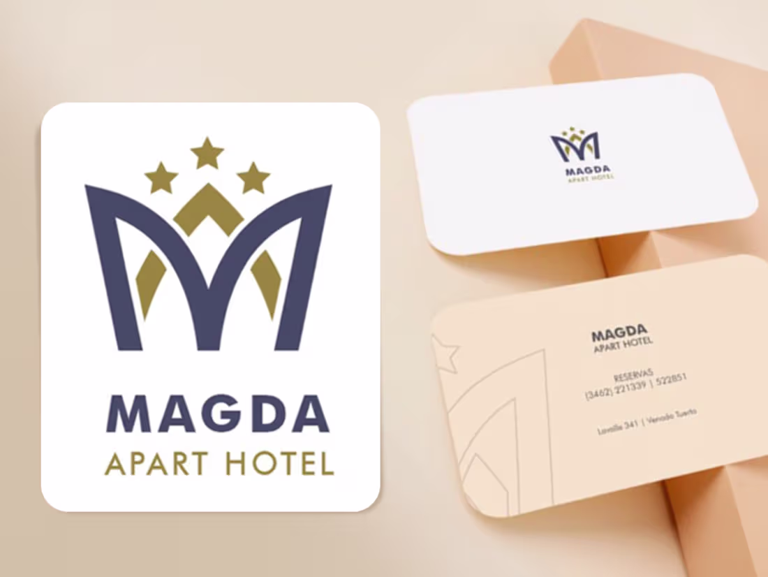
Visual Identity for Magda Apart Hotel: Legacy & Sophistication
I designed a minimalist identity for Magda Apart Hotel, blending personal heritage with high-end service. The concept centers on a crown symbol—a tribute to the owner’s grandmother, Magda—representing both quality and roots.
The 'M' monogram serves as a clean, impactful anchor, ensuring legibility and brand recognition. I curated a color palette of deep blue for tranquility and soft mustard for elegance, creating a sophisticated atmosphere where guests feel at home.
The result is a refined visual system that balances historical meaning with a modern, functional aesthetic for the hospitality industry.
0
77