
Managed Code
UX/UI Design | Product Design | Webflow | AI Agents
- 5.00
- Rating
- 23
- Followers
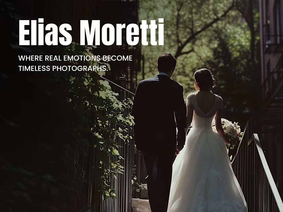
We designed this website for a photographer whose work is driven by emotion, pacing, and restraint.
The challenge wasn’t layout complexity—it was knowing when to stop.
We focused on:
• quiet typography that lets images breathe
• clear hierarchy without visual pressure
• navigation that stays present, then disappears
• rhythm and spacing that guide attention instead of pulling it
The goal was simple and demanding at the same time: let the photographs carry the story, without the interface competing for it.
This kind of project only works when design decisions are deliberate—what to show, what to soften, what to leave unsaid. Every screen was shaped around that idea.
We enjoy projects where design steps back just enough to make the work feel more human.
27
260
Just wrapped a digital revamp for Fabius, a law firm that wanted to feel human first, legal second. Instead of cold corporate visuals, we used subtle gradients, muted tones, and portraits with personality. ✨
The experience is built around clarity: practice areas are easy to scan, and expandable when you want more. A streamlined specialist search helps you find the right expert fast, and a compact profile carousel keeps browsing clean and simple.
Portraits add warmth without losing credibility, shifting the tone from “law” to “people who help you solve problems.”
Typography stays crisp, interactions stay intuitive, and navigation feels calm. No friction, no noise — just a confident digital presence that builds trust ✅
Legal service can feel intimidating. This one doesn’t — and that was the point. 💼😌
15
269
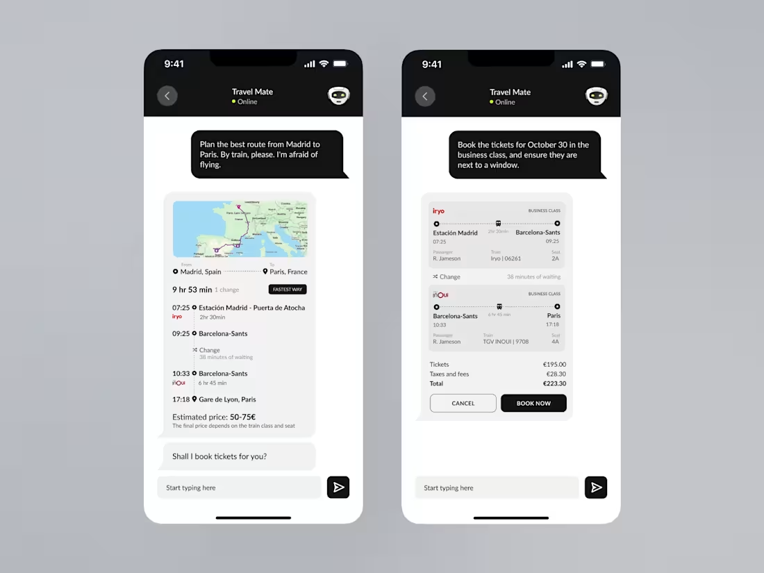
✈️ Travel Booking App — Smart Assistant & Ticket System
I designed a mobile interface for a modern travel booking experience.
Users can search flights, compare options, and get smart route suggestions — all in a clean, intuitive UI.
The app also includes a chat-based assistant that helps book tickets, optimize routes, and send travel reminders automatically.
Simple, fast, and focused on the traveler’s comfort.
3
202
Learning new words doesn’t have to be dull. With AIVO, the goal was to create a calm, clean experience that feels genuinely enjoyable to use. Minimal noise, smooth flows, and just enough breathing room to keep you focused ✨
Progress is always visible. You instantly see what’s done, what’s in progress, and what’s ready next — creating that quiet motivation to keep going.
Adding vocabulary feels natural too. Notes, lists, documents — everything fits into a simple layout that stays out of your way.
And my favorite part: Visual Vibes. A small image-based matching moment that makes new words stick without forcing memorization 🧠
AIVO is about clarity, gentle design, and learning that feels good.
Learn clearly. Remember naturally. And enjoy the vibe.
27
323
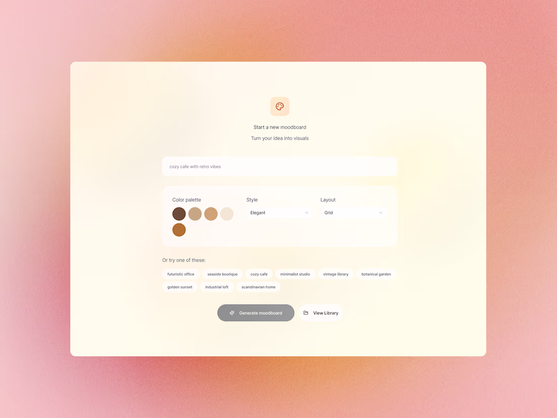
AI moodboard generator
2
21
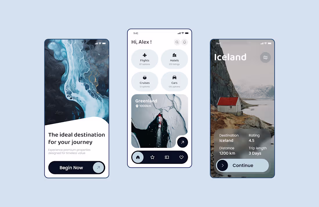
Travel App UI Design
1
17
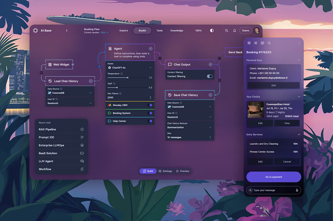
UI/UX Design for AI Chatbot & Intelligent Assistant Platform
4
33
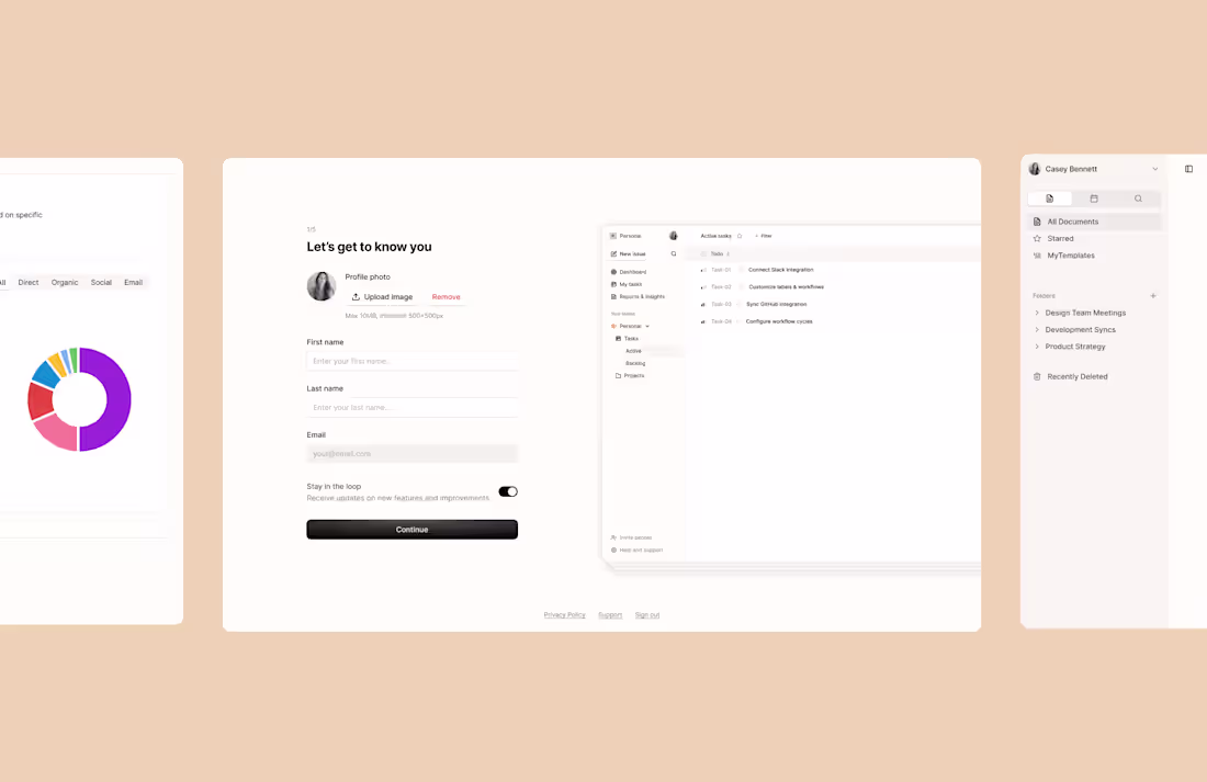
Productivity & Project Management Tool | UI/UX
2
46
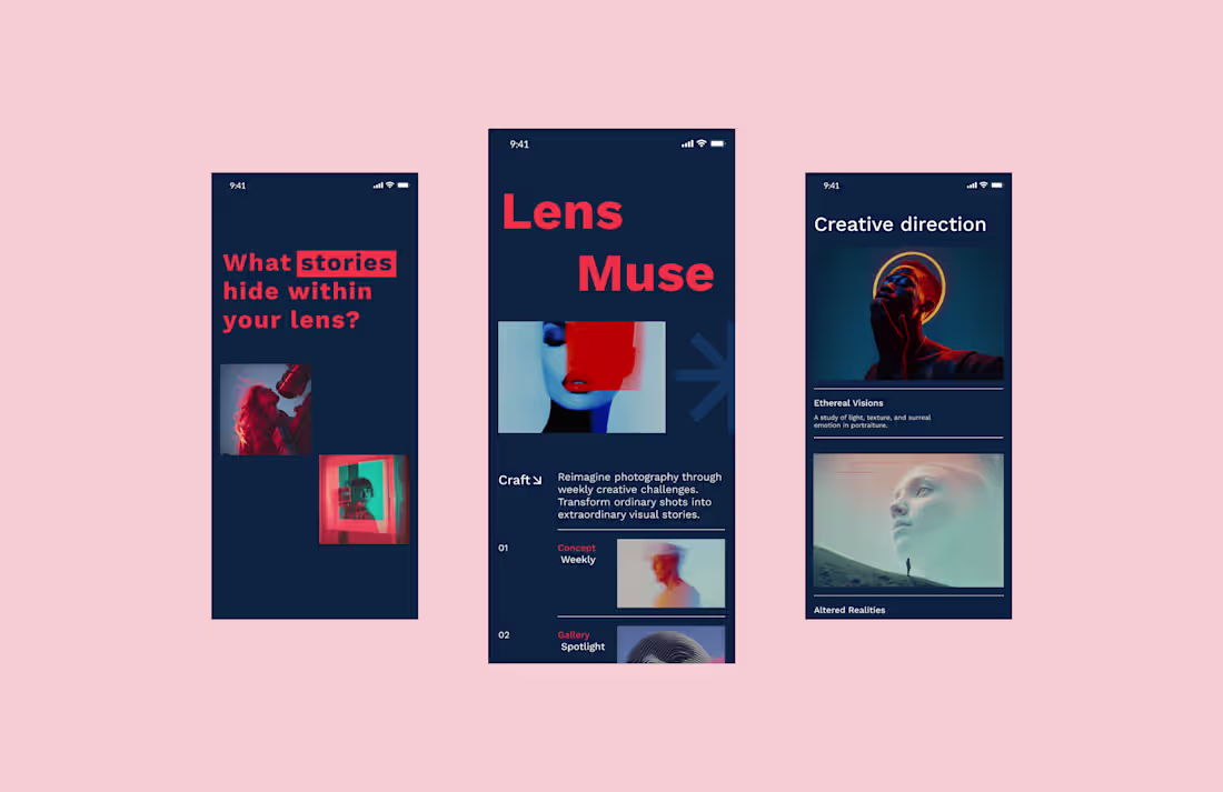
Lens Muse | Creative Photography App Design | UI/UX
2
23
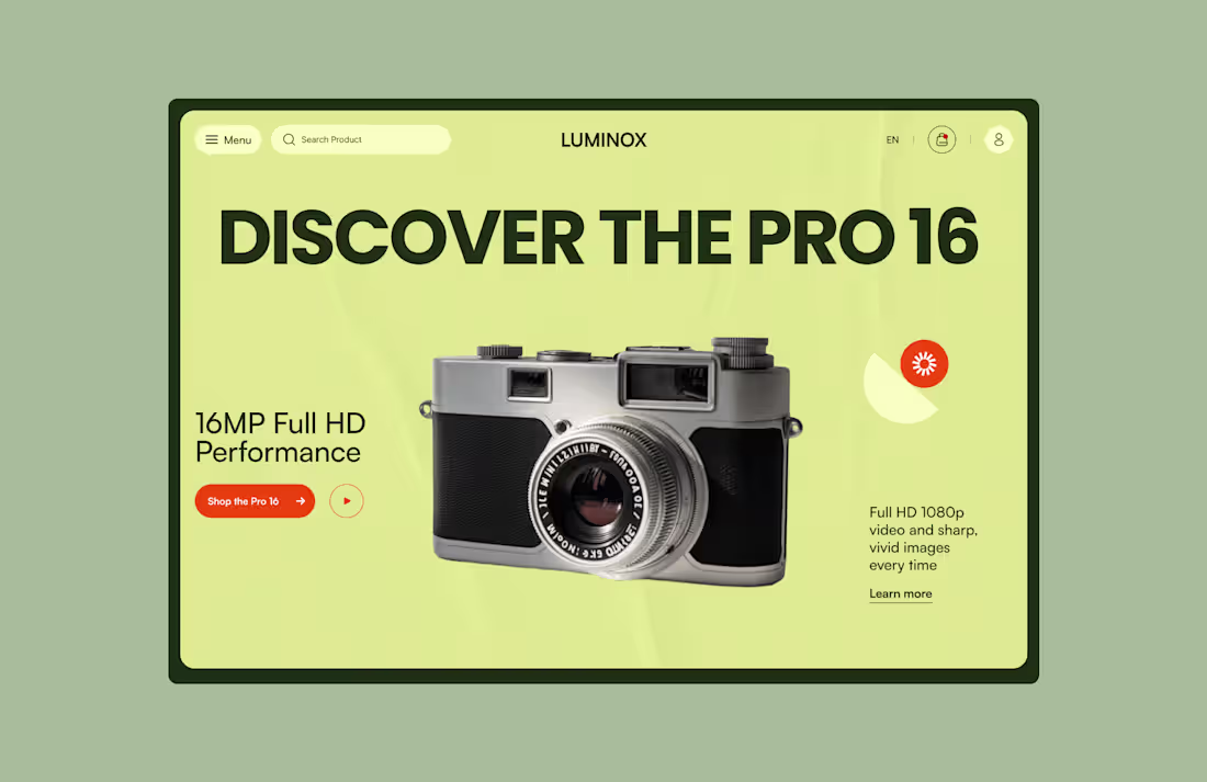
Luminox | Camera Product Landing Page Design | UI/UX
2
21
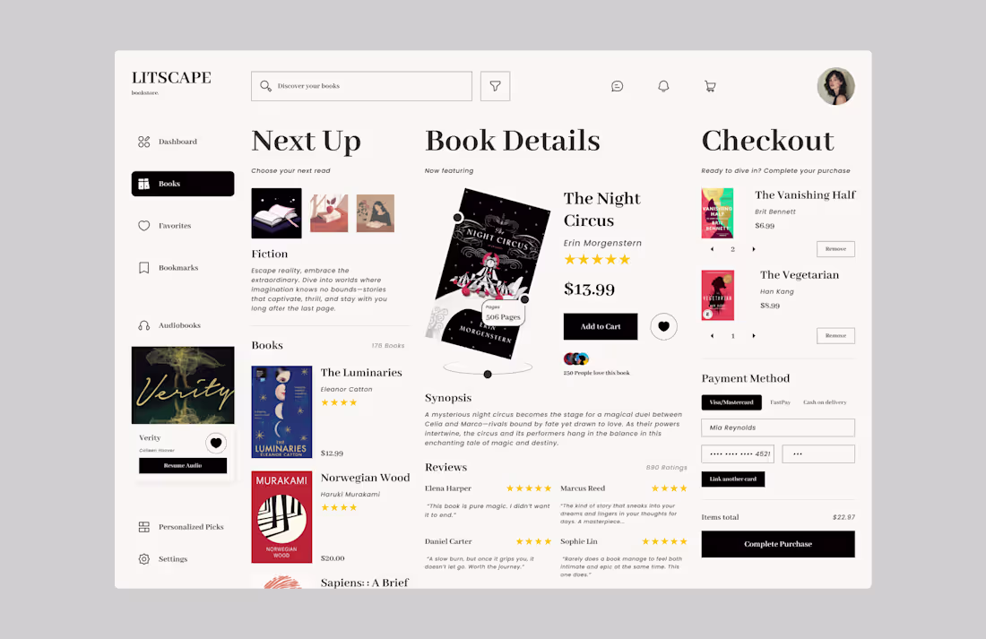
LITSCAPE | Bookstore Web Design | UI/UX
2
15
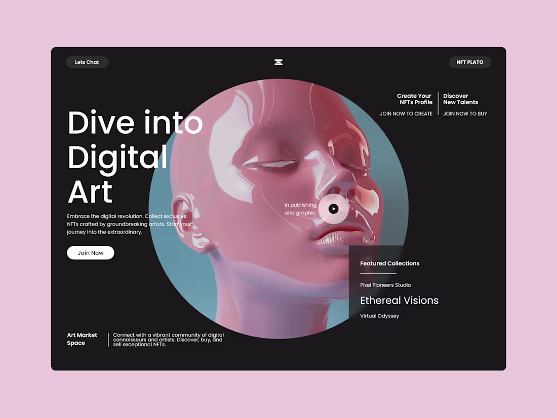
NFT Plato | Digital Art NFT Platform | UI/UX
8
74
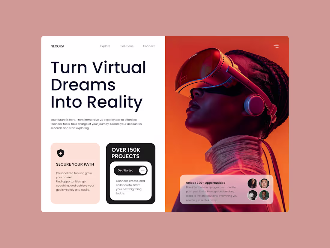
Nexora | VR & Career Growth Platform | Product Design
13
144
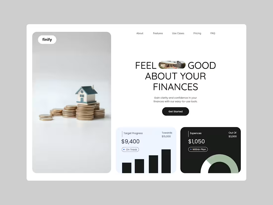
Finify | Financial Planning App | UI/UX
11
178
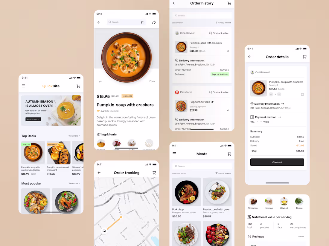
Foof Delivery Hub | SaaS platform with AI
3
22
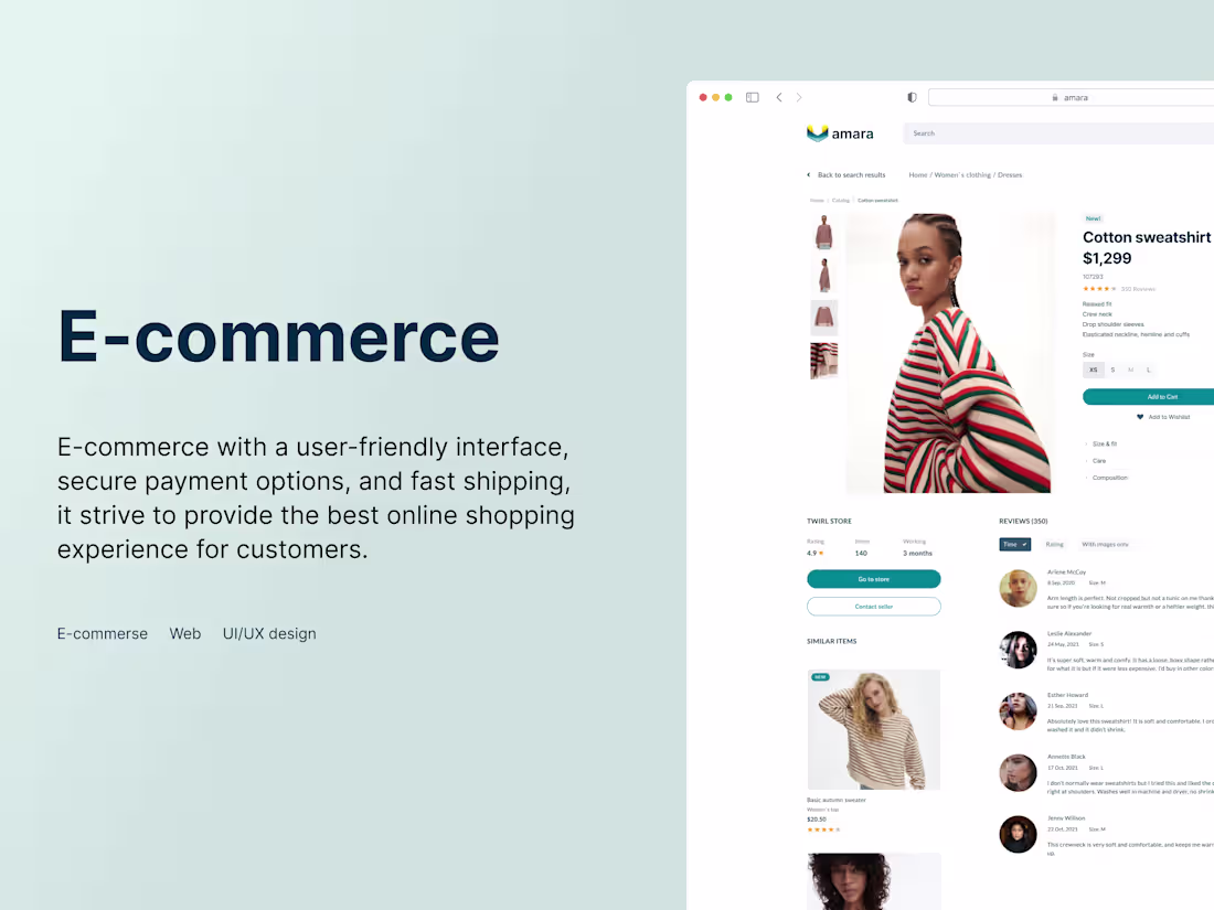
Marketplace | E-commerce solution with a user-friendly interface
1
8
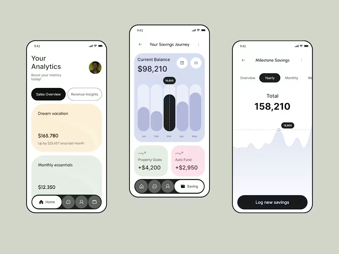
FinTrack | Financial App
1
37
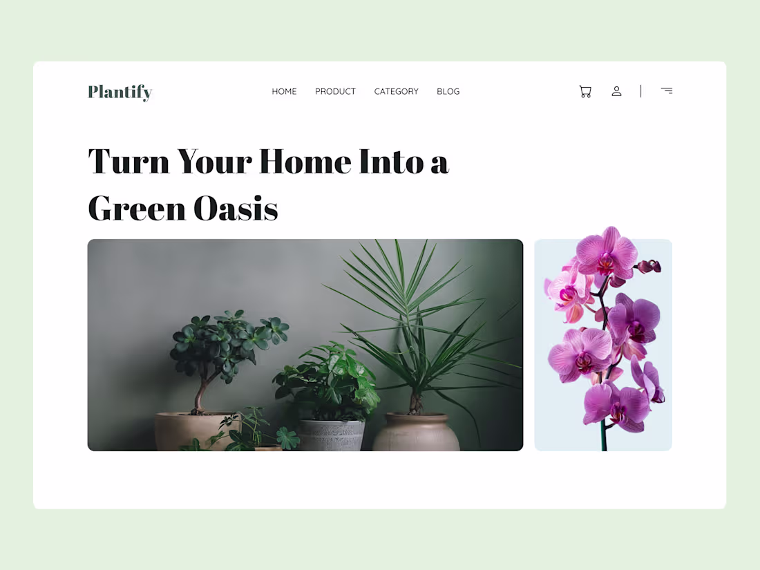
Plantify | Modern UI/UX Website for an Online Plant Store
1
28
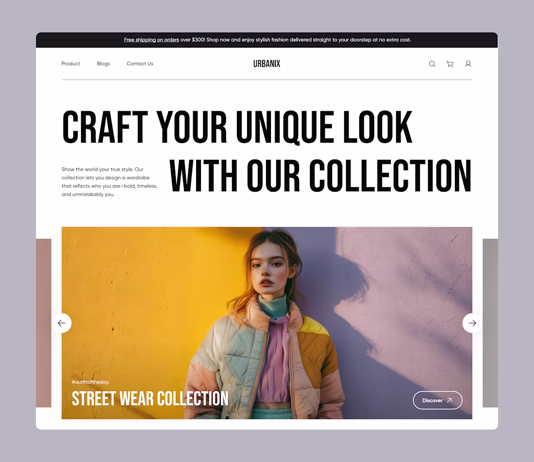
Urbanix E-commerce Clothing Store | UI/UX Design
1
16
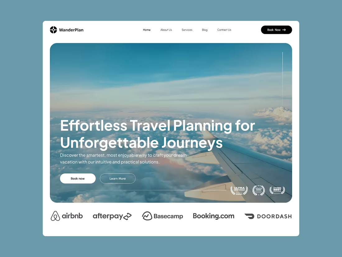
WanderPlan - UI/UX design for travel landing page
3
28