
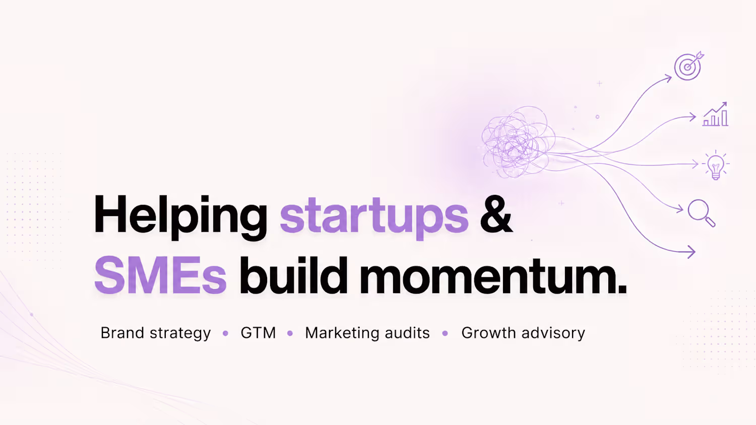
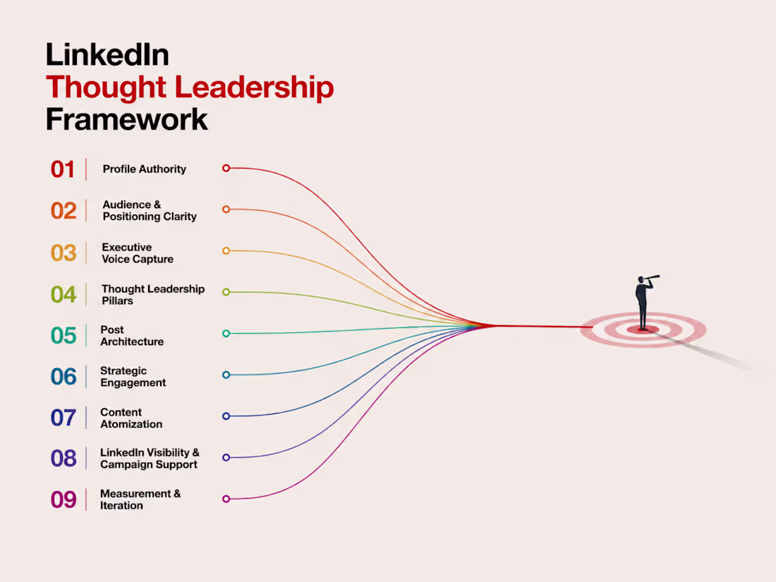
This is my LinkedIn thought leadership framework for founders, executives, and expert-led teams who want to build trust, authority, and visibility through LinkedIn.
At Twimbit, I helped executives strengthen their LinkedIn presence and supported the wider team through LinkedIn workshops. The goal was to help leaders move beyond basic posting and build a clearer system for profile positioning, executive voice, content direction, engagement, and authority-building.
My work focused on understanding each leader’s expertise, audience, industry context, and communication style before shaping their LinkedIn presence. This included profile positioning, content themes, thought leadership angles, post structure, and practical guidance on how to show up consistently without sounding generic.
I also worked on LinkedIn visibility through content and ads. For example, I helped deliver 50,000+ LinkedIn reach for a Twimbit Open House event, combining platform understanding with campaign execution.
I specialise in LinkedIn thought leadership, executive positioning, LinkedIn content strategy, company page growth, workshops, and LinkedIn ads. I have helped grow LinkedIn profiles from small audiences to 10K+ followers, built company pages from scratch, and developed systems for turning expertise into credible, repeatable content.
I am currently working with the founder and executive team of Blob/Campus App to build their thought leadership presence. This includes analysing their current LinkedIn position, identifying gaps, shaping their voice, and building a practical plan to grow authority and visibility.
This project showcases how I approach LinkedIn as more than a posting channel. For founders and executives, LinkedIn becomes a trust-building system: profile, voice, content, comments, campaigns, and consistency working together to create authority before the first conversation.
0
3
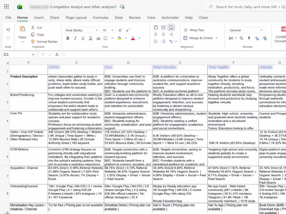
This is my framework for competitor analysis for any brand, startup, or product before I build a marketing strategy.
For The Campus App, this framework became the strategic foundation for positioning, GTM direction, and a 0-budget growth approach. Before building the strategy, I studied the student-tech landscape in detail to understand where the product stood, what competitors were owning, where they were weak, and which opportunities could help the app stand apart.
The analysis looked at competitor positioning, audience, messaging, acquisition channels, onboarding, monetisation, community signals, GTM motion, and visible traction. It helped move the strategy away from assumptions and towards a clearer understanding of the market.
The research revealed a strong gap. Many student platforms were either institution-led, academically focused, or too broad in their community positioning. This created an opportunity for The Campus App to build a more student-first strategy centred on belonging, peer connection, campus discovery, and community-led growth.
The overall strategy was organic, student-native, and built around community behaviour rather than paid acquisition. Competitor intelligence shaped the messaging, launch channels, referral loops, and content direction, helping the product move with more clarity in a crowded market.
The 0-budget growth approach helped drive 2,000+ account signups, +1,200% month-over-month install growth, a 70% referral rate, and a 27% average conversion rate through community-led acquisition and organic marketing
1
32
Project Name: Carah
Live Links
Mobile app prototype:
https://aloha-pasta-27048890.figma.site/
Community Link:
https://www.figma.com/community/file/1648357612932267098
Project Overview
Carah is a care coordination app designed to make daily care tasks, live progress tracking, and shift handovers simpler for care homes, caregivers, and families.
The idea came from a clear problem: care often depends on scattered notes, verbal updates, WhatsApp messages, paper checklists, and memory. That creates confusion, missed context, repeated questions, and stressful shift changes. Carah turns daily care into a simple shared system: create a care card once, assign tasks, track progress live, confirm care actions, and hand over clearly to the next person.
I didn’t want to build another clinical dashboard. I wanted Carah to feel warm, human, calm, and trustworthy. The experience is designed for real care environments where people need clarity quickly, without feeling overwhelmed by software.
The product includes onboarding, role selection, care profile setup, daily care card creation, task timing, caregiver invitations, live task progress, check-off notifications, chat, shift handover notes, review-style confirmation, family access, and settings.
What made Carah interesting as a product challenge was the emotional weight of the problem. This is not just productivity software. It is about trust, continuity, dignity, and making sure care does not break between people, shifts, or family members.
Why I Built Carah
I wanted to solve a real operational problem in care: the gap between what needs to be done, what has been done, and what the next person needs to know.
In many care settings, the hardest part is not only doing the work. It is keeping everyone aligned. Carah helps reduce that friction by giving caregivers and managers one clear place to see daily tasks, progress, notes, and handovers.
The goal was to make care coordination feel less fragmented and more reliable.
How I Used ChatGPT
I used ChatGPT as a research, strategy, and planning partner throughout the project.
ChatGPT helped me shape the problem, define the core user roles, structure the product flow, simplify the feature set, refine the care card logic, explore the owner and caregiver experience, and turn the idea into a clear product narrative.
It also helped me sharpen the positioning: Carah is not a medical record system or a complex care management platform. It is a simple daily care coordination tool focused on tasks, handovers, visibility, and trust.
Workflow and Product Development
Step 1: Problem Definition
I started by identifying the core problem:
Daily care is often split across people, shifts, notes, and memory.
This creates practical risks:
missed tasks
unclear handovers
repeated instructions
poor visibility for managers
confusion between caregivers
limited reassurance for families
Carah was built around one simple goal: make daily care easier to see, complete, and hand over.
Step 2: User Roles and Flow
I designed the product around two main roles:
Owner / Manager
Caregiver / Staff
The core flow became:
Sign up → Choose role → Create profile → Add care profile → Build daily care card → Invite caregivers → Track tasks → Complete care actions → Send handover → Next caregiver continues
This helped keep the product focused on the real daily rhythm of care homes.
Step 3: Care Card System
The care card became the heart of the product.
Instead of creating scattered tasks every day, the owner can build a care card once and reuse it as a daily structure.
Each care card includes:
care recipient details
daily tasks
task timing
assigned caregiver
progress status
notes
completion state
handover history
This makes the app feel useful immediately because the caregiver always knows what needs to happen next.
Step 4: Live Progress and Check-Offs
I added live progress logic so managers and caregivers can see what has been completed and what is still pending.
For example:
12 of 20 tasks completed
8 tasks remaining
next task due soon
handover ready
This gives Carah a real operational layer. It is not just a static prototype. The interface shows care moving forward through the day.
Step 5: Shift Handover
The handover flow was one of the most important parts of the product.
Caregivers can add notes before ending a shift, confirm completed tasks, and send a handover to the next caregiver.
The next caregiver can then open the care card and continue with context instead of starting from zero.
This feature is what makes Carah feel truly useful in a care setting.
Step 6: Family Adaptation
I also explored how the same logic could work for families caring for a loved one at home.
In the family version, the language changes:
caregiver becomes family member
unit becomes house
care profile becomes family care card
team becomes family
This makes Carah flexible enough for both professional care homes and family care situations.
Step 7: Visual Direction
The visual direction was designed to feel premium, warm, and trustworthy.
The design system used:
warm brown as the primary colour
deep green for trust and calm
soft blue accents
clean neutral backgrounds
rounded cards
clear hierarchy
gentle glassmorphism
soft biomorphic shapes
simple icons
high-contrast readable text
The goal was to avoid the cold, clinical feeling common in care software. Carah needed to feel calm, human, and easy to use.
Step 8: Prototype Experience
The prototype was designed to feel like a real product journey, not just a set of disconnected screens.
The key experience includes:
login and signup
role selection
profile setup
care card creation
task timing
caregiver invite
dashboard
live care card
notifications
chat
handover notes
family access
settings
Each screen was connected to show how a real caregiver, manager, or family member would move through the product.
Final Thoughts
Carah is built around a simple but important belief:
Care should not depend on memory, scattered notes, or broken handovers.
The product turns daily care into a shared, visible, and calm system. It helps caregivers know what to do, helps managers see progress, and helps families feel reassured.
For me, the strongest part of Carah is that it solves a real human problem through a simple product experience. It is not trying to be everything. It focuses on one painful workflow and makes it clearer.
Carah is built around one simple belief:
Better handovers create better care.
4
3
195
Inika Collections
Social Media Content and Instagram Growth for a Kerala Jewellery Brand
Project Overview
Inika Collections is a Kerala-based online jewellery brand offering everyday jewellery and traditional Kerala-style pieces.
The brand needed a stronger Instagram presence that could showcase its collections in a more consistent, engaging, and visually appealing way while reaching a wider audience.
I supported Inika with Instagram strategy, social media content direction, visual content design, and influencer campaign planning. Through a focused growth approach, the page reached 25,000 followers within one month.
The Challenge
The jewellery category is highly competitive, with many brands relying on similar product images and promotional content.
Inika needed a social media presence that could:
Present its products in a more polished and recognisable way
Balance everyday jewellery with traditional Kerala-style collections
Build stronger audience interest beyond direct sales posts
Increase reach and visibility through influencer-led content
Create a consistent visual experience across Instagram
My Role
I worked on the strategic and creative development of Inika’s Instagram presence.
My work included:
Instagram content strategy
Social media content planning
Visual content design
Campaign creative direction
Influencer campaign planning
Audience growth strategy
Content consistency and feed direction
Social Media Content Strategy
I developed a content approach that combined product visibility, brand storytelling, jewellery styling, cultural relevance, and audience engagement.
The strategy focused on creating a more balanced Instagram feed rather than relying only on product promotions. Content was designed to help potential customers understand how the jewellery could be worn, styled, and incorporated into both everyday and traditional looks.
Social Media Design
I created and directed social media designs that gave the page a more polished and consistent appearance.
The content used clean layouts, refined typography, product-focused visuals, and a premium aesthetic to make the brand feel more recognisable and trustworthy.
The visual system helped ensure that promotional posts, campaign content, product features, and lifestyle-led posts could work together without making the feed feel repetitive.
Influencer Campaign
I supported the planning and execution of an influencer campaign to increase visibility and connect the brand with relevant audiences.
The campaign used creator-led content to show the jewellery in a more relatable and authentic setting, helping potential customers see how the pieces could be styled in real life.
Results
The combination of a clearer Instagram strategy, stronger social media content, consistent visual design, and influencer-led reach helped Inika grow its Instagram page to 25,000 followers within one month.
The project gave the brand a stronger social media foundation and a more effective way to present its jewellery collections online.
Services Provided
Instagram Strategy
Social Media Content Planning
Social Media Design
Campaign Creative Direction
Influencer Marketing
Audience Growth Strategy
0
54
Twimbit Sign-Up Campaign
Be More
Context
Twimbit wanted to drive sign-ups by helping the audience understand the platform’s benefits in a simple, emotionally engaging way.
The product was a research and intelligence platform, but the challenge was that research often feels heavy, corporate, and distant. The campaign needed to make Twimbit feel more approachable while still communicating clear business value.
Instead of using a serious B2B campaign style, the idea was built around children’s natural curiosity, ambition, and eagerness to learn.
The campaign used the thought:
Everyone starts with the desire to be more.
More informed.
More confident.
More prepared.
More connected.
More capable of making better decisions.
Strategic insight
Adults often treat learning and research as tasks. Children treat learning as discovery.
The campaign used this contrast to make research feel less like a burden and more like an opportunity.
The key insight was:
People do not sign up for research platforms because they want more information. They sign up because they want to become better at what they do.
Twimbit was positioned not just as a platform for consuming research, but as a tool that helps users grow, decide faster, discover better insights, and create more impact.
Creative idea
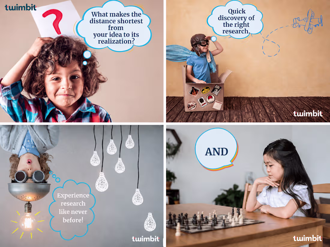
The creative idea was to use childlike imagination as a metaphor for professional growth.
Each visual showed children in playful, aspirational situations, paired with benefit-led messages that connected back to Twimbit’s value proposition.
The campaign line was:
twimbit — be more
Each creative translated “be more” into a specific user benefit:
Elevate sales conversions
Supercharge your career
Make impactful decisions
Boost your community with meaningful interactions
Experience research like never before
Quick discovery of the right research
Move faster from idea to realisation
The campaign made B2B benefits feel simpler, warmer, and more human.
Campaign copy
twimbit — be more
Be more than informed.
Be more prepared.
Be more confident in your decisions.
Be more connected to the right insights.
Be more capable of turning ideas into action.
Twimbit helps professionals discover research faster, access the right insights, build meaningful communities, and make sharper business decisions.
Result
The campaign helped communicate Twimbit’s product benefits in a more accessible way and supported the brand’s sign-up efforts across social channels.
It also connected with Twimbit’s wider growth performance. Your resume notes that Twimbit drove a 50% increase in sign-ups through Facebook ads, a 200% increase in website traffic through Google Search Ads, and significant LinkedIn brand reach growth through brand awareness campaigns.
What this campaign proved
Ability to simplify a B2B research platform into clear audience benefits
Ability to turn product features into emotionally engaging messaging
Strong understanding of storytelling-led acquisition campaigns
Ability to make a serious B2B category feel approachable and human
Ability to connect brand awareness with sign-up intent
Creative ability to use metaphor, visuals, and benefit-led copy together
Understanding of multi-channel campaign communication across social and paid channels
0
93
Twimbit Brand Awareness Campaign
Superhero Moment Marketing Campaign
Context
Twimbit needed to build awareness for its research and intelligence platform in a way that felt less corporate and more memorable.
The challenge was simple: research platforms are often perceived as serious, dense, difficult to consume, and built only for experts. Twimbit wanted to shift that perception and show that research could be easier to access, more collaborative, and more enjoyable to consume.
During the release and peak conversation around superhero films, especially the Avengers moment, Twimbit used pop-culture relevance to create a brand awareness campaign across LinkedIn, Facebook, and Instagram.
The campaign borrowed the cultural familiarity of popular superheroes and rewrote their famous ideas into messages that explained what Twimbit stood for.
Strategic insight
Most B2B research brands communicate through authority, complexity, and jargon.
But the audience does not only need more research. They need research that is easier to find, easier to understand, and easier to use.
The campaign was built on this insight:
Research does not have to feel hard to be valuable.
By using superhero references, the campaign made Twimbit’s value proposition more accessible: research can be useful, collaborative, open, and even enjoyable.
Instead of explaining the platform through technical product language, the campaign translated the brand promise into familiar cultural shorthand.
Creative idea
The creative idea was to connect superhero lessons with Twimbit’s product belief.
Each creative used a recognisable superhero reference and reframed it around Twimbit’s mission: making research easier, more accessible, and more useful for experts, brands, and users.
Examples:
Shuri taught us just because we are used to the hard way of consuming research doesn’t mean it can’t be made easier.
This connected Shuri’s innovation-led character with Twimbit’s belief that research consumption should be simpler.
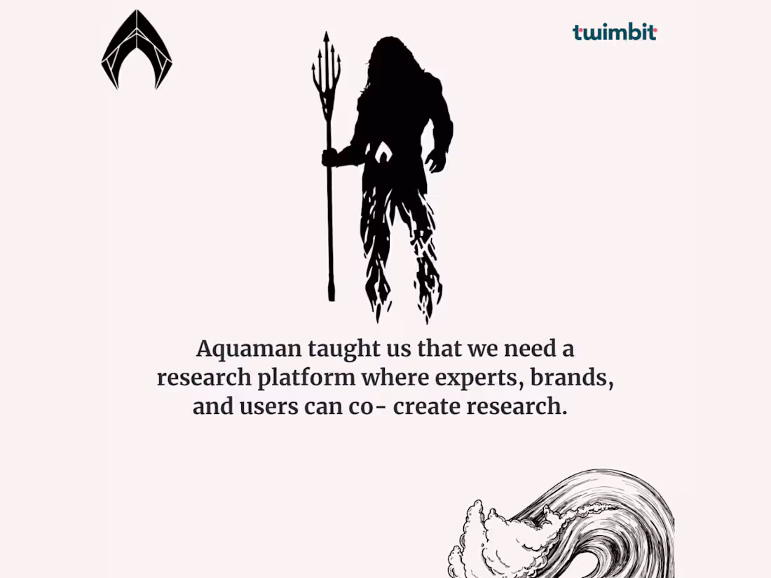
Aquaman taught us that we need a research platform where experts, brands, and users can co-create research.
This positioned Twimbit as a collaborative research ecosystem, not just a static content platform.
Iron Man taught us there are 3000 reasons to reinvent a research world that is accessible to all.
This used a popular emotional reference to communicate accessibility and reinvention.
Harry Potter taught us research should not be closet-ed.
This pointed to the idea that research should not stay hidden, locked away, or difficult to access.
Black Panther taught us creating research is not enough. What matters more is easy access to the right research.
This captured the core product problem: the value is not just in producing research, but in helping people access the right insight at the right time.
Campaign copy
Research does not need to feel complex to be credible.
For Twimbit, we used pop-culture moments and superhero references to explain the platform’s core belief: research should be accessible, collaborative, and easier to consume.
The campaign translated Twimbit’s value proposition into simple, familiar messages that helped audiences understand what the platform did without relying on heavy B2B jargon.
Result
The campaign generated 50K LinkedIn reach and helped Twimbit build awareness around its research platform in a more engaging and culturally relevant way.
It also supported Twimbit’s broader brand visibility efforts. Your resume notes that Twimbit’s LinkedIn brand reach expanded significantly through brand awareness campaigns, alongside major growth in website visits, sign-ups, and Product Hunt launch performance.
What this campaign proved
Ability to simplify a complex B2B product through creative messaging
Strong moment marketing instincts
Ability to use pop culture to improve brand recall
Ability to make research and intelligence feel accessible, not intimidating
Strong understanding of B2B awareness campaigns across LinkedIn, Facebook, and Instagram
Ability to translate product value into audience-friendly campaign ideas
Creative ability to make a serious category feel more human, memorable, and shareable
1
109
International Yoga Day Moment Marketing
FIFA x Yoga Day Campaign
Context
Lemon Tea Creative wanted to create an International Yoga Day post that did not look like every other brand’s Yoga Day creative.
At the time, the FIFA World Cup was also happening, and Kerala had a strong football culture. Instead of creating a predictable yoga-themed post with calm poses, mats, or wellness imagery, the campaign connected Yoga Day with something people were already emotionally invested in: football.
The opportunity was clear:
Use FIFA’s cultural momentum to make International Yoga Day feel fresh, fun, and shareable.
Strategic insight
Most calendar-day posts fail because they treat the occasion in isolation.
But people do not experience culture that way. They experience multiple cultural moments at once: sport, festivals, news, trends, identity, humour, and local passion.
The campaign was built on this insight:
Moment marketing works best when two active cultural conversations collide naturally.
FIFA was already dominating attention. Yoga Day needed a fresh hook. Kerala’s football obsession gave the campaign a strong local relevance.
So instead of asking people to look away from football and think about yoga, the campaign used football as the entry point into yoga.
Creative idea
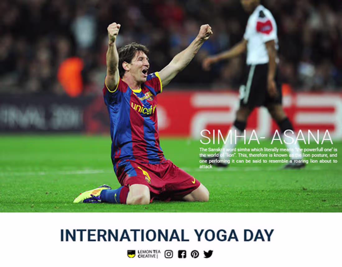
The creative idea was to reframe famous football body movements as yoga asanas.
Footballers were shown in dynamic match moments that visually resembled yoga poses. Each post gave the football moment a yoga-inspired name, such as:
Hala-Asana
Simha-Asana
Shalabha-Asana
Sasaka-Asana
Matsya-Asana
The idea made Yoga Day content feel playful, topical, and culturally relevant.
Instead of saying “Yoga is good for you,” the campaign said:
Your favourite footballers are already doing yoga, just with more drama.
Campaign copy
FIFA World Cup and India?
Never a goal so easy to reach the post.
But even before our team members could think of it, our archaic tradition had already worn the golden boots.
See our favourite players cherish the yoga positions.
With the world singing one life to Russia, halt a while to celebrate the unique way of life that is Yoga.
If with the feet you conquer the world, with Yoga you quash your body and soul.
Result
The campaign gained attention organically and generated almost 40K organic reach.
It worked because it did not behave like a standard awareness post. It used humour, football fandom, topical timing, and visual recognition to make a cultural-day campaign more entertaining and shareable.
0
105
International Yoga Day Moment Marketing
FIFA x Yoga Day Campaign
Context
Lemon Tea Creative wanted to create an International Yoga Day post that did not look like every other brand’s Yoga Day creative.
At the time, the FIFA World Cup was also happening, and Kerala had a strong football culture. Instead of creating a predictable yoga-themed post with calm poses, mats, or wellness imagery, the campaign connected Yoga Day with something people were already emotionally invested in: football.
The opportunity was clear:
Use FIFA’s cultural momentum to make International Yoga Day feel fresh, fun, and shareable.
Strategic insight
Most calendar-day posts fail because they treat the occasion in isolation.
But people do not experience culture that way. They experience multiple cultural moments at once: sport, festivals, news, trends, identity, humour, and local passion.
The campaign was built on this insight:
Moment marketing works best when two active cultural conversations collide naturally.
FIFA was already dominating attention. Yoga Day needed a fresh hook. Kerala’s football obsession gave the campaign a strong local relevance.
So instead of asking people to look away from football and think about yoga, the campaign used football as the entry point into yoga.
Creative idea
The creative idea was to reframe famous football body movements as yoga asanas.
Footballers were shown in dynamic match moments that visually resembled yoga poses. Each post gave the football moment a yoga-inspired name, such as:
Hala-Asana
Simha-Asana
Shalabha-Asana
Sasaka-Asana
Matsya-Asana
The idea made Yoga Day content feel playful, topical, and culturally relevant.
Instead of saying “Yoga is good for you,” the campaign said:
Your favourite footballers are already doing yoga, just with more drama.
Campaign copy
FIFA World Cup and India?
Never a goal so easy to reach the post.
But even before our team members could think of it, our archaic tradition had already worn the golden boots.
See our favourite players cherish the yoga positions.
With the world singing one life to Russia, halt a while to celebrate the unique way of life that is Yoga.
If with the feet you conquer the world, with Yoga you quash your body and soul.
Result
The campaign gained attention organically and generated almost 40K organic reach.
It worked because it did not behave like a standard awareness post. It used humour, football fandom, topical timing, and visual recognition to make a cultural-day campaign more entertaining and shareable.
1
125

#Unaru Ratheesh Unaru
Context
Anti-smoking campaigns often repeat the same message: smoking kills.
The problem is that many people have heard this so often that they no longer emotionally respond to it.
For this campaign, we chose a different angle: smoking does not only threaten life expectancy. It can also affect reproductive health, fertility, and sexual wellbeing.
Strategic insight
Fear-based messaging becomes invisible when people hear it too often. A more personal, immediate consequence can create stronger attention.
Creative idea
The campaign used local-language humour and a visual metaphor to communicate the message in a way that felt culturally familiar.
Instead of showing diseased lungs or death imagery, the creative used a carrot/cigarette metaphor and the line:
#Unaru Ratheesh Unaru
This made the message more memorable, more local, and more socially shareable.
Why it worked
It did not sound like a government warning. It sounded like something people would send to a friend.
That is why it worked organically.
Result
The campaign went viral, received national media coverage, and generated 50K organic reach on Facebook.
1
120
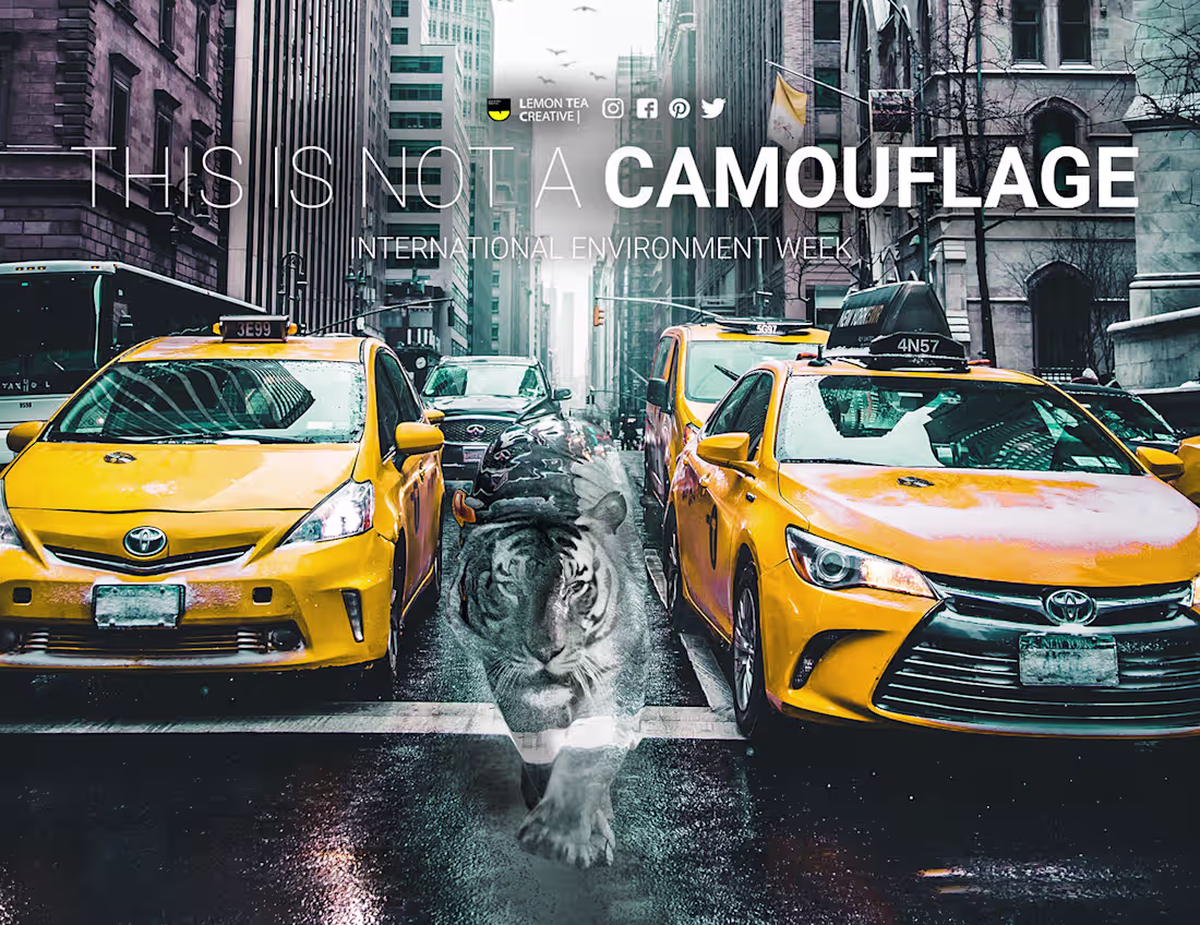
Environmental Awareness Campaign
This Is Not a Camouflage
Context
The environmental campaign was created to show how human negligence is slowly forcing nature to disappear into human-made damage.
The campaign used animals visually blending into polluted, urban, and artificial environments.
Strategic insight
The future danger is not that animals will adapt beautifully to human destruction. The danger is that they will become invisible casualties of it.
Creative idea
The campaign used the line:
This Is Not a Camouflage
The message reframed camouflage not as survival, but as a warning.
Animals appearing to “blend in” with plastic, traffic, glass buildings, and urban chaos became a metaphor for environmental collapse.
Why it worked
Most environmental campaigns show destruction very literally: dead animals, dirty water, smoke, plastic waste.
This campaign took a more conceptual route. It showed the audience an unnatural visual and asked them to sit with the discomfort.
1
120
Herbtantra Meta Sales Campaign
Performance-led social advertising for a herbal wellness brand
1
199

Menstrual Hygiene Day campaign- Lemon Tea Creative - Deepa Sant…
0
1
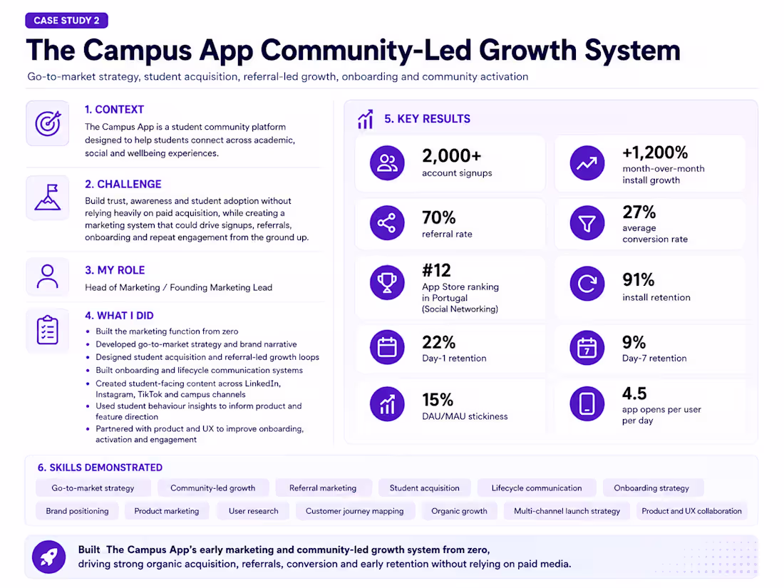
The Campus App started as an MVP-stage student platform with a clear challenge: build early awareness, trust, and student adoption without relying on paid media.
As the founding marketing lead, I built the marketing function from zero — including positioning, messaging, onboarding communication, student acquisition, referral-led growth, and multi-channel launch planning. The work focused on understanding student behaviour, identifying community gaps, shaping the product narrative, and creating a low-budget GTM system that could generate early traction through relevance, peer sharing, and campus-led storytelling.
The 0-budget growth approach helped drive 2,000+ account signups, +1,200% month-over-month install growth, a 70% referral rate, and a 27% average conversion rate through community-led acquisition and organic marketing.
1
211
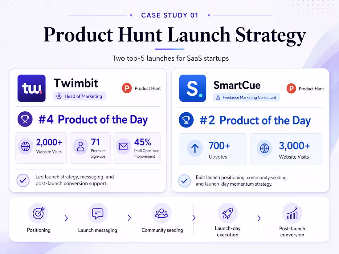
I led Product Hunt launch strategy for two SaaS products, helping SmartCue reach #2 Product of the Day and Twimbit reach #4 Product of the Day. The work covered positioning, launch messaging, community seeding, outreach, launch-day coordination, and post-launch conversion thinking. Together, the launches generated thousands of website visits, strong product visibility, and measurable signup outcomes.
1
184