
DEEN VINO
Creative Director, JUICE | AI Cinematic Ads & Brand Films
New to Contra
DEEN is ready for their next project!

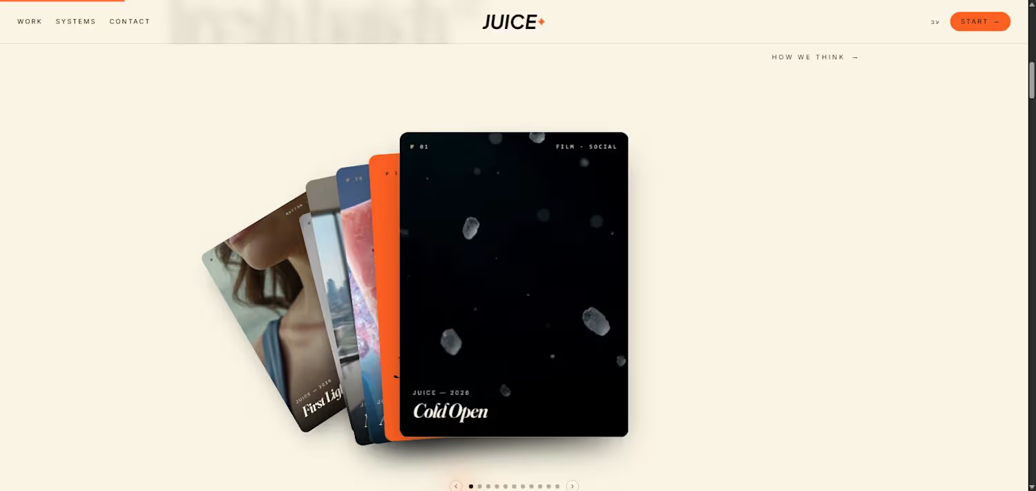

JUICE — our own mark, built with the same system we apply to every client: a wordmark that has to hold up as small as a favicon and as large as a title card.
0
70
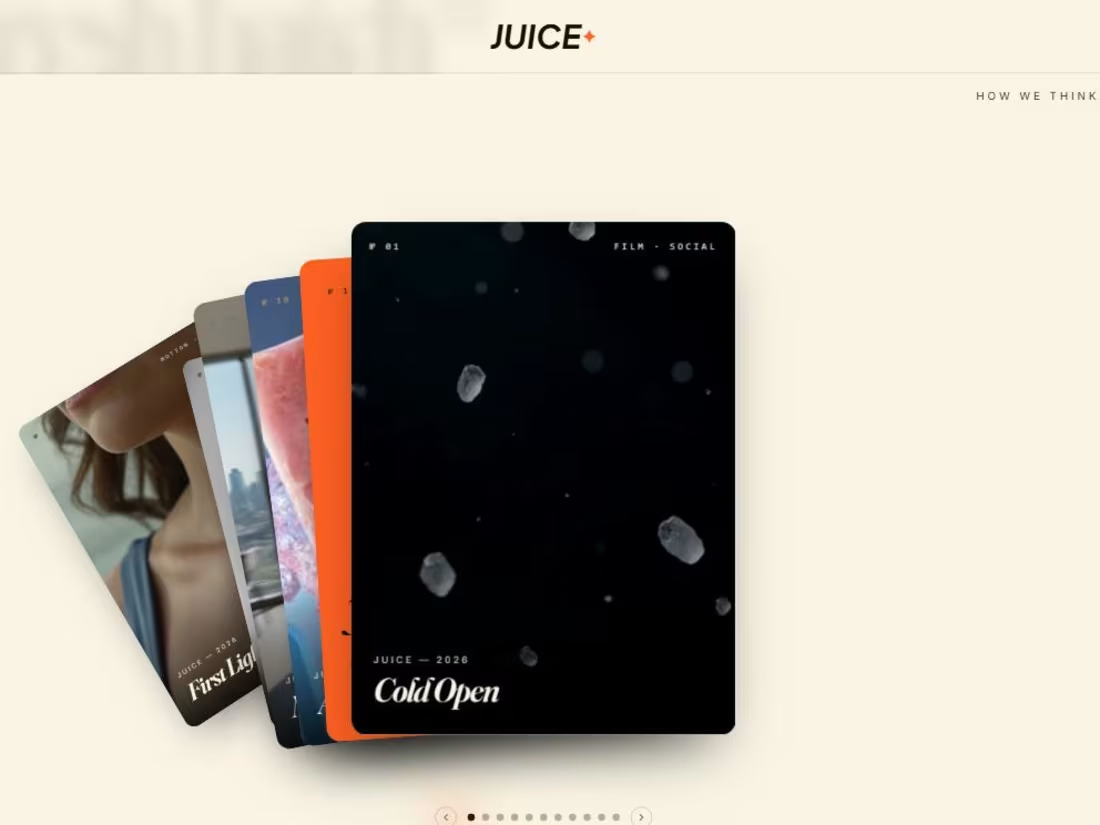
Fresh Batch — a look inside the range: product, social, campaign and DTC work, all directed under one visual language instead of a different freelancer for every format.
0
72

Become Unforgettable — the hero line for JUICE's own brand world. Same process we run for clients: strategy first, then a look that's impossible to mistake for anyone else.
0
68
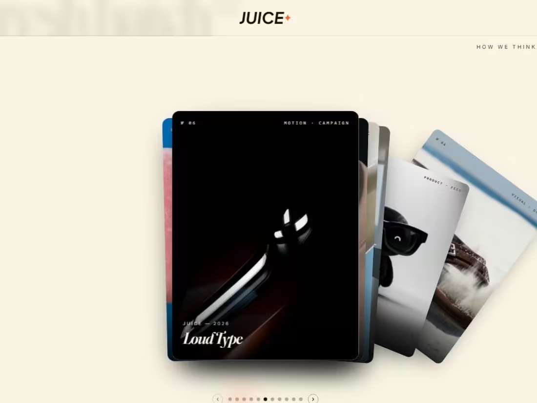
Loud Type — treating typography as a brand asset, not decoration. Metal, light and motion, directed to make a wordmark feel physical.
0
70