
Darsh Panchal
A Product Designer with a burning desire to build cool stuff
Ready for work
Darsh is ready for their next project!
Redesigned a mobile screen I stumbled upon online…
because my brain refuses to look at any UI without whispering “lemme fix that"
1
10
This project started as a quick creative experiment inspired by a sleek payment flow I came across. I decided to recreate and refine it in my own way, focusing on the finer details that make digital experiences feel alive. The result: a three-screen flow Review, Processing, and Confirmation. While simple in structure, the real work was in crafting the microinteractions, timing, and subtle transitions that give the flow its rhythm and personality.
0
11
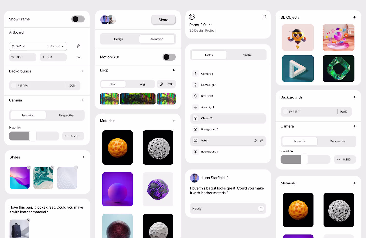
This dashboard started with nothing but curiosity. I stumbled upon an all-white layout and thought, why not try it? Soon, I found myself drowning in white-on-white components and random bento cards that didn’t even make sense together. But that chaos taught me a lot, how to handle spacing, layering, and subtle shade variations when everything looks the same. It’s not perfect, but it’s the one that made me obsessed with balance.
0
19
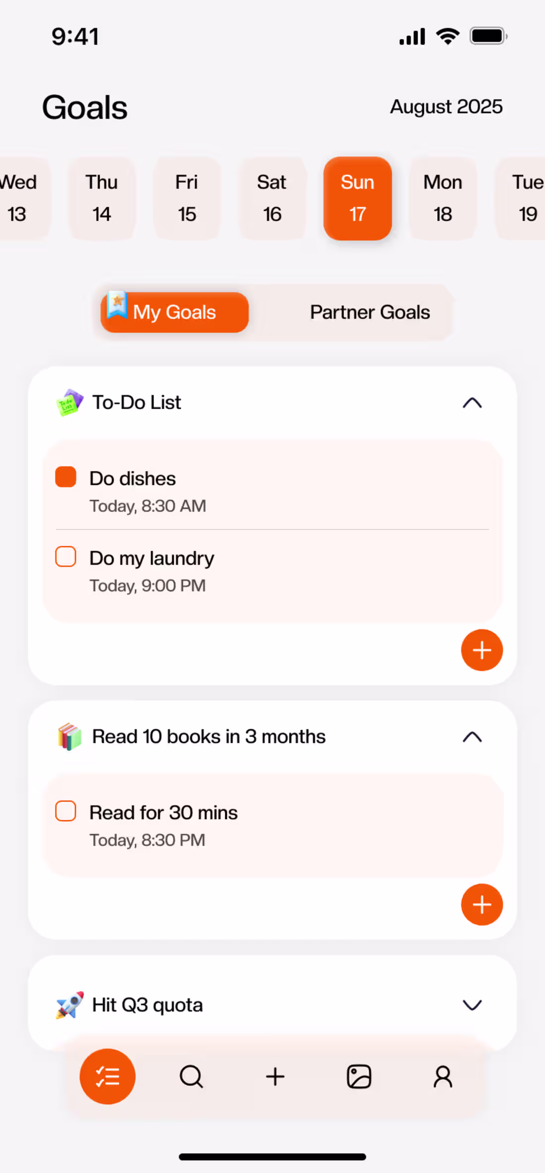
I came across a clean dashboard design on X and couldn’t resist recreating it from scratch, partly to understand its flow, partly because I needed more dashboards in my design closet. It started as a reference, but somewhere along the way, I made it mine! balanced, structured, and quietly confident.
0
12
Built this one to shake off some boredom and procrastination turned out pretty fun to work on! Focus was on simplicity, quick search flow, and a modern layout for EV users on the go.
0
9