
Daniel Muñoz
Commercial illustrator and visual storyteller
New to Contra
Daniel is ready for their next project!

For over five years, we’ve been collaborating with Naturgy, a leading international energy company, on an ongoing project, creating a wide range of visuals for their social media channels and newsletters.
The goal of this long-term partnership is to translate complex messages into clear, engaging and accessible visual content, while maintaining a strong visual consistency across multiple platforms and formats. From awareness campaigns to educational and corporate communication, each illustration is designed to be instantly recognizable within Naturgy’s visual ecosystem.
Working on a continuous basis allows us to deeply understand the brand’s tone of voice, communication needs and audience, enabling us to deliver fast, reliable and high-quality visual solutions. The result is a coherent and dynamic visual language that reinforces brand identity and improves engagement across digital channels.
0
12
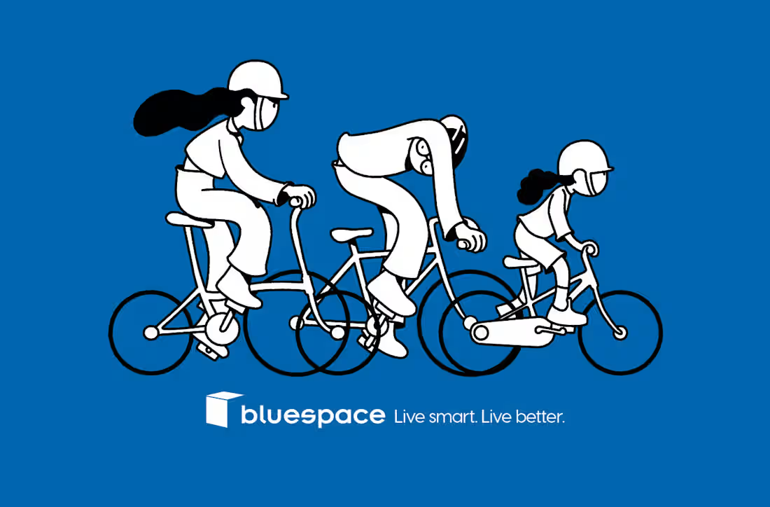
A commission from Snoop Agency for Bluespace (https://www.bluespace.es/en). The previous brand’s visual identity was largely supported by photography. But for this new communication line, they decided to shift towards illustration as a more expressive and flexible visual system. The brief called for a bold black-and-white style to illustrate the brand claims for Bluespace, Spain’s leading self-storage operator. So we created a series of playful, character-driven illustrations that combine strong graphic contrast with an approachable tone, allowing the brand to communicate its messages with greater clarity, consistency and personality across the brand’s visual ecosystem.
0
18
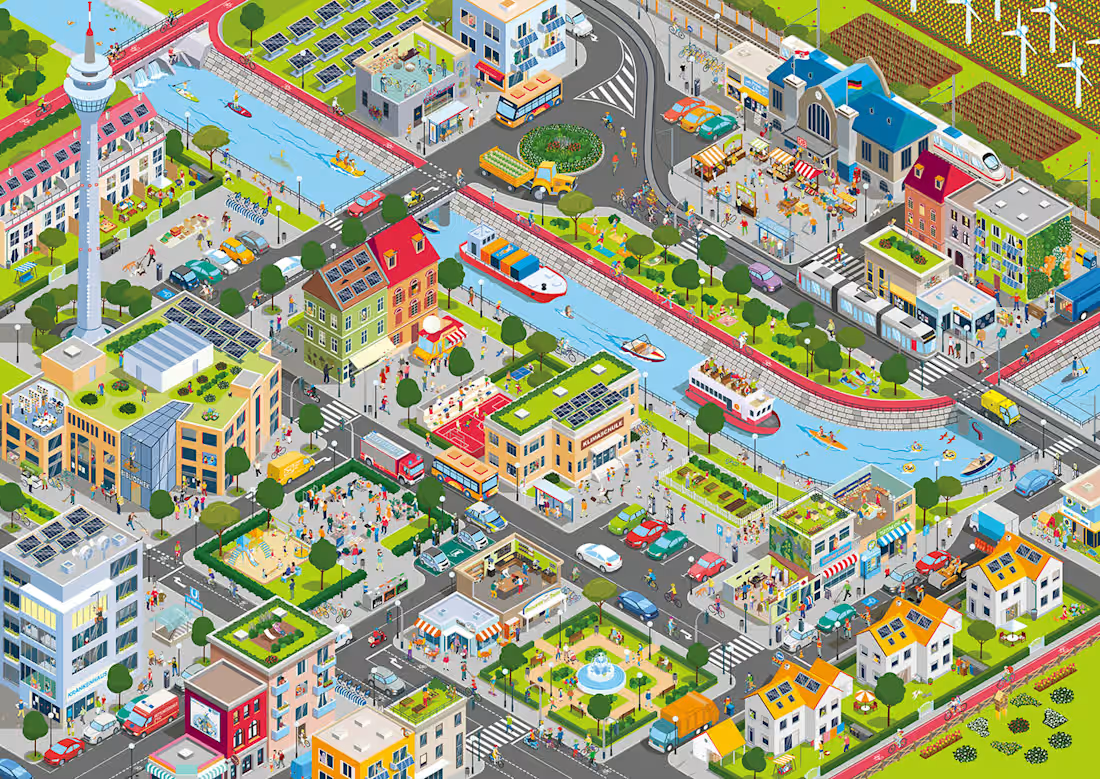
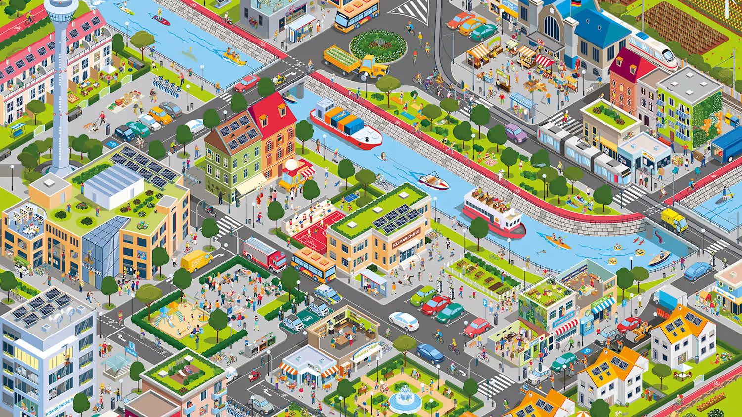
We were commissioned by @energy4climate to create an illustrated Wimmelbild (look & find game) of a rather free interpretation of Düsseldorf city. It is a game designed by @energy4climate, a foundation that supports the implementation of climate protection and energy transition measures in the region of North Rhine-Westphalia, Germany. The game was distributed free of charge to kindergartens and primary schools to help children learn about environmental protection and energy saving in our everyday lives.
0
30
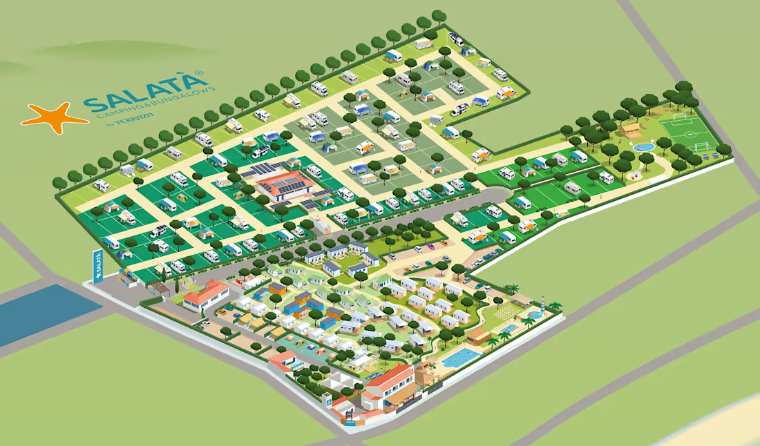
For this project, we developed a custom isometric illustrated map for a camping website, evolving an existing orthographic plan into a more spatial and user-friendly visual solution.
The shift from a flat, cenital layout to an isometric view allowed us to clearly show buildings, accommodation units and shared facilities, making the environment easier to understand at a glance.
The isometric map improves:
· Spatial clarity and orientation
· Visual hierarchy of key areas and services
· Overall perception of the camping layout
Designed entirely in vector format, the map is optimized for digital use, scalable layouts and future interactive applications.
0
37