The network for creativity
Join 1.25M professional creatives like you
Connect with clients, get discovered, and run your business 100% commission-free
Creatives on Contra have earned over $150M and we are just getting started
Back to feedPost
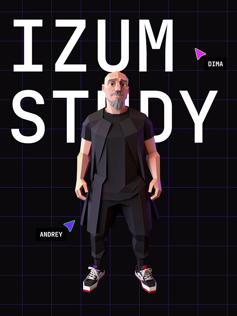
🔥 𝗦𝘁𝗮𝗿𝘁𝗶𝗻𝗴 𝗮 𝗯𝗶𝗴 𝗿𝗲𝗯𝗼𝗼𝘁 𝗼𝗳 𝗜𝗭𝗨𝗠.𝗦𝗧𝗨𝗗𝗬 🔥
We have outgrown our old format. The project is transforming into a massive ecosystem for developers with a deep knowledge base, a script library, and a dedicated community. For such ambitions we needed a corresponding style: bold and recognizable.
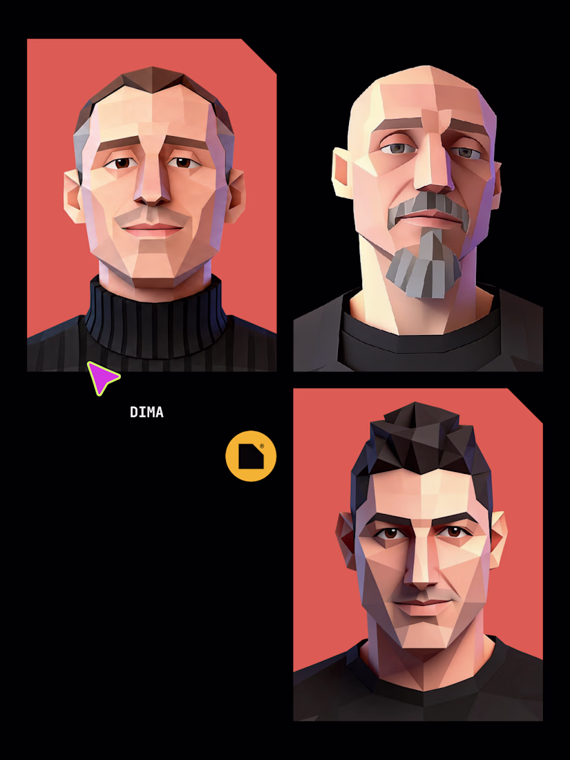
𝗔𝗹𝗲𝘅𝗮𝗻𝗱𝗲𝗿 𝗟𝗮𝗴𝘂𝘁𝗮 was responsible for the branding. There is no need to introduce him for long: co-founder of Dprofile, author of the "Plus to Level" design club, and an absolute UI/UX heavyweight (more than 90 awards on Behance and 50+ on Dprofile). Ironclad expertise.
Together with Sasha we went into a bold geeky style. Pixel art, a brutal grid, strict typography, and acid accents hit the right vibe 100%.
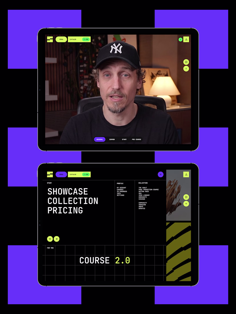
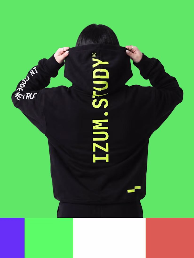
Right now, based on this style, we are building the new IZUM.STUDY website in full swing. And while the work is boiling, drop by Behance. A big case study is already there, where you can examine our updated visuals in layouts and on merch.
🔗 𝗥𝗮𝘁𝗲 𝘁𝗵𝗲 𝗽𝗿𝗼𝗷𝗲𝗰𝘁: https://www.behance.net/gallery/251886547/IzumStudy-brending
What do you think about the style? How do you like this step towards digital aesthetics? Write in the comments 👇
The network for creativity
Join 1.25M professional creatives like you
Connect with clients, get discovered, and run your business 100% commission-free
Creatives on Contra have earned over $150M and we are just getting started
Related posts
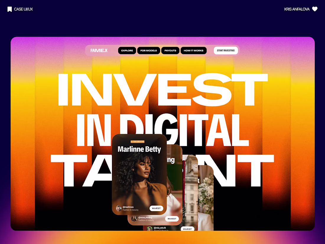
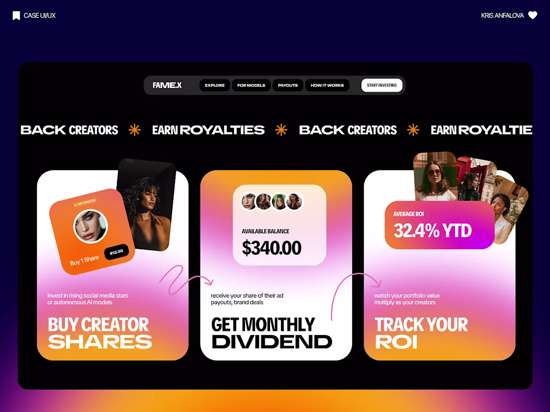
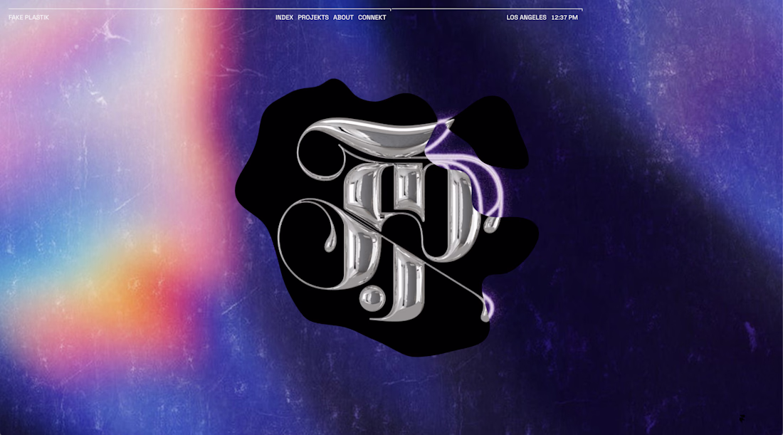
Always down for a fresh UI experiment! 🎨✨
Just finished up this new concept: FAME.X — a platform designed for investing in digital talent and creators.
For the visual direction, I wanted something bold, energetic, and slightly futuristic. To pull that off, I went heavy on high-contrast, grainy gradients mixed with massive, striking typography and sleek glassmorphism cards. It gives the whole platform that trendy, high-value feel. 🔥
I’m an absolute sucker for testing out new design tools, and when they are built by awesome people, it’s an ultimate ccccombo. 💥
To get these incredibly juicy gradients, I used a brand-new tool created by Leo. I’ve been playing around with it, and it’s honestly just pure joy to use. Plus, it’s completely free.
If you want to level up your gradient game, you absolutely have to try it out: https://www.gradientool.com/
I like it!
Can't decide on the nav direction for the new template I'm working on. What do you think??
20 voted
74%
7 voted
26%
27 votes
Closed
Blurred looks more clean
4 of my favorite Landing Pages i've designed recently. Reach out at kaiborgdesigns.com for yours.
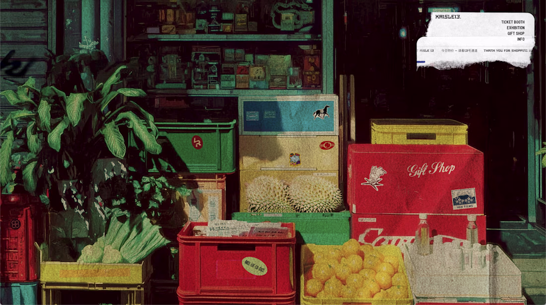
Lovely designs
Trending
Claude
Claude has entered the design space. How are you using Claude Design?
Contra University
Learn from expert creatives how to earn more using next-gen AI tools.
MagicPath
The canvas is infinite, and exploration is becoming the workflow. How are you using MagicPath?
creativeaiflow
Creative AI workflows are evolving. What tools do you use, and what are their strengths and weaknesses?
freelancerlife
Freelancer life is wins, pivots, and everything in between. What’s yours right now?