The network for creativity
Join 1.25M professional creatives like you
Connect with clients, get discovered, and run your business 100% commission-free
Creatives on Contra have earned over $150M and we are just getting started
Back to feedPost

I've converted high ticket offers with a Googledoc and words and a few links on a page.
We love a beautiful design, but the hook and messaging comes first...


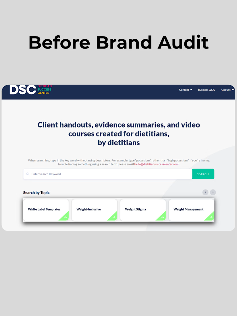
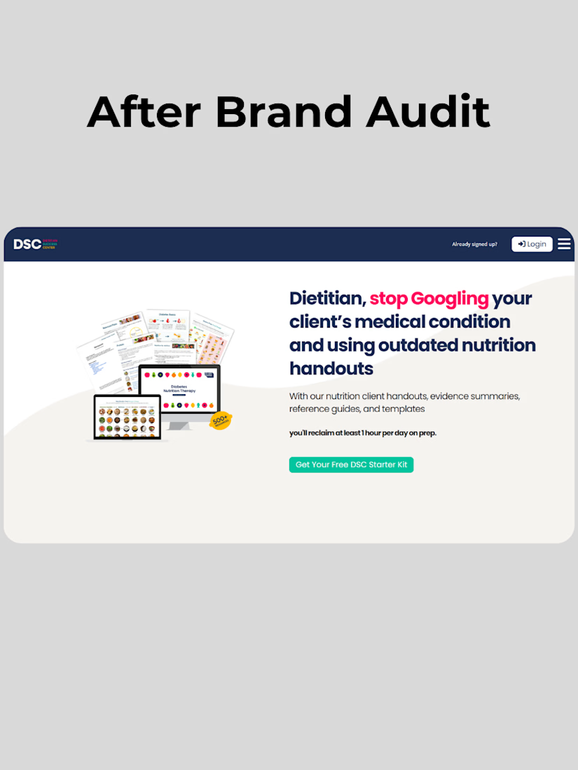
Your homepage hero is either converting or confusing.
When we run a brand audit, we go beyond colors and logos. It's really about messaging and positioning. So when we audited a dietitian brand's site, we found a hero that described features but didn't speak to the audience's...
The network for creativity
Join 1.25M professional creatives like you
Connect with clients, get discovered, and run your business 100% commission-free
Creatives on Contra have earned over $150M and we are just getting started





Related posts

Designed two versions of the Dermoscan website. Same product, two languages, same layout adapted for each market.
A — English version, clean and clinical
B — French version, same structure localized for a European audience
Curious from a design perspective: does anything feel off between the two, or does the layout hold up across both? 👇
4 voted
67%

2 voted
33%

6 votes
Closed

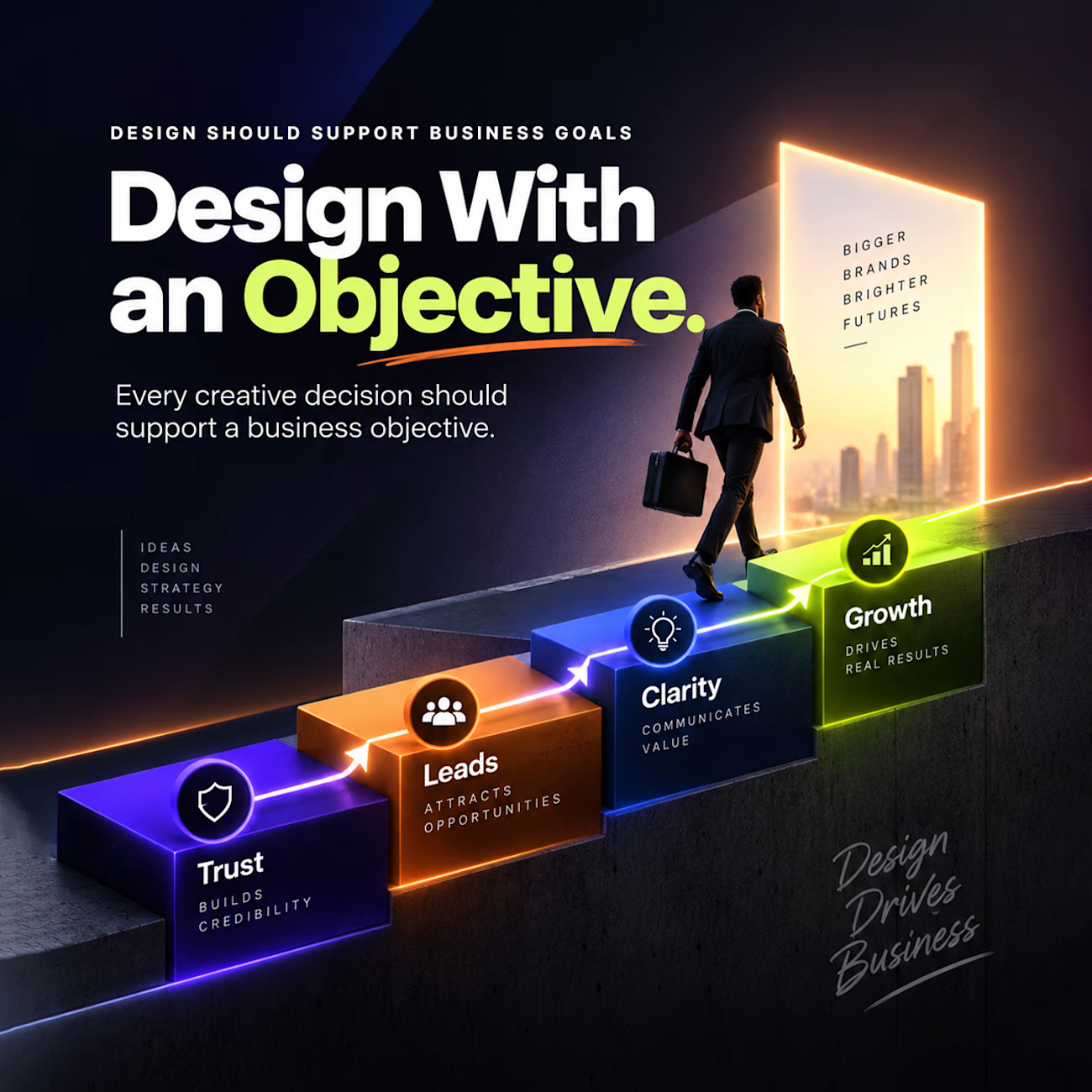
Good design should never exist just to look pretty on a screen. Every creative decision needs to serve a clear business goal.
When design is backed by strategy, it stops being an expense and becomes an engine for momentum.
Here is how intentional design drives your business forward:
• Trust: Builds immediate credibility the second someone lands on your page.
• Leads: Catches attention and attracts qualified opportunities into your funnel.
• Clarity: Communicates your true value fast with zero confusion.
• Growth: Turns interested visitors into long term customers and real revenue.
When you design with an objective, the business naturally scales with it.

When I start my design journey I really discover that I design lots of great stuff but it has no goal but the moment I discover that I start progressing and moving forward ❤️

Luxury Lighting E-commerce Website Design for Modern Home Decor
A modern luxury lighting e-commerce website concept crafted to showcase premium statement pieces through a refined, immersive, and editorial-inspired digital experience. The design combines warm ambient lighting, bold typography, cinematic imagery, and clean minimalist layouts to create a sophisticated online presence for a high-end home decor brand. Every element is thoughtfully designed to enhance product storytelling, improve user engagement, and deliver a seamless shopping experience across all devices.


really nice design