The network for creativity
Join 1.25M professional creatives like you
Connect with clients, get discovered, and run your business 100% commission-free
Creatives on Contra have earned over $150M and we are just getting started
Back to feedPost

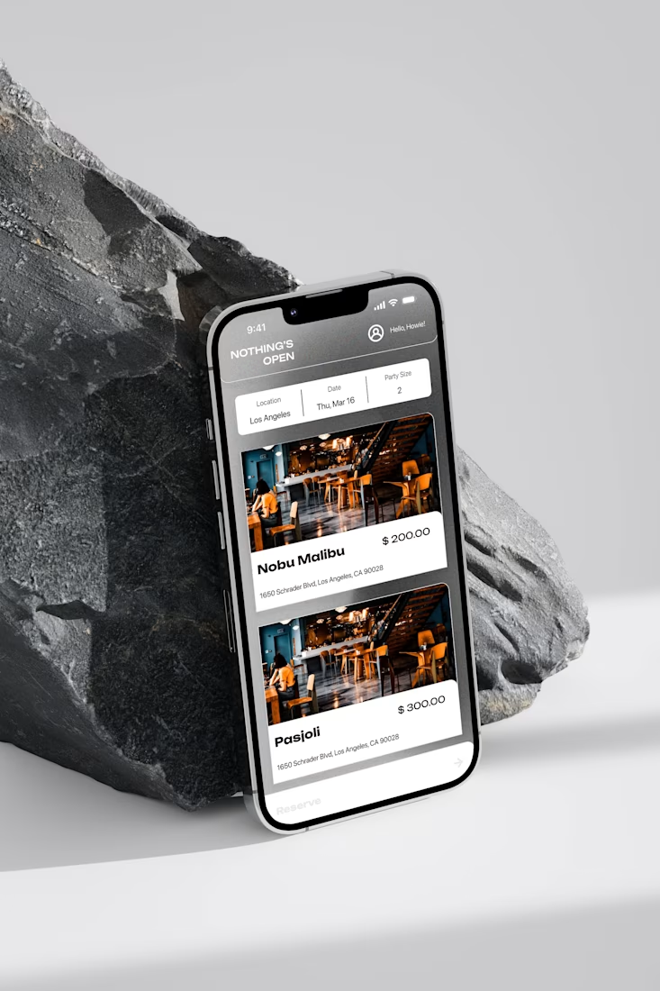
NOTHING'S OPEN is a premier, exclusive dining reservation platform that provides a unique and unmatched experience for effortlessly securing reservations at the most popular restaurants. Our platform ensures a dining journey that is both extraordinary and tailored to individual preferences.

The network for creativity
Join 1.25M professional creatives like you
Connect with clients, get discovered, and run your business 100% commission-free
Creatives on Contra have earned over $150M and we are just getting started





Related posts

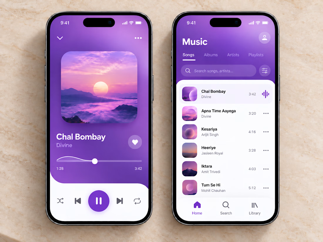
🎧💜 The clean and vibrant UI of this music app creates a calm, immersive listening experience, while smooth controls and simple navigation make finding and playing your favorite songs effortless.
🎶 Thoughtful organization, clear song lists, and a minimal player layout let you stay focused on the music without unnecessary clutter or extra clicks.



sick execution

Awesome


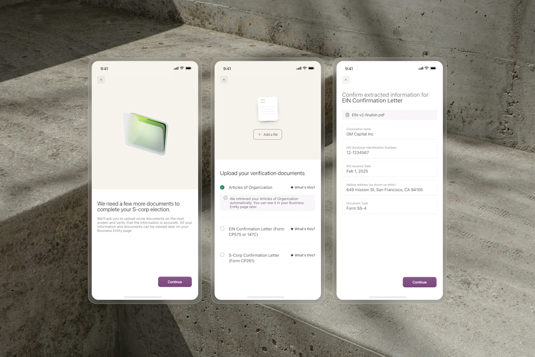
OCR extracts business names, formation dates, and addresses from uploaded documents automatically. But users still need to trust what the system found before anything gets submitted.
We designed the confirmation flow around editable fields that surface extracted data clearly....


Very nice