The network for creativity
Join 1.25M professional creatives like you
Connect with clients, get discovered, and run your business 100% commission-free
Creatives on Contra have earned over $150M and we are just getting started
Back to feedPost

100/100 Performance Achieved: Building a High-Speed Full-Stack E-commerce Engine 🚀
Performance is not just a metric; it’s a business requirement.
I’m thrilled to share the latest results for my Full-Stack E-commerce platform built with Next.js, Laravel, and SQL. Achieving near-perfect Lighthouse scores across the board wasn't easy, but the results speak for themselves:
⚡ Performance: 100/100
🔍 SEO: 100/100
🛡️ Best Practices: 96/100
♿ Accessibility: 90/100
How I achieved this:
Headless Architecture: Decoupled the Laravel backend from the Next.js frontend to ensure lightning-fast API responses and optimized rendering.
Next-Gen Styling: Leveraged Tailwind CSS v4 for a minimal CSS footprint and superior build performance.
Core Web Vitals Optimization: Near-zero CLS (Cumulative Layout Shift) and sub-second First Contentful Paint (0.3s) through aggressive asset optimization.
State Management: Efficient global state handling using Zustand, minimizing unnecessary re-renders.
This project proves that luxury e-commerce can be both visually immersive and technically flawless.
What’s your priority when building full-stack apps: Speed, SEO, or Scalability? Let’s discuss in the comments! 👇


The network for creativity
Join 1.25M professional creatives like you
Connect with clients, get discovered, and run your business 100% commission-free
Creatives on Contra have earned over $150M and we are just getting started


Related posts

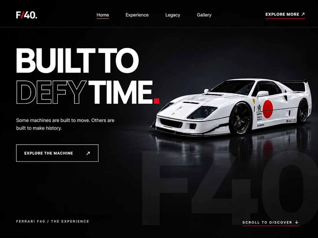
Ferrari F40 — Built to Defy Time
A cinematic, luxury-inspired automotive website concept designed and developed to bring the legendary Ferrari F40 to life through bold visuals, smooth animations, and interactive elements.
Built using HTML, CSS, and JavaScript, this project focuses on creating an immersive browsing experience with a dark aesthetic, striking typography, and responsive layouts.
Key Features
Interactive Car Viewer: Explore six different Ferrari F40 angles using drag gestures, navigation buttons, or keyboard controls.
Cinematic Hero Section: Bold typography, layered visuals, and animated entrances.
Scroll-Triggered Animations: Smooth transitions that bring content into view as users explore the website.
Responsive Design: Layouts adapted for desktop, tablet, and mobile screens.
Automotive Gallery: A visually engaging gallery with hover effects.
Private Inquiry Section: A styled contact form that prepares an email inquiry through the visitor's email application.
Technologies Used
HTML5 · CSS3 · JavaScript
Project Goal
To combine visual storytelling, interactive frontend development, and responsive design into a premium digital experience that feels modern, engaging, and memorable.
Independent portfolio concept — not affiliated with or endorsed by Ferrari.




We rebuilt effekt.design from the ground up.
Over the past weeks we changed how we talk about ourselves and how the site feels. Less is more, and simple is easier to maintain, so we cut the site down to what founders and marketing leads actually need: the work, how we work, and an easy way to start a conversation.
The new positioning: the design partner for fast-moving tech companies. Strategy-led design, shaped by your business goals and measured against them.
The brand is quieter on purpose. The goal was to let the work be the loudest thing on the page, and to put the care into the little details instead. A few examples: a cursor that tells you what a click will do, projects you can filter by discipline, and a light mode switch hiding in the footer. There are many more small moments across the site for anyone who looks closely.
We focused on these interactions because they are a small preview of how we work. The goal is for clients to feel in good hands from the first click, clear on what is happening and confident the details are covered.
Case studies are next. Feedback is always welcome.


Love the idea of the work being the loudest thing on the page. The light mode switch hidden in the footer is a fun detail.

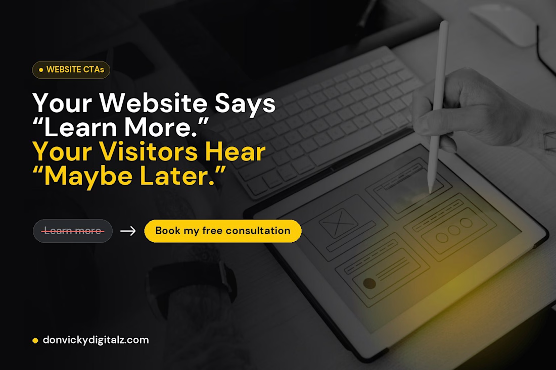
Your Website Says “Learn More.” Your Visitors Hear “Maybe Later.”
This week I audited the buttons on my own website.
“Learn more” appeared 7 times.
“Get in touch” appeared 4 times.
Neither told a visitor what they’d actually get.
Worse, my “Get in touch” buttons opened an email app, while my header button opened my booking page. Same goal, two different experiences.
So I rewrote them:
❌ Learn more → ✔ Book my free consultation
❌ Get in touch → ✔ Start your project
❌ Explore projects → ✔ See more on Behance ↗
❌ (nothing) → ✔ Not sure what you need? Let’s figure it out together
That last one matters most. Some of my sections built interest… then just stopped. No next step at all.
A good button does three things:
→ Says what happens when you click
→ Shows up at the moment someone is convinced
→ Leads everyone to the same easy next step
Your buttons are the only part of your website that asks people to do something. They deserve more than two words.
Quick challenge: open your homepage and count your “Learn more” buttons. How many did you find? 👇