The network for creativity
Join 1.25M professional creatives like you
Connect with clients, get discovered, and run your business 100% commission-free
Creatives on Contra have earned over $150M and we are just getting started
Back to feedPost

Hello Contra — first post, here we go.
I'm Ethan. Brand identity designer, father of two, husband, and someone who takes the craft seriously. I've been consulting and freelancing for a few years now and I'm just getting my Contra profile properly set up.
What I do: I build brands from the ground up. Strategy first, visuals second, nothing generic ever. The best brands aren't just good looking — they're intentional, differentiated, and true to who the business actually is. That's what I care about.
A little about me outside of work — I lift weights, play basketball, paint custom sneakers, and have about a billion other hobbies that keep life interesting.
If you're a designer — let's connect, I love seeing great work.
If you're a business owner looking for a brand that actually means something — reach out. I'd love to help.


The network for creativity
Join 1.25M professional creatives like you
Connect with clients, get discovered, and run your business 100% commission-free
Creatives on Contra have earned over $150M and we are just getting started








Related posts

I'm excited to share the full case study from our collaboration on the Unik Mindz logo design and branding, completed in August 2026.
Unik Mindz is a creative design studio born from the legacy of the Unik family brand. Founded on the belief that every idea begins with a unique mind, the studio needed an identity that could carry that message and become the face of the brand.
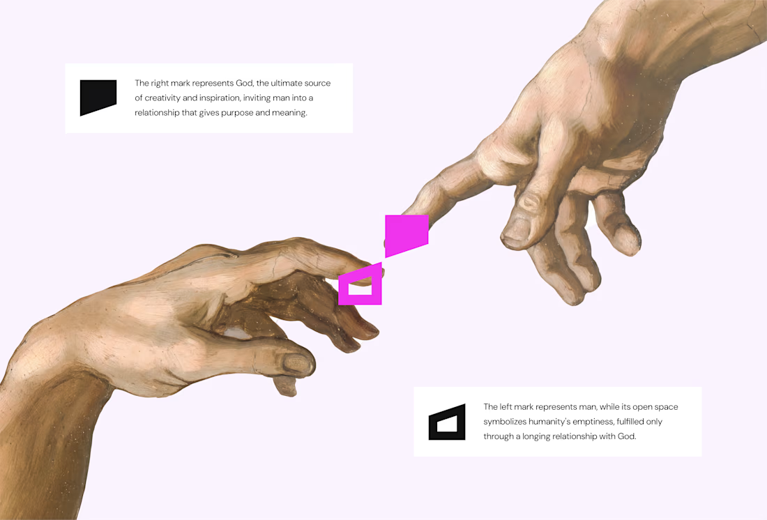
The logo draws inspiration from Michelangelo’s The Creation of Adam, focusing on the idea of connection. It captures the moment two minds meet to create something greater, reflecting the brand’s conviction that meaningful creativity starts with connection.
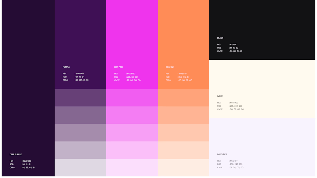
We wrapped the project with a clear system and guide for how the brand assets should be used going forward.
Want to work with us? Send a DM or email to info@donatus.agency


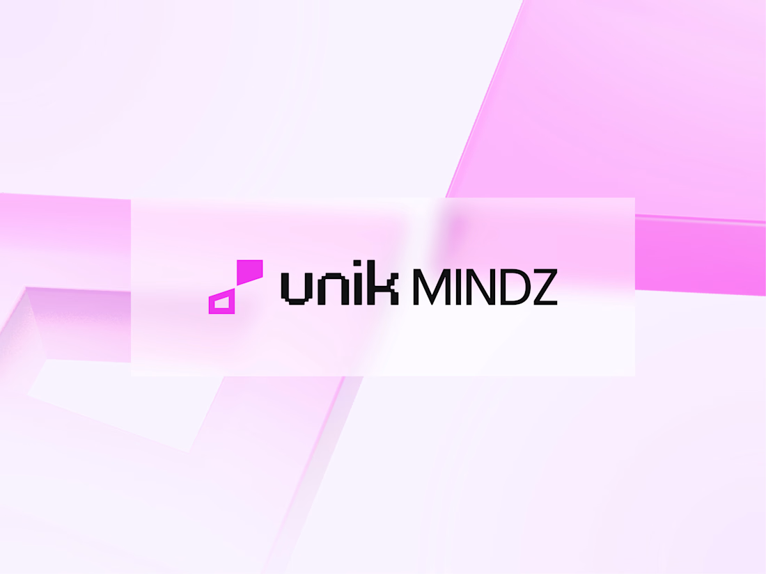
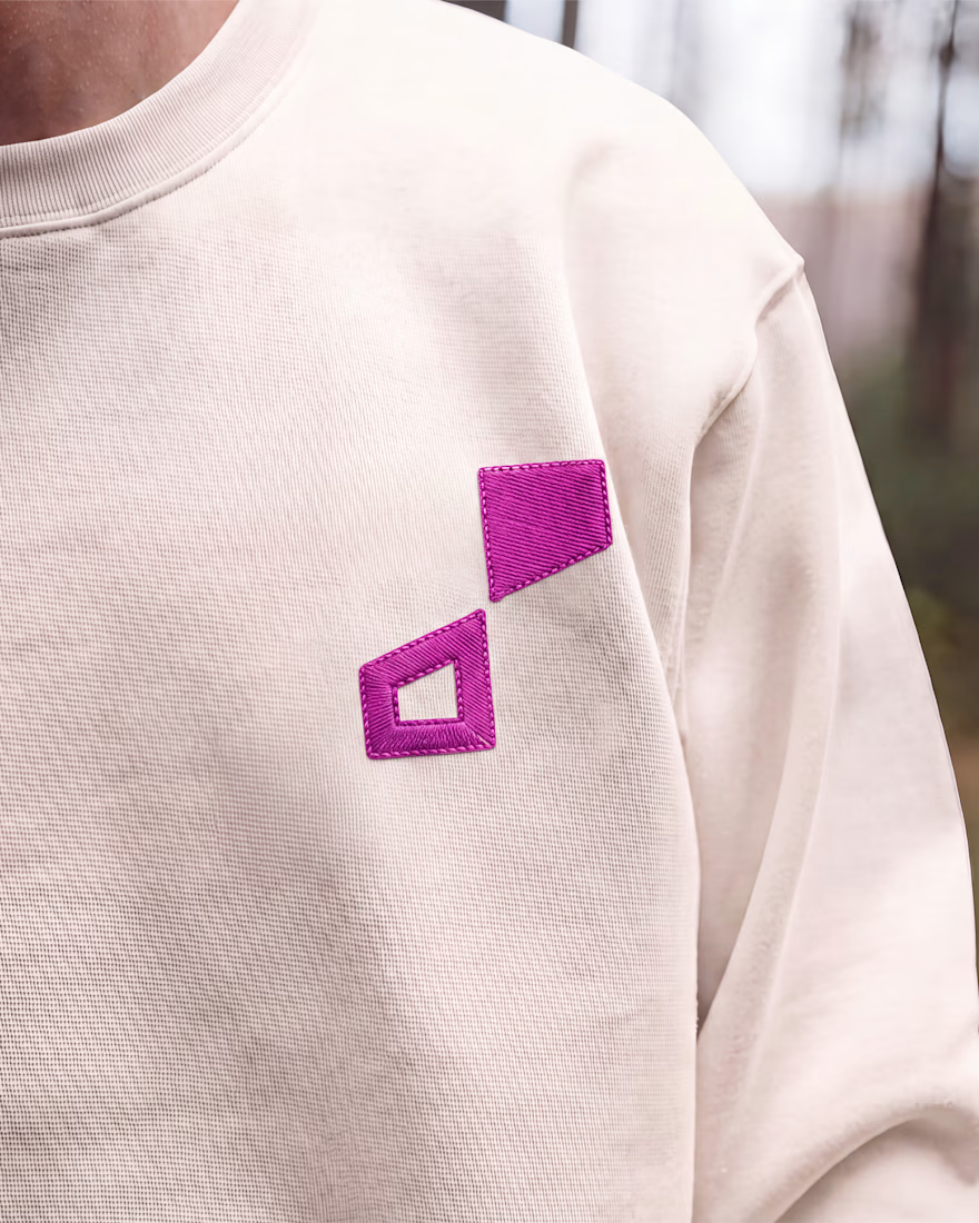

Honestly I never see something like this before I love the uniqueness of the design and it's vibrant color palette great job 🎉🎉

Jordan Reid - Sportswear Brand Identity

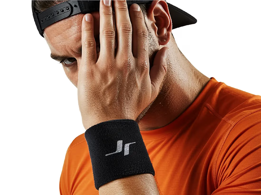


Like the logo direction

Good Terms -- Logo Design