The network for creativity
Join 1.25M professional creatives like you
Connect with clients, get discovered, and run your business 100% commission-free
Creatives on Contra have earned over $150M and we are just getting started
Back to feedPost
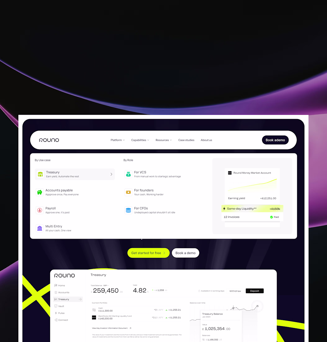
Kudos to the team at Round Treasury for building a product that tackles a real and often overlooked challenge, bringing clarity and efficiency to treasury, payments, and cash management. It’s never easy simplifying something this complex.
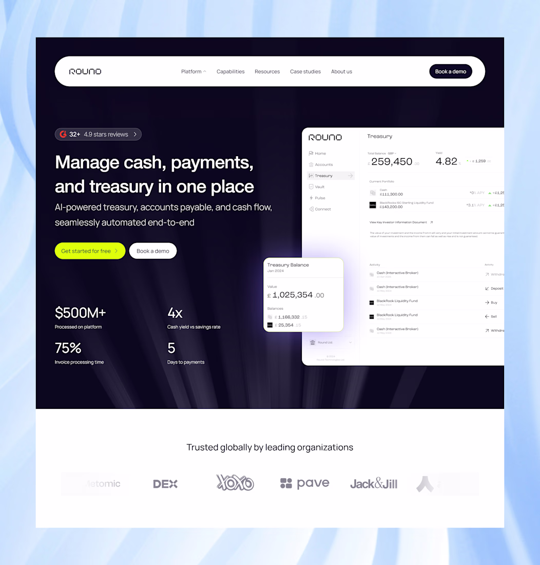
I recently explored a refined design direction for their website hero section, with a focus on improving clarity, structure, and overall user experience.
This wasn’t about redesigning for aesthetics alone, but about making the product easier to understand, trust, and navigate from the very first interaction.
As part of this exploration, I worked on two different design directions, alongside a new concept for the navbar dropdown, leveraging colors derived from the original website to maintain brand familiarity while improving visual engagement and usability.
A few key improvements I made:
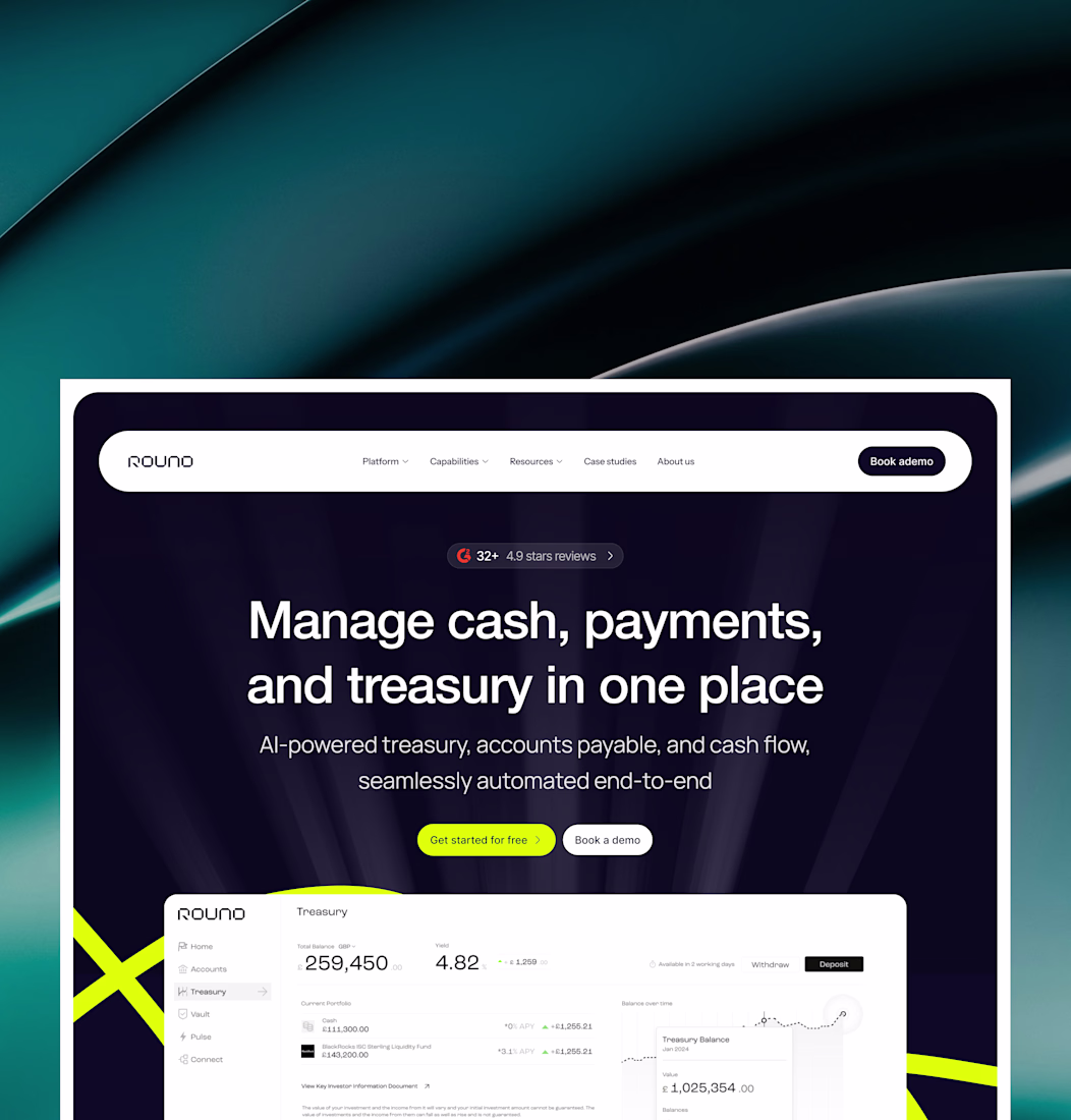
• Typography: I introduced a more readable and modern typeface to improve legibility and make content easier to scan. In fintech, clarity is everything.
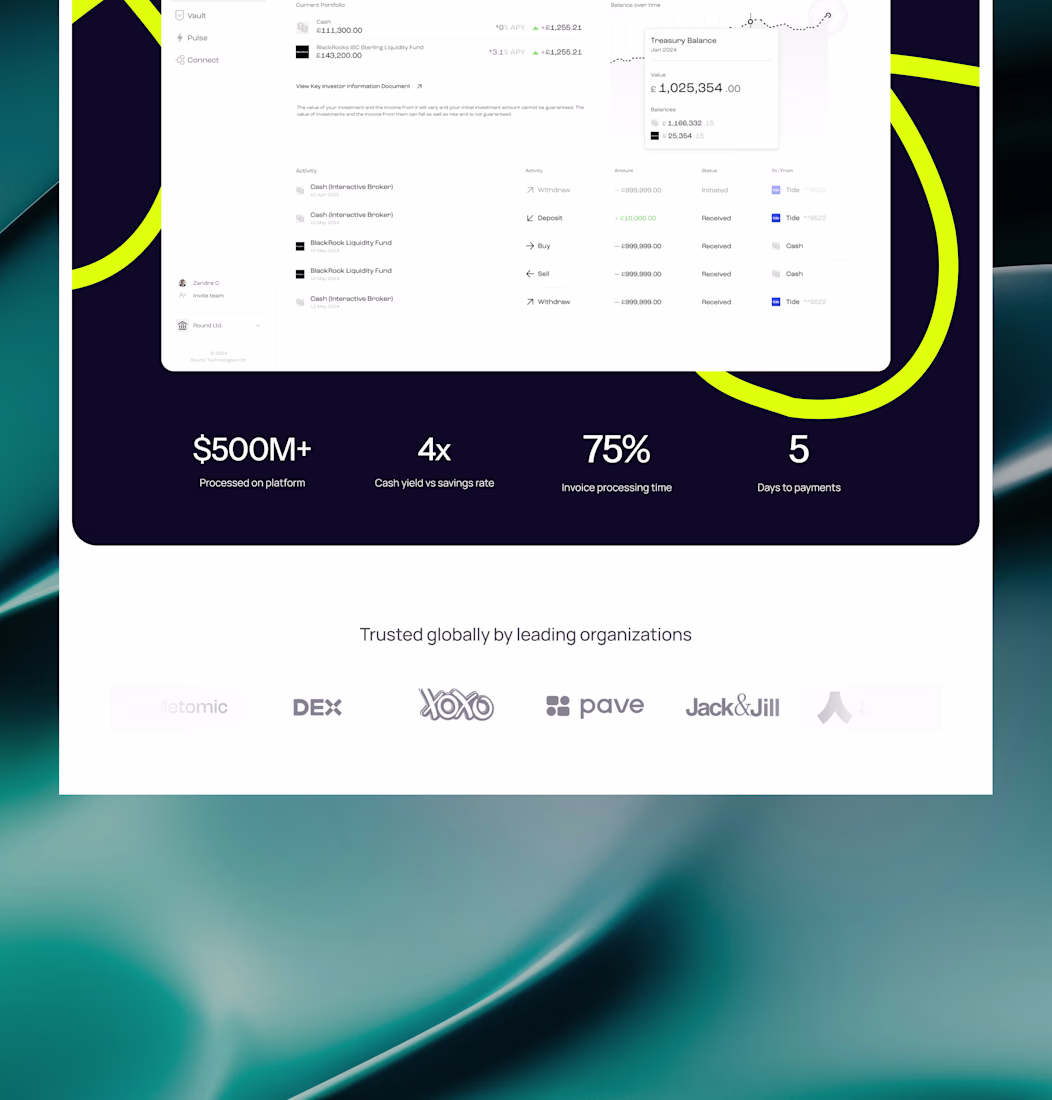
• Overall section: I added subtle background elements to create depth and visual focus, helping guide attention naturally to the core messaging and calls-to-action without overwhelming the user.
• Structure & hierarchy: I reworked the layout to improve flow, including repositioning client logos into a dedicated trust section. This allows social proof to stand on its own and reinforces credibility at the right moment.
• Color system: I refined the color usage to ensure consistency and balance, creating contrast where needed while maintaining a clean, cohesive visual experience.
The result is a design that feels more intentional, more usable, and more aligned with how users actually engage with fintech products: clear messaging, strong hierarchy, and less friction.
The network for creativity
Join 1.25M professional creatives like you
Connect with clients, get discovered, and run your business 100% commission-free
Creatives on Contra have earned over $150M and we are just getting started
Related posts
The animations are smooth
Just wrapped up a custom website project in Framer for my client!
Focused on creating a clean, modern, and responsive experience that looks great across all devices. From layout design to smooth interactions and performance optimization, every detail was crafted to help the brand stand out online.
1 Built with Framer
2 Fully responsive design
3 Fast-loading pages
4 Modern UI/UX
5 Easy-to-manage structure
Always excited to help businesses turn their ideas into high-converting websites.
#Framer #WebDesign #WebsiteDevelopment #UIUX #FreelanceDesigner #ContraCreator #ResponsiveDesign #NoCode
Always grateful for the trust my clients place in me. Looking forward to more Framer projects and helping businesses establish a stronger online presence.
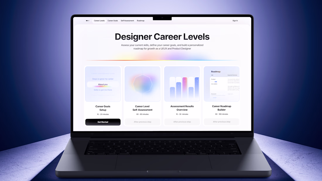
⛳️ 𝗦𝗸𝗶𝗹𝗹 𝗔𝘀𝘀𝗲𝘀𝘀𝗺𝗲𝗻𝘁 𝗠𝗮𝘁𝗿𝗶𝘅 & 𝗥𝗼𝗮𝗱𝗺𝗮𝗽 𝗕𝘂𝗶𝗹𝗱𝗲𝗿 𝗳𝗼𝗿 𝗗𝗲𝘀𝗶𝗴𝗻𝗲𝗿𝘀
Skill Assessment Matrix is a SaaS designed to help Product Designers and UI/UX Designers better understand their current level, identify their strongest skills, and build a personalized growth roadmap
The idea came from a problem I experienced early in my career:
"𝙃𝙤𝙬 𝙙𝙤 𝙄 𝙠𝙣𝙤𝙬 𝙞𝙛 𝙄'𝙢 𝙖 𝙅𝙪𝙣𝙞𝙤𝙧, 𝙈𝙞𝙙-𝙡𝙚𝙫𝙚𝙡, 𝙤𝙧 𝙎𝙚𝙣𝙞𝙤𝙧 𝙙𝙚𝙨𝙞𝙜𝙣𝙚𝙧?"
This first version is focused on the desktop experience and was designed as the foundation for a larger SaaS product
𝗣𝗥𝗢𝗕𝗟𝗘𝗠
Designers often struggle with:
✦ Understanding their current level
✦ Identifying their strongest skills
✦ Knowing what to improve next
✦ Creating a clear career growth plan
𝗦𝗢𝗟𝗨𝗧𝗜𝗢𝗡
Skill Assessment Matrix helps designers answer three simple questions:
✦ Where am I today?
✦ What are my strongest skills?
✦ What should I focus on next?
The product guides users through a complete career planning flow:
𝗦𝘁𝗲𝗽 𝟭 [Career Goals Setup] Users define their career goals and desired direction
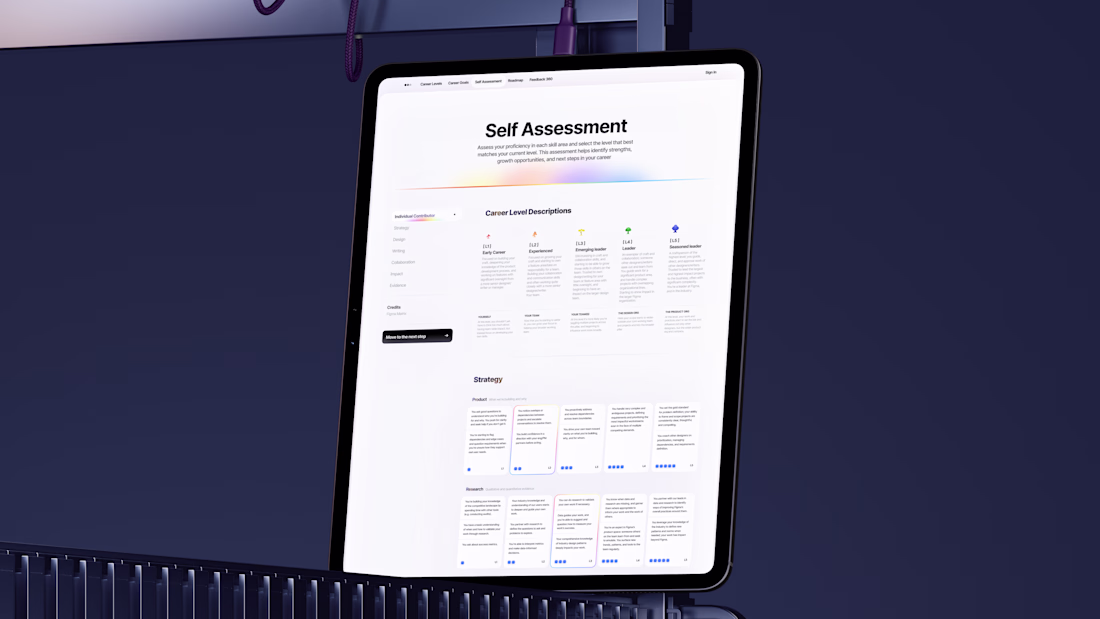
𝗦𝘁𝗲𝗽 𝟮 [Self Assessment] Users evaluate their current skills across multiple competency areas
𝗦𝘁𝗲𝗽 𝟯 [Summary] The system generates a personalized overview highlighting strengths and growth opportunities.
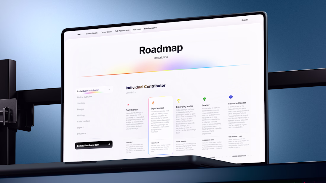
𝗦𝘁𝗲𝗽 𝟰 [Roadmap Builder] Users receive a personalized roadmap and can further customize it by adding their own skills
𝗦𝘁𝗲𝗽 𝟱 [PDF Export] The final roadmap can be exported as a PDF and used as a practical career development plan.
⚡️This roadmap generation and export flow became one of the most valuable features of the project⚡️
𝗥𝗘𝗦𝗘𝗔𝗥𝗖𝗛 𝗙𝗢𝗨𝗡𝗗𝗔𝗧𝗜𝗢𝗡
This project is based on more than 5 years of research into Skill assessment frameworks. The primary foundation for this work was the Figma Community Skills Matrix documentation, supported by dozens of additional public frameworks
𝗪𝗛𝗔𝗧 𝗪𝗔𝗦 𝗧𝗘𝗦𝗧𝗘𝗗
✦ Figma AI Agent for generating new interfaces
✦ Figma Make for transforming designs into interactive product flows
✦ Combining a custom design system with generated product experiences
✦ Building complex multi-step user journeys inside Figma Make
✦ Creating SaaS-style product logic without traditional development workflows
𝗧𝗢𝗢𝗟𝗦 𝗨𝗦𝗘𝗗
Figma ✦ Figma AI Agent ✦ Figma Make ✦ MCP Servers
🔗 𝗣𝗥𝗢𝗝𝗘𝗖𝗧 𝗟𝗜𝗡𝗞: https://meta-poet-59855448.figma.site
🎥 Watch the video to see the full design process and how the project was built
🔗 𝗩𝗜𝗗𝗘𝗢: https://youtu.be/S3q38_kpTXo
𝗖𝗢𝗟𝗟𝗔𝗕𝗢𝗥𝗔𝗧𝗢𝗥𝗦:
Special thanks to @Illia Skliarov for contributing to the creative process, design discussions, design, brainstorming sessions, and product thinking throughout the project.
𝗦𝗨𝗣𝗣𝗢𝗥𝗧 (っ◔◡◔)っ
Please like, comment, share, or save this project to help more designers discover it ❤️
🔗 𝗦𝗢𝗖𝗜𝗔𝗟 𝗠𝗘𝗗𝗜𝗔 𝗣𝗢𝗦𝗧: https://www.instagram.com/reel/DZwXAvhoMHA/?igsh=MWpmZGRwYmx0Y2lwdA==
Love this
Trending
Claude
Claude has entered the design space. How are you using Claude Design?
Contra University
Learn from expert creatives how to earn more using next-gen AI tools.
MagicPath
The canvas is infinite, and exploration is becoming the workflow. How are you using MagicPath?
creativeaiflow
Creative AI workflows are evolving. What tools do you use, and what are their strengths and weaknesses?
freelancerlife
Freelancer life is wins, pivots, and everything in between. What’s yours right now?