The network for creativity
Join 1.25M professional creatives like you
Connect with clients, get discovered, and run your business 100% commission-free
Creatives on Contra have earned over $150M and we are just getting started
Back to feedPost

Every category has a way of doing things. We saw an opportunity to do things differently.
In 2026, Egypt's energy drink shelves were full, but something was missing. Between excessive sugar, high sodium, and brands competing to be the loudest, there was little room for a more considered approach to energy.
That's where AURA began.
The ambition was bigger than launching another energy drink. It was about challenging what an energy drink could look like, feel like, and stand for.
We started with a blank canvas and built everything from the ground up: the brand strategy, positioning, visual identity, and packaging. Every decision was intentional, bringing together clean energy, performance, and premium aesthetics.
The result? A brand designed for a generation that expects more from what they consume and how they live.
Not just another can on the shelf. A different perspective on energy.
AURA. Energy, Refined.
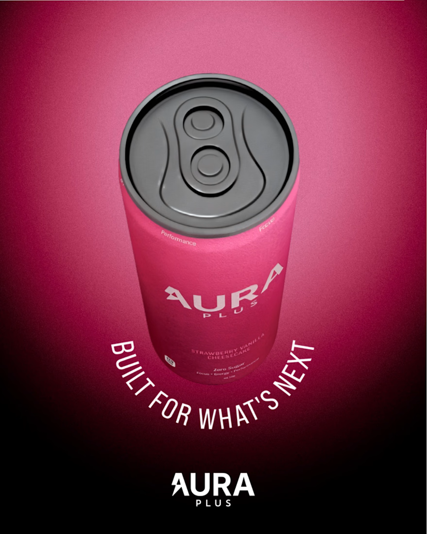


Mohmed, that pink can with the curved lettering looks so good!!

Nice this looks
The network for creativity
Join 1.25M professional creatives like you
Connect with clients, get discovered, and run your business 100% commission-free
Creatives on Contra have earned over $150M and we are just getting started


Related posts

Ever wondered what a space-race poster would sell if it sold hammers?
The Zvezda Works case study answers that, and it’s nearly here.
Watch this space.

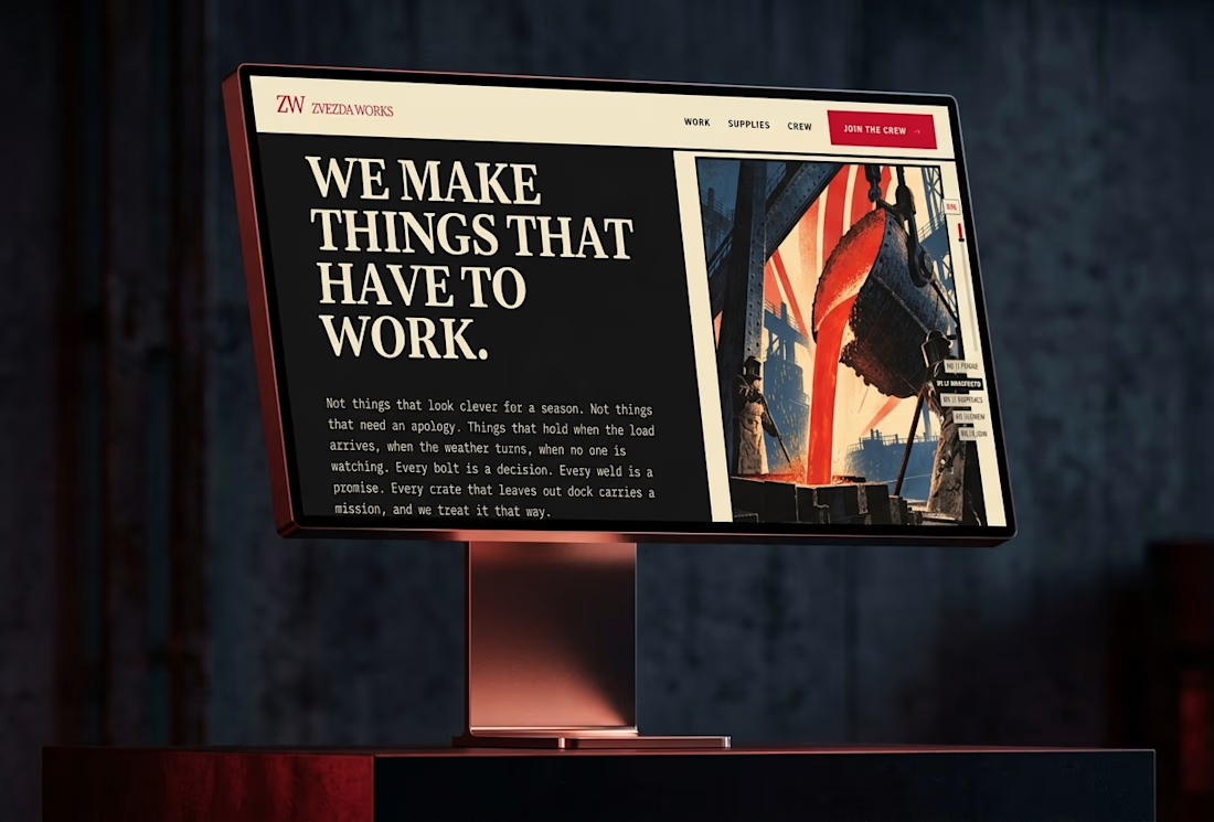
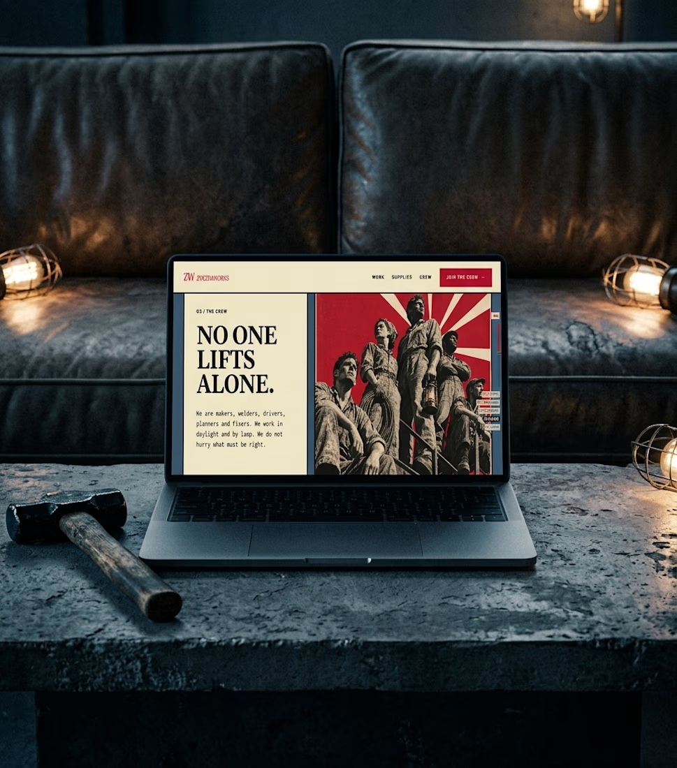

This one made me stop scrolling....
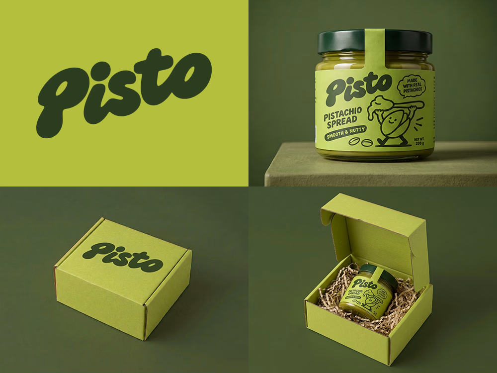
Love the playful wordmark and that olive-pistachio palette.
Sharing so others can enjoy it on their feed a little longer. 🙌

Can AI create a professional-looking logo?
I tried to create a logo concept for a pistachio spread brand using Recraft Logo Maker.
After answering a few questions about the brand and going through several variations, I finally landed on a logo that felt right and captured the fun,...

Wow

My latest branding project for the Atlanta Museum of Paleontology.
Check out the full project at maximjungle.com


A T-rex drawn in one thin outline is such a good mark 🦖 I'd happily visit that museum.