The network for creativity
Join 1.25M professional creatives like you
Connect with clients, get discovered, and run your business 100% commission-free
Creatives on Contra have earned over $150M and we are just getting started
Back to feedPost


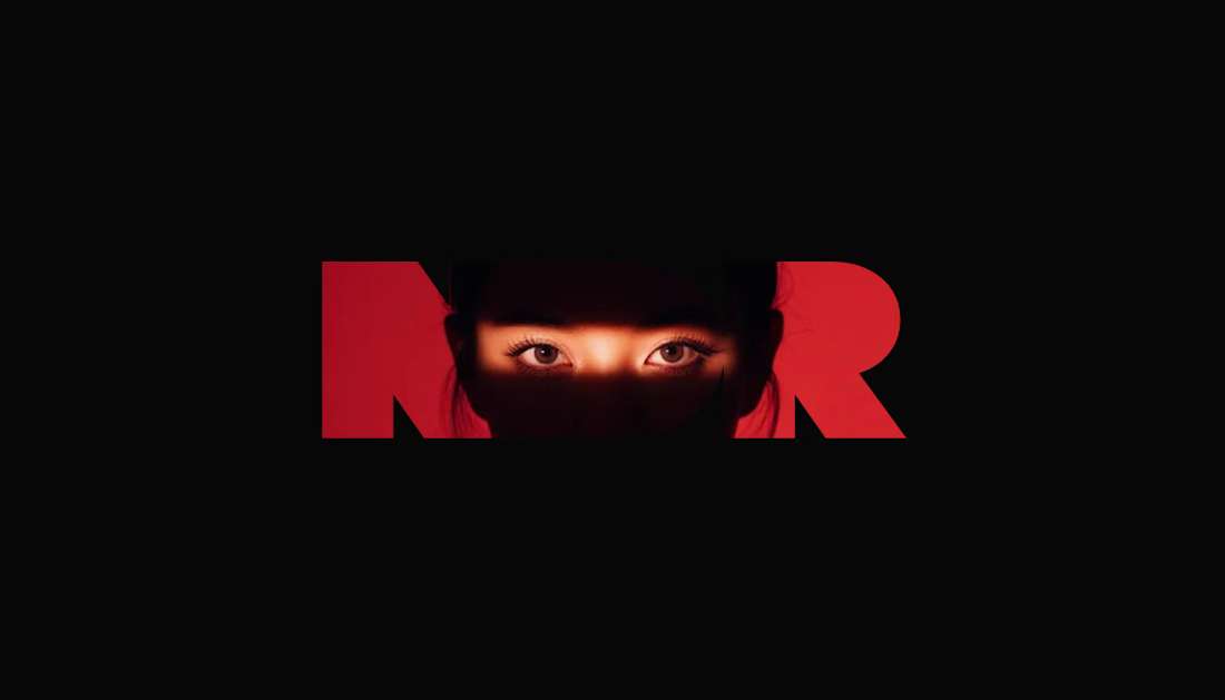
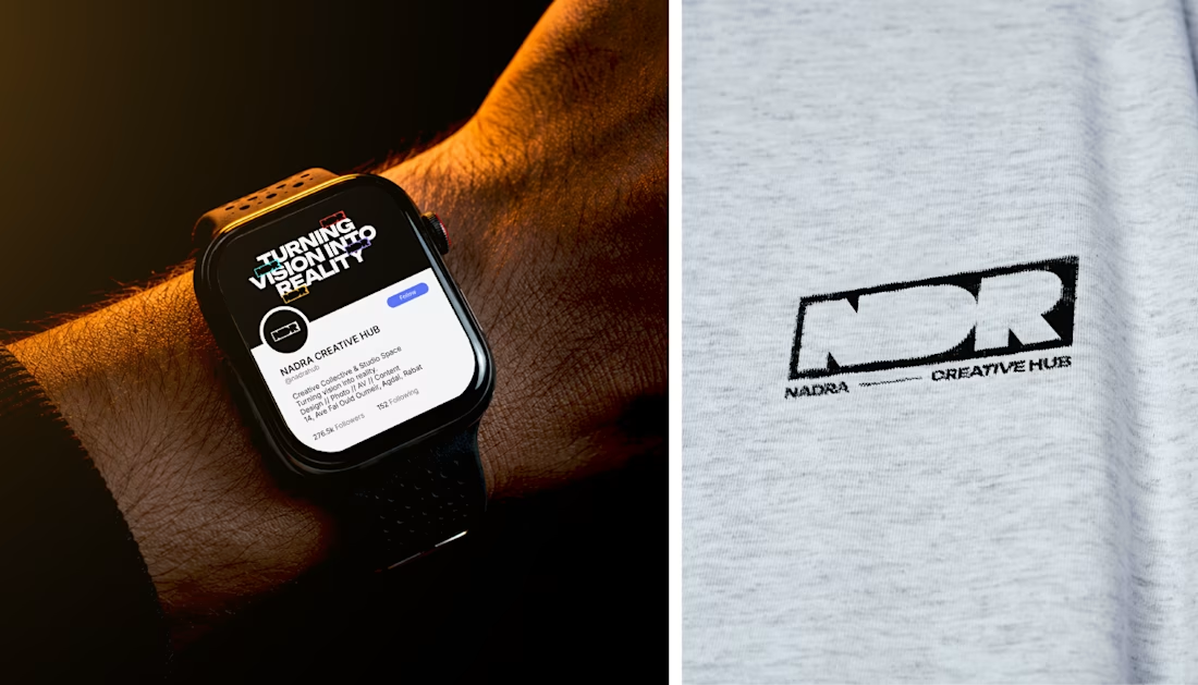
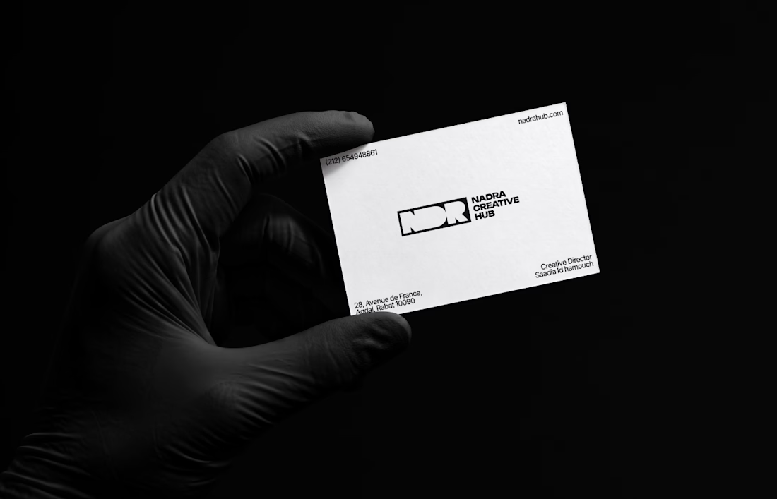
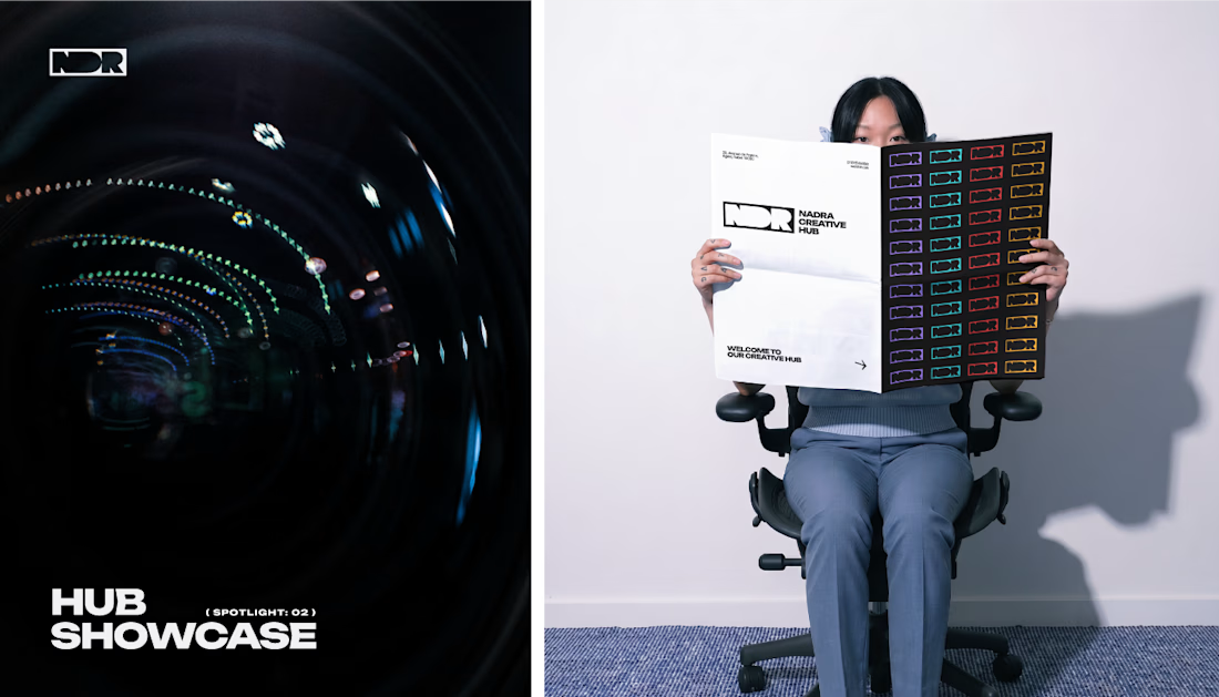

That glowing red NDR wordmark with the eyes peeking through is unforgettable, Saadia. The rollout across watch face, tee, and card mockups shows real brand discipline. Bold identity work.
The network for creativity
Join 1.25M professional creatives like you
Connect with clients, get discovered, and run your business 100% commission-free
Creatives on Contra have earned over $150M and we are just getting started



Related posts

Brand work for HauntChain
I'm loving building this brand and the results so far
A deFi platform with some gamification


That's cute ❤️


Is text on album covers really tacky?
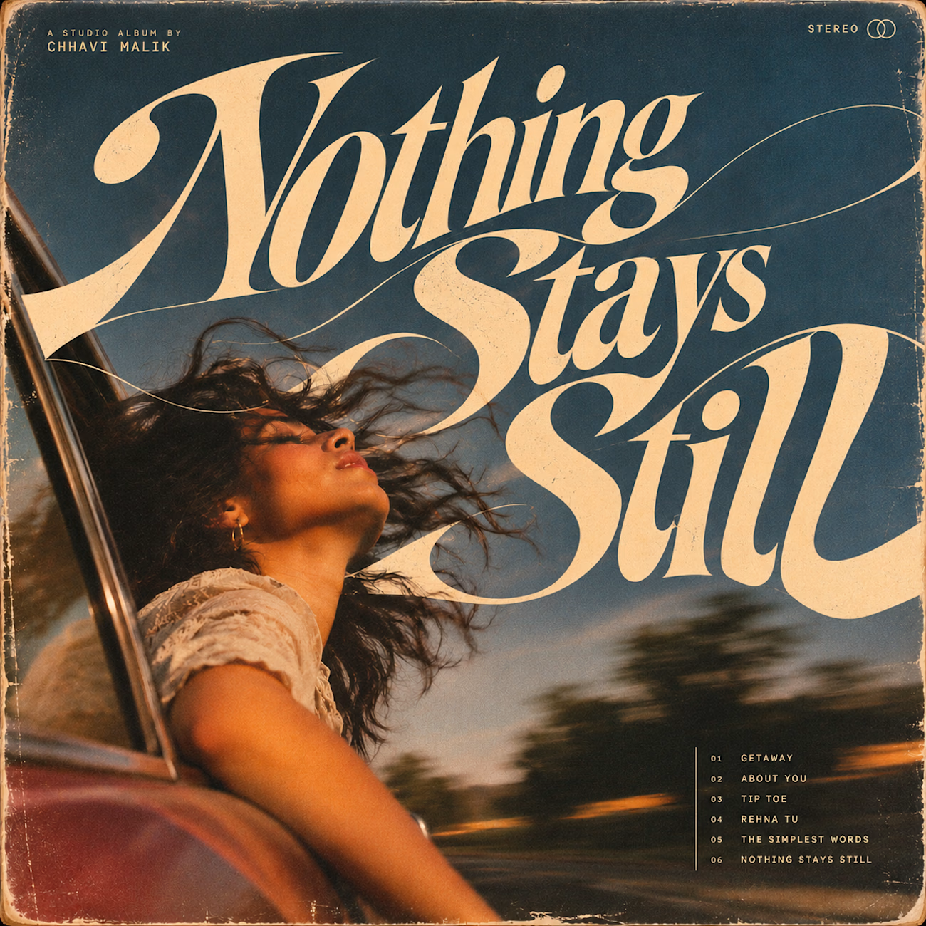
This question has been doing the rounds on X and I have to say, I'm firmly on the other side of that argument. I've always loved seeing typography become part of the artwork rather than just a title sitting on top of it.
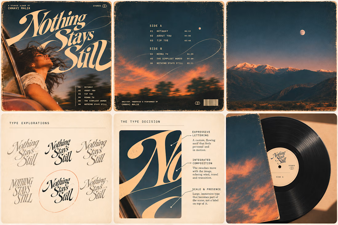
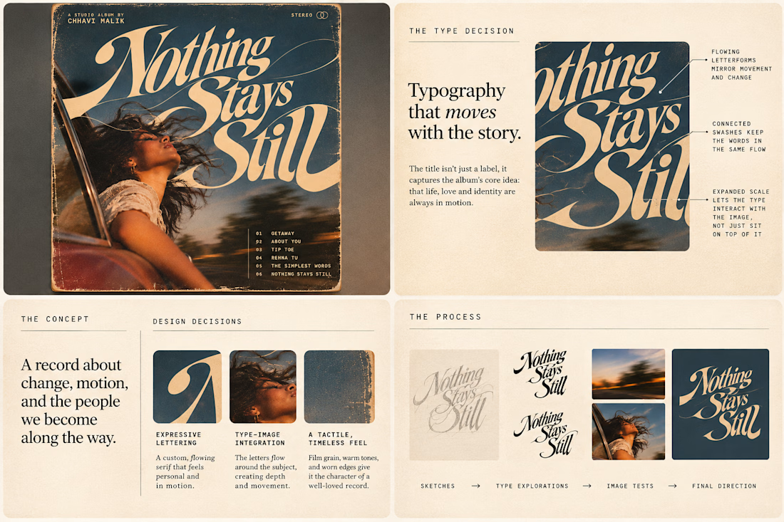
So I wanted to put that idea to the test with an imagined album called Nothing Stays Still, inspired by change, fleeting moments and everything in between:)
I played around with the lettering until it felt expressive, a little restless, and inseparable from the photograph.
Because I think badly considered typography is tacky. Typography itself? Give it a chance :)
What's an album cover where the type really makes it for you?


In geology, strata are layers laid down over time, each one holding the rest. That’s exactly what an enterprise platform should feel like.
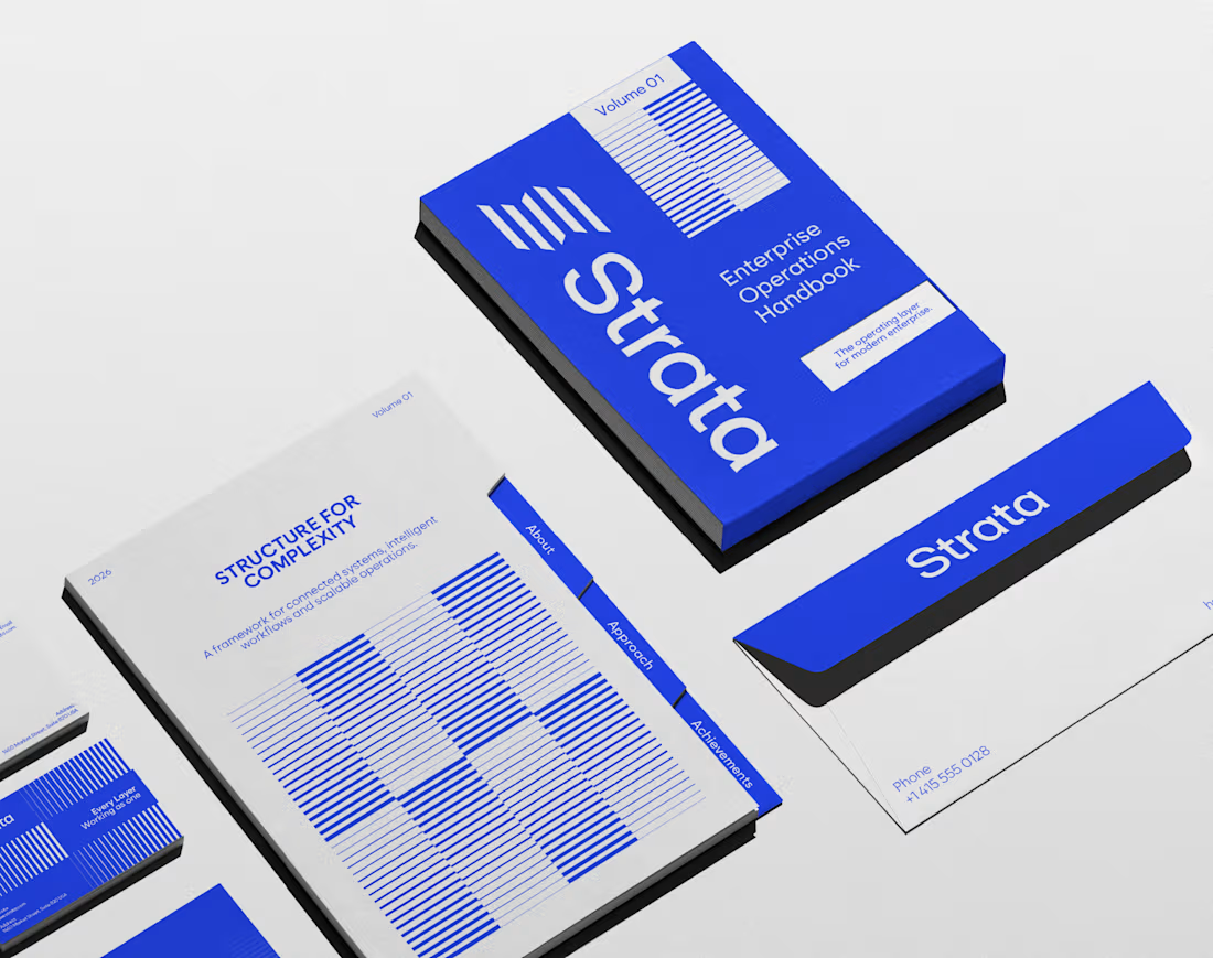
I designed the brand identity for Strata, a SaaS platform that connects fragmented systems, data, workflows and teams. The name already carried the idea, so the identity makes it visible: “Every layer, working as one.”
Logo: Five stacked layers forming a subtle S, solid like rock and arranged for motion.
Principle: “Complexity, organized into movement” turns a dense product story into something calm.
Palette: Strata Blue #2447F9, near-black #02040C and white. Flat colour only, so every layer stays distinct.
Layout: Modular grids and architectural spacing that build pages the way strata build ground, in order.
Imagery: Portraits washed in Strata Blue, with light streaming through, putting people at the centre of the system.
A good name sets up the brand. The identity has to prove it.
If your SaaS or B2B platform needs a brand as solid as its infrastructure, let’s talk.
#BrandIdentity #SaaSBranding #TechBranding #LogoDesign