The network for creativity
Join 1.25M professional creatives like you
Connect with clients, get discovered, and run your business 100% commission-free
Creatives on Contra have earned over $150M and we are just getting started
Back to feedPost

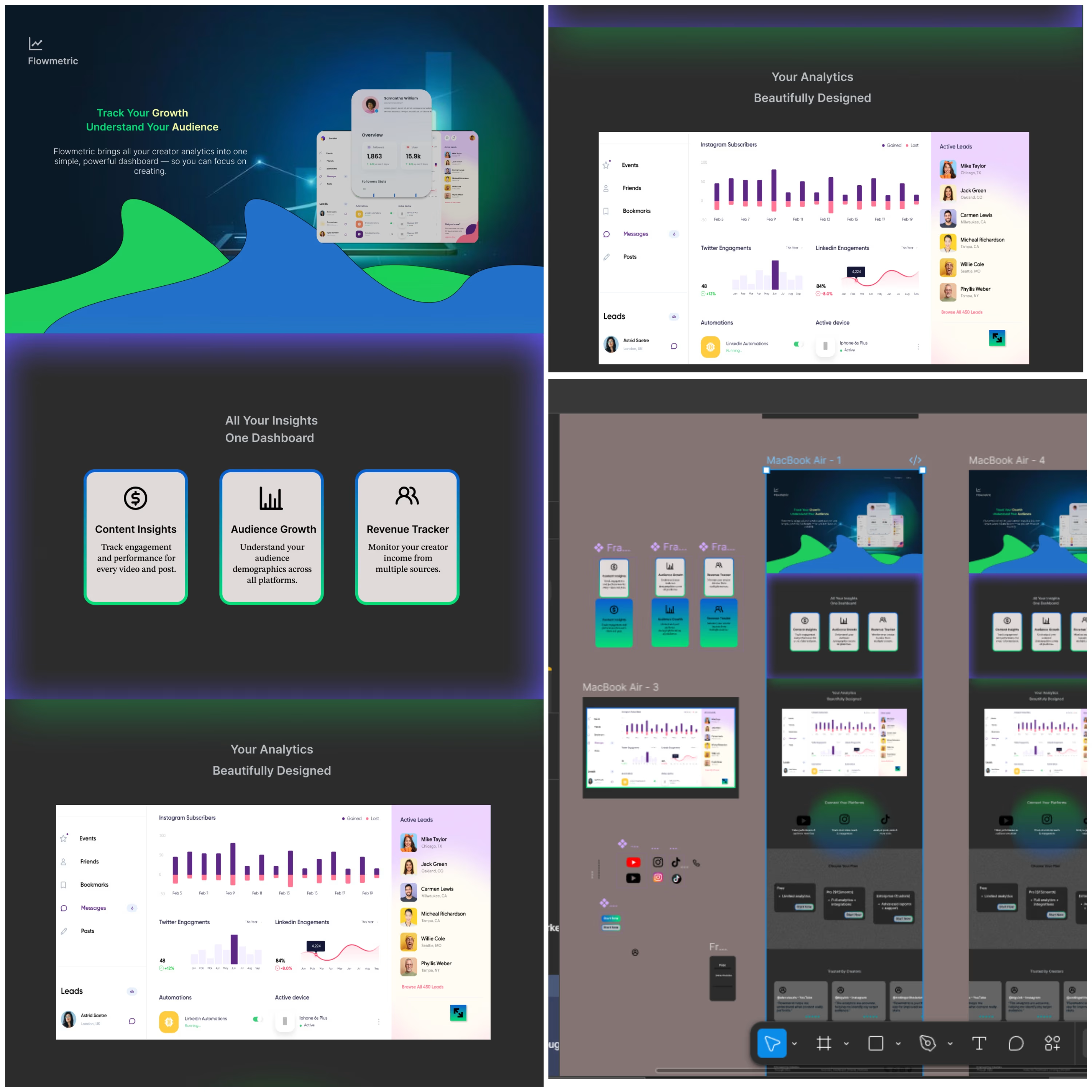
Flowmetric started with a simple idea: analytics should feel clear, not overwhelming.
The challenge was creating a SaaS experience that could present a lot of information without making users feel lost. I focused on building a clean visual hierarchy, using cards, charts, spacing, and subtle interactions to guide attention naturally.
The result is a dashboard that turns complex data into something easier to scan, understand, and act on. Every section was designed with the user’s workflow in mind, balancing functionality with a modern, polished visual language.
This project allowed me to explore how thoughtful UI decisions can make data-heavy products feel simple and approachable.

The network for creativity
Join 1.25M professional creatives like you
Connect with clients, get discovered, and run your business 100% commission-free
Creatives on Contra have earned over $150M and we are just getting started

Challenges
View all


Related posts


Some designers are obsessed with removing friction. Usually, they’re wrong.
When it comes to high stakes fintech "invisible" is a bug, not a feature.
We designed the Tithe onboarding with a mandatory slide to confirm. One second of friction to ensure a lifetime of trust.
Don't just make it fast but rather feel right.
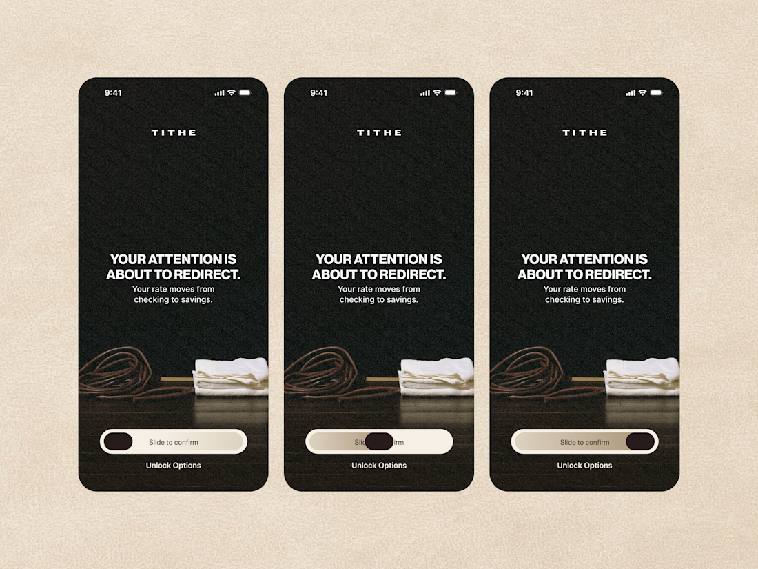

The slide-to-confirm is a nice touch. For financial decisions, that extra moment of intention makes sense.

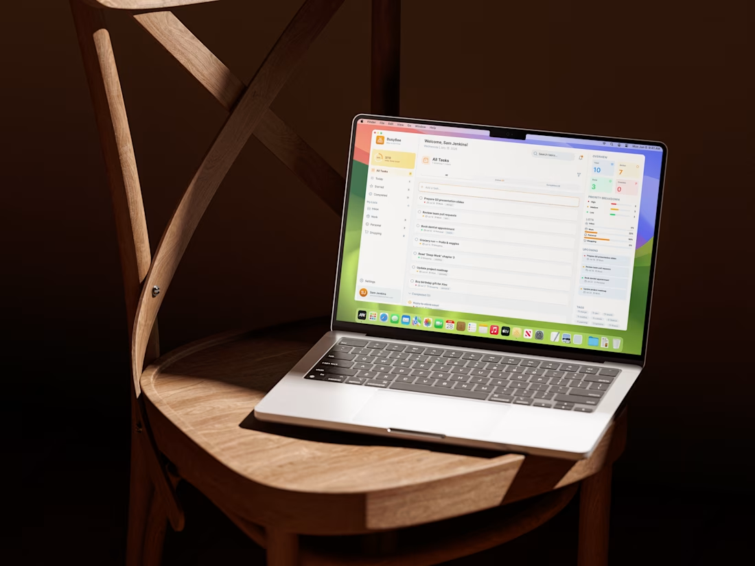
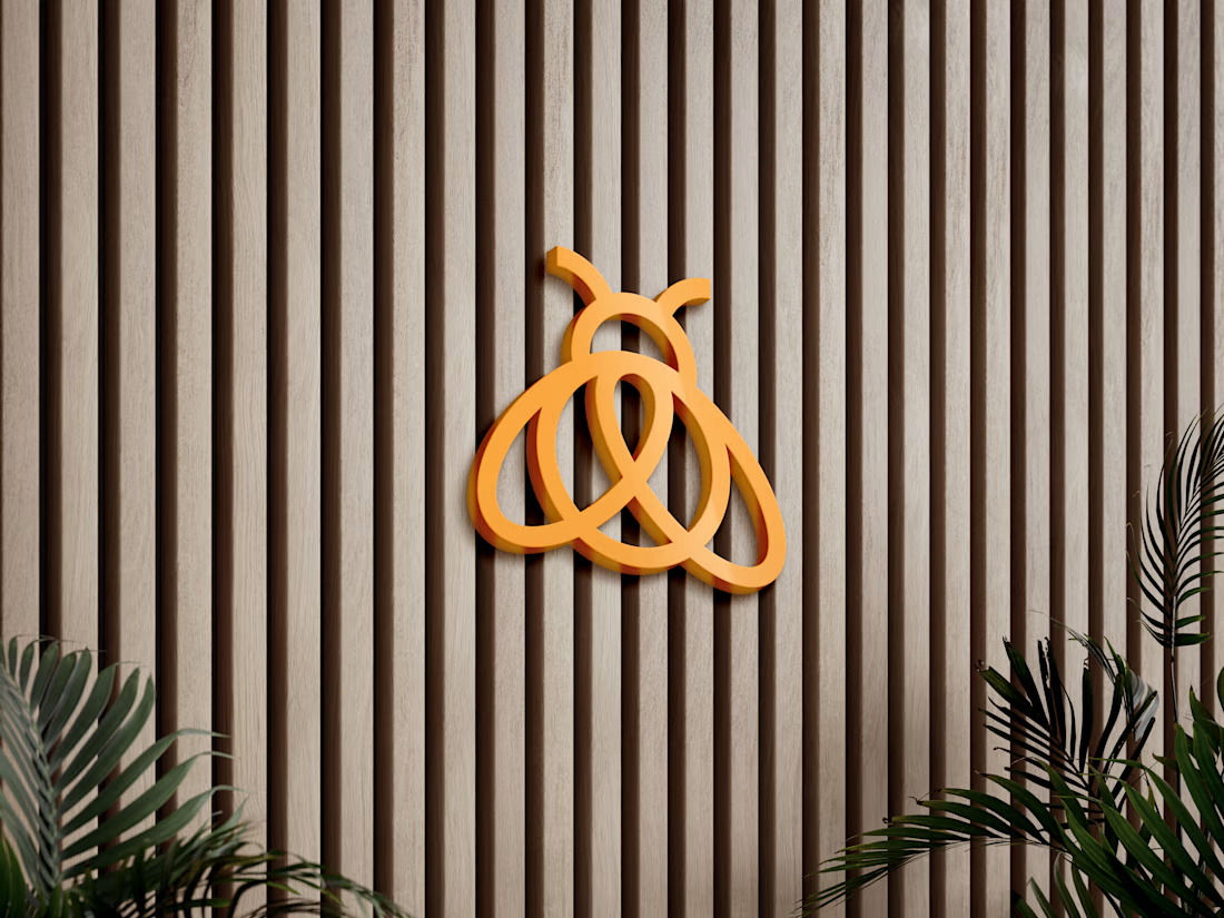
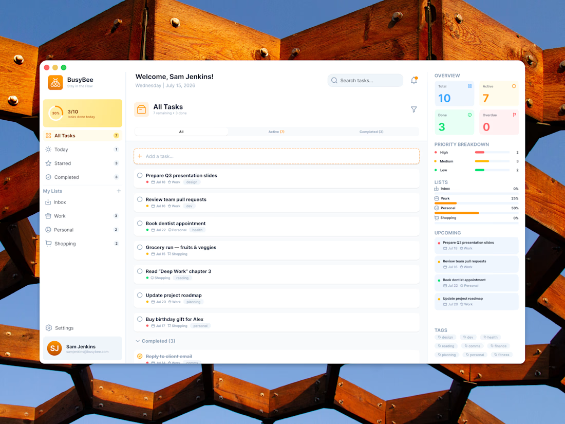
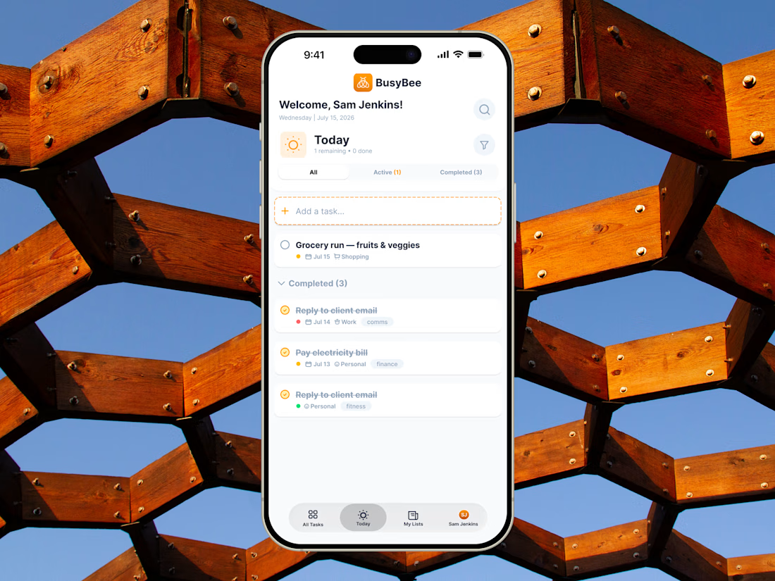
BusyBee is a product design and brand system project built around responsive UI, information hierarchy, and intuitive task management across desktop and mobile.
#shareyourwork #dashboard #uiuxdesign

Designed a modern Executive Business Dashboard.
Clean and data-driven UI with key metrics (Sales, Revenue, Profit, Retention), performance charts, product insights, and clear analytics for smarter business decisions.
smallbusinessdashboardbusinessdashboardProduct DesignWeb DesignAdobe After EffectsFigmaJitterUI Design


