The network for creativity
Join 1.25M professional creatives like you
Connect with clients, get discovered, and run your business 100% commission-free
Creatives on Contra have earned over $150M and we are just getting started
Back to feedPost

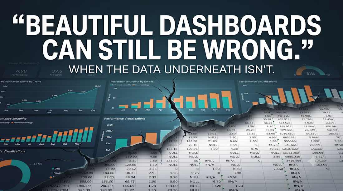
Beautiful dashboards can still be wrong.
If the data underneath is messy, inconsistent, or poorly structured, the visuals are just polished confusion.
So I built this Power BI project from the ground up:
RAW DATA → CLEANING → TRANSFORMATION → MODELING → DAX → DASHBOARD → INSIGHTS
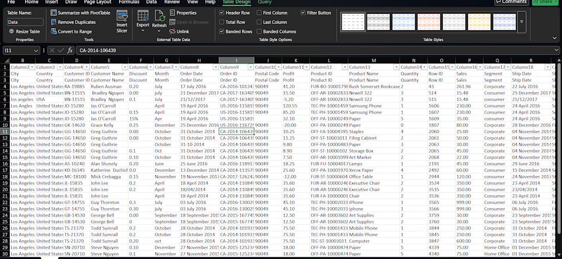
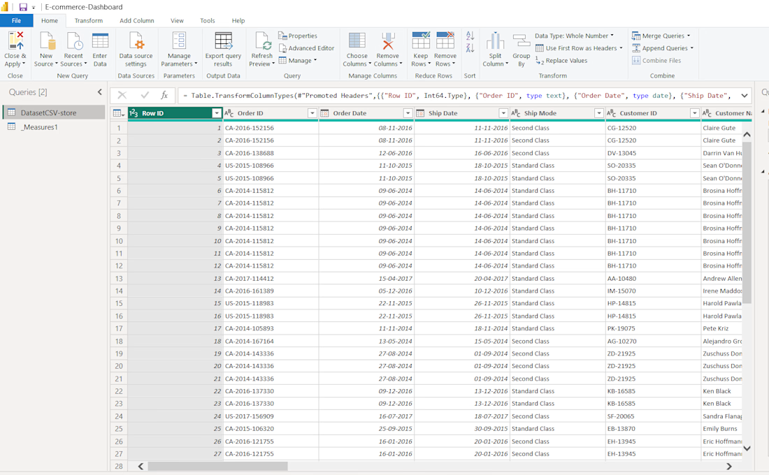
1. Cleaned messy data
Removed duplicates, handled missing values, standardized inconsistent fields, and fixed data-quality issues.
2. Transformed the data
Used Excel + Power Query to turn raw data into a structured, analysis-ready dataset.
3. Built the analytical layer
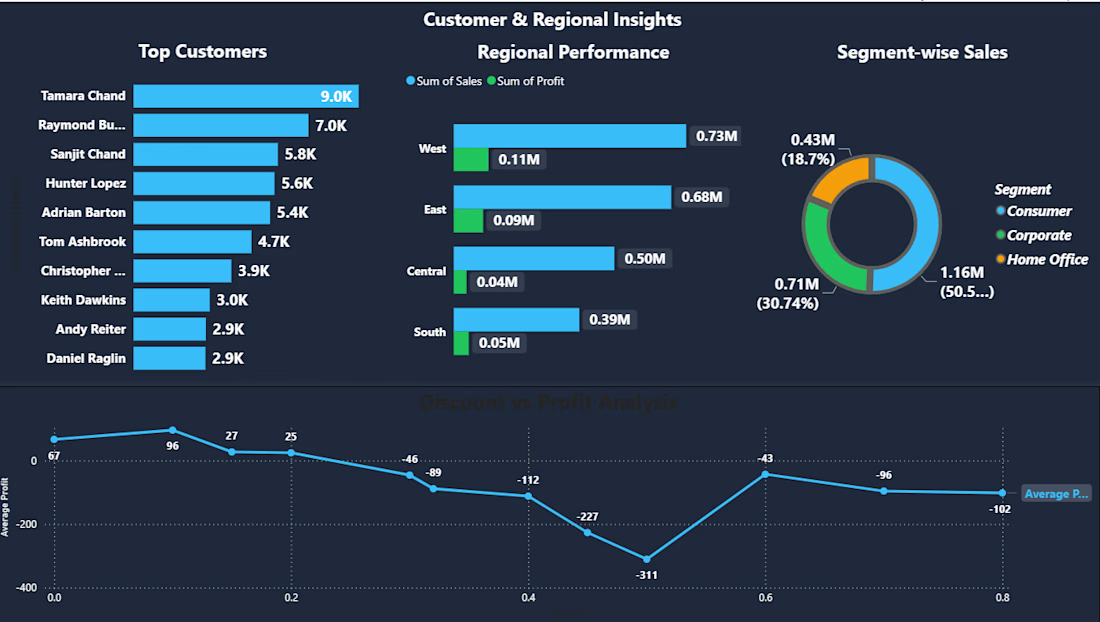
Created relationships, data models and DAX measures for meaningful KPIs.
4. Designed the dashboard
Interactive Power BI visuals, filters, KPIs and drill-down analysis focused on answering real business questions.
5. The result:
A messy dataset transformed into a clean, interactive and decision-ready analytics dashboard.
I’m not interested in building dashboards that simply look good.
I want to build dashboards that make people understand what their data is saying.
Have messy Excel/CSV data? Let's turn it into clarity.
#PowerBI #DataAnalytics #DataAnalysis #BusinessIntelligence #PowerQuery #DAX #Excel #DataCleaning #DataVisualization #Dashboard #BusinessAnalytics #Freelance

The network for creativity
Join 1.25M professional creatives like you
Connect with clients, get discovered, and run your business 100% commission-free
Creatives on Contra have earned over $150M and we are just getting started
Trending
retrofuturism
Share your favorite designs from the past exploring the distant future. Or your own take on the aesthetic 🚀
halftone
Dots. Texture. Grain. Let's see your designs using the halftone technique.

Midjourney
Creatives are showing off what they're making with Midjourney.
colorgrade
Video editors sound off: How do you enhance the mood of your video in color grading?
Related posts

Finding the right job often requires manually comparing a resume against dozens of job descriptions.
This project automates that process by:
Analyzing a resume against multiple real job postings
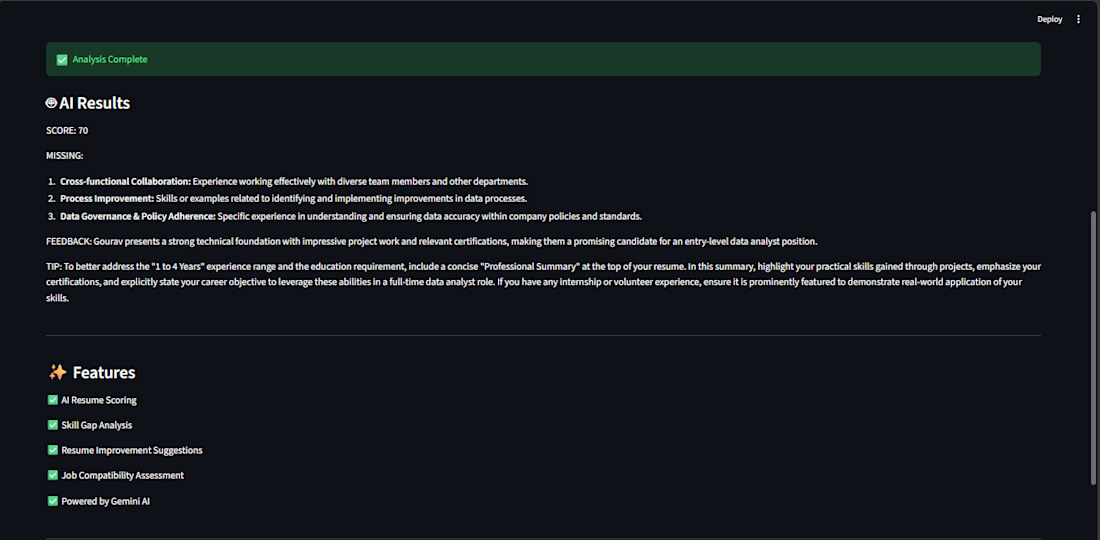
Generating AI-powered match scores
Identifying missing skills
Providing resume improvement suggestions
Storing results in a SQL database
Visualizing insights in Power BI
Offering a live Streamlit web application
🛠️ Tech Stack
Python
Pandas
SQLite
SQL
Google Gemini AI API
Streamlit
Power BI
VS Code
📊 Key Features
AI Resume Analysis
Resume-to-job match scoring (0–100%)
Missing skill identification
AI-generated recruiter feedback
Resume improvement recommendations
Database & SQL
Stores analyzed jobs in SQLite
Performs analytical queries
Identifies skill gaps
Finds best-fit companies and locations
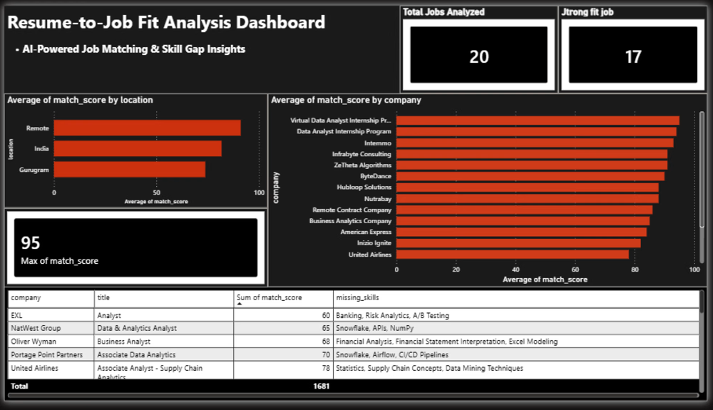
Power BI Dashboard
Average Match Score
Strong Fit Jobs
Top Match Score
Company Match Analysis
Skill Gap Analysis
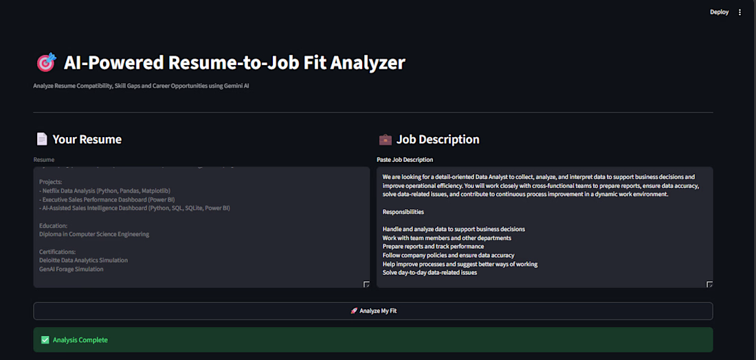
Streamlit Application
Paste any job description and instantly receive:
Match Score
Missing Skills
AI Feedback
Resume Improvement Tips
📈 Dashboard Insights
The dashboard provides:
Overall resume strength across jobs
Best matching companies
Skill gap analysis
Job fit distribution
Career improvement opportunities
🎯 Business Value
This project demonstrates:
Data Cleaning
Data Analysis
SQL Querying
AI Integration
Dashboard Development
Data Visualization
End-to-End Analytics Workflow
🔮 Future Improvements
Analyze 100+ job postings
Automated LinkedIn job ingestion
Multiple resume comparison
Industry-specific recommendations
Advanced skill trend tracking
👨💻 Author
Gourav Jangid
Aspiring Data Analyst passionate about transforming data into actionable insights using Analytics, SQL, Python, Power BI, and AI.



Awesome use case! Automating resume-job matching saves so much time.



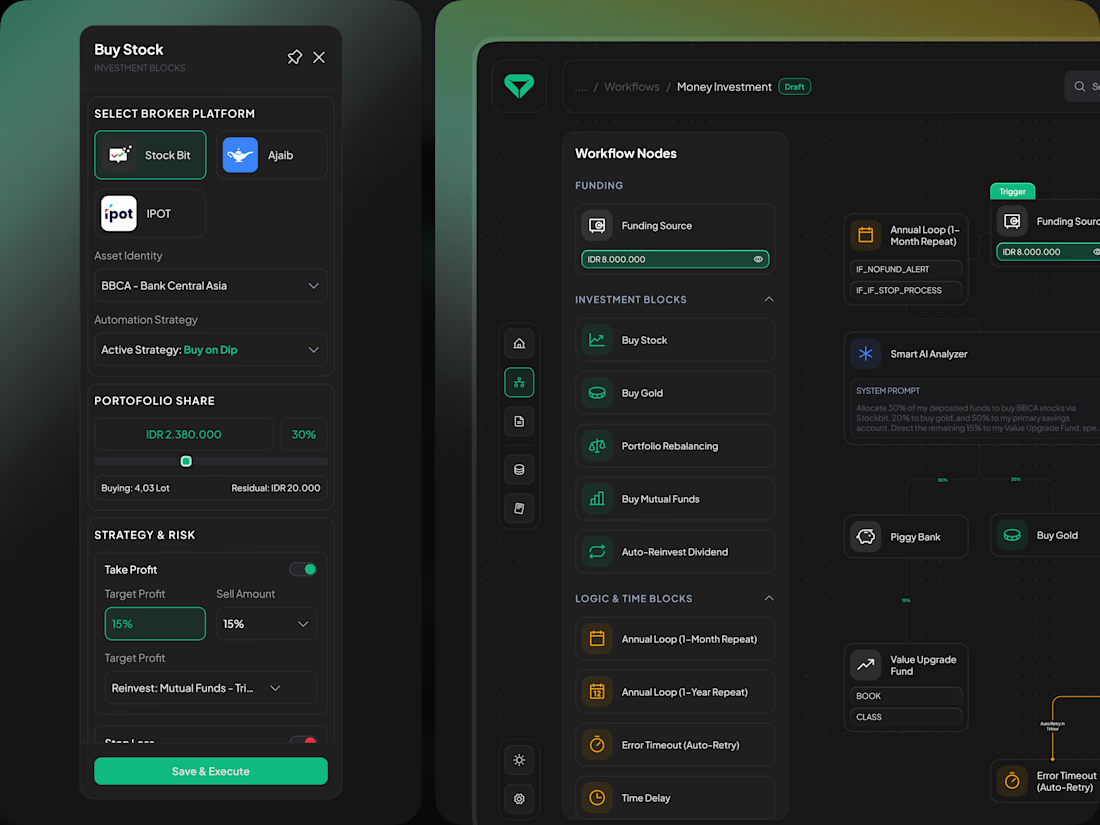
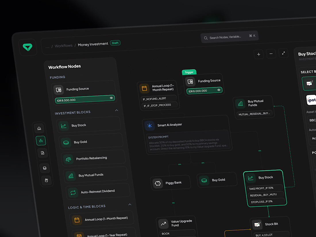
Spent 3 weeks redesigning the automated investment dashboard for our client. We cut complex node setups into a 1-click workflow. Here are the 3 decisions that mattered most!
(1/5) 🧵
The final dashboard. Built around scannable workflow nodes and real-time portfolio logic, not pretty static charts.
(2/5)