The network for creativity
Join 1.25M professional creatives like you
Connect with clients, get discovered, and run your business 100% commission-free
Creatives on Contra have earned over $150M and we are just getting started
Back to feedPost
Taste Test
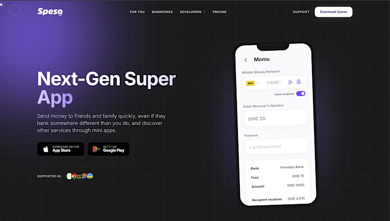
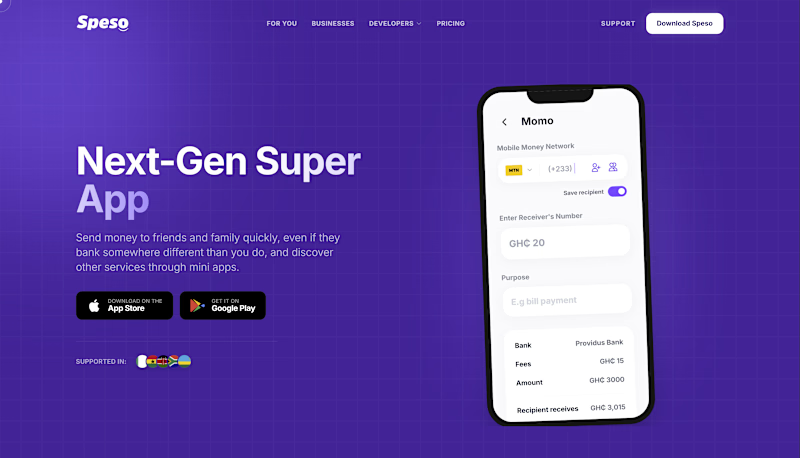
Hero section exploration for a fintech landing page 👇
Dark theme or purple theme… which one are you picking?
3 voted
100%
0 voted
0%
3 votes
Closed


The dark one looks amazing.

Oh i can see that also, thank you for engaging Vincent.
Welcome!
I don't know if i could reach out, can I?

Thank you for engaging
The network for creativity
Join 1.25M professional creatives like you
Connect with clients, get discovered, and run your business 100% commission-free
Creatives on Contra have earned over $150M and we are just getting started





Related posts


In recent days I’ve been practicing designing around an image.
Sometimes an image can have great potential and reinforce the message we want to convey. I’m not saying this is the correct way to prepare a strategy, it’s simply an exercise. As a result, I created these three hero section designs, which I’ve published in the Figma community where they can be freely used for experimentation.
If you use them, I’d love to see the outcome, so make sure to tag me!


So beautiful

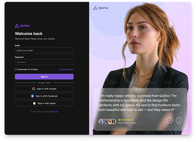
Which one works better for you — Light or Dark? 👀
11 voted
46%
13 voted
54%
24 votes
Closed

Both of them are great ❤️❤️

Luxury Fashion E-commerce Landing Page
A premium e-commerce website concept created for a modern luxury fashion brand. The experience focuses on elegant visuals, refined typography, and an intuitive shopping journey that reflects the brand's premium identity.
Project Goal💯
The objective was to design a sophisticated online shopping experience that combines visual storytelling with seamless product discovery. Every section was crafted to highlight the brand's quality, build trust, and encourage conversions while maintaining a clean, minimal aesthetic.


Stunning work