The network for creativity
Join 1.25M professional creatives like you
Connect with clients, get discovered, and run your business 100% commission-free
Creatives on Contra have earned over $150M and we are just getting started
Back to feedPost
Taste Test

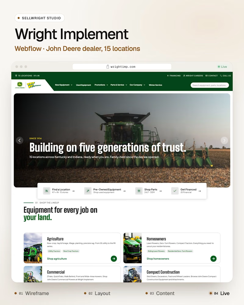
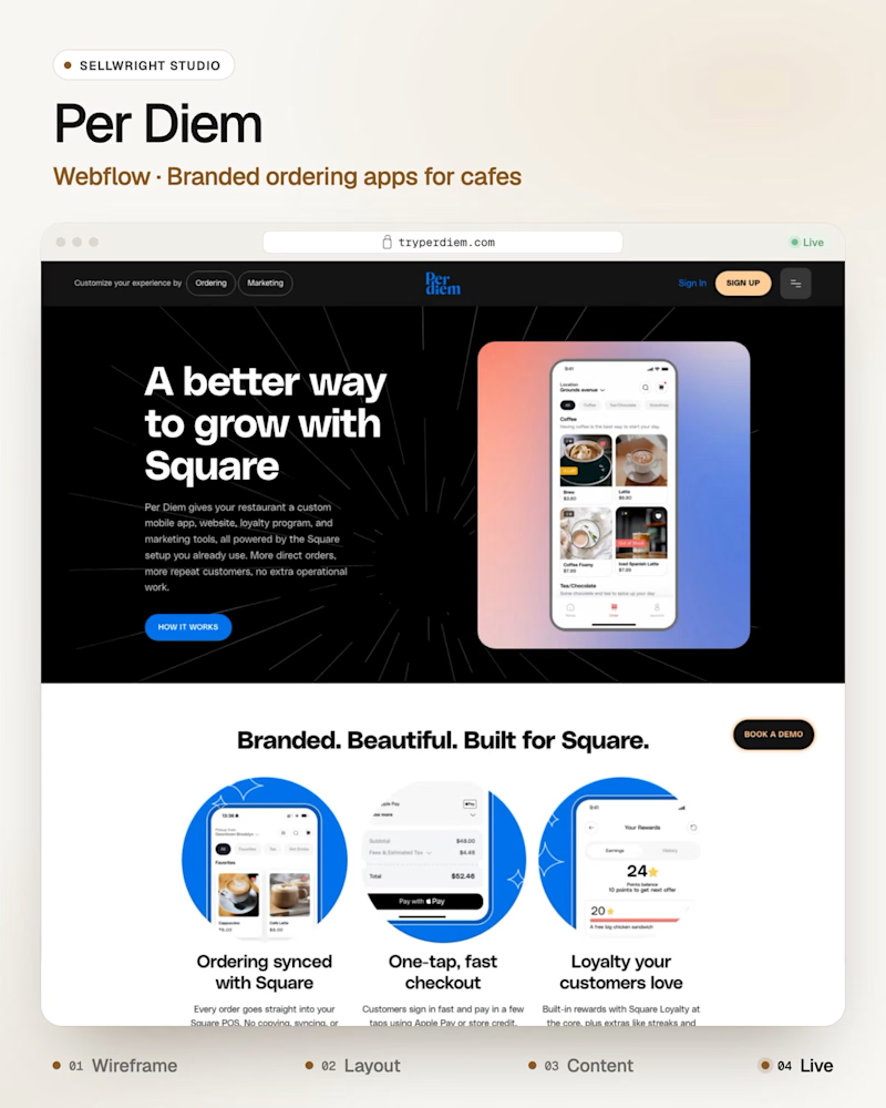
Big photo or product mockup: which Webflow hero tells you more?
Wright Implement (Webflow), a John Deere dealer, with a big field photo up front.
Per Diem (Webflow), branded ordering apps for cafes, with the app mockup up front.
Two Webflow sites, one job: tell a visitor what the company does in five seconds.
Which one did you understand faster?
Live: wrightimp.com · tryperdiem.com
More builds: instagram.com/sellwrightstudio · youtube.com/@sellwrightstudio

1 voted
50%
1 voted
50%
2 votes
Closed

The product mockup communicates the value faster for me. A field photo creates atmosphere, but a clear product visual helps visitors understand the offer almost instantly. Great comparison! 👏
Thanks for voting, Apexline! Agreed, a clear product visual explains the offer in one look. For a dealer like Wright the field photo earns its place too, since buyers want to see real machines on real farms. Both work, they just answer different first questions.
Exactly! The best hero depends on what the audience needs to understand first. Great breakdown! 👏

Great breakdown! This is such a crucial hero decision.
Big photo sells the outcome/lifestyle, mockup sells the product itself. Wright needs context, Per Diem needs clarity - totally different jobs. Love this comparison!
Thanks Sagar! Exactly, same hero slot, two different jobs. A dealer's buyers want to see the machines out in the field, an app's buyers want to see the product itself. Which do you reach for first when a client could go either way?
The network for creativity
Join 1.25M professional creatives like you
Connect with clients, get discovered, and run your business 100% commission-free
Creatives on Contra have earned over $150M and we are just getting started



Related posts

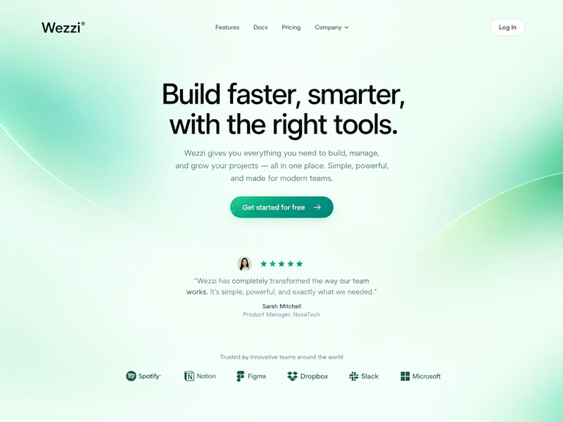
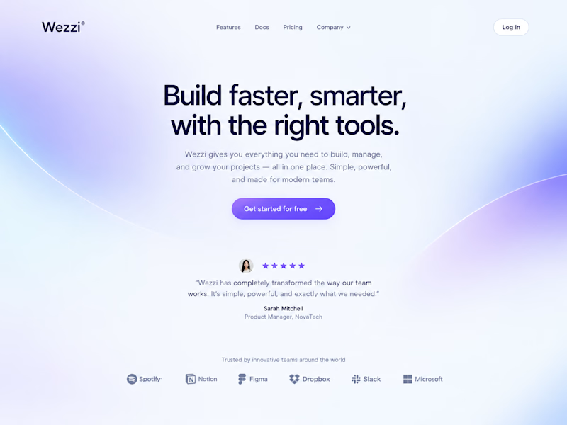
Same layout. Same copy. Completely different feel.
Swapping just the color palette and gradient glow changed the whole personality of this Wezzi hero section.
Which one fits a SaaS brand better? 👇

10 voted
50%
10 voted
50%
20 votes
Closed
Such a great demonstration Amina! It's amazing how just changing the color palette and gradient glow completely shifts the personality — same layout, same copy but totally different vibe. This Dreamy Haze version feels so soft, modern and perfect for a SaaS brand, very...

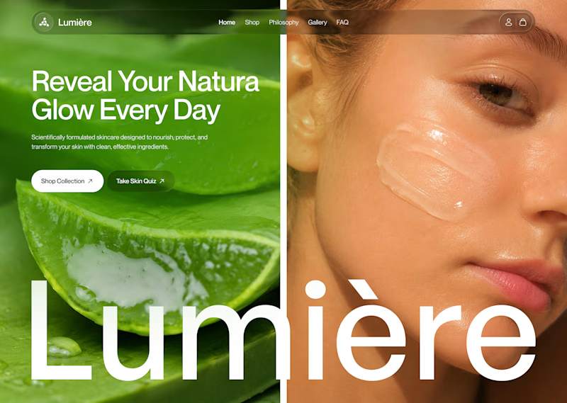
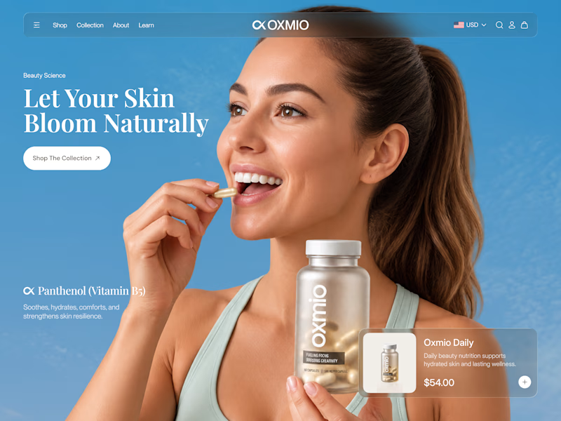
Your design has 3 seconds to earn attention. Which skincare brand wins?
A leads with confidence, energy, and aspiration. B builds trust through nature, freshness, and simplicity.
Great design doesn’t just look good. It makes people feel the brand before they read a word.
A or B? Which would make you stop scrolling?


30 voted
52%
28 voted
48%
58 votes
Closed


B without questions

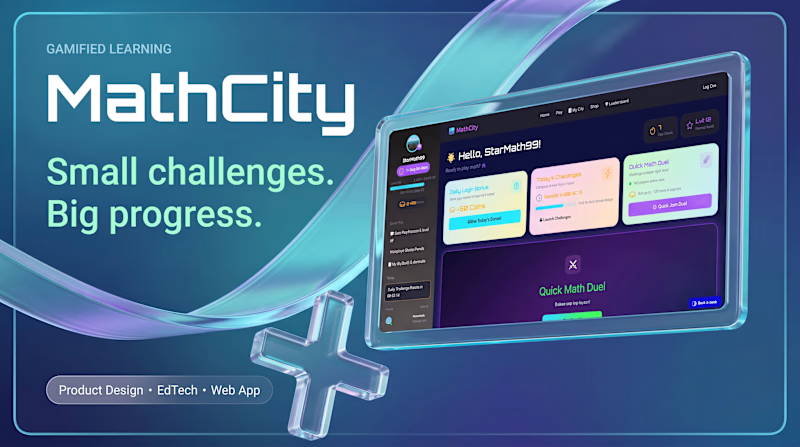
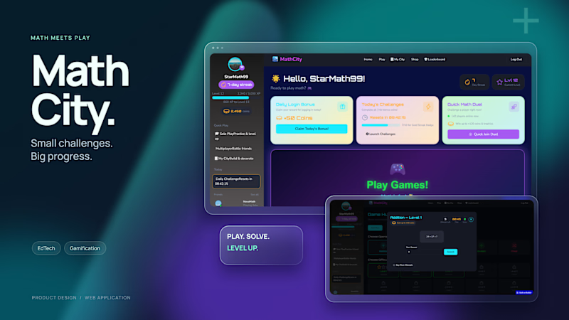
Experimenting with glass elements in banners for MathCity my app for learning math through play.
Which version do you prefer? I’d also love to hear your thoughts in the comments
4 voted
50%
4 voted
50%
8 votes
Closed

Went with B. The bold MathCity wordmark reads fast, and A's glass effect pulls attention from the name.