The network for creativity
Join 1.25M professional creatives like you
Connect with clients, get discovered, and run your business 100% commission-free
Creatives on Contra have earned over $150M and we are just getting started
Back to feedPost

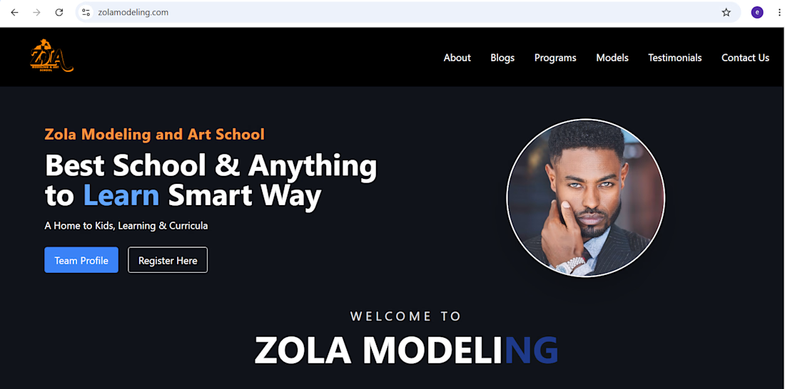
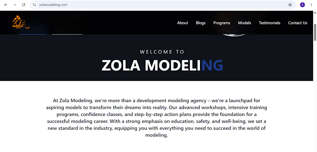
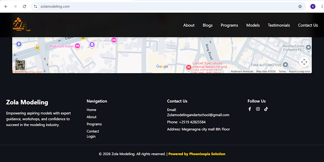
🚀 Just finished working on a new website for Zola’s modeling school!
As a developer, I wanted to create something that feels more than just a “school website” — it needed to capture the fashion, confidence, personality, and energy behind modeling.
One of my favorite parts of building projects like this is turning someone’s vision into an actual digital experience.
Now I’m curious 👀
What do you think makes a modeling school website stand out?
✨ The visual design?
📸 The way models are showcased?
🎓 The programs and information?
💫 Or the overall experience when you first land on the site?
I’d love to hear your thoughts!!
The network for creativity
Join 1.25M professional creatives like you
Connect with clients, get discovered, and run your business 100% commission-free
Creatives on Contra have earned over $150M and we are just getting started







Related posts

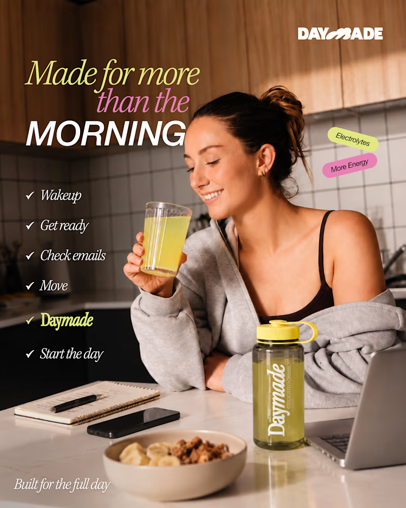
✨ Two styles. One campaign. Which Daymade design hits differently?
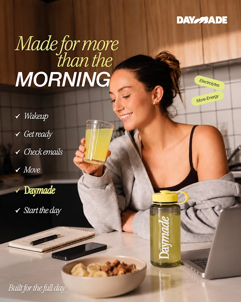
I explored two creative directions for Daymade, combining lifestyle storytelling with bold typography and fresh, energetic colors. ☀️🥤
💛 Option 1: Fresh & Minimal 💗 Option 2: Bold & Playful
Which one grabs your attention? 👀
Cast your vote! 🗳️👇
25 voted
26%
73 voted
74%
98 votes
Closed

Option 2 looks better

NEOL. Making of the Hero
NEOL develops CuGlide™, a copper-based lubricant technology that reduces wear between metal parts.
I recently designed their website. The hero was the hardest part: two gears in contact, with a thin copper film where they meet. That's why I built it in 3D instead of generating it: AI video can't give that level of control and precision.
From the first draft to the live site.


Sleek work!

AI Automation SaaS Landing Page
A modern AI automation SaaS website design focused on simplifying workflows, automating repetitive tasks, and helping businesses work smarter. Designed with a clean interface, intuitive user experience, and a scalable visual system to communicate the value of AI-powered automation.

Amazing