The network for creativity
Join 1.25M professional creatives like you
Connect with clients, get discovered, and run your business 100% commission-free
Creatives on Contra have earned over $150M and we are just getting started
Back to feedPost

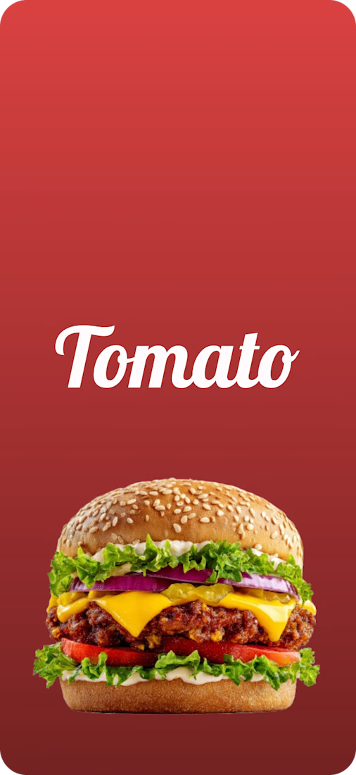
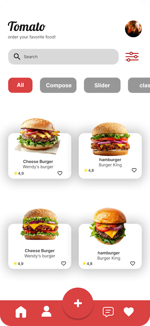
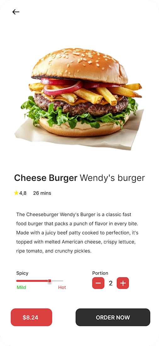
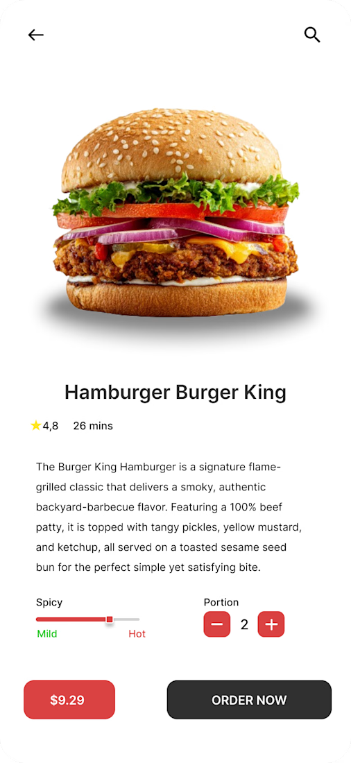
Food Delivery App UI UX
The design was truly enjoyable, and I tried to focus on the smallest details that would make the customer happy with the experience.

The network for creativity
Join 1.25M professional creatives like you
Connect with clients, get discovered, and run your business 100% commission-free
Creatives on Contra have earned over $150M and we are just getting started

Challenges
View all


Related posts


A look at the identity we designed for Vetti, a dog health monitoring brand.
There’s a lot of data behind a product like this but the person using it just wants to know their dog is okay.
That’s the balance in the design with a connected dot system that feels precise and warm colors and photography that keep it close to what people care about.
Also, an excellent excuse to spend far too long choosing dog photos.


A or B? 😇👈
Which design delivers the better luxury feel and overall visual experience?

3 voted
17%
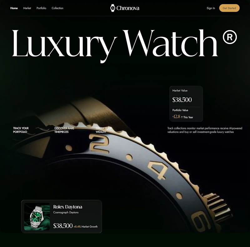
15 voted
83%
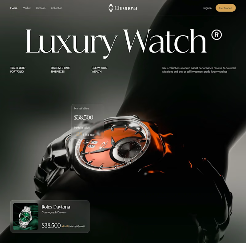
18 votes
Closed

Option B feels more luxurious to me—the watch gets a clearer hero moment and the warmer accent adds just enough energy against the dark field. The typography and product scale also make the comparison feel polished.

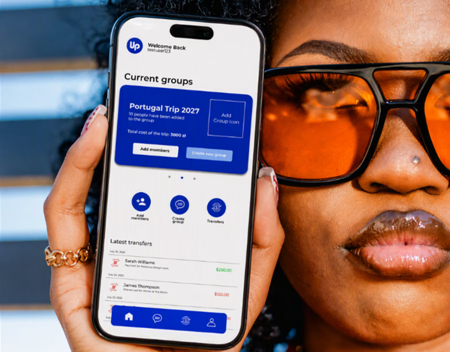
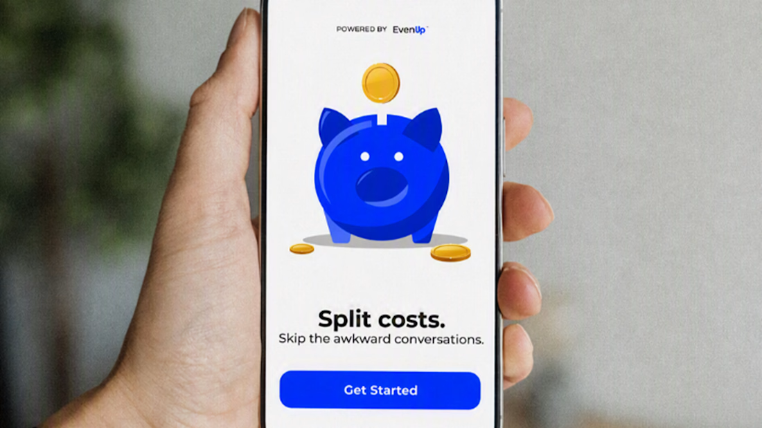
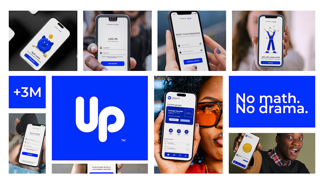
New case study just dropped 💙 EvenUp — an expense-splitting app design
Ever been the one who remembers who paid for what? 💸 That's the problem EvenUp was designed to solve — because splitting costs with friends was never really about math. It was about the awkward conversation after.
Full UI/UX case study includes:
✅ User research & personas
✅ User flow mapping
✅ Complete design system
✅ Full UI — light & dark mode
✅ Edge cases & error states
✅ Interactive prototype
Full case study on Behance — link in bio ⬆️


Perfect