The network for creativity
Join 1.25M professional creatives like you
Connect with clients, get discovered, and run your business 100% commission-free
Creatives on Contra have earned over $150M and we are just getting started
Back to feedPost

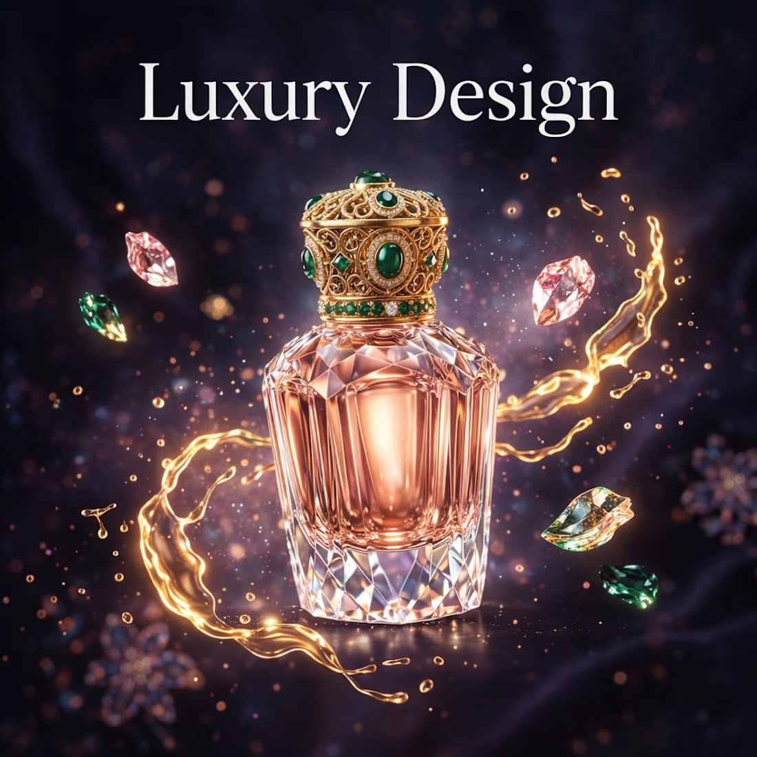
I will create elegant luxury designs for beauty, perfume & jewelry brands
The network for creativity
Join 1.25M professional creatives like you
Connect with clients, get discovered, and run your business 100% commission-free
Creatives on Contra have earned over $150M and we are just getting started





Related posts

Riwo – Premium Bicycle Brand Website Design
Most bike brands look the same: spec sheets, stock photos, and cluttered shops. I designed Riwo to feel like the ride itself, which is bold, fast, and effortless.
What I created
A high-impact website concept for a modern bicycle brand, built to turn first-time visitors into buyers.
What it does for the business
Hooks visitors instantly. A cinematic hero ("Ride Beyond Limits") with a clear price and a single call to action.
Makes products easy to compare. Clean product cards with pricing front and center, so shoppers see what they want in seconds.
Builds trust. A features section built around lightweight construction, responsive geometry, and everyday reliability.
Raises order value. An accessories section that encourages customers to complete their setup.
Keeps people scrolling. Smooth scroll animations and text reveals that make the site feel premium and memorable.
Ideal for
E-commerce brands, product launches, and lifestyle or sports companies that want a site that looks as good as their product.


Incredible work man

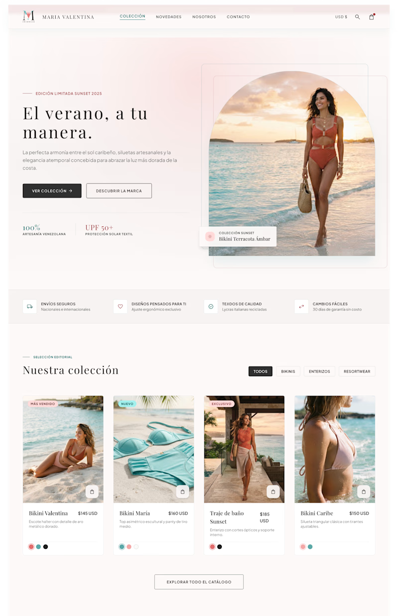
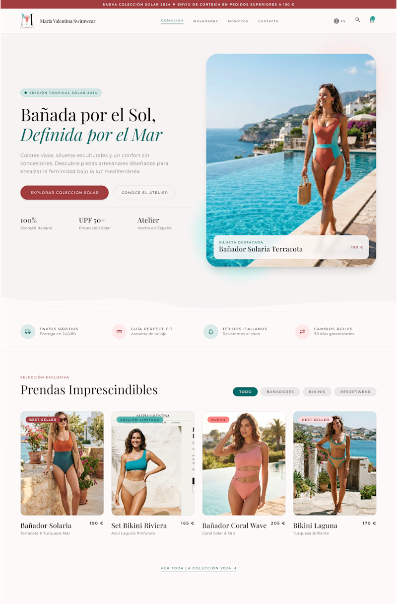
I created two design versions for this swimwear store owner client. Both are elegant and attractive with lots of white space. The brand is all about exclusiveness, elegance, and subtle details. Which one do you think is better?
7 votes
Ends in 11h
Creative work

Luxury fashion identity - ELARA 👑
Minimal serif, gold foil, matte black, build to feel expensive before they even wear it.
Goal : not just a logo, but a brand that let you charge $300+.
I help fashion/ beauty/ clothing brand go from nice logo to premium brand.
I spot open this week for full luxury Logo + package mockup ($300) .
DM Luxury or any design if you want yours.
What makes a logo feel luxury to you - Typography or spacing?
