The network for creativity
Join 1.25M professional creatives like you
Connect with clients, get discovered, and run your business 100% commission-free
Creatives on Contra have earned over $150M and we are just getting started
Back to feedPost
How can motion design help a brand communicate its message clearly?
For this United Hacks promo, I focused on presenting the key information in a way that's engaging and easy to follow.
From communicating the main message to showcasing the website and Discord community, each section guides viewers through the information and toward the next step.
I brought everything together using animated typography, motion graphics, transitions, and sound design.
The goal wasn't just to make the video look good. It was to make the information easier to understand and act on.
#MotionDesign #VideoEditing #AfterEffects


The teal glow on the "global stage" text against the dark background reads really clearly. Was the globe animated in After Effects?

Yeah this was compleatly made in after effects
The network for creativity
Join 1.25M professional creatives like you
Connect with clients, get discovered, and run your business 100% commission-free
Creatives on Contra have earned over $150M and we are just getting started
Related posts

IPO Gateway landing page web design 3D animation website


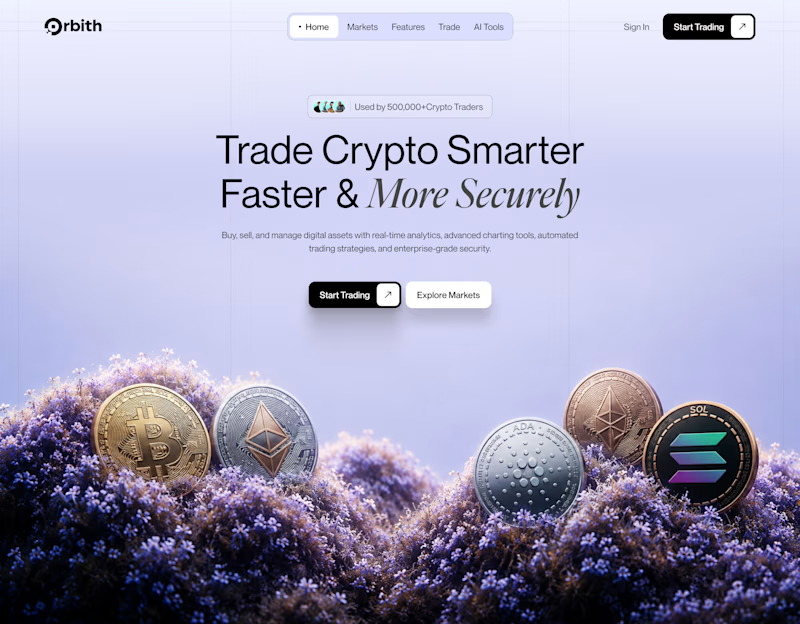
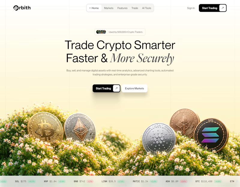
Your crypto landing page has 3 seconds to earn trust. Which direction gets it right?
One crypto homepage feels built for serious traders. The other makes crypto feel effortless.
Which one would make you click “Start Trading” without hesitation: #1 or #2?


10 voted
37%
17 voted
63%
27 votes
Closed


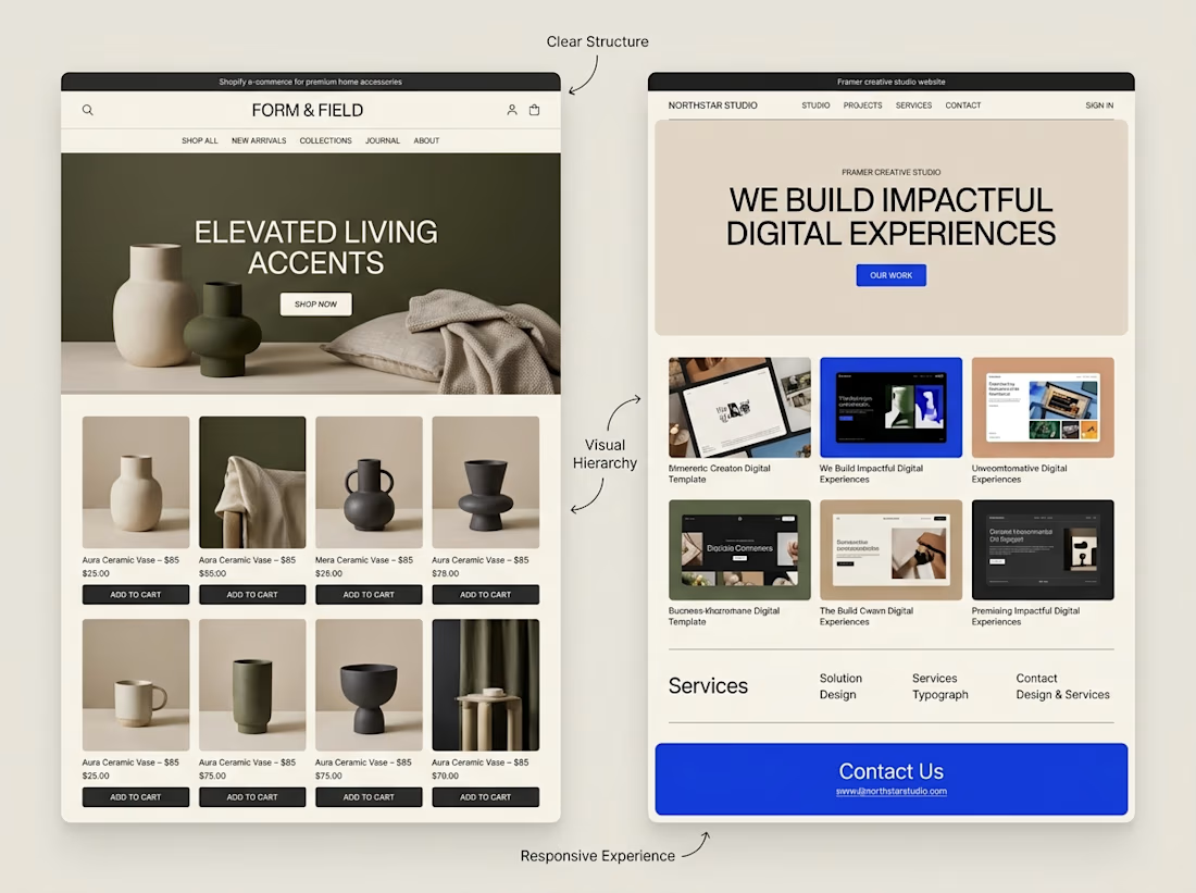
A website can look beautiful and still be difficult to use.
That's something I keep in mind when exploring both Shopify store design and Framer website design.
Although the platforms serve different purposes, some design principles apply to both:
→ Clear navigation helps visitors find their way.
→ Strong visual hierarchy makes important information stand out.
→ Thoughtful page structure creates a natural flow.
→ Responsive layouts help the experience work across screen sizes.
→ Clear calls to action help visitors understand what to do next.
The goal isn't simply to make a website look impressive.
It's to make the experience clear, useful, and easy to navigate.
I'm continuing to explore how these principles can be applied across different types of websites and projects.
What matters most to you when visiting a website, its visual design, its usability, or a combination of both?



Well said. Usability first, then visuals. Clear navigation wins me every time. 🙌