The network for creativity
Join 1.25M professional creatives like you
Connect with clients, get discovered, and run your business 100% commission-free
Creatives on Contra have earned over $150M and we are just getting started
Back to feedPost

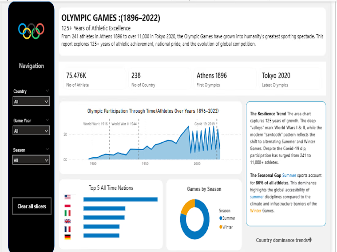
Data is useless if you can’t read the story. 📖
Most Power BI reports are cluttered "data dumps." For my latest project, an Olympic Games performance analysis, I took 120+ years of chaotic data and turned it into a clean, intuitive decision-making tool.😊
I don't just build dashboards; I build visual narratives that help stakeholders spot trends in seconds, not hours.
🚀 Power BI World Championship Entry
💼 Open for new analytics projects
The network for creativity
Join 1.25M professional creatives like you
Connect with clients, get discovered, and run your business 100% commission-free
Creatives on Contra have earned over $150M and we are just getting started





Related posts

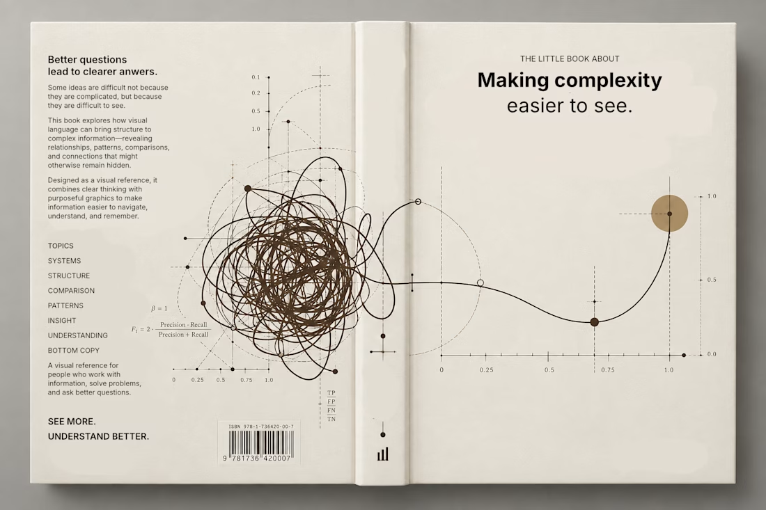
Currently exploring a book design focused on making complex information easier to understand through visual language. Playing with typography, data visualization, and graphic systems to give the subject a more editorial feel.


This is a trully elegant and impressive design concept.
I love it.

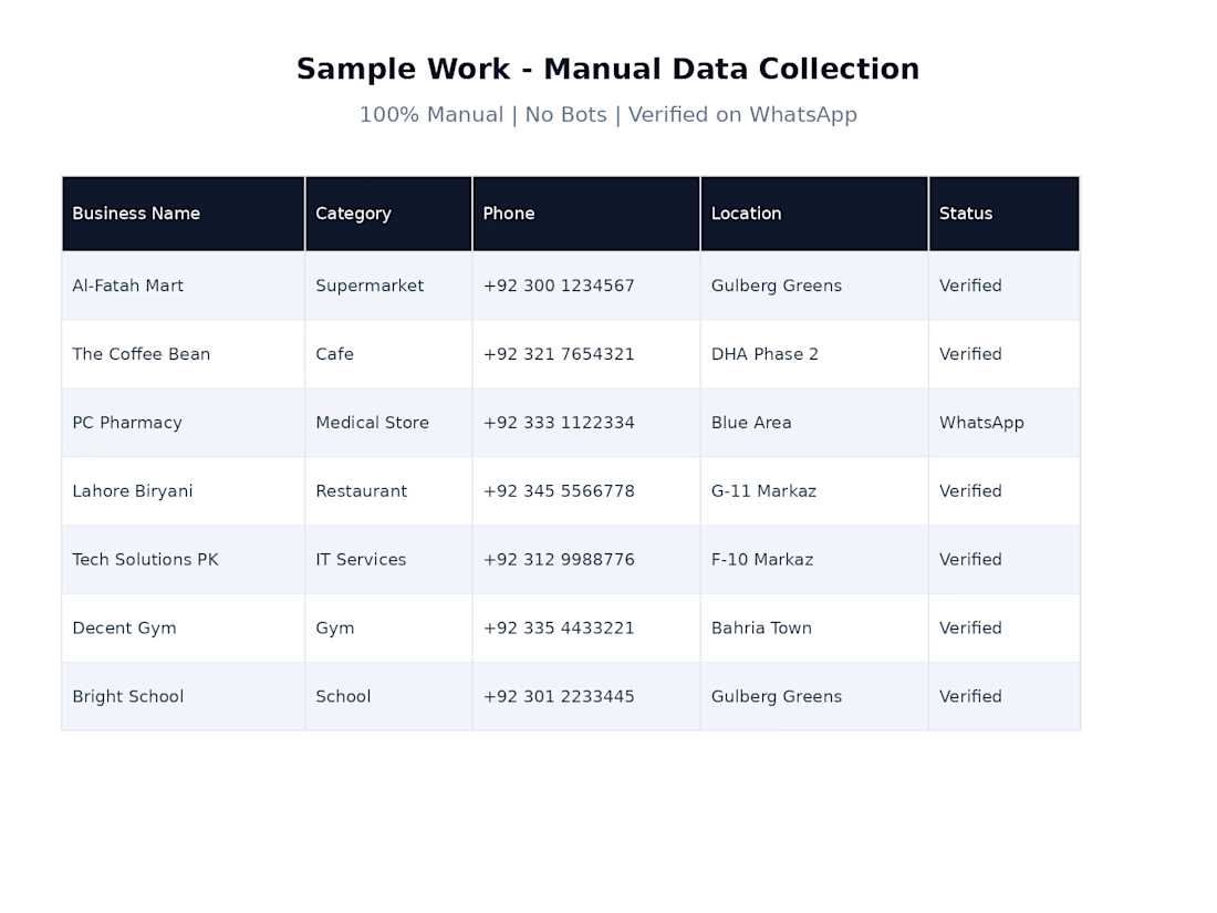
Sample of my manual business data collection work using Google Maps. I verified business details and organized the information into a clean, structured Excel sheet for marketing and lead generation.



Hello is there any #Dataentry jobs available?

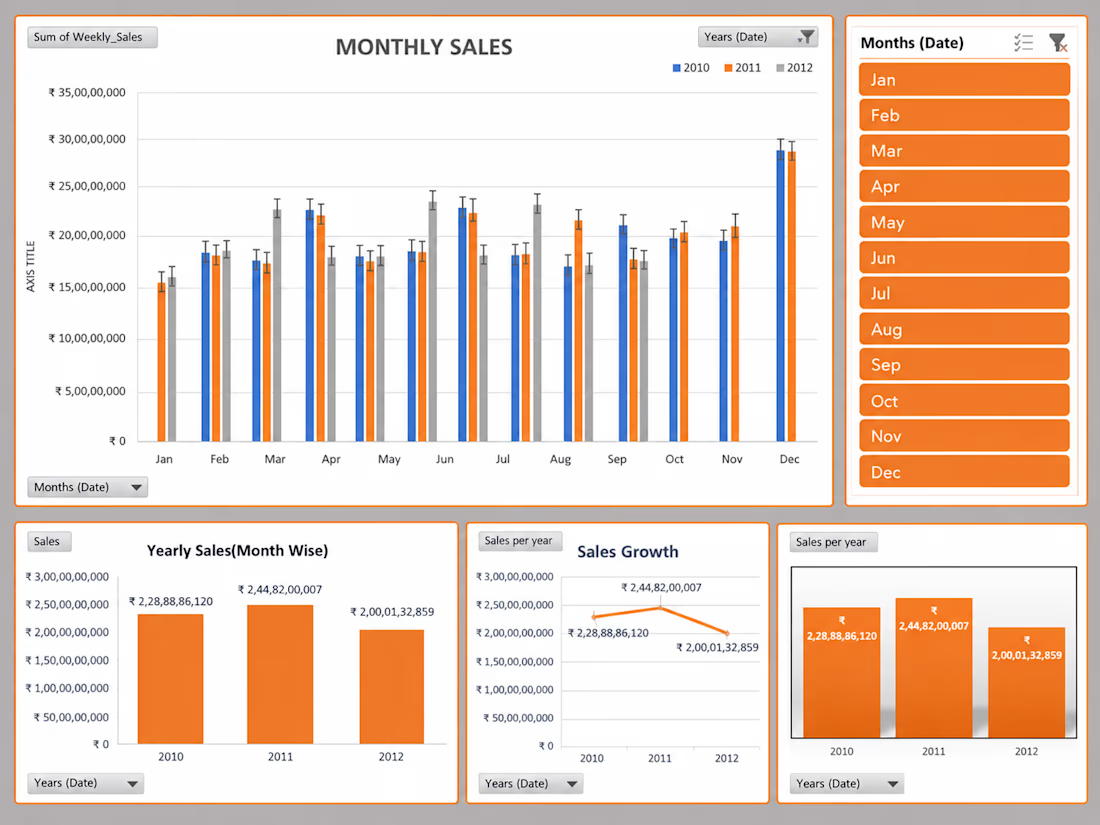
📊 Turning Data Into Insights
Sharing one of my recent Power BI dashboard projects.
I worked on transforming raw data into an interactive dashboard with a focus on:
• Data cleaning & transformation
• KPI tracking
• Interactive visualizations
• DAX calculations
• Trend & performance analysis
🛠️ Tools: Power BI • Power Query • DAX • Excel
Still learning, building, and improving with every project. 🚀
#PowerBI #DataAnalytics #DataVisualization #DAX #BusinessIntelligence #DataAnalyst #Analytics #Dashboard