The network for creativity
Join 1.25M professional creatives like you
Connect with clients, get discovered, and run your business 100% commission-free
Creatives on Contra have earned over $150M and we are just getting started
Back to feedPost
Taste Test
My team and I recently redesigned the KOPILOT.ID app, which helps athletes keep their emergency medical information accessible through an NFC tag built into their gear.
Time for a little before & after 👀 Which version do you prefer - the original or our redesign?
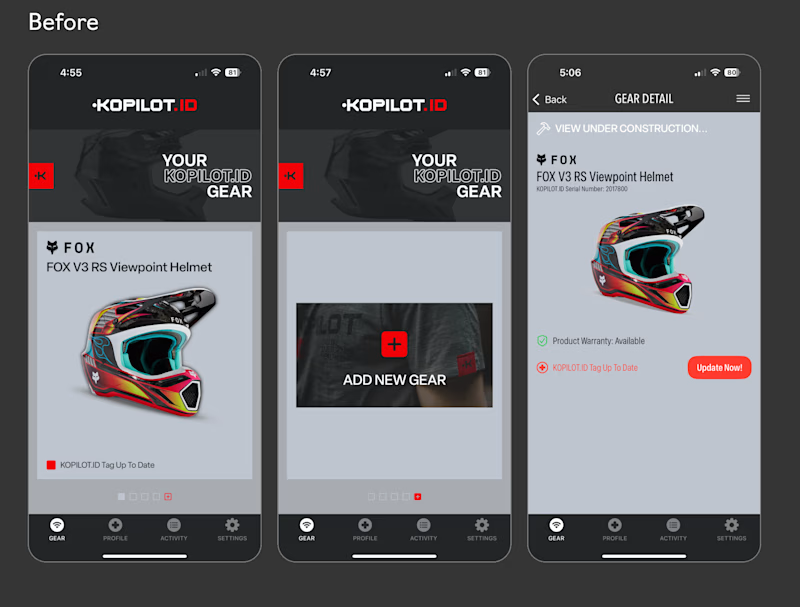
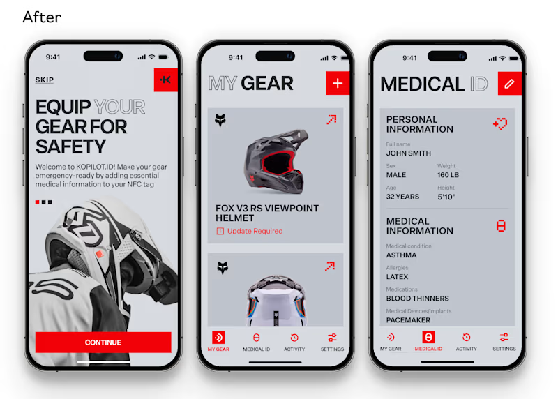
3 votes
Ends in 1d

After. The light layout makes the medical info much easier to scan.

That was exactly our thinking! We wanted the medical details to be easier to scan at a glance, especially in an emergency when every second counts.

Light version is much visible & the typography it's too close with brand identity
Thank you! We wanted the redesign to feel like a natural evolution of the brand, not a completely different product.
The network for creativity
Join 1.25M professional creatives like you
Connect with clients, get discovered, and run your business 100% commission-free
Creatives on Contra have earned over $150M and we are just getting started











Related posts


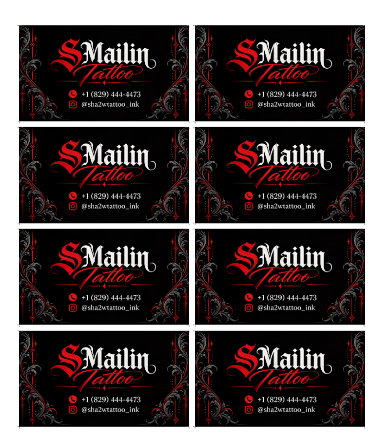
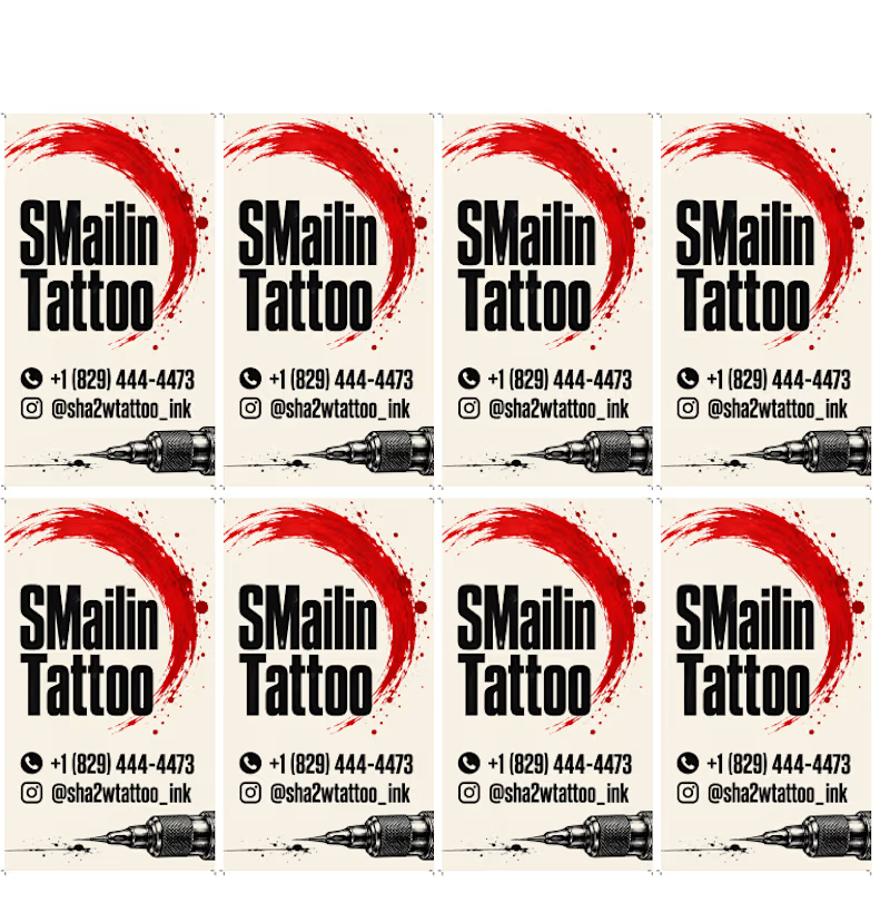
Two directions, one identity. 🖤❤️
Horizontal and vertical business card concepts for SMailin Tattoo, exploring bold contrast and clean layouts.
Which one would you choose?
🅰️ Horizontal
🅱️ Vertical
Vote A or B in the comments! What would you improve? 👇
#GraphicDesign #BusinessCardDesign #BrandIdentity #TattooStudio #DesignFeedback
1 voted
25%
3 voted
75%
4 votes
Closed

Which color looks better to this logo

2 voted
22%
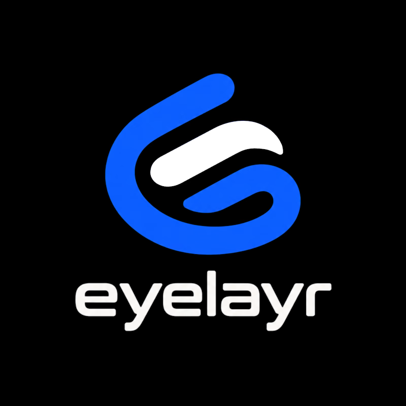
7 voted
78%
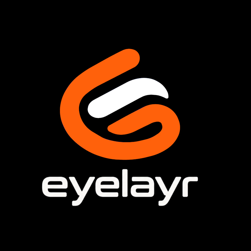
9 votes
Closed

Same Design.com promo, two crops. Square keeps the desk tight, wide gives the room its light. 1 or 2.
11 voted
73%
4 voted
27%
15 votes
Closed