The network for creativity
Join 1.25M professional creatives like you
Connect with clients, get discovered, and run your business 100% commission-free
Creatives on Contra have earned over $150M and we are just getting started
Back to feedPost
Taste Test

Experimenting with a stock market widget today.
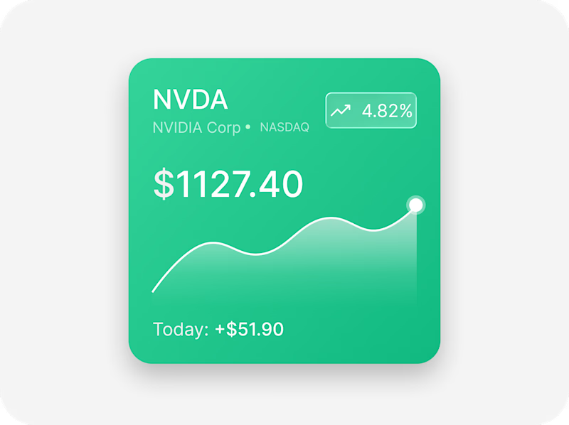
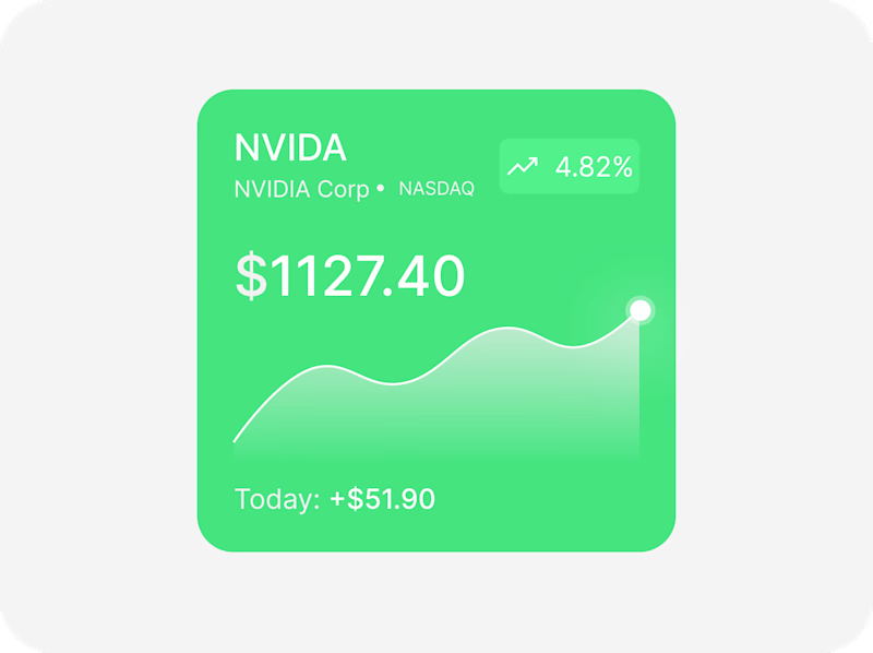
The goal was to keep the interface minimal while making the price trend the focal point. I tried two different treatments for the performance badge:
• Left: Glassmorphism with an outlined container.
• Right: A cleaner filled badge that feels more integrated with the card.
I'm leaning toward one, but I'd love to hear your thoughts.
👇 Which version would you choose?
Left or Right?
Always learning, iterating, and refining.

5 voted
100%
0 voted
0%
5 votes
Closed


One of the best designs I’ve seen today. Really solid work 👏 I'm leaning toward the glassmorphic badge on the left it would look absolutely incredible animated in a Framer layout. Keep pushing!

Glassmorphism
The network for creativity
Join 1.25M professional creatives like you
Connect with clients, get discovered, and run your business 100% commission-free
Creatives on Contra have earned over $150M and we are just getting started
Related posts


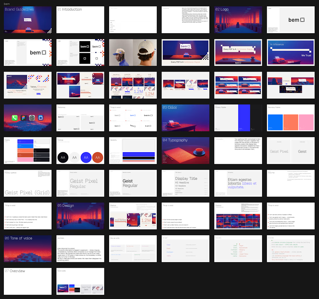

Never fail to surprise me 🥹

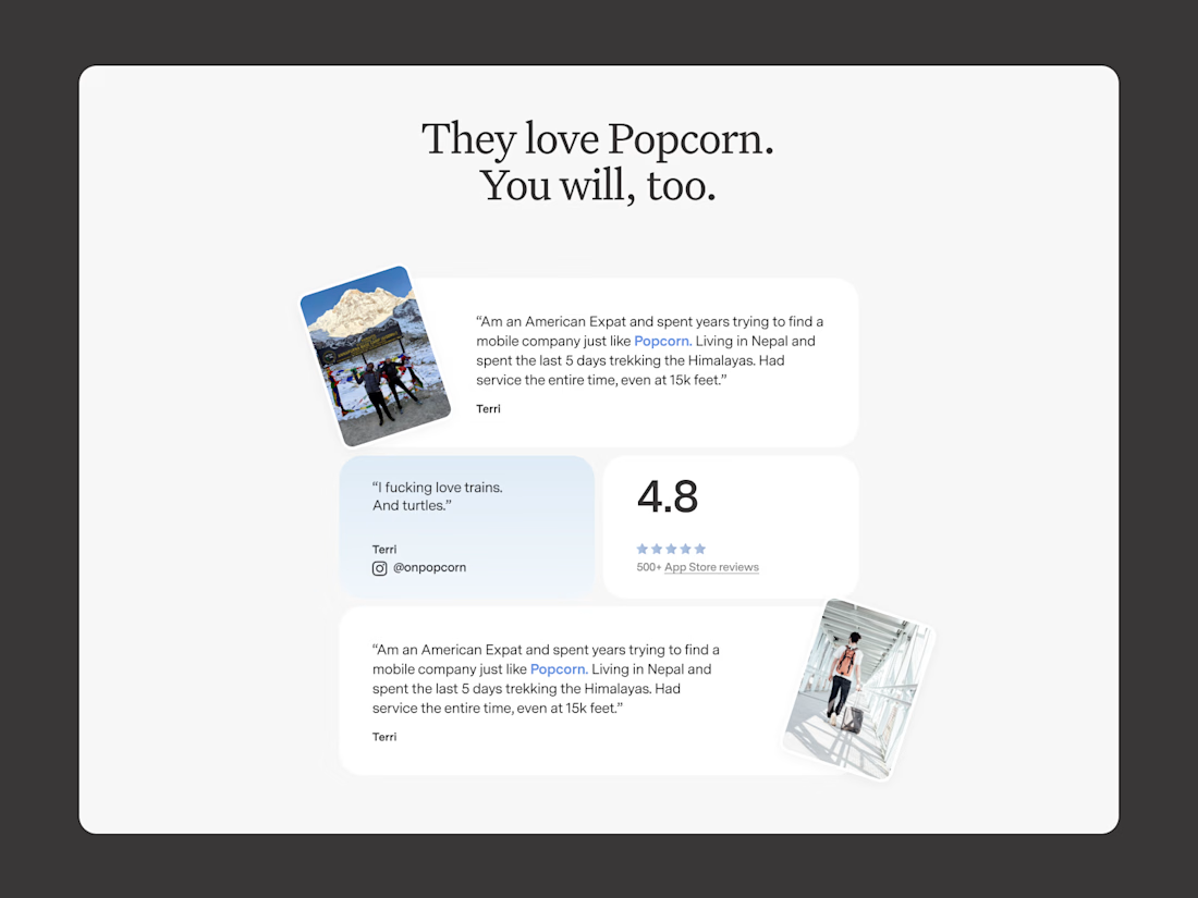
Who says review sections must be boring? A look at how i used deconstructing layouts for a review section that stands out on Popcorn!

This is amazing

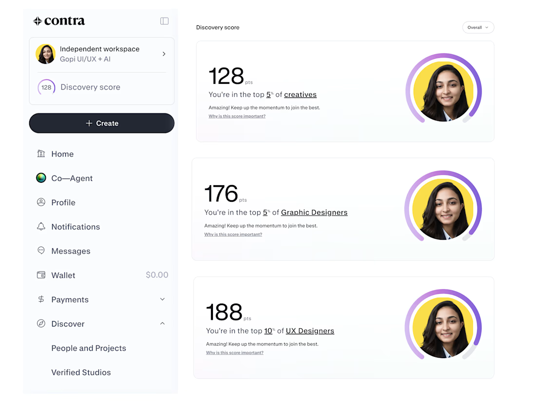
Hard work. Consistency. Great design.
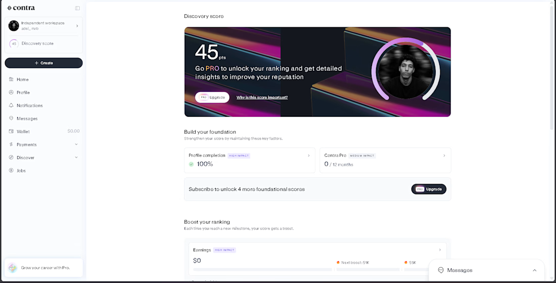
Proud to be ranked among the Top 5% of creatives on Contra. 💜










Trending

Claude
Claude has entered the design space. How are you using Claude Design?

Contra University
Learn from expert creatives how to earn more using next-gen AI tools.

MagicPath
The canvas is infinite, and exploration is becoming the workflow. How are you using MagicPath?
creativeaiflow
Creative AI workflows are evolving. What tools do you use, and what are their strengths and weaknesses?
freelancerlife
Freelancer life is wins, pivots, and everything in between. What’s yours right now?