The network for creativity
Join 1.25M professional creatives like you
Connect with clients, get discovered, and run your business 100% commission-free
Creatives on Contra have earned over $150M and we are just getting started
Back to feedPost

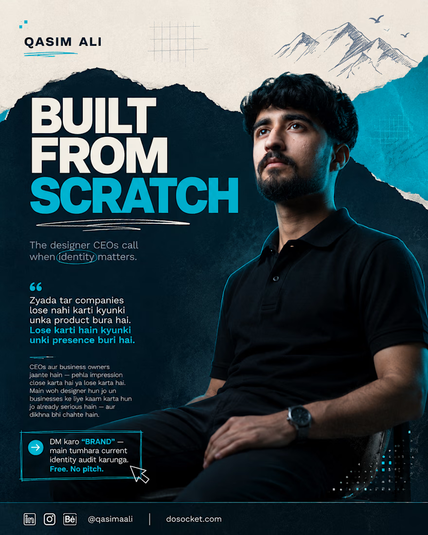
Most companies don't lose because their product is bad. They lose because their presence is weak.
I'm not saying this because of some theory. I'm saying it because I've seen it and fixed it.
Self-taught. No degree. Started from retail. Today I work with international clients because I took design seriously when most people weren't even thinking about it.
CEOs and founders already know this the first impression either closes the deal or kills it.
If your brand still looks generic today, your audience has already moved on.
The question isn't whether design matters. The question is whether yours is working.
DM me "BRAND" — I'll audit your current identity.
Free. No pitch. Just honest feedback.


The network for creativity
Join 1.25M professional creatives like you
Connect with clients, get discovered, and run your business 100% commission-free
Creatives on Contra have earned over $150M and we are just getting started
Challenges
View all


Related posts

A little interactive experiment for Verdant 🌱
Writing unique code for animations makes iterating on reactive micro-interactions so much smoother. It completely transforms how a brand narrative feels in the browser.


Great job

Client’s choice vs. Designer’s choice 👀
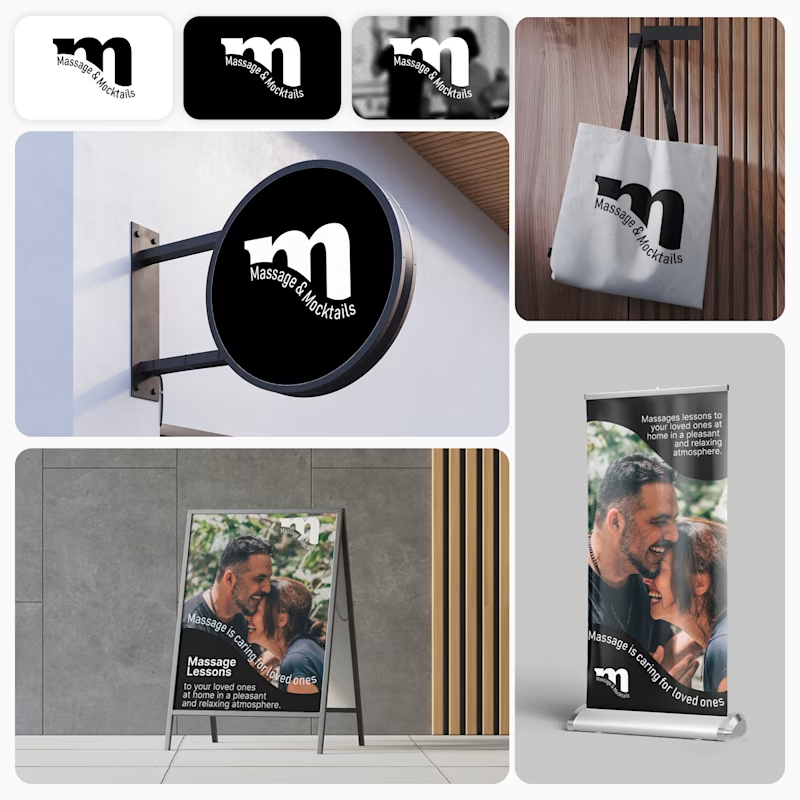
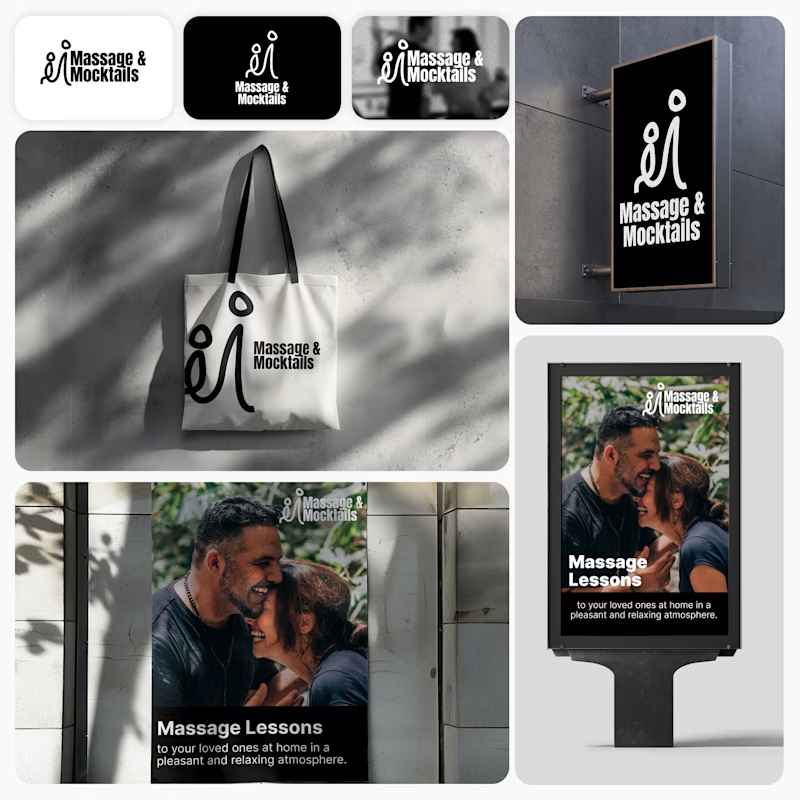
I’m currently working on a branding project for Massage & Mocktails — a concept built around couples learning massage together in a relaxed, social atmosphere.
These are two early, black & white directions from Stage 2 of my branding process, before moving into color, typography, and the full visual system.
The interesting part?
My client chose Concept 1. I chose Concept 2.
Now I’m curious what other creatives think.
Which direction would you choose — 1 or 2? And why?
Sometimes the most interesting part of branding is seeing how differently a client and a designer respond to the same brief.
21 voted
44%
27 voted
56%
48 votes
Closed

Concept 2 for me. That interlocking figure mark reads as two people meeting, which is the actual brief here, so it gives you more to build a system on. Concept 1 is the safer, more literal pick, which is usually why clients reach for it.


New case study!
Artist portfolio website design and Webflow development for Teri Sanders, a New York-based artist.


The way the editorial grid lets Teri’s work lead while the oversized name anchors the page feels beautifully restrained. Nice balance of art direction and a usable Webflow portfolio structure.


