The network for creativity
Join 1.25M professional creatives like you
Connect with clients, get discovered, and run your business 100% commission-free
Creatives on Contra have earned over $150M and we are just getting started
Back to feedPost
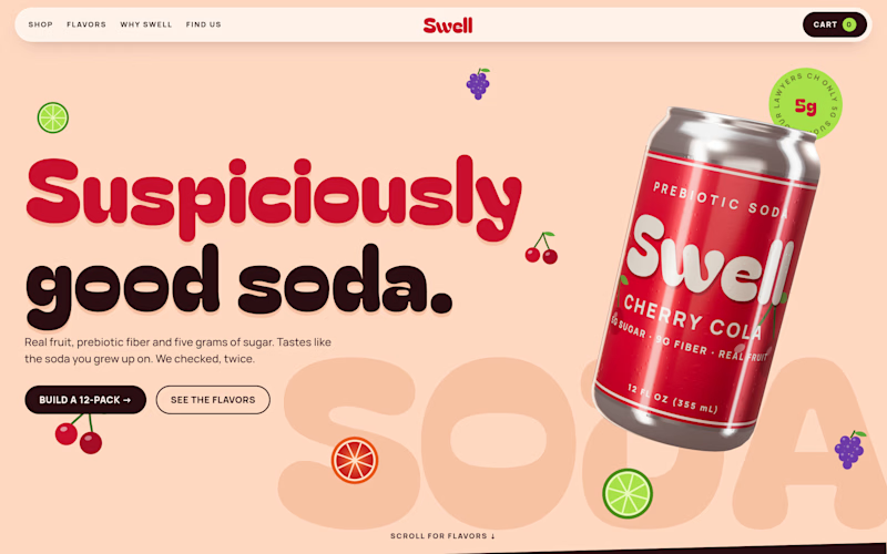
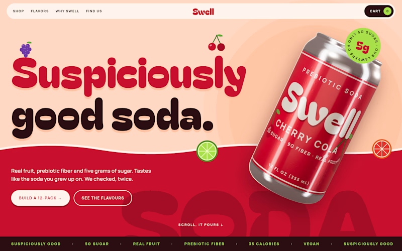
Taste Test

Which version you will prefer?
7 voted
58%

5 voted
42%

12 votes
Closed

Voted Hero 2. The light background works better for a medical brand, it feels more approachable and trustworthy. Hero 1 has good structure too but the darker tone feels less fitting for health and longevity messaging.

Hero 1
The network for creativity
Join 1.25M professional creatives like you
Connect with clients, get discovered, and run your business 100% commission-free
Creatives on Contra have earned over $150M and we are just getting started
Related posts

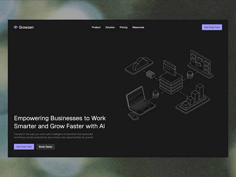
Designed a website concept for AI powered platform.
I wanted to give it a clean, minimal with a custom isometric illustration in the hero section.
Which version do you like better?

4 votes
Ends in 1d







This looks premium