The network for creativity
Join 1.25M professional creatives like you
Connect with clients, get discovered, and run your business 100% commission-free
Creatives on Contra have earned over $150M and we are just getting started
Back to feedPost

NK Logomark — Designed on the Grid
I wanted to design something that didn't just look good — but was built right. The NK monogram started as a simple idea: a pixel-style lettermark that felt both retro and modern. Clean enough for digital, bold enough to stand alone.
The real work was the construction. Every pixel snaps to a 16px base unit. The spacing, stroke weight, and proportions all follow the same rule — one unit. No exceptions.
The construction sheet is my favorite part of this project. It pulls back the curtain and shows the geometry, the guide circles, the grid — the thinking behind the mark.
This is the kind of logo that looks simple but is anything but.
Tools: Figma · SVG
Type: Logo Design · Geometric Construction
Style: Pixel · Modular · Systematic
🚀


The network for creativity
Join 1.25M professional creatives like you
Connect with clients, get discovered, and run your business 100% commission-free
Creatives on Contra have earned over $150M and we are just getting started
Related posts

Looking forward with connecting with talented Graphic Designers!

$30-45/hr for ongoing part-time design work is solid — good role for someone looking to build consistent income

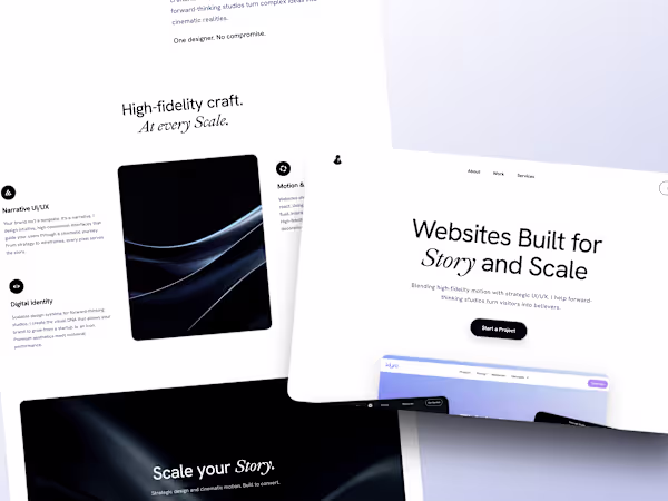
The case study for my new web site is up.
I am so happy with how it came out, it really feels like me and something i am proud of!
https://contra.com/p/cvNUUPEv-repositioning-for-story-and-scale-a-portfolio-redesign?referralExperimentNid=DEFAULT_REFERRAL_PROGRAM&referrerUsername=alexis_pilon_wtikezbh


Quite impressive!


It's good.


Trending


Notion
Notion isn’t just where you work, it’s starting to work for you. What agents are you building?
portfolioreview
The best portfolios tell a story, not just show a grid. Share yours for feedback.
brandguidelines
Brand guidelines are becoming living systems, not static documents. What are you building for your clients?
aivideo
AI video tools are moving at warp speed. Which ones are you experimenting with?
freelancerlife
Freelancer life is wins, pivots, and everything in between. What’s yours right now?