The network for creativity
Join 1.25M professional creatives like you
Connect with clients, get discovered, and run your business 100% commission-free
Creatives on Contra have earned over $150M and we are just getting started
Back to feedPost

I've designed live websites for clients in Australia, the UK and New York, but on Contra I'm still at $0 earned. 😅
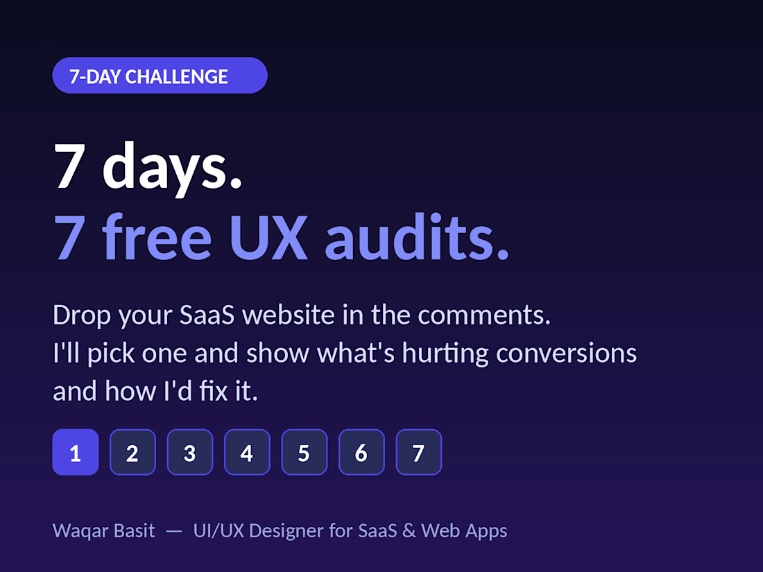
So I'm trying something different. For the next 7 days I'll post one free UX mini-audit of a real SaaS homepage, showing what's hurting conversions and how I'd fix it.
Founders, drop your website in the comments and I'll pick one to audit publicly.
The network for creativity
Join 1.25M professional creatives like you
Connect with clients, get discovered, and run your business 100% commission-free
Creatives on Contra have earned over $150M and we are just getting started







Related posts


Definitely the new one. Seems more fluid and easier to interact with

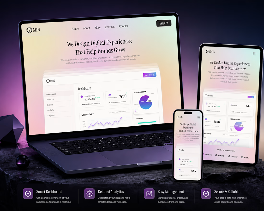
A clean and modern landing page concept designed for a SaaS platform. The goal was to create a visually engaging hero section with a strong focus on product presentation, clear hierarchy, and a premium user experience.
Designed with simplicity, usability, and scalability in mind.
Services: • UI/UX Design • SaaS Dashboard • Landing Page • Web Design


Amazing work

From problem to polished product.
I started by identifying the UX problems, then refined the same product through better structure, hierarchy, spacinga navigation, and interactions making the experience clearersimpler, and easier to use.
1 voted
50%
1 voted
50%
2 votes
Closed