The network for creativity
Join 1.25M professional creatives like you
Connect with clients, get discovered, and run your business 100% commission-free
Creatives on Contra have earned over $150M and we are just getting started
Back to feedPost
Industrial shortcuts ruined milk. I brought honest dairy back.
Walk down any dairy aisle today. What do you see?
Clinical white cartons
• Generic cow illustration with no story
• Corporate logos shouting percentage points
Every single brand plays by the exact same visual playbook. And because they try to fit in, they completely blend into the background.
When designing the brand identity and packaging for Elsie's (an organic, grass-fed milk brand), my goal was simple:
Break that pattern. Completely.
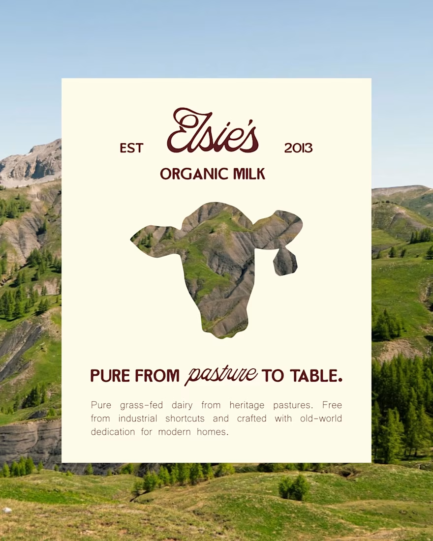
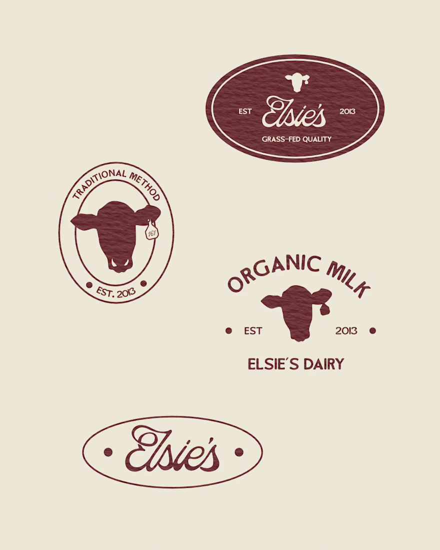
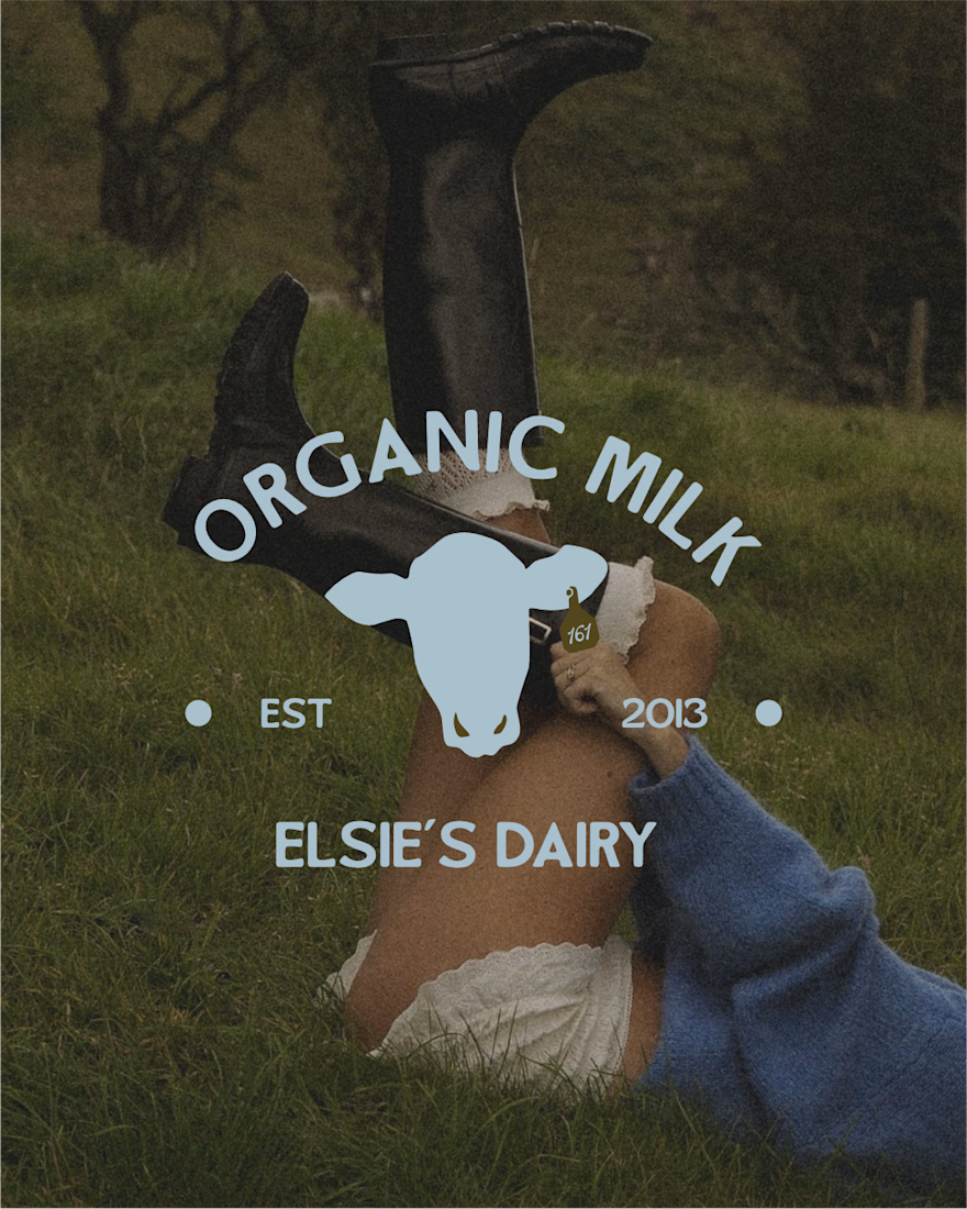
To make Elsie's unmissable in a crowded fridge, I built a visual identity rooted in heritage, warmth, and total transparency:
1 Color Palette: Swapped sterile blues and clinical whites for rich, warm tones that evoke real pastures and old-world farm kitchens.
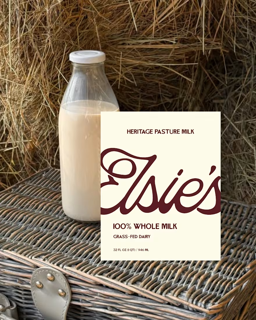
2 Typography: Built the brand around custom serif lettering that feels human, grounded, and instantly premium.
3 Visual Hierarchy: Placed "100% Grass-Fed" front and center so shoppers recognize the quality before reading a single line of fine print.
This created packaging that earns immediate trust on the shelf and looks great on a kitchen counter.
Swipe through to check out the packaging details and visual system!


What do you think about it?
The network for creativity
Join 1.25M professional creatives like you
Connect with clients, get discovered, and run your business 100% commission-free
Creatives on Contra have earned over $150M and we are just getting started





Related posts


Has AI taken my job yet? 👀
As a designer, I feel like I constantly need to keep up with new tools and products, if only to keep my "has a computer replaced me already?" anxiety under control
At first, we expected AI to do everything with one click
Then we moved on to writing ridiculously long and detailed prompts
And now I feel like we're finally getting to a healthier place with our expectations: build a good system → get good results
I went to play with Recraft's new Logo Maker to see if AI can actually make decent logos now
Weeeeell, you can see the result for yourself! 🤩
Sure, it's not a magic button that reads your mind and does everything for you. But if you have a clear sense of your brand's style and personality, the results can be surprisingly good
Left - my usual aesthetic. Right - Recraft's take on me
So, what do you think of my one-click logo?
Does it feel like me? 🪩✨


“Build a good system, get good results” is exactly where I’ve landed too. The tool only goes as far as your sense of what you’re after. How many tries did it take to get there?

A brand built on the daily walk.
For Patta, a Brazilian pet-lifestyle brand, the wordmark leans like a pair walking side by side, and dog-tag shapes frame everything from packaging to Barkz, its collectible charms.
Pet brands: cute, or bold enough to wear?



I like it!🔥 Best one since morning.

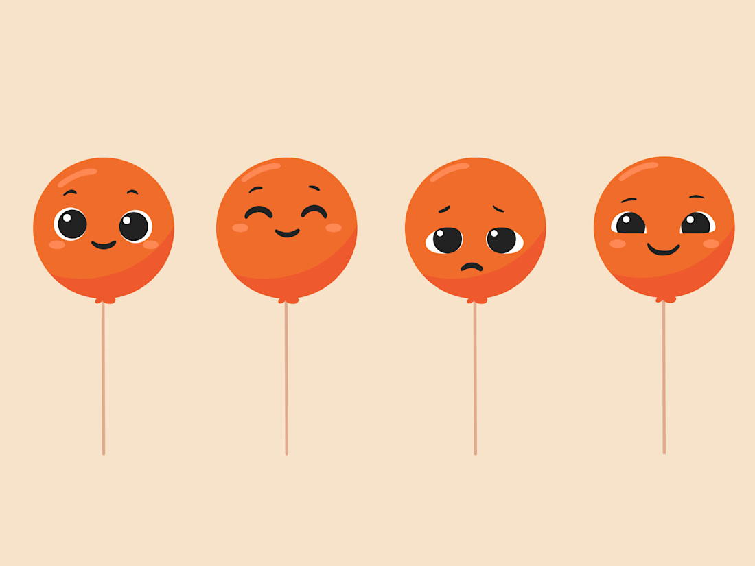
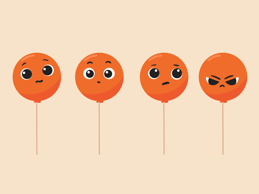
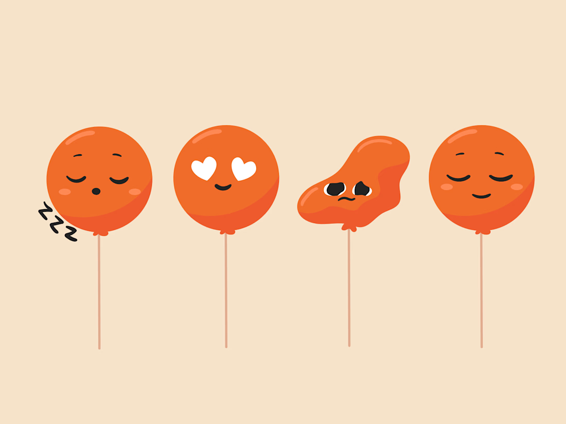
Balloon Mascot expression ranges
Illustrations by @Mary Delaney

I really love coming across this project in this space