The network for creativity
Join 1.25M professional creatives like you
Connect with clients, get discovered, and run your business 100% commission-free
Creatives on Contra have earned over $150M and we are just getting started
Back to feedPost

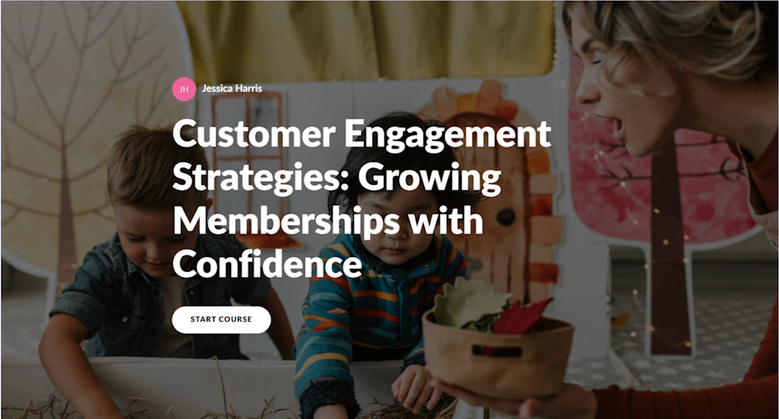
Rise Course training on membership growth for play cafe

The network for creativity
Join 1.25M professional creatives like you
Connect with clients, get discovered, and run your business 100% commission-free
Creatives on Contra have earned over $150M and we are just getting started




Related posts

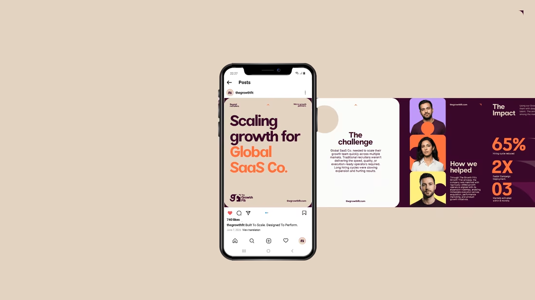
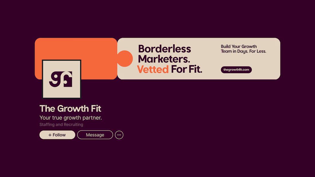
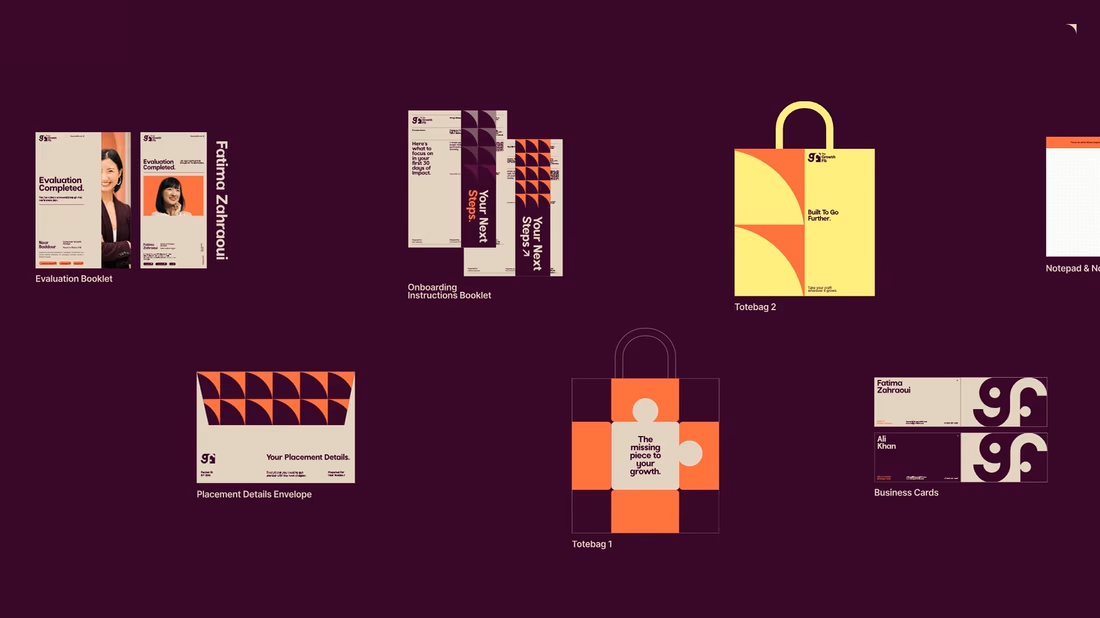
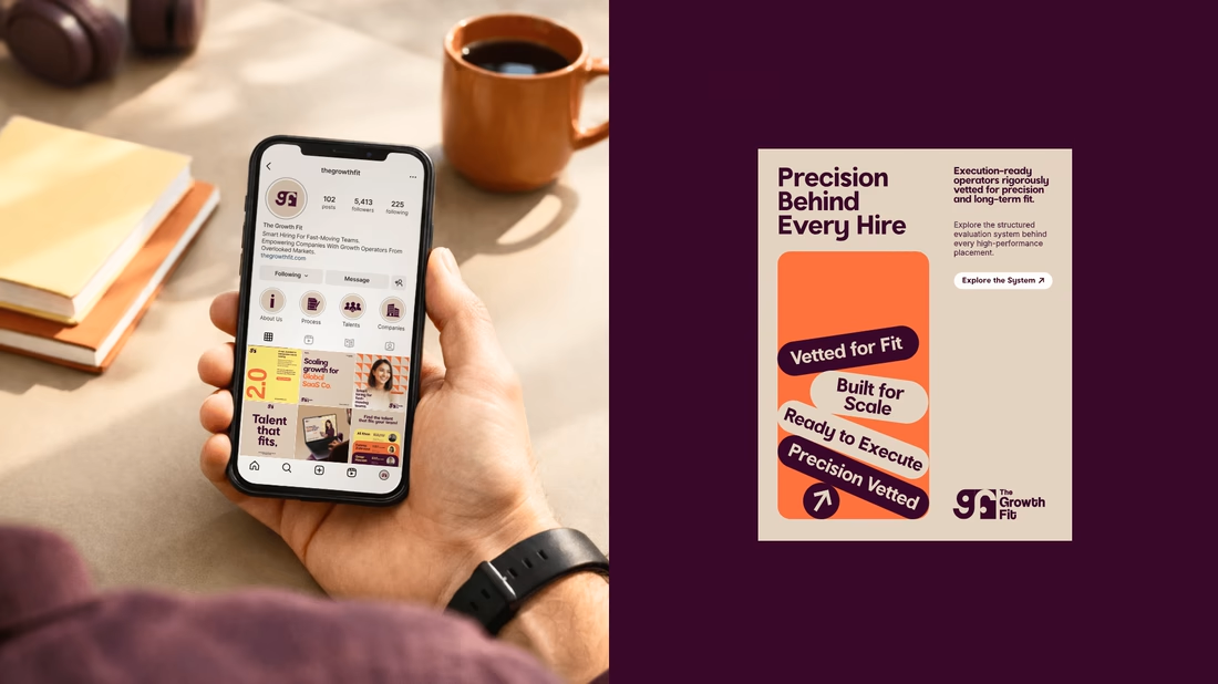
A few more touchpoints & collaterals from The Growth Fit, a project that just got featured on Contra. ✨
For The Growth Fit, the challenge was making recruitment feel less corporate without losing credibility or trust.
So every touchpoint, from social media and FitCards to stationery and collaterals, carried the same idea: the right talent meeting the right opportunity.
Warm colours, bold typography and recurring visual cues kept the brand human, confident and unmistakably TGF wherever it showed up.
A simple mantra:
Consistency creates recognition.
Recognition builds familiarity.
Familiarity builds trust.
Which TGF touchpoint stands out to you the most?



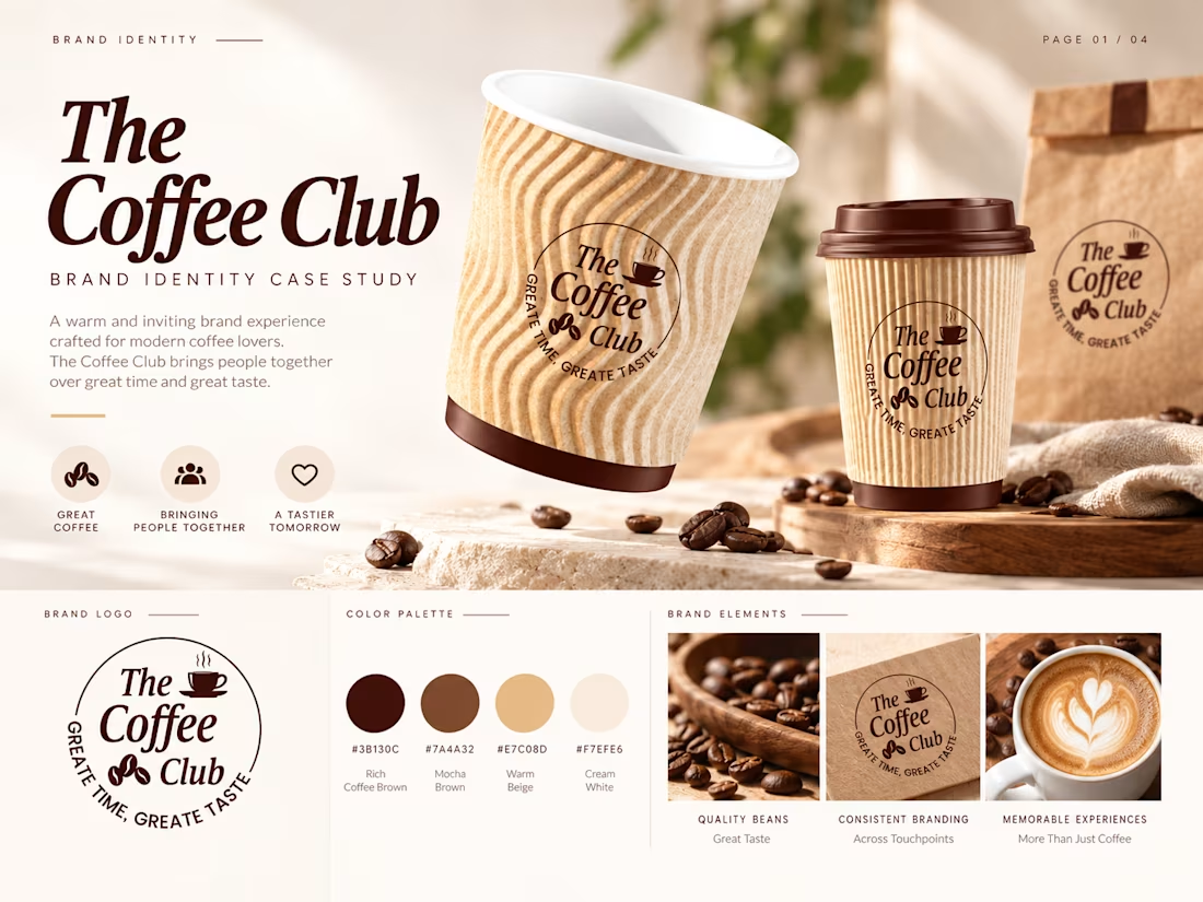
The Coffee Club — Brand Identity & Logo Design
A warm, modern brand identity created for The Coffee Club, designed to communicate comfort, quality, and the social experience of enjoying great coffee together.
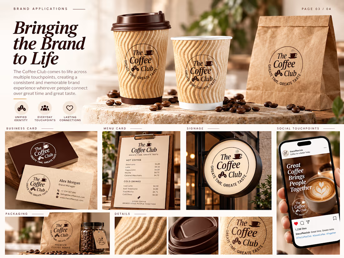
The visual identity combines an elegant typographic logo with coffee-inspired elements, including a cup icon, coffee beans, and a circular badge structure. A natural palette of rich coffee brown, warm beige, and cream creates a welcoming and premium café aesthetic.
The project was developed as a complete brand system, including logo applications, packaging, takeaway cups, signage, business cards, social media visuals, and motion graphics concepts.


I just made 2 little illustrations for cafe branding if someone want creativity i am always up for new projects.